Imagine this: you’ve got an elegant, savvy website ready to launch. But what about user engagement? That’s where the Bootstrap search box comes into play—your digital beacon guiding users to their desired content with ease and precision.
In the heart of a well-structured webpage, a search box is akin to the compass of cyberspace—indispensable for navigation.
Crafting one that’s both attractive and functional isn’t just smart; it’s crucial. And yes, you’re spot on, Bootstrap, the trusted front-end framework, offers a sparkling array of options to magnify user experience.
By the tail end of this article, you’ll have the lowdown on implementing a responsive search form, sprucing it up with a sprinkle of UI/UX design, and making sure every search sings with cross-browser compatibility.
We’re diving deep into dynamic search suggestions and AJAX search queries, ensuring no stone’s left unturned.
Get set to unravel the art of creating a Bootstrap input group that not only fits like a glove but functions like a dream.
Bootstrap search box examples
Search Form With Animated Search Button

Ever seen a button that changes shape? That’s what’s happening here. Hover over the search icon, and boom, it’s an arrow! It’s a Bootstrap search box with flair, not just plain and dull.
The text box has bold writing, so it’s clear and easy to read. No squinting at the screen. Cool for a website or app.
Colorlib Search Form V14

Looking for a hotel? This one’s for you. It’s not just a search bar; it’s like a search bar on vacation. Using Bootstrap magic, it’s got style, flair, and the wow factor. Perfect for your site, especially if hotels are your thing.
Bootstrap Search Bar

Okay, so, you’re a web designer or developer? Check this out. A bs4 search Bar, given to the world by Bootdey Admin, and guess what? It’s free.
It’s a smart snippet using the Bootstrap framework, and it’s responsive for all gadgets. Save time, look awesome.
Awesome Bootstrap Search Box Input Form

Minimalistic. Beautiful. Functional. This Bootstrap search box is a gem. With its solid fill and clear input field, users will glide through your content. And the animation? So cool. It’s got design; it’s got grace.
Colorlib Search Form v18
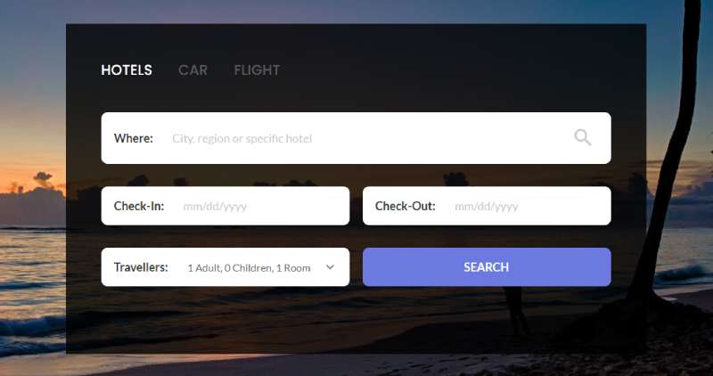
Travelers, unite! This free search box is not just for globetrotters, though. Sections for hotels, cars, flights, it’s all there. Use it how you like, but know this: it’s a time saver, and it’s ready for anything.
Bootstrap Searchbar by Ace Subido

Simple but effective. That’s Ace Subido’s creation. It’s a Bootstrap search bar, sleek and friendly to all browsers. Chrome, Edge, Firefox, Opera, Safari – they’re all invited to the party.
Bootstrap version 3.2.0 backs it up, making it a solid go-to for your project.
App Search Bar – Bootstrap Search Bar Examples For Mobile Apps

Apps need love too, and that’s where this Bootstrap search box comes into play. Accessibility is key here. Top right corner, neat animation, bam – there’s your search bar.
Want it full-page? Go for it. Interaction with users is crystal clear. Make your app stand out!
Bootstrap 4 Algolia Instant Search Location Autocomplete Input

Ever needed to find a place, like snap, instantly? Here it is, the Bootstrap 4 algolia magic for you. HTML, CSS, JavaScript, and a sprinkle of jQuery.js.
Don’t fret; it’ll play nice with browsers like Chrome, Edge, Firefox, Opera, and Safari. Fully responsive, too.
Beautiful Search Box

Simplicity. Elegance. That’s the way. This full-page Bootstrap search box design is pure charm. White text, big characters. Imagine it, a search box that’s both basic and gorgeous. Your site or app would love it.
Bootstrap Responsive Carousel with Three Input Search Form

You like cars? Uber-stuff, maybe? Check out this one. Think of a vehicle reservation system. Pick-up, drop destination, vehicle type – it’s all there.
Click the search button, and you’re set. The tech? Bootstrap 4, HTML5, and CSS3, all whipped up into something cool.
Search Form V25 -Dark Theme Search Box

Love transparency? Here’s a transparent Bootstrap search box. Background images, patterns – see them all through the search box. Add in a gradient-colored call-to-action button, and you’ve got a searcher’s dream. Classy and functional. That’s what’s up.
Bootstrap 4 Text Input Form with Search Icon
Font Awesome? You bet. This Bootstrap 4 text input comes with a shiny search symbol. A must-have for any Bootstrap 4 driven site.
Two different search bar designs, just a few seconds of loading time, and boom, related content right at your fingertips.
Bootstrap Search Box With Filter
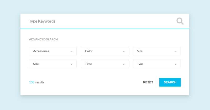
Keep it simple. That’s the motto of this Bootstrap search box. Filters just below, results count in the corner, it’s got you covered.
You’ll love the clean, easy-to-customize code. Roomy for options and text, just how we like it. No fuss, just efficiency.
Search Form v1

Just a basic Bootstrap search box. Two boxes, two variables. Need a travel service? This search is your buddy. Flexibility in the code means you can make it your own.
Throw it on your site. Add it to your database. Simplicity. That’s how we roll.
Bootstrap 4 Simple Responsive Search Box

Created by Ask SNB, this Bootstrap 4 search box is here to serve you, no strings attached. Free and open-source. Yep, that’s right. You want it; you use it. Simple, responsive, and ready for all kinds of projects. Just like that.
Bootstrap 5 Task List With Search

Your users want to find stuff? Let ’em. Give ’em the ability to filter down those search results. Swift and smooth. Got a service-based site? You need this Bootstrap search box. Filter choices, clean look, and saving space. Oh yeah, your website just got cleaner.
Minimal Search Bar

Minimalist Bootstrap search engine. Quirky, cool, compact. Takes less space, and only expands when you need it. The search icon? Becomes a search box. Fill in queries, hit enter, get info. It’ll turn back into its original shape, just like magic. Bootstrap search box minimalism. Now, that’s fresh.
FAQ On Bootstrap Search Box
How do I create a Bootstrap search box?
Trust me, it’s a cinch. Start with a form tag, add an input group from Bootstrap for style, slip in an input with type=”search”, plop a search icon button next to it, and voila – your neat, responsive search form is ready for action.
Can I customize the Bootstrap search box to match my website’s theme?
Absolutely. Bootstrap’s a dream when it comes to customization. Use your CSS to get creative – colors, padding, borders. Play around, make that search box feel like home. Tailor it to your heart’s content and keep it in sync with your site’s vibe.
How do I add a search icon inside the search box?
Oh, icons are a nice touch. Just nest a span with the icon class inside the Bootstrap input group. Position it correctly; it’s like giving directions in a new city. That icon? It’s like telling users, “Here’s where the magic happens.”
Is the Bootstrap search box mobile responsive?
You bet it is. Bootstrap’s all about being mobile-friendly. Your search box will dance to any device’s tune, looking sharp on phones, tablets, desktops – you get the gist.
Can I implement an autocomplete feature in the Bootstrap search box?
Sure can! Mix in some JavaScript, maybe a dash of AJAX for flavor. It’s all about fetching data real-time, giving users a taste of what they’re searching for as they type. Such a slick feature, really ramps up the experience.
How do I integrate a Bootstrap search box in the navbar?
It’s about finding its place. Wedge it in your Bootstrap navbar, snug between nav links or brand logos. The key is to keep it accessible, easy to find like a lighthouse in a stormy web sea.
What’s the best way to ensure accessibility with a Bootstrap search box?
Keep the focus on clear labels, properly set ARIA attributes, and keyboard-navigable elements. Accessibility—it’s respecting every user’s journey, making it smooth-sailing for all.
How do I align the search box to the right within its container?
Think of it as tidying up a room. Use Bootstrap’s utility classes – a little float-right magic or flexbox utilities, and there you have it, your search box is tucking in neatly on the right.
Can I make the search box expand when clicked?
Absolutely, it’s like opening a treasure chest on click. A bit of JavaScript, a sprinkle of CSS transitions, and you can have that search box bloom beautifully upon interaction.
How do I add a dropdown list with search recommendations in the Bootstrap search box?
It’s all about guiding your users. You create a dropdown menu, populate it with recommended searches, and use JavaScript to make it interactive. Like a trusty compass, it shows options as users embark on their search quest.
Conclusion
So, here we are. We’ve journeyed through the ins and outs of conjuring up a Bootstrap search box. It’s sleek, it’s functional, and it’s sure to elevate the user experience like a well-timed joke elevates a speech.
- We’ve colored outside the lines, tailoring the CSS search field to reflect your brand’s personality.
- We’ve guided the search box design with care, ensuring that its place on your website feels as natural as coffee in the morning.
- Our foray included making the search box play nice with different screen sizes, ’cause let’s face it, mobile-friendly search bars are no longer just nice to have; they’re a must.
- And who could forget about dynamic search suggestions? They’re like a friendly nudge for your users when they’re not quite sure what they’re after.
As this curtain closes, you’re not just walking away with a search box. Nah, you’re armed with a swiss army knife of search magic, prepped to enhance navigation, drive engagement, and bake a little bit of wow right into your digital presence. Now, go on, make that search box shine.
If you liked this article about Bootstrap search boxes, you should check out this article about Bootstrap headers.
There are also similar articles discussing Bootstrap login forms, Bootstrap contact forms, Bootstrap animations, and Bootstrap timelines.
And let’s not forget about articles on Bootstrap galleries, Bootstrap charts, Bootstrap profiles, and Bootstrap menus.