Resources
370 articles

Out of the box, a blockquote is an indented block of text and not much else. The browser applies a 40px indent and stops…

Borders, gradients, pseudo-elements and clipped shapes can all split a page into sections without a single image file. Plenty of pages add one out…
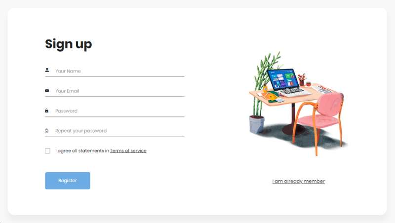
Bootstrap handles the layout, the validation styling and the responsive behavior of a login form, and that’s where it stops. Password checks, sessions and…

Bootstrap animates very little by itself. A few components get CSS transitions or keyframe loops, switched on with classes such as .fade, .collapse and…
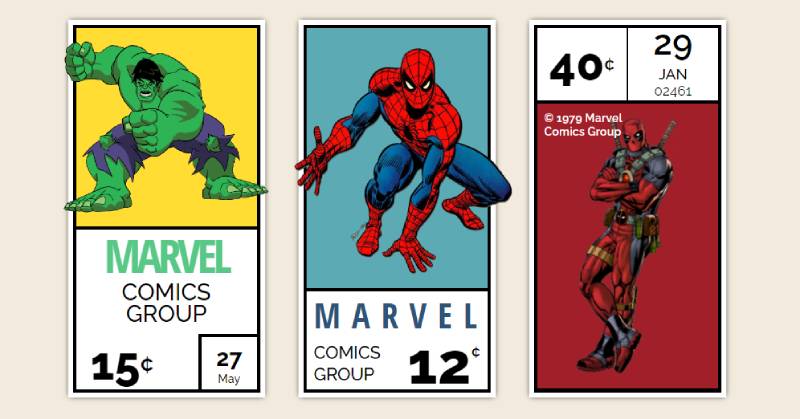
Most card bugs I’ve run into had nothing to do with shadows or border radius. The markup looked fine with one card on the…

Open the Bootstrap 5.3 documentation (v5.3.8) and go looking for a footer. There isn’t one. The docs index 24 components, and none of them…
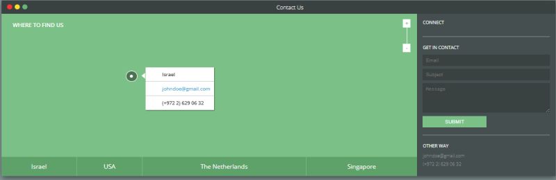
Paste a tooltip into a Bootstrap 5.3 page and nothing happens. The markup is fine. The plugin just doesn’t run until new bootstrap.Tooltip() is…
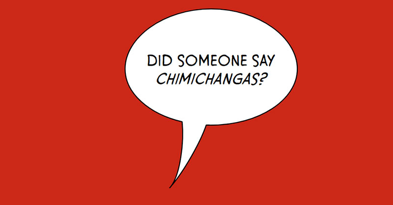
Add a box-shadow to a bubble that uses clip-path and watch it vanish. MDN documents that clip-path hides every part of an element outside…

Pinterest-style card walls used to mean JavaScript. CSS can now do it natively with display: grid-lanes, which drops each item into the lane with…

CSS card hover effects need no JavaScript. Put a transition on the card’s resting rule, change transform or box-shadow inside :hover, and the card…

Tailwind dashboards usually ship without a stylesheet of their own. The sidebar, top bar, stat cards, tables and charts are all styled by classes…

Bootstrap 5 draws its toggle switch with CSS alone. The checkbox underneath still holds the on/off state, and the .form-switch class on its wrapper…

When text animation goes wrong, the splitting step is usually to blame, not the motion. Adrian Roselli’s February 2026 tests of GSAP’s own SplitText…
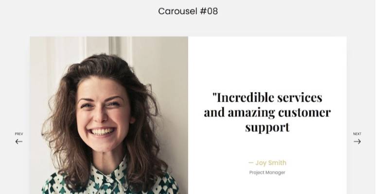
As of October 2026, the Bootstrap 5.3 documentation lists six carousel options (interval, keyboard, pause, ride, touch and wrap), and none of them sets…
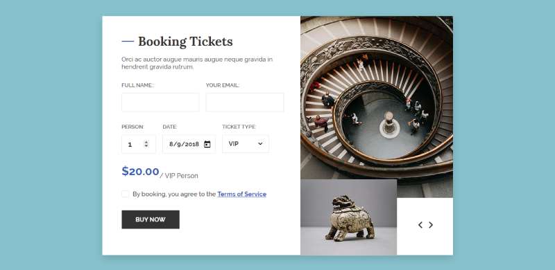
Bootstrap runs on 13.1% of all websites and holds a 74.8% share of the CSS framework market (W3Techs, October 2026), so a good share…
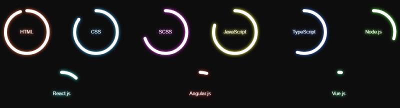
Most progress bars look identical on screen whether they’re built well or badly. A styled div and a native progress element both fill from…

A customer in Lagos spends 20 minutes filling their cart with products they genuinely want to buy. They proceed to checkout, excited about their…

Recolor a Bootstrap checkbox with a plain background-color override and the old white check mark stays exactly where it was. It trips up a…

A button that only changes color on :hover or :active confirms the press happened and nothing more. The ripple adds the where: a fading…

Bootstrap builds a progress bar out of two divs. The outer .progress is the track, and the inner .progress-bar is the fill that grows…
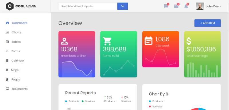
Themewagon’s free portfolio template still lists Bootstrap 4 and jQuery as its stack. Bootstrap 4 reached end of life on January 1, 2023 (Bootstrap…

For years, getting a background to trail behind the text meant a JavaScript scroll listener and a transform rewritten on every frame. CSS can…

Protecting privacy while accessing the web securely, watching videos unrestricted, and using any online service (in Europe) has become more important than ever. For…
Almost nobody was using backdrop-filter in 2018. Chromium engineer Mason Freed put unprefixed usage at about 0.0003% in November of that year (W3C CSS…

Email marketing remains one of the most powerful tools in your digital arsenal. For every dollar you spend on email campaigns, you can expect…

Tailwind CSS ships no dropdown logic. The utility classes decide how a menu looks, and the open and close behavior has to come from…

Most of a Tailwind modal is the native dialog element doing its own job. One showModal() call gives you the backdrop, the Escape key…

Copy Tailwind’s table-fixed example into a project and the layout may not change at all. The reason is in MDN’s documentation (MDN, 2026): table-fixed…

Copy a spinner snippet from an older Tailwind tutorial into a v4 project and the ring can come out looking off. The Tailwind CSS…

Tailwind CSS doesn’t include a tooltip, so you put one together from utilities. A relative wrapper marked group holds the trigger, and an absolutely…