Resources
376 articles
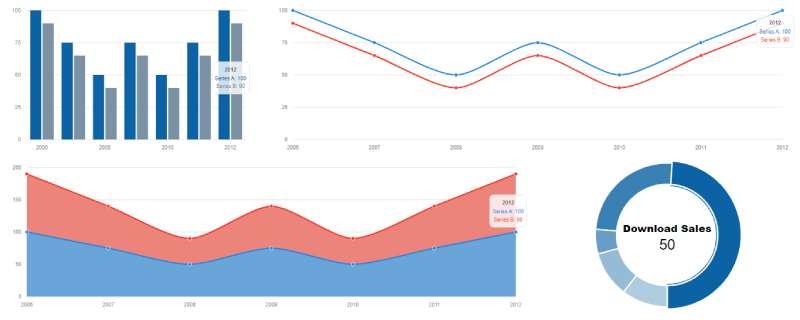
Raw data means nothing without visualization. Bootstrap charts examples show you how to turn numbers into bar graphs, line charts, pie charts, and interactive dashboards that…

Scroll snapping alone gets you a working carousel with no slider script, and the browser can generate the buttons and position markers too. Product…

Website navigation can make or break user experience. Bootstrap menus solve this problem with pre-built, responsive navigation components that work across all devices. No…

Visitors scan a page for a spot to type, and when they find one, they use it. On useit.com, Nielsen Norman Group (2001) recorded…

Most loading spinners on the web are just a keyframe animation sitting in the stylesheet. Nobody needs a GIF or an animation library to…
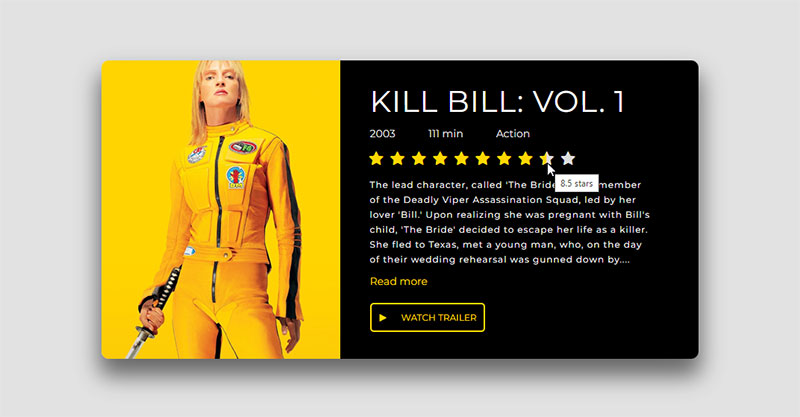
Stars on a page are easy to get wrong because two very different widgets look almost the same. Some only report a score. Others…

Splitting content across pages sounds simple until you actually build it. These Tailwind pagination examples give you ready-to-use code for every common pattern. Basic numbered links.…

Footer bugs mostly turn up on pages with very little content. The footer floats halfway up the screen with blank space under it, or…
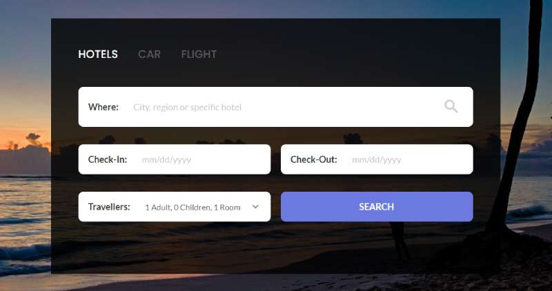
Users expect to find what they need fast. A well-built search box makes that happen. Bootstrap search box examples give you ready-to-use code for…

Rotate a card with rotateY and it just looks like a flat shape getting narrower. Perspective sets the viewing distance between the viewer and…

Discovering that your website has been deleted can be stressful. Whether it happened because a hosting account expired, a domain was lost, or files…
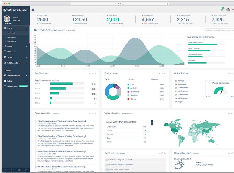
Your sidebar can make or break a web application’s navigation flow. A poorly built side panel frustrates users. A well-crafted one keeps them engaged…

Changelogs, resumes, project histories and product roadmaps keep asking for the same thing, which is dated events in order along a line. HTML and…

Tabs keep interfaces clean. They organize content without overwhelming users. These Tailwind tabs examples show you how to build tab components from scratch using…
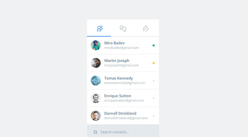
Most of a chat box is a flex column with rounded corners. Bubbles, a header, a scrolling message list and an input bar at…

Browser default radio buttons look terrible. They clash with modern designs and render differently across Chrome, Firefox, and Safari. These Tailwind radio button examples…

Toggle switches have become the default for settings panels, dark mode switchers, and feature controls across modern web applications. Building them from scratch takes…

A lot of sliders load a script just to change which image is showing. CSS can handle that part on its own. Hero banners,…

Even the best WordPress sites can run into SEO issues over time. Broken links, slow pages, duplicate content, and outdated keywords quietly hold your…
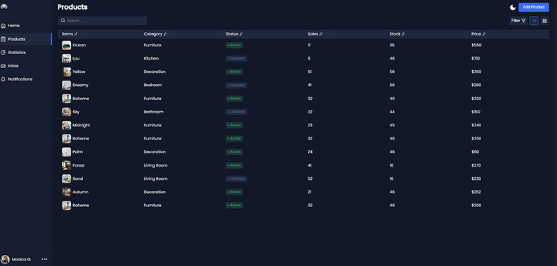
Plenty of internal admin panels and monitoring screens carry a full component framework just to get a sidebar and a few cards onto the…

Most border animation on a page is a color change on hover. One transition line does it, and it’s what buttons and pricing cards…

You can make a button feel finished with CSS alone. No images, no JavaScript, just hover, focus and press states that do something visible.…

Most flip card tutorials stop once the card turns on hover. That part is easy, and it’s also where the trouble starts, because a…

A class toggle is enough to show and hide a panel. The W3C’s ARIA Authoring Practices Guide (2025) still points most websites somewhere else,…

Building a functional calendar component shouldn’t drain your development time or break your design system. Tailwind calendar examples offer developers ready-made solutions that blend seamlessly with…
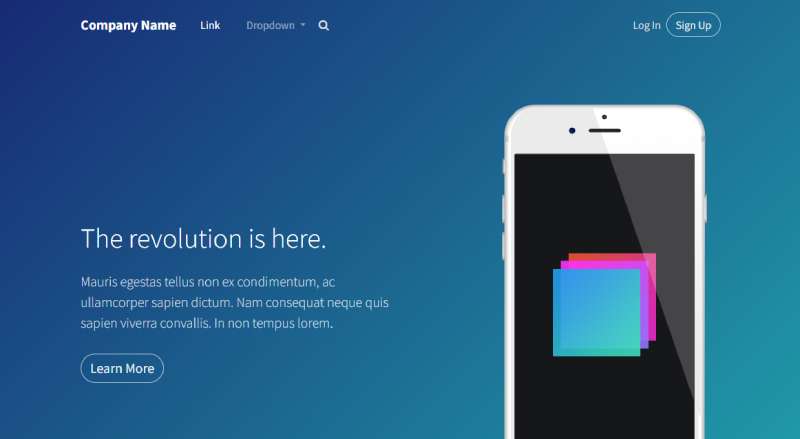
Headers make or break first impressions. A clunky navigation bar sends visitors elsewhere. These Bootstrap header examples cover the patterns that actually work in…

Creating eye-catching YouTube thumbnails is no longer just for graphic designers. With the rise of AI-powered tools, anyone can generate viral-worthy images in minutes.…
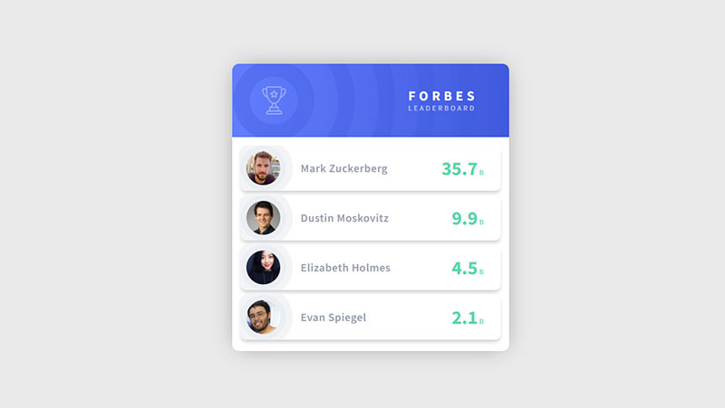
Most list styling problems come down to the marker, the bullet or number sitting in front of each item. CSS handles it through list-style-type,…
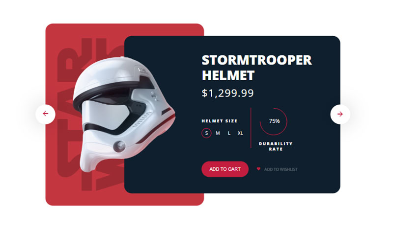
Baymard Institute’s 2023 benchmark found that 50% of ecommerce sites fail to show adequate list item attributes. Test participants dismissed relevant products or left…

Licensing is the part of CSS animation libraries that gets the least attention. Hover.css requires a paid license for commercial work, while the Animate.css…