Author: Bogdan Sandu

Your website looks great. But you’re not ready to go live yet. Maybe you need client approval. Or team feedback. Or you just want…

Scroll effects used to mean an event listener and a throttle function, and plenty of pages still ship that way. Progress bars, cards that…

Raw data means nothing without the right visualization. Tailwind charts examples show you how to build bar charts, line charts, pie charts, and more…

Your brand has a story to tell, but traditional website builders weren’t designed for storytelling. They’re built for static pages and basic layouts, not…
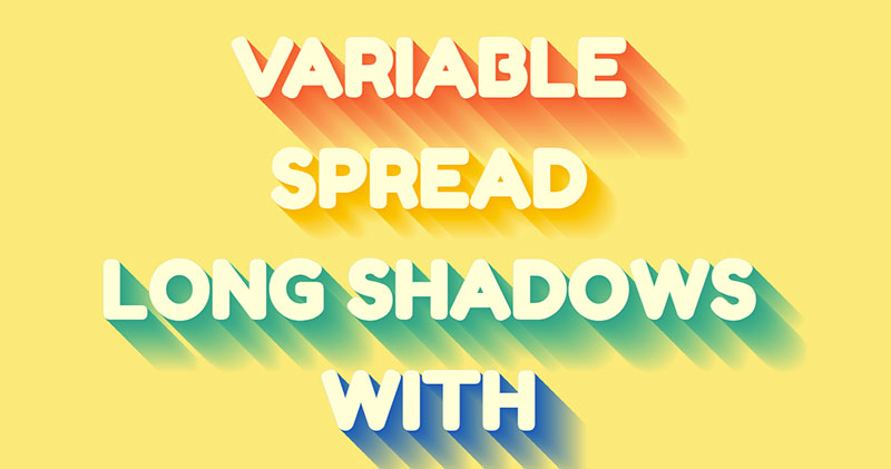
Shadows are one of those things everybody adds and almost nobody goes back to. A card gets a box-shadow in week one, a heading…

Plenty of tutorials style a button element, call it a download button and move on. It looks right. It also has no file URL…

Disabled Tailwind Select Add the disabled attribute to prevent user interaction. Tailwind handles the visual styling with opacity and cursor classes. “ <select disabled…
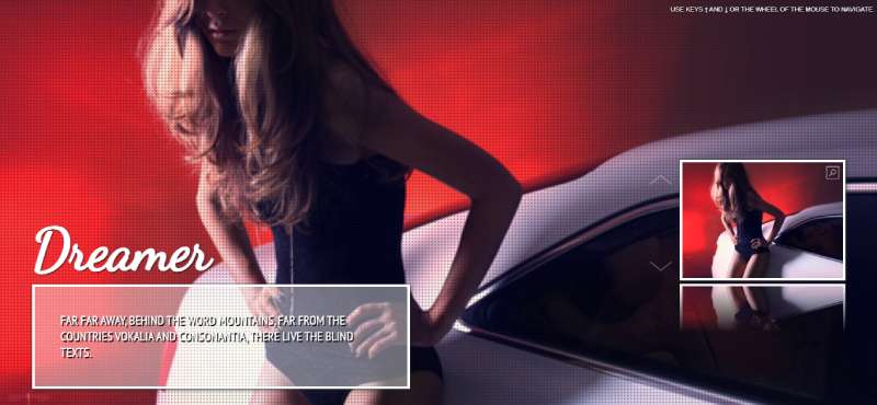
Building stunning image galleries shouldn’t require wrestling with complex code or hiring a developer. Bootstrap gallery examples offer the perfect solution for creators who…
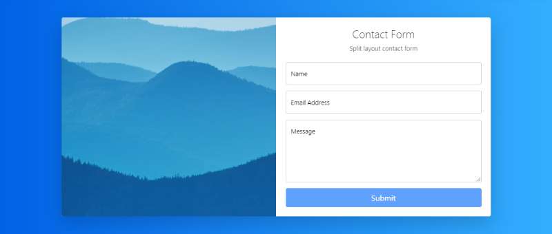
A broken contact form costs you leads. Every failed submission is a visitor who wanted to reach you but couldn’t. Bootstrap contact form examples…

Many businesses begin with simple IT support and get by just fine. That changes as systems grow. More cloud tools get added. More users…
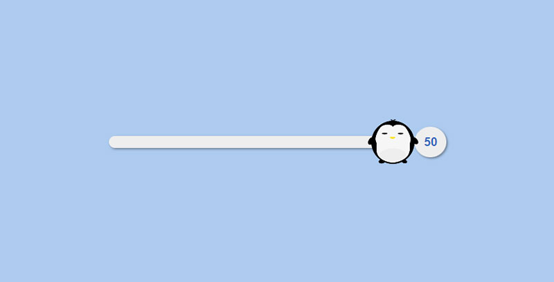
The browser draws a range slider and handles the dragging. CSS only gets to repaint it. The control is input type=”range”, which lets a…

Bars, slices and rings can all be drawn with HTML elements and CSS properties alone. Bars come from grid or flexbox layouts with percentage…

Your hero section has about three seconds to convince visitors to stay. Most Tailwind hero examples online look identical. Same gradient backgrounds, same centered text, same…

Users need feedback. Every form submission, every error, every successful action requires a clear response. That is where Tailwind alert examples come in. These…

Static image galleries kill conversions. Sliders keep visitors engaged. Building a responsive carousel from scratch takes hours of custom code and endless browser testing.…

How to Style Tailwind Input Validation States Validation states communicate form status to users visually. Red for errors, green for success, yellow for warnings.…
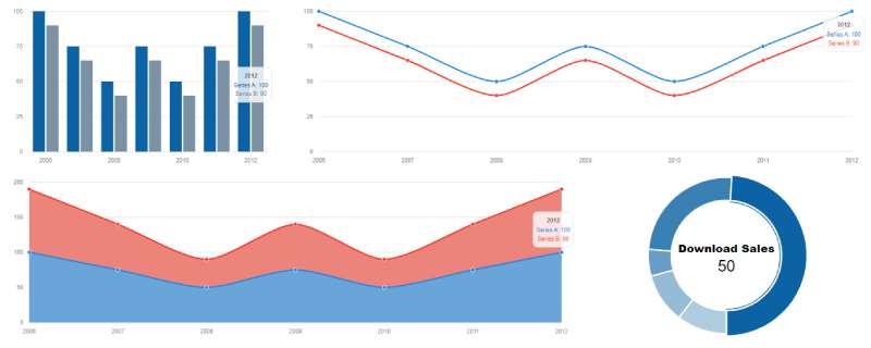
Raw data means nothing without visualization. Bootstrap charts examples show you how to turn numbers into bar graphs, line charts, pie charts, and interactive dashboards that…

Scroll snapping alone gets you a working carousel with no slider script, and the browser can generate the buttons and position markers too. Product…

Website navigation can make or break user experience. Bootstrap menus solve this problem with pre-built, responsive navigation components that work across all devices. No…

Visitors scan a page for a spot to type, and when they find one, they use it. On useit.com, Nielsen Norman Group (2001) recorded…

Most loading spinners on the web are just a keyframe animation sitting in the stylesheet. Nobody needs a GIF or an animation library to…
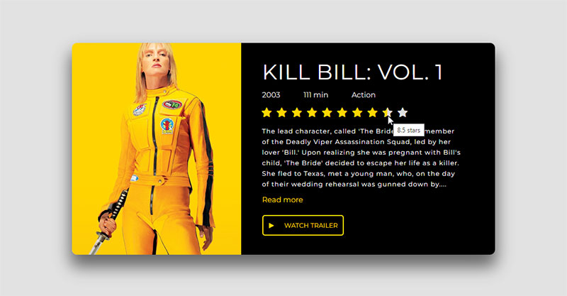
Stars on a page are easy to get wrong because two very different widgets look almost the same. Some only report a score. Others…

Splitting content across pages sounds simple until you actually build it. These Tailwind pagination examples give you ready-to-use code for every common pattern. Basic numbered links.…

Footer bugs mostly turn up on pages with very little content. The footer floats halfway up the screen with blank space under it, or…
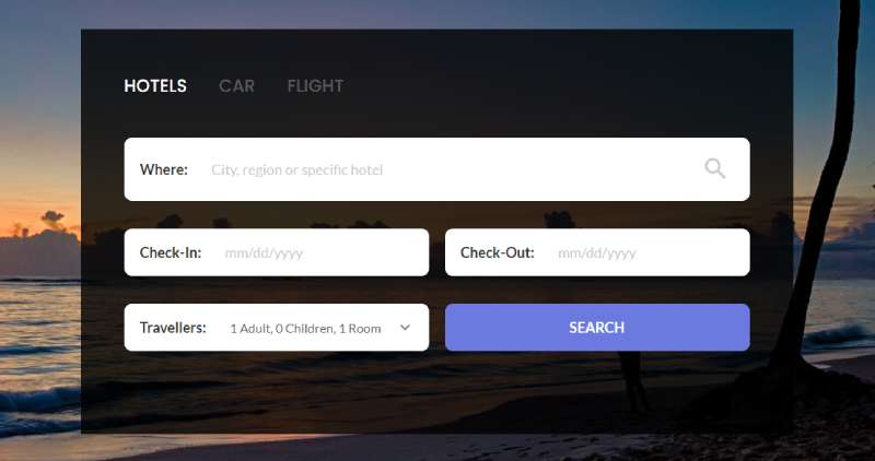
Users expect to find what they need fast. A well-built search box makes that happen. Bootstrap search box examples give you ready-to-use code for…

Rotate a card with rotateY and it just looks like a flat shape getting narrower. Perspective sets the viewing distance between the viewer and…

Discovering that your website has been deleted can be stressful. Whether it happened because a hosting account expired, a domain was lost, or files…
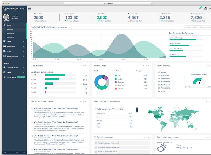
Your sidebar can make or break a web application’s navigation flow. A poorly built side panel frustrates users. A well-crafted one keeps them engaged…

Changelogs, resumes, project histories and product roadmaps keep asking for the same thing, which is dated events in order along a line. HTML and…

Tabs keep interfaces clean. They organize content without overwhelming users. These Tailwind tabs examples show you how to build tab components from scratch using…