
A poorly built footer breaks trust. Users scroll down expecting contact info, legal links, and quick navigation. When they find a broken layout or missing content, they leave.
These CSS footers examples cover real techniques that work across browsers and devices.
You’ll find code for fixed footers, sticky footers, Flexbox layouts, CSS Grid structures, responsive designs, and accessible implementations.
Each example includes working code you can copy directly into your projects. No frameworks required, just clean CSS that handles positioning, column layouts, dark mode switching, and hover animations.
Whether you’re building a simple copyright bar or a multi-column footer with newsletter forms and social icons, these patterns solve the common problems.
What is a CSS Footer
A CSS footer is the bottom section of a webpage styled using Cascading Style Sheets.
It sits below all main content and typically spans the full width of the browser window.
Footers contain site-wide information: copyright notices, contact details, privacy policy links, and secondary navigation.
The HTML <footer> tag provides semantic structure, while CSS controls the visual presentation, spacing, and positioning behavior.
Modern footer layouts rely on Flexbox or CSS Grid for column arrangements and responsive design patterns.
CSS footer examples
Footers but Make ’em Responsive

Just the Basics, Pal

Mind-Blown Expandable Magic

Mustard Footer For the Win

Smashing Responsive Design

Insta-Worthy Footer

Whoa, Goey Much?

@itsrehanraihan’s Eyecandy
Less is More, Folks

Animate, Don’t Hesitate

Stay Grounded with Fixed Footer

Plain HTML, Big Impact

Slide ‘N Glide Footer

Footers Got Swag

Peekaboo Footer

Easy-Peasy Responsive Magic

Pure Sass & Class

Floating on Cloud Parallax

Why Basic When Responsive?

Flex Those Footer Muscles

Content Shrink & Footer Pop

Grids & Waves Hello

Double Trouble: Contact + Footer

Ride the Footer Wave

Smarty Two-Part Harmony

Dance of the Northern Lights

Ocean’s Serenity

Chit-Chat Corner
Rebel With A Cause

Clean Slate

On-the-Go Groove

Pack it All in

Steve’s Footprint

The Sticky Situation

Clingy, But in a Good Way

Why Does a Website Need a Footer
Footers give users a predictable place to find essential links after scrolling through page content.
They boost user experience by offering quick access to sitemap links, social media icons, and newsletter signup forms.
From an SEO perspective, footer navigation distributes internal link equity across your site architecture.
Legal requirements often mandate visible links to terms of service and privacy policies. The footer handles this without cluttering the main layout.
Trust signals like contact information, business addresses, and certification badges commonly appear here. Visitors expect them.
How to Create a Basic CSS Footer
Start with semantic HTML structure, then apply CSS for background color, padding, and text alignment.
A basic footer needs just a few lines of code to function properly across desktop and mobile devices.
What HTML Structure Works Best for Footers
Use the <footer> element as your container. Nest <nav> for link groups, <address> for contact info, and <ul> for navigation links.
Screen readers recognize these semantic elements, which improves web accessibility.
<footer>
<nav>
<ul>
<li><a href="/about">About</a></li>
<li><a href="/contact">Contact</a></li>
<li><a href="/privacy">Privacy</a></li>
</ul>
</nav>
<p>© 2024 Your Company</p>
</footer>
Which CSS Properties Control Footer Positioning
These properties handle most footer positioning needs:
position(static, relative, fixed, sticky, absolute)bottom,left,rightfor fixed/absolute placementdisplay: flexordisplay: gridfor internal layoutwidth: 100%for full-width footersmargin-top: autoin Flexbox containers
The viewport height unit (vh) becomes useful when building sticky footer techniques with min-height calculations.
Fixed Footer CSS Example
A fixed footer stays locked to the bottom of the browser window regardless of scroll position.
It uses position: fixed combined with bottom: 0 and left: 0.
footer {
  position: fixed;
  bottom: 0;
  left: 0;
  width: 100%;
  background-color: #1a1a2e;
  color: #ffffff;
  padding: 15px 20px;
  z-index: 1000;
}
The z-index value keeps the footer above other page elements. Without it, content might overlap during scroll.
When Should You Use a Fixed Footer
Fixed footers work well for cookie consent notices, persistent CTAs, and mobile navigation bars.
Avoid them on content-heavy pages. They eat up vertical screen space, especially on smaller devices.
Chat widgets and call-to-action buttons benefit from fixed positioning when immediate user interaction matters.
Sticky Footer CSS Example
A sticky footer stays at the page bottom when content is short, but scrolls normally with longer content.
Two common approaches: Flexbox method and CSS Grid method.
Flexbox approach:
body {
  display: flex;
  flex-direction: column;
  min-height: 100vh;
}

main {
  flex-grow: 1;
}

footer {
  background: #2d3436;
  color: #dfe6e9;
  padding: 20px;
}
The flex-grow: 1 on the main content area pushes the footer down. Simple and reliable across browsers.
How Does Sticky Positioning Differ from Fixed
Fixed elements ignore document flow entirely. They anchor to the viewport and stay visible during scroll.
Sticky elements behave like relative positioning until a scroll threshold triggers them to stick. Compare this to how sticky navigation headers work.
For footers, the Flexbox sticky technique differs from position: sticky. It uses layout properties rather than positioning to achieve the bottom-anchored behavior.
Flexbox Footer Layout Example
Flexbox provides the cleanest solution for footer layout control without hacky workarounds.
The parent container uses display: flex with flex-direction: column to stack content vertically.
.page-wrapper {
  display: flex;
  flex-direction: column;
  min-height: 100vh;
}

.main-content {
  flex-grow: 1;
}

footer {
  display: flex;
  justify-content: space-between;
  align-items: center;
  padding: 30px 5%;
  background: #0f0f0f;
}
What Flexbox Properties Keep the Footer at the Bottom
Three properties do the heavy lifting: min-height: 100vh on the wrapper, flex-direction: column for vertical stacking, and flex-grow: 1 on the main content area to consume available space.
CSS Grid Footer Layout Example
CSS Grid offers precise control over multi-column footer arrangements and row sizing.
The grid system handles complex layouts that would require nested Flexbox containers.
.page-layout {
  display: grid;
  grid-template-rows: auto 1fr auto;
  min-height: 100vh;
}

footer {
  display: grid;
  grid-template-columns: repeat(4, 1fr);
  gap: 30px;
  padding: 40px 5%;
  background: #16213e;
}
How to Structure Grid Rows for Footer Placement
The pattern grid-template-rows: auto 1fr auto creates three rows: header (auto height), main content (fills remaining space), and footer (auto height).
Responsive Footer CSS Example
A responsive footer design adapts its layout across screen sizes using media queries.
Mobile-first design starts with stacked columns, then expands to horizontal layouts on larger screens.
footer {
  display: flex;
  flex-direction: column;
  gap: 20px;
  padding: 30px 15px;
}

@media (min-width: 768px) {
  footer {
    flex-direction: row;
    justify-content: space-between;
    padding: 40px 5%;
  }
}
How to Stack Footer Columns on Mobile Devices
Set flex-direction: column as the default, then switch to row at your tablet breakpoint. Adjust gap and padding values for touch-friendly spacing on smaller screens.
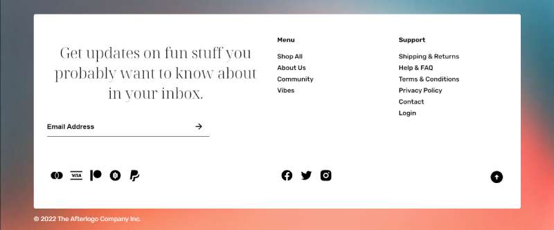
Multi-Column Footer CSS Example
Most corporate sites use three or four column layouts in their footer sections.
Each column serves a specific purpose within the overall user interface structure.
footer {
  display: grid;
  grid-template-columns: 2fr 1fr 1fr 1fr;
  gap: 40px;
  padding: 50px 5%;
  background: #1a1a2e;
}

.footer-brand { grid-column: 1; }
.footer-links { grid-column: 2; }
.footer-resources { grid-column: 3; }
.footer-contact { grid-column: 4; }
What Content Belongs in Each Footer Column
- Column 1: Logo, company description, social media icons
- Column 2: Quick links (About, Careers, Blog)
- Column 3: Resources (Help, Documentation, API)
- Column 4: Contact info, newsletter signup form, address
Dark Mode Footer CSS Example
Dark mode footers use CSS custom properties and the prefers-color-scheme media query.
Proper color contrast ratios remain critical for readability.
:root {
  --footer-bg: #ffffff;
  --footer-text: #1a1a1a;
  --footer-link: #0066cc;
}

@media (prefers-color-scheme: dark) {
  :root {
    --footer-bg: #0d1117;
    --footer-text: #c9d1d9;
    --footer-link: #58a6ff;
  }
}

footer {
  background: var(--footer-bg);
  color: var(--footer-text);
}
Animated Footer CSS Example
CSS hover effects add subtle interactivity to footer links and icons.
Keep animations quick. Users expect footer interactions to feel snappy.
footer a {
  color: #b2bec3;
  transition: color 0.2s ease, transform 0.2s ease;
}

footer a:hover {
  color: #ffffff;
  transform: translateY(-2px);
}

.social-icon {
  transition: opacity 0.3s ease;
}

.social-icon:hover {
  opacity: 0.7;
}
The transform: translateY(-2px) creates a subtle lift effect. Combined with color transitions, these micro-interactions improve perceived responsiveness.
Accessible Footer CSS Example
Accessible footer design requires proper semantic markup, keyboard navigation support, and sufficient contrast ratios.
Screen reader compatibility starts with correct ARIA landmarks.
footer a:focus {
  outline: 2px solid #ffffff;
  outline-offset: 3px;
}

footer a:focus-visible {
  outline: 2px solid #4a90d9;
  border-radius: 2px;
}

.skip-to-footer {
  position: absolute;
  left: -9999px;
}

.skip-to-footer:focus {
  left: 10px;
  top: 10px;
}
Which ARIA Roles Apply to Footer Elements
The <footer> element automatically receives role="contentinfo". Add aria-label to distinguish multiple navigation sections within the footer.
<footer>
  <nav aria-label="Footer navigation">...</nav>
  <nav aria-label="Social media links">...</nav>
</footer>
Footer CSS Best Practices
Follow these guidelines for maintainable, performant footer code:
- Use semantic HTML (
<footer>,<nav>,<address>) - Test cross-browser compatibility on Chrome, Firefox, Safari, Edge
- Keep footer link colors distinct from body text links
- Set reasonable
max-widthvalues to prevent ultra-wide layouts - Use
remoremunits for scalable accessible typography - Compress footer images and use SVG for icons
- Add
loading="lazy"to non-critical footer images
Validate your code using browser DevTools like Chrome DevTools or Firefox Developer Tools. Check mobile rendering on actual devices when possible.
FAQ on CSS Footers Examples
How do I make a footer stay at the bottom of the page?
Use the Flexbox sticky footer technique. Set min-height: 100vh on your wrapper, flex-direction: column, and flex-grow: 1 on the main content area. The footer automatically stays at the bottom regardless of content length.
What is the difference between fixed and sticky footer positioning?
A fixed footer stays locked to the browser window during scroll. A sticky footer sits at the page bottom when content is short but scrolls normally with longer content. Different use cases, different CSS approaches.
How do I create a responsive multi-column footer?
Use CSS Grid with grid-template-columns: repeat(auto-fit, minmax(200px, 1fr)). Columns automatically stack on mobile screens. Add gap properties for spacing and adjust padding at different breakpoints.
Which HTML elements should I use inside a footer?
Use semantic elements: <footer> as the container, <nav> for link groups, <address> for contact information, and <ul> for navigation lists. Screen readers recognize these patterns for better accessibility.
How do I add social media icons to a CSS footer?
Create an unordered list with icon links. Use Bootstrap icons, Font Awesome, or inline SVG graphics. Apply Flexbox with gap for spacing. Add CSS link hover effects for visual feedback.
How do I make footer links accessible?
Add visible focus states using :focus-visible with outline properties. Maintain sufficient color contrast ratios (4.5:1 minimum). Include descriptive link text instead of generic phrases. Test keyboard navigation through all footer elements.
Can I use CSS Grid and Flexbox together in a footer?
Yes. Use Grid for the overall column structure and Flexbox for aligning items within each column. This combination handles complex footer layout patterns where neither system alone provides enough control.
How do I add a dark mode toggle to my footer?
Define CSS custom properties for colors. Use prefers-color-scheme media query for automatic switching. For manual toggles, add JavaScript to swap a class on the body element that overrides the color variables.
What footer width should I use for large screens?
Set max-width: 1400px with margin: 0 auto for centered content. Use percentage-based padding (around 5%) for inner spacing. This prevents footer content from stretching uncomfortably wide on ultrawide monitors and maintains usability.
How do I add animations to footer elements?
Apply CSS transitions to links and icons for hover states. Use transition: transform 0.2s ease, opacity 0.2s ease for smooth effects. Keep durations under 300ms. Subtle movements like translateY(-2px) add polish without distraction.
Conclusion
These CSS footers examples give you production-ready code for any project type.
You now have techniques for fixed positioning, sticky layouts, Flexbox structures, and CSS Grid arrangements. Each approach solves different problems.
Test your footer code across Chrome, Firefox, Safari, and Edge. Check MDN Web Docs or Can I Use for browser support details on newer properties.
Focus on semantic HTML structure first. Add visual hierarchy through spacing, font size adjustment, and background color choices.
Keep accessibility in mind. Proper focus states, keyboard navigation, and inclusive design patterns make footers usable for everyone.
Start with a basic footer template. Expand it as your site grows. Clean, maintainable CSS beats clever tricks every time.

