Imagine molding the web with your fingertips, each element shifting and turning like dancers in a cosmic ballet. That’s the artistry possible with CSS perspective—a touch of code that breathes life into flat designs.
This transformative feature is the gateway to a new dimension, where you, as the creator, command depth with the stroke of a keyboard.
Dive deep into the fabric of web imagery, where we call forth the illusion of three-dimensional space. Grasping the intricacies of this potent property paves the way for interfaces that resonate with realism.
By journey’s end, not only will “vanishing points” and “z-axis” be part of your fluent lexicon, but a sweeping array of transformative visuals shall lie at your behest.
This exploration will confront CSS3 advancements, dissect front-end development nuances, and elevate the user experience. Prepare to unlock the full spectrum of CSS animation, translating static design into dynamic storytelling.
From fundamental principles to complex visual effects, this deep dive elevates you from observer to architect of the digital realm.
CSS perspective examples
Funky CSS Show by Alkshendra Maurya
See the Pen
CSS Perspective example by Alkshendra Maurya (@alkshendra)
on CodePen.
It’s like Alkshendra waved a wand and created this dazzling CSS perspective!
Fly Open Door Nav by Just another Chris

You ever seen doors that fly open? Click that menu icon and get a load of this pure CSS magic, all with that 3D goodness.
Typo-Artistry from Noah Blon
See the Pen
3D CSS Typography by Noah Blon (@noahblon)
on CodePen.
Talk about making words pop! Noah’s play with CSS gives typography a whole new depth.
Buttons that Make You Go WHOA
See the Pen
Perspective button hover effect by Comehope (@comehope)
on CodePen.
See, buttons are cool, but add a sprinkle of hover effects? Now they’re super fly. All thanks to a dash of CSS and HTML.
Nick’s Basic Yet Mind-Blowing Sample
See the Pen
A Basic CSS Perspective Example by Nick Salloum (@callmenick)
on CodePen.
It’s basic. It’s clean. And oh boy, does it have that 3D twist! Kudos, Nick Salloum.
Carousel That’s Next Level

Imagine a carousel but make it 3D. Yup, this one delivers a lot without overwhelming. It’s a neat perspective way to present your content.
Get Deep with 3D Transforms
See the Pen
CSS 3D Transforms: Translation by Alvin Wan (@alvinwan)
on CodePen.
You’ve got your X, you’ve got your Y. Now, dive deep with the Z! Makes stuff pop out or sink in on your screen.
Loader Like You’ve Never Seen by Jhey
See the Pen
Side by Side Perspective Loader 😇 by Jhey (@jh3y)
on CodePen.
Responsive, quirky, and full of 3D vibes. Trust me; this ain’t your regular loader.
CSS3 Wonderland by Oliver Taylor
See the Pen
CSS3 3D Perspective by Oliver Taylor (@olivertaylor)
on CodePen.
Dive into this perspective-rich CSS3 transition, complete with scrolling and sound. It’s a whole vibe.
Perspective 101

Understanding 3D and where things stand? This tool tells you all about the Z magic in CSS.
3D World by monim67

Mouse moves, and BAM! 3D transforms in action. It’s like football, but way cooler.
Picture Perfect by Eriksen
See the Pen
3D perspective mouse hover image by Eriksen (@eriksenlezama)
on CodePen.
This isn’t just an image. It’s an experience! Hover and see the magic unfold.
Isometric Beats by Hexagoncircle
See the Pen
CSSometric by Ryan Mulligan (@hexagoncircle)
on CodePen.
Blend of isometric views and smooth CSS animations. The depth, the play, the absolute beauty of 3D – it’s all here.
Film Buffs, Attention!
See the Pen
Divtober 27: Film by Alvaro Montoro (@alvaromontoro)
on CodePen.
It’s not just a clapperboard; it’s a 3D masterpiece. Hover to see it come alive!
Dive into 3D with interaminense
See the Pen
Css Perspective by Adriano Interaminense (@interaminense)
on CodePen.
Discover how a 3D element can transform with a simple CSS perspective attribute. Real game-changer, this!
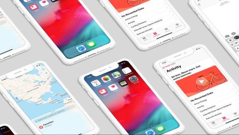
The Future of Phones by jkantner
See the Pen
Isometric iPhones by Jon Kantner (@jkantner)
on CodePen.
Phones but in a responsive perspective. It’s all the rage. Check it out!
Text That Floats Like a Feather
See the Pen
CSS Perspective Text Hover by James Bosworth (@bosworthco)
on CodePen.
Ever wished your text could float? This bad boy uses CSS 3D transform tools and some killer webfonts. Hover over and watch that text lift, like it’s on cloud nine.
Spin the Globe, Mate
See the Pen
3d Perspective Spheres by Jayshua Nelson (@jayshua)
on CodePen.
From solar systems to tiny atoms, this perspective view is wicked! Feels like you’re spinning a whole globe with just your mouse.
Trapezoid Tales
See the Pen
Building a trapezoid by Claudio Procida (@claudiopro)
on CodePen.
Crafting that funky trapezium shape using basic CSS and then giving it an edge with some border tricks. Who knew div elements could look this rad?
Cube That Can’t Stop, Won’t Stop
See the Pen
CSS Perspective Transforms by Niall (@niallains)
on CodePen.
This cube’s got moves! Spinning non-stop, flaunting colors from all faces. Forget mouse hovers; this one’s dancing solo.
Slide in Style with Alex
See the Pen
Smooth 3d perspective slider by Alex Nozdriukhin (@alexnoz)
on CodePen.
It’s a slider, but make it 3D. Smooth moves by the mastermind Alex Nozdriukhin.
Cubing It Right

Ever played with a cube? Color it, toss in some CSS 3D elements, and bam! Dive into this 3D perspective gem.
Objects, Eyes, and All That Jazz
See the Pen
css perspective transform by Hassaan ALalosy (@HassaanALalosy)
on CodePen.
Objects look different based on where you stand. That’s perspective for ya, and this one nails it!
Sphere That Keeps You Waiting
See the Pen
Perspective Sphere Preloader by Jon Kantner (@jkantner)
on CodePen.
A preloader but with a twist. All thanks to the genius, Jon Kantner.
Classic Comp Vibes
See the Pen
CSS 3D – Perspective Example by Adobe Inspire Magazine (@AdobeInspireMagazine)
on CodePen.
Miss those old computer screens? This perspective example gives you all the nostalgic feels, wrapped in sleek CSS3. Just peep the code, and you’ll spot the magic right up top!
Let’s Slide in Perspective Playground
See the Pen
CSS3 Perspective Playground ✨ by Mehmet Burak Erman (@mburakerman)
on CodePen.
Ever seen those rad 3D effects and wondered how they do it? It’s all in the parent-child relationship, buddy. This playground sets a perspective on the parent, and boom! Its kiddos (child elements) show off that nifty depth.
A Camera That Pops in 3D
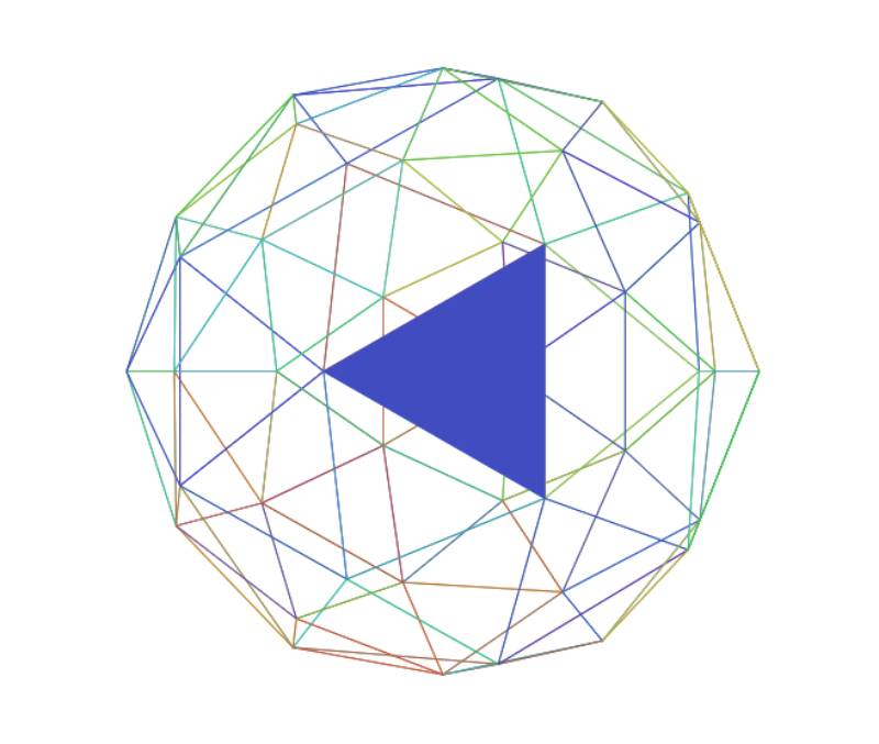
Imagine a sphere, pieced together by see-through triangles. Hover over, and wham! a triangle lights up with color. But wait, there’s more – they keep moving, like a never-ending dance.
Tilt It Like Henry Desroches
See the Pen
Perspective Tilty Images by Henry Desroches (@xdesro)
on CodePen.
Shoutout to Henry, who brought this funky perspective tilt to the picture world.
Where Are You Looking At?
See the Pen
Simple Perspective preloader by creotip (@creotip)
on CodePen.
You know, it’s all about where you stand (or where your eyes are). With the perspective-origin, things can appear closer or further. It’s like magic but in CSS.
Quackit’s Dive into 3D

Ever thought about adjusting how you view things in 3D? This perspective property does just that. It’s like giving you the reins to control your view.
Boxy World with Cool Controls
See the Pen
Pure CSS Perspective Boxes (Animated) v3 – with Controls by Joshua Hibbert (@joshnh)
on CodePen.
Okay, okay, picture this – mini boxes, and you have the power to change how you see them. From the top, the side, or even the bottom! But mouse lovers, hold on, this one’s all about the buttons.
Cards That Pop, Thanks to Fernando Cohen
See the Pen
3D Perspective cards with depth [CSS] by Fernando Cohen (@designfenix)
on CodePen.
Cards but with a 3D twist? Fernando nailed it! Dive into a world of cards that feel like they could jump off the screen.
Fly Over Places with Akhil Sai Ram
See the Pen
World Places (CSS 3d hover) by Akhil Sai Ram (@akhil_001)
on CodePen.
Kudos to Akhil for creating this 3D magic. Just hover over and feel like you’re traveling around the globe.
See it in 3D with Jérémy Heleine
See the Pen
3D Perspective View by SitePoint (@SitePoint)
on CodePen.
Got a thing for prisms? Jérémy brings you a rotating prism that reacts to your mouse. Click, drag, and be amazed! Plus, some serious lessons on HTML, CSS perspective views, and transforming the 3D world.
FAQ On CSS Perspective
What exactly is CSS perspective?
CSS perspective unlocks dimensions; think of it as a magic wand, granting web elements the illusion of depth. It crafts the scene where elements play on a pseudo-3D stage, influenced by a virtual camera angle—forging realms where pixels meet perspective.
How does CSS perspective differ from transform?
Perspective lays the 3D groundwork, affecting the scale of depth. Transform, however, is the orchestra, directing how elements rotate, scale, and move in that space.
Together, they compose the symphony of depth and motion, each with its distinct part in the choreography of visuals.
Can you animate the CSS perspective property?
Absolutely, animating perspective breathes life into static elements. Invoke the spirit of CSS animation, blending transitions and perspective shifts, crafting a dance of elements that approach or recede as if the screen were a stage and pixels the performers.
What’s perspective-origin in CSS?
Picture perspective-origin as the director’s camera, stationed at just the right spot. This CSS property tells the scene where to pivot, setting the vanishing point’s anchor—a crucial cue in the realm of visual effects where the director’s gaze steers the viewer’s focus.
Is it necessary to use CSS perspective on all 3D elements?
Not always. Perspective is a tool for specific needs; when depth is called for, it shines. It’s a storyteller for 3D transformations, but only when the tale is of a multi-dimensional landscape. One must judge, based on the narrative of design, whether its service is required.
What happens if I don’t set a CSS perspective?
Without setting perspective, the 3D stage becomes a flat canvas. Elements that yearn for depth will find themselves bound to the surface, like shadows without form. Depth perception fades, and the enchanting illusion of space remains just beyond reach.
How do browser compatibility and responsive design affect CSS perspective?
The twin heralds of responsive design and browser compatibility decree: what’s crafted must flow on all screens and browsers.
Perspective’s magic may vary across browsers, a reminder to test and tweak, guaranteeing that the spectacle of depth and motion remains consistent across the digital landscape.
Why does my CSS perspective not look the same in all browsers?
Divergent paths lie within each browser’s core, with unique interpretations of the web’s lexicon. CSS perspective might bend differently in each, a testament to the diversity of browser engines.
Thorough testing, prefixed properties, and fallbacks are your compass through this maze.
How can I create more dramatic 3D effects with CSS perspective?
To magnify drama, command a ballet of transform-origin alongside perspective. Manipulate the viewpoint closer, tightening the perspective depth.
Notice how elements warp and stretch, amplifying the theatrics of your 3D spectacle. The more acute the perspective, the bolder the effect.
Does adjusting CSS perspective impact performance?
Indeed, as in any performance, extravagance has its price. Conjuring depth and dimension places demands on the machine’s spirit—the CPU.
Lavish use, especially when animated, can tax the device, invoking a need for balance and optimisation to preserve the fluidity of the user’s journey through your creation.
Conclusion
As the curtain falls on our exploration of CSS perspective, we are reminded that the web is a canvas of infinite potentials. Mastering this powerful property has set a stage where flat designs leap into the realm of depth, where pixels bend to our creative will.
- Our journey whisked us through the alleys of CSS3, around the corners of front-end development, and into the open plazas of user experience.
- We’ve seen how a simple line of code can transform the mundane into the marvelous, shift the static into the dynamic.
- Through the lens of perspective-origin and the z-axis, we’ve glimpsed the robust architecture behind the screen.
The key takeaway? CSS perspective is more than a tool; it’s a brushstroke on the digital canvas. It’s the quiet architect behind the scenes. It empowers designers to mold experiences that not only engage but immerse.
Harness this power, and let each project be a gateway to a more vibrant, three-dimensional web.
If you liked this article about CSS perspective, you should check out this article about CSS tooltips.
There are also similar articles discussing CSS animations, CSS headers, CSS carousels, and CSS slideshows.
And let’s not forget about articles on CSS animated backgrounds, CSS cards, CSS progress bars, and CSS parallax effects.