
Users need feedback. Every form submission, every error, every successful action requires a clear response.
That is where Tailwind alert examples come in. These notification components communicate status messages instantly, guiding users through your web application without confusion.
Tailwind CSS gives you complete control over alert styling through utility classes. No framework bloat, no fighting default styles.
This guide covers everything from basic alert creation to advanced patterns like dismissible notifications, dark mode variants, and animated toast messages.
You will find working code snippets for success alerts, error notifications, warning banners, and info boxes. Copy them directly into your project and customize as needed.
What is a Tailwind Alert
A Tailwind alert is a notification component built with Tailwind CSS utility classes that displays feedback messages to users.
Alerts communicate status information like success confirmations, error notifications, warnings, and informational messages within web applications.
You see them everywhere. Form submissions, payment confirmations, login errors, session timeouts.
They sit inside the user interface and grab attention when something needs acknowledgment.
Unlike Bootstrap’s pre-styled components, Tailwind alerts require you to build the styling yourself using utility classes. More control, more flexibility, slightly more work upfront.
The payoff? You get exactly what you want without fighting framework defaults.
Tailwind alert examples
Tailwind Alerts – The Basics

Success Payment Alert – Tailwind Style

Flowbite’s Tailwind CSS Alerts

Gopi’s Dismissible Alert

Tailwind Elements – Alerts Galore

The Art of Tailwind CSS Alert

Tailwind Starter Kit’s Alert Magic

Warning! Tailwind CSS Alert Ahead

Preline’s Tailwind CSS Alerts

Prashant’s Notification Alert

Horizon UI’s React Alert

Animated Ping Alert Bell

Floating Notification That Plays Nice

Colorful Alerts with a Splash

Rob’s Lo-fi Alerts

Alerts with a Stylish Edge

Big Logo, Big Impact
Success Payment Alert – Crafted by iaminos

Flowbite’s Simple React Alert

Vue + Tailwind = Headless Notification Magic

Tailwind CSS Alert Vibes by Dev

Iconic Alert Messages with Tailwind
A Symphony of Alert Colors by Creative Tim

How Do Tailwind Alerts Work
Tailwind alerts work through utility class composition applied to HTML div elements.
You stack classes for background color, text color, padding, border radius, and layout. No custom CSS files needed.
The basic structure looks like this:
- Container div with background and padding classes
- Text color utilities matching the alert type
- Border radius for rounded corners
- Flexbox classes for icon alignment
- Optional close button with JavaScript interaction
Everything happens inline. The utility-first approach means your alert styling lives right in the markup.
Need a red error alert? Add bg-red-100 text-red-800. Want rounded corners? Throw in rounded-lg.
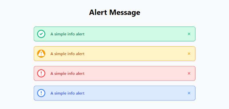
What Are the Types of Tailwind Alerts
Four main alert types cover most use cases in frontend development: success, error, warning, and info.
Each serves a specific purpose and uses distinct color utilities to communicate meaning instantly.
Success Alert
Success alerts confirm completed actions using green color palettes like bg-green-100 and text-green-800.
Common triggers: form submission confirmation, payment completion, account creation, file upload success.
Error Alert
Error alerts signal problems with red styling, typically bg-red-100 paired with text-red-700.
Use them for validation failures, server errors, authentication problems, failed transactions.
Warning Alert
Warning notifications use yellow or amber classes to indicate caution without indicating failure.
Session timeout notices, unsaved changes reminders, data loss prevention messages. That sort of thing.
Info Alert
Info message components use blue color utilities for neutral announcements.
Feature tips, onboarding guidance, system updates, general notifications that need attention but carry no urgency.
How to Create a Basic Tailwind Alert
Start with a div element. Add your utility classes. Done.
Here is the minimal structure for a working alert component:
“ <div class="bg-blue-100 border border-blue-400 text-blue-700 px-4 py-3 rounded" role="alert"> <span>This is an info alert message.</span> </div> `
The role=”alert” attribute matters for web accessibility. Screen readers announce the content immediately.
Breaking down the classes:
- bg-blue-100
sets a light blue background
- border border-blue-400
adds a matching border
- text-blue-700
controls text color
- px-4 py-3
handles horizontal and vertical padding
- rounded
applies border radius
Swap the color values for different alert types. Green for success, red for errors, yellow for warnings.
The pattern stays identical. Only the color utilities change.
How to Add Icons to Tailwind Alerts
Icons make alerts scannable. Users recognize the visual cue before reading the text.
Most developers use SVG icons from Heroicons, which pairs naturally with Tailwind CSS.
The trick is flexbox alignment. Wrap the icon and text in a flex container:
` <div class="bg-green-100 border border-green-400 text-green-700 px-4 py-3 rounded flex items-center" role="alert"> <svg class="w-5 h-5 mr-2" fill="currentColor" viewBox="0 0 20 20"> <path fill-rule="evenodd" d="M10 18a8 8 0 100-16 8 8 0 000 16zm3.707-9.293a1 1 0 00-1.414-1.414L9 10.586 7.707 9.293a1 1 0 00-1.414 1.414l2 2a1 1 0 001.414 0l4-4z" clip-rule="evenodd"></path> </svg> <span>Success! Your changes have been saved.</span> </div> `
Key classes for icon integration:
- flex items-center
vertically centers icon and text
- w-5 h-5
sets icon dimensions
- mr-2
adds spacing between icon and message
- fill=”currentColor”
inherits the text color
For accessible SVG files, include appropriate ARIA attributes when the icon conveys meaning beyond decoration.
Checkmarks for success. X marks for errors. Exclamation points for warnings. Information circles for neutral messages.
The icon choice should match user expectations instantly.
How to Make Tailwind Alerts Dismissible
Dismissible alerts need a close button and some JavaScript to handle the click event.
Alpine.js works great here since it pairs naturally with Tailwind projects. Vanilla JS works too.
` <div x-data="{ show: true }" x-show="show" class="bg-yellow-100 border border-yellow-400 text-yellow-700 px-4 py-3 rounded relative" role="alert"> <span>Warning: Your session expires in 5 minutes.</span> <button @click="show = false" class="absolute top-0 right-0 px-4 py-3"> <svg class="fill-current h-6 w-6 text-yellow-500" viewBox="0 0 20 20"> <path d="M14.348 14.849a1.2 1.2 0 0 1-1.697 0L10 11.819l-2.651 3.029a1.2 1.2 0 1 1-1.697-1.697l2.758-3.15-2.759-3.152a1.2 1.2 0 1 1 1.697-1.697L10 8.183l2.651-3.031a1.2 1.2 0 1 1 1.697 1.697l-2.758 3.152 2.758 3.15a1.2 1.2 0 0 1 0 1.698z"/> </svg> </button> </div> `
Position the button with absolute top-0 right-0. The parent needs relative positioning.
For usability, make the click target large enough. At least 44×44 pixels for touch devices.
Add aria-label=”Close” to the button for screen reader support.
How to Style Tailwind Alerts with Borders
Border accents create visual hierarchy and help differentiate alert types at a glance.
Two popular approaches: left border accent or full border wrap.
Left Border Accent
Add border-l-4 with a matching border color. Clean, minimal, effective.
` <div class="bg-blue-50 border-l-4 border-blue-500 text-blue-700 p-4" role="alert"> <p>New feature available. Check your dashboard.</p> </div> `
Full Border Style
Use border with border-green-400 for a complete outline. Works well with rounded corners.
` <div class="bg-green-50 border border-green-400 text-green-700 px-4 py-3 rounded-lg" role="alert"> <p>Your profile has been updated successfully.</p> </div> `
Border width utilities: border, border-2, border-4. Thicker borders grab more attention.
How to Create Tailwind Alert with Title and Description
Two-line alerts work better for complex messages that need context.
Structure: bold title on top, lighter description below.
` <div class="bg-red-100 border border-red-400 text-red-700 px-4 py-3 rounded" role="alert"> <p class="font-bold">Payment Failed</p> <p class="text-sm">Your card was declined. Please try a different payment method.</p> </div> `
Key classes for hierarchy:
- font-bold
orfont-semiboldfor the title
- text-sm
reduces description size
- Same text color maintains visual cohesion
Keep titles under 5 words. Descriptions under 15. Users scan, they do not read.
How to Make Tailwind Alerts Responsive
Alerts should adapt across screen sizes using mobile-first design principles.
Tailwind’s responsive design breakpoint prefixes handle this: sm:, md:, lg:, xl:.
` <div class="bg-blue-100 text-blue-700 p-3 md:p-4 lg:p-5 rounded text-sm md:text-base" role="alert"> <p>Responsive alert with adaptive padding and text size.</p> </div> `
Responsive adjustments to consider:
- Padding: smaller on mobile (p-3
), larger on desktop (md:p-4)
- Text size: text-sm
base,md:text-basefor wider screens
- Width constraints: max-w-md
ormax-w-lgprevents alerts stretching too wide
Test on actual devices. The viewport simulation in DevTools only gets you so far.
How to Add Animations to Tailwind Alerts
Animation draws attention to new alerts without being obnoxious. Subtle works best.
Tailwind includes built-in transition utilities. For custom effects, use CSS keyframes.
` <div class="bg-green-100 text-green-700 p-4 rounded transform transition-all duration-300 ease-in-out" role="alert"> <p>Animated alert with smooth transitions.</p> </div> `
Common animation patterns:
- Fade in: opacity-0
toopacity-100withtransition-opacity
- Slide down: combine with translate-y
transforms
- Scale: scale-95
toscale-100for a subtle pop effect
Duration classes: duration-150, duration-300, duration-500. Faster feels snappier.
Pair with Alpine.js x-transition directives for enter/leave animations on dismissible alerts.
How to Create Dark Mode Tailwind Alerts
Dark mode requires adjusted color values to maintain color contrast and readability.
Tailwind’s dark: variant makes this straightforward.
` <div class="bg-blue-100 dark:bg-blue-900 text-blue-800 dark:text-blue-200 p-4 rounded" role="alert"> <p>This alert adapts to dark mode automatically.</p> </div> `
Dark mode color swaps:
- Light backgrounds (bg--100
) become dark (dark:bg--900)
- Dark text (text--800
) becomes light (dark:text--200)
- Borders shift accordingly
Enable dark mode in tailwind.config.js with darkMode: ‘class’ or darkMode: ‘media’.
Test both themes. What looks great in light mode can disappear in dark mode without proper contrast.
What Are Common Tailwind Alert Design Patterns
Four design patterns dominate modern web applications. Pick based on your UI style.
Solid Background Alerts
Full color backgrounds with contrasting text. High visibility, strong presence. Use bg-red-500 text-white.
Soft Background Alerts
Light tinted backgrounds with darker text. Less aggressive, easier on the eyes. The bg--50 or bg--100 shades work well.
Outlined Alerts
Transparent background with colored border and text. Minimalist design approach. Pairs with bg-transparent border-2.
Alerts with Action Buttons
Include Tailwind buttons for user actions like “Undo” or “View Details”.
` <div class="bg-yellow-50 border-l-4 border-yellow-400 p-4 flex justify-between items-center" role="alert"> <p class="text-yellow-700">Unsaved changes detected.</p> <button class="bg-yellow-500 text-white px-3 py-1 rounded text-sm">Save Now</button> </div> `
How to Position Tailwind Alerts on a Page
Alert positioning depends on context. Inline for form validation, fixed for toast notifications.
Inline Placement
Place directly in document flow near the triggering element. Standard for form errors and section feedback.
Fixed Position Toast Notifications
Use fixed positioning with directional utilities for persistent notifications.
` <div class="fixed top-4 right-4 z-50 bg-green-500 text-white px-6 py-3 rounded shadow-lg" role="alert"> <p>Item added to cart!</p> </div> `
Position options:
- Top right: fixed top-4 right-4
(most common)
- Top center: fixed top-4 left-1/2 -translate-x-1/2
- Bottom right: fixed bottom-4 right-4
Always set z-50 or higher. Alerts need to stack above other content including modals and dropdowns.
Add shadow-lg for depth. Floating alerts need visual separation from the page beneath.
FAQ on Tailwind Alert Examples
What is a Tailwind alert component?
A Tailwind alert component is a frontend UI element built with utility classes that displays feedback messages to users.
It communicates success confirmations, error notifications, warnings, and informational messages within web applications.
How do I create a basic alert in Tailwind CSS?
Create a div element with background color, text color, padding, and border radius utility classes.
Add role=”alert” for accessibility. Stack classes like bg-blue-100 text-blue-700 p-4 rounded for a working notification.
What are the different types of Tailwind alerts?
Four main types exist: success alerts (green), error alerts (red), warning notifications (yellow/amber), and info messages (blue).
Each uses distinct color utilities to communicate meaning instantly to users.
How do I make a Tailwind alert dismissible?
Add a close button with absolute positioning and handle the click event with Alpine.js or vanilla JavaScript.
Use x-data and x-show directives for reactive visibility toggling on user interaction.
Can I add icons to Tailwind alerts?
Yes. Use inline SVG icons from Heroicons or similar libraries.
Wrap icon and text in a flex container with items-center for vertical alignment. Add mr-2 spacing between the icon and message text.
How do I style Tailwind alerts for dark mode?
Use Tailwind’s dark: variant prefix to swap colors.
Light backgrounds become dark (dark:bg-blue-900), and dark text becomes light (dark:text-blue-200). Enable dark mode in your tailwind.config.js file first.
How do I position toast notifications with Tailwind?
Use fixed positioning with directional utilities like top-4 right-4 for corner placement.
Set z-50 or higher to stack above other content. Add shadow-lg for visual depth separation from the page.
Are Tailwind alerts accessible?
They can be with proper markup. Add role=”alert” so screen readers announce content immediately.
Include aria-label on close buttons. Maintain sufficient color contrast ratios between background and text colors for readability.
How do I add animations to Tailwind alerts?
Use built-in transition utilities like transition-all duration-300 for smooth effects.
Combine with opacity or transform classes for fade-in and slide animations. Pair with Alpine.js x-transition for enter/leave micro-interactions.
Can I use Tailwind alerts with React or Vue?
Absolutely. Tailwind alerts work with any frontend framework.
Create reusable alert components with props for type, message, and dismissibility. The utility classes remain identical regardless of your JavaScript framework choice.
Conclusion
These Tailwind alert examples give you the foundation to build any feedback indicator your project needs.
You now have working code for dismissible notifications, bordered alert boxes, responsive layouts, and animated flash messages.
The utility-first approach means every alert stays customizable. Swap colors, adjust padding, add icons. No CSS overrides required.
Dark mode variants and proper accessibility markup keep your alerts functional across themes and assistive technologies.
Start with the basic patterns shown here. Then expand into more complex UI components like Tailwind tooltips, cards, and navigation bars.
The same utility class logic applies everywhere.
Build one alert component well, and you understand the system. The rest follows naturally.


