
Static image galleries kill conversions. Sliders keep visitors engaged.
Building a responsive carousel from scratch takes hours of custom code and endless browser testing.
Tailwind slider examples solve this problem by combining utility-first CSS classes with proven JavaScript libraries like Swiper.js and Splide.js.
This guide covers 15+ slider patterns you can implement today.
You will learn how to build image carousels, product sliders, testimonial rotators, and full-width hero sections using Tailwind CSS.
Each example includes the exact utility classes needed for slide transitions, navigation arrows, pagination dots, and touch swipe support across all devices.
What is a Tailwind Slider
A Tailwind slider is a frontend component that displays content in a horizontal or vertical sequence using Tailwind CSS utility classes.
It cycles through images, text, or cards with smooth slide transition effects.
Unlike traditional CSS carousels that require custom stylesheets, Tailwind CSS handles styling through predefined classes like flex, overflow-hidden, and transform.
Most implementations pair Tailwind with JavaScript libraries such as Swiper.js, Splide.js, or Alpine.js for touch swipe support and autoplay functionality.
The result is a responsive slider that works across all viewport sizes without writing a single line of custom CSS.
Tailwind slider examples
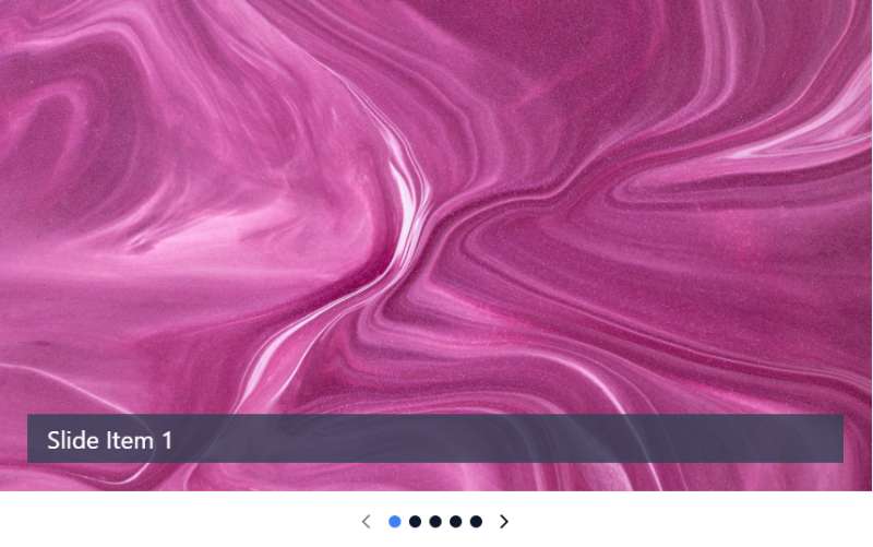
Tailwind CSS Simple Image Slider By hafizhaziq.dev

Slider with Tailwind CSS

Range Slider

Tailwind CSS slider – TUK

Tailwind CSS carousel slider

Cool kids slider Examples
Sticky fullpage pages / slides

Infinite slider with Tailwind CSS

Tailwind CSS Image Slider By mohau-r

Simple range slider

Tailwind CSS Carousel – Flowbite

Tailwind CSS Carousel Slider Examples

Fully Interactive Frames Slider By amirrahman132132

Vertical slider with Tailwind and Eleventy

Carousel Slider with TailwindCSS and jQuery By Axel

Tailwind CSS Carousel

Tailwind CSS Stripe Carousel Clone By r3oath

Tailwind CSS Slider – Soft UI

Tailwind CSS Range Slider – Horizon UI

Tailwind CSS Carousel – React

Onboarding Slider – TailWind + Alpine by Máté Molnár

What Types of Tailwind Sliders Exist
Tailwind sliders fall into several categories based on their purpose and behavior.
Image Sliders
Display photos in sequence with navigation arrows and pagination dots.
Common in portfolios and image galleries.
Content Carousels
Rotate cards, testimonials, or text blocks.
Used for product showcases and feature highlights.
Hero Section Slideshows
Full-width sliders positioned above the fold with hero images and overlay text.
Multi-Item Carousels
Show multiple slides visible at once, typically 3-4 items per view.
Perfect for ecommerce product carousels and logo showcases.
Vertical Sliders
Scroll content up and down instead of left to right.
Less common but effective for news tickers and timeline displays.
How Does a Basic Tailwind Image Slider Work
A basic Tailwind image slider uses a flex container with overflow-hidden to hide slides outside the visible area.
Each slide sits inside a wrapper that shifts position using transform: translateX() values controlled by JavaScript.
The HTML structure looks like this:
- Outer container with
relativeandoverflow-hidden - Slide wrapper with
flexandtransition-transform - Individual slides with
flex-shrink-0andw-full
Navigation arrows use absolute positioning at left and right edges.
Pagination dots sit at the bottom, with the active slide state indicated by a different background color.
The transition-duration class controls animation speed, typically set between 300ms and 500ms for smooth movement.
What is a Tailwind Carousel with Auto-Play
An autoplay carousel advances slides automatically at set intervals without user input.
JavaScript handles the timing through setInterval() functions that trigger the next slide every 3-5 seconds.
Most implementations include these features:
- Pause on hover stops rotation when users mouse over the slider
- Infinite loop scroll returns to the first slide after the last
- Progress indicators show time remaining before the next transition
Swiper.js offers built-in autoplay with a single configuration option.
Alpine.js requires manual interval setup but gives more control over behavior.
Consider user experience when setting speed, as overly fast rotation frustrates visitors trying to read content.
How to Create a Tailwind Testimonial Slider
Testimonial sliders display customer reviews in a rotating format, building trust through social proof.
Each slide typically contains a quote, author name, job title, and profile photo.
Structure each testimonial card with these elements:
- Quote text using
text-lgortext-xlfor readability - Star rating using SVG icons or Unicode characters
- Author info with smaller text below the quote
- Company logo when available
The fade effect slider works well for testimonials since it keeps focus on the text rather than the sliding motion.
Set longer intervals, around 6-8 seconds, so visitors can read entire quotes before transitions.
For similar functionality with a different framework, check out Bootstrap testimonial sliders as an alternative approach.
What is a Tailwind Product Slider for E-commerce
A product slider displays multiple items in a scrollable carousel format, letting shoppers browse without leaving the page.
Each slide contains a product card with image, title, price, and call-to-action button.
Key features for ecommerce sliders:
- Lazy loading images to improve page speed
- Quick view modals triggered on click
- Hover states showing additional product details
- Add-to-cart functionality within each slide
Keen Slider and Embla Carousel handle touch swipe gestures smoothly on mobile devices.
Show 4 items on desktop, 2 on tablet, 1 on mobile using Tailwind’s responsive prefixes.
How Does a Tailwind Full-Width Hero Slider Function
A full-width hero slider spans the entire viewport width, typically placed at the top of a landing page.
The container uses w-screen or w-full with negative margins to break out of constrained layouts.
Each slide contains:
- Background image with
object-coverandaspect-ratio - Dark overlay using
bg-black/50for text readability - Centered headline and button with absolute positioning
Navigation arrows sit at screen edges with z-index layering above the overlay.
Slide indicators appear as dots or lines at the bottom center.
What is a Tailwind Multi-Item Slider
Multi-item sliders display several slides visible simultaneously, unlike single-slide carousels.
The slide wrapper calculates width based on items per view: 3 items means each slide gets w-1/3.
Common use cases include logo carousels, team member displays, and related products sections.
Splide.js handles per-page settings with breakpoint configurations for mobile-first responsiveness.
Add gap spacing between slides using gap-4 or space-x-4 on the flex container.
How to Build a Tailwind Slider with Thumbnails
Thumbnail sliders pair a main image display with a row of smaller preview images below.
Clicking a thumbnail updates the main slide, common in product galleries and portfolio sites.
Structure requires two synchronized slider instances:
- Main slider showing the large active image
- Thumbnail slider with clickable previews
Swiper.js supports this pattern through its thumbs module with minimal configuration.
Apply ring-2 or border-2 to indicate the active slide state on thumbnails.
What is a Tailwind Fade Transition Slider
Fade sliders crossfade between slides using opacity transitions instead of horizontal movement.
All slides stack in the same position with absolute positioning.
The active slide gets opacity-100 while others remain at opacity-0.
CSS handles the transition: transition-opacity duration-500.
Fade effects work best for image galleries, testimonials, and hero sections where sliding motion would distract from content.
How Does a Tailwind Vertical Slider Work
Vertical sliders scroll content up and down using translateY() instead of translateX().
The container needs a fixed height with overflow-hidden to mask slides.
Best applications:
- News tickers and announcement bars
- Timeline displays
- Before/after comparison sliders
- Mobile app feature showcases
Swiper.js enables vertical mode through a single direction parameter.
What Are the Best Tailwind Slider Libraries
Several JavaScript libraries integrate well with Tailwind’s utility-first approach.
Swiper.js
Most popular choice with 35k+ GitHub stars, supports every slider type, excellent touch handling.
Splide.js
Lightweight at 29KB, no dependencies, accessible by default with ARIA support built in.
Embla Carousel
Framework-agnostic, works with React, Vue.js, and vanilla JS, highly customizable through plugins.
Keen Slider
Zero dependencies, smooth animations, supports drag and touch gestures natively.
Glide.js
Modular architecture, only 23KB gzipped, clean API for custom controls.
Flickity
Touch-friendly, physics-based animations, good for content carousels and galleries.
How to Add Navigation Arrows to a Tailwind Slider
Navigation arrows use absolute positioning on left and right edges of the slider container.
Basic arrow setup:
- Position with
absolute left-4andabsolute right-4 - Center vertically using
top-1/2 -translate-y-1/2 - Style with
bg-white/80 rounded-full p-2 - Add hover effects with
hover:bg-white
Use chevron icons from Heroicons or Lucide React for the arrow graphics.
Hide arrows on mobile where swipe gestures are more intuitive, show them on desktop with hidden md:block.
What is a Responsive Tailwind Slider
A responsive slider adapts layout, slide count, and navigation based on screen size.
Tailwind’s breakpoint prefixes handle visual adjustments: sm:, md:, lg:, xl:.
Responsive considerations:
- Reduce slides per view on smaller screens
- Swap arrows for swipe indicators on touch devices
- Adjust image aspect ratios to prevent cropping
- Scale typography with responsive text classes
Most slider libraries accept breakpoint configurations matching Tailwind’s default values: 640px, 768px, 1024px, 1280px.
How to Control Tailwind Slider Speed and Timing
Transition speed determines how fast slides animate between positions.
Tailwind provides duration utilities: duration-300, duration-500, duration-700.
Timing functions control acceleration curves:
ease-linearfor constant speedease-in-outfor smooth start and stopease-outfor quick start, slow finish
Autoplay intervals set through JavaScript, typically 3000-5000 milliseconds between slides.
Pair CSS keyframes with Tailwind’s animation utilities for custom easing curves.
What Tailwind CSS Classes Style Slider Components
Specific utility classes handle common slider styling needs.
Container Classes
relative, overflow-hidden, w-full, max-w-screen-xl, mx-auto
Slide Wrapper Classes
flex, transition-transform, duration-500, ease-in-out
Individual Slide Classes
flex-shrink-0, w-full, snap-center, scroll-snap-align
Image Classes
object-cover, object-center, aspect-video, aspect-square
Navigation Classes
absolute, top-1/2, -translate-y-1/2, cursor-pointer, z-10
Pagination Dot Classes
w-3, h-3, rounded-full, bg-gray-300, active state with bg-gray-800
Combine these with media queries through Tailwind’s responsive prefixes for adaptive layouts across all devices.
FAQ on Tailwind Slider Examples
Does Tailwind CSS have a built-in slider component?
No. Tailwind CSS provides utility classes only, not pre-built components.
You need JavaScript libraries like Swiper.js, Splide.js, or Alpine.js to handle slide transitions, autoplay functionality, and touch swipe support.
Which JavaScript library works best with Tailwind sliders?
Swiper.js offers the most features and community support.
Splide.js is lighter at 29KB. Embla Carousel works well with React and Vue.js projects requiring custom slider behavior.
How do I make a Tailwind slider responsive?
Use Tailwind’s breakpoint prefixes like md: and lg: to adjust slides per view.
Most slider libraries accept breakpoint configurations matching Tailwind’s defaults: 640px, 768px, 1024px, 1280px.
Can I create a slider without JavaScript in Tailwind?
Yes, using CSS-only techniques with scroll-snap properties.
Add snap-x and snap-mandatory to the container, snap-center to each slide. No autoplay or navigation arrows without JS though.
How do I add autoplay to a Tailwind carousel?
JavaScript handles autoplay through setInterval() functions or library configurations.
Swiper.js enables autoplay with a single option. Set intervals between 3000-5000 milliseconds for comfortable reading time.
What causes Tailwind slider performance issues?
Large unoptimized images slow down sliders significantly.
Enable lazy loading, compress images, and use loading="lazy" on img tags. Too many slides or heavy CSS animations also hurt performance.
How do I style navigation arrows in Tailwind?
Position arrows with absolute, top-1/2, and -translate-y-1/2.
Style with bg-white/80 rounded-full p-2. Use Heroicons or Lucide for arrow icons. Hide on mobile with hidden md:block.
Are Tailwind sliders accessible?
They can be with proper implementation.
Add keyboard navigation support, focus states, and appropriate roles. Splide.js includes accessibility features by default. Pause autoplay for users who prefer reduced motion.
How do I create a full-width hero slider?
Use w-screen or w-full with negative margins to break container constraints.
Add object-cover on images and dark overlays with bg-black/50 for text readability over hero sections.
Can I use Tailwind sliders with React or Next.js?
Yes. Swiper.js and Embla Carousel provide React-specific packages.
Install via npm, import components, and apply Tailwind classes directly. Check Tailwind CSS in React setup guides for configuration details.
Conclusion
These Tailwind slider examples give you ready-to-use patterns for any project type.
Pick a JavaScript library that fits your needs. Swiper.js handles complex requirements. Glide.js and Keen Slider work better for lightweight implementations.
Start with basic image sliders, then add features like autoplay functionality, keyboard navigation, and lazy loading images as needed.
Test on touch devices early. Mobile friendly carousels need smooth swipe gestures and properly sized slide indicators.
Focus on performance. Compress images, limit active slides in the DOM, and use CSS transform properties instead of layout-triggering changes.
The utility class approach keeps your slider code maintainable and consistent with your existing Tailwind components.
Build your first carousel today.


