CSS Download Buttons: 16 Examples + the download Attribute

A CSS download button is an anchor with an href and the download attribute, styled with padding, a background and rounded corners. The catch, per MDN: the attribute works only for same-origin, blob: and data: URLs.

Below are 16 CSS download button examples you can try and copy, followed by a guide to states, accessibility and cross-origin fixes.

By Bogdan Sandu · Updated October 28, 2026

Download buttons with states

Progress, success, failure and gating. The files in these demos are generated in your browser from fixed text, handed to a temporary link as a Blob URL and revoked a second later, so nothing is fetched from a server.

Progress to done, with announcements at milestones

  • custom property scaleX
  • role="status"
  • Blob download

Usage report, October 2026

Seats, storage and API calls for every workspace, as plain text.

Click the button. Each demo saves a small text, CSV or JSON file made on the spot.

The fill is a scaleX transform driven by one custom property. The label says Preparing, not Downloading, because a page cannot read real save progress, and the live region speaks only at 25, 50 and 75 percent and at the end instead of on every tick. The finished file is a Blob made in the browser.

View code
.dl-prog {
  width: 100%;
  display: grid;
  place-items: center;
}
.dl-prog__card {
  width: min(100%, 400px);
  padding: 22px;
  border-radius: 14px;
  background: #fff;
  box-shadow: 0 10px 30px rgba(30, 27, 75, .1);
}
.dl-prog__title {
  margin: 0;
  color: #1e1b4b;
  font-size: 1.0625rem;
  font-weight: 700;
}
.dl-prog__text {
  margin: 4px 0 18px;
  color: #4b5563;
  font-size: .875rem;
  line-height: 1.5;
}
.dl-prog__btn {
  --dl-p: 0;
  position: relative;
  display: flex;
  align-items: center;
  justify-content: space-between;
  gap: 12px;
  width: 100%;
  min-height: 48px;
  padding: 12px 18px;
  overflow: hidden;
  border: 0;
  border-radius: 10px;
  background: #4338ca;
  color: #fff;
  font: inherit;
  font-weight: 600;
  text-align: left;
  cursor: pointer;
  isolation: isolate;
}
.dl-prog__fill {
  position: absolute;
  inset: 0;
  z-index: -1;
  background: #312e81;
  transform: scaleX(var(--dl-p));
  transform-origin: left;
}
.dl-prog__pct {
  font-variant-numeric: tabular-nums;
}
.dl-prog__btn:hover {
  background: #3730a3;
}
.dl-prog__btn[data-state="busy"] {
  background: #6366f1;
  cursor: progress;
}
.dl-prog__btn[data-state="done"] {
  background: #15803d;
}
.dl-prog__btn[data-state="done"] .dl-prog__fill {
  transform: scaleX(0);
}
.dl-prog__btn[data-state="done"] .dl-prog__label::before {
  content: "\2713\00a0";
}
.dl-prog__btn:focus-visible {
  outline: 3px solid #1e1b4b;
  outline-offset: 3px;
}
.dl-prog__status {
  min-height: 1.4em;
  margin: 10px 0 0;
  color: #4b5563;
  font-size: .8125rem;
}
@media (prefers-reduced-motion: no-preference) {
  .dl-prog__fill {
    transition: transform .14s linear;
  }
}

Arrow that morphs into a checkmark

  • pathLength
  • stroke-dashoffset
  • opt-in motion

Click the button. Each demo saves a small text, CSV or JSON file made on the spot.

Every path has pathLength="1", so one dash value draws or erases it whatever its real length. On click the ring fills, the arrow erases itself and the check draws in. All of the movement sits inside prefers-reduced-motion: no-preference, so with reduced motion the states simply swap.

View code
.dl-morph {
  display: grid;
  justify-items: center;
  gap: 10px;
}
.dl-morph__btn {
  display: inline-flex;
  align-items: center;
  gap: 14px;
  min-height: 64px;
  padding: 8px 24px 8px 8px;
  border: 0;
  border-radius: 999px;
  background: #064e3b;
  color: #fff;
  font: inherit;
  text-align: left;
  cursor: pointer;
  transition: background-color .2s ease;
}
.dl-morph__btn:hover {
  background: #065f46;
}
.dl-morph__btn:focus-visible {
  outline: 3px solid #064e3b;
  outline-offset: 3px;
}
.dl-morph__disc {
  position: relative;
  display: grid;
  place-items: center;
  width: 48px;
  height: 48px;
  border-radius: 50%;
  background: #10b981;
  color: #022c22;
}
.dl-morph__ring {
  position: absolute;
  inset: 0;
  width: 48px;
  height: 48px;
  transform: rotate(-90deg);
  fill: none;
  stroke-width: 3;
}
.dl-morph__track {
  stroke: #059669;
}
.dl-morph__arc {
  stroke: #ecfdf5;
  stroke-dasharray: 1;
  stroke-dashoffset: 1;
}
.dl-morph__icon {
  position: relative;
  width: 24px;
  height: 24px;
  fill: none;
  stroke: currentColor;
  stroke-width: 2.4;
  stroke-linecap: round;
  stroke-linejoin: round;
}
.dl-morph__shaft,
.dl-morph__head,
.dl-morph__check {
  stroke-dasharray: 1;
  stroke-dashoffset: 0;
}
.dl-morph__check {
  stroke-dashoffset: 1;
}
.dl-morph__btn[data-state="loading"] .dl-morph__arc {
  stroke-dashoffset: 0;
}
.dl-morph__btn[data-state="done"] .dl-morph__arc {
  stroke-dashoffset: 0;
  stroke: transparent;
}
.dl-morph__btn[data-state="done"] .dl-morph__shaft,
.dl-morph__btn[data-state="done"] .dl-morph__head {
  stroke-dashoffset: 1;
}
.dl-morph__btn[data-state="done"] .dl-morph__check {
  stroke-dashoffset: 0;
}
.dl-morph__btn[data-state="done"] .dl-morph__disc {
  background: #ecfdf5;
  color: #065f46;
}
.dl-morph__text {
  display: grid;
  line-height: 1.3;
}
.dl-morph__label {
  font-weight: 700;
}
.dl-morph__sub {
  color: #a7f3d0;
  font-size: .8125rem;
}
.dl-morph__status {
  min-height: 1.4em;
  margin: 0;
  color: #374151;
  font-size: .8125rem;
}
@media (prefers-reduced-motion: no-preference) {
  .dl-morph__arc {
    transition: stroke-dashoffset 1.1s linear, stroke .2s ease;
  }
  .dl-morph__shaft,
  .dl-morph__head {
    transition: stroke-dashoffset .25s ease;
  }
  .dl-morph__check {
    transition: stroke-dashoffset .3s ease .2s;
  }
  .dl-morph__disc {
    transition: background-color .25s ease, color .25s ease;
  }
  .dl-morph__btn[data-state="loading"] .dl-morph__shaft {
    animation: dl-morph-drop .6s ease-in-out infinite;
  }
  @keyframes dl-morph-drop {
    0%, 100% { transform: translateY(0); }
    50% { transform: translateY(2px); }
  }
}

Split button with a format menu

  • aria-expanded
  • aria-pressed
  • CSV / JSON / TXT

Orders, last 7 days

OrderCustomerTotal
A-1041Rivera Studio$128.00
A-1042Okafor & Lind$64.50
A-1043Bramble Cafe$212.90

Click the button. Each demo saves a small text, CSV or JSON file made on the spot.

The main half downloads the current format, the chevron opens a small list of alternatives. Picking one saves that format and makes it the new default. The table is serialized three ways from one array, Escape closes the list and returns focus, and moving focus out of the widget closes it too.

View code
.dl-split {
  width: 100%;
  min-height: 430px;
  display: grid;
  place-items: start center;
}
.dl-split__card {
  width: min(100%, 400px);
  padding: 20px;
  border-radius: 14px;
  background: #fff;
  border: 1px solid #e2e8f0;
}
.dl-split__title {
  margin: 0 0 10px;
  color: #0f172a;
  font-size: 1rem;
  font-weight: 700;
}
.dl-split__table {
  width: 100%;
  margin: 0 0 16px;
  border-collapse: collapse;
  font-size: .8125rem;
}
.dl-split__table th,
.dl-split__table td {
  padding: 6px 4px;
  border: 0;
  border-bottom: 1px solid #e2e8f0;
  background: none;
  color: #334155;
  text-align: left;
}
.dl-split__table th {
  color: #64748b;
  font-weight: 600;
}
.dl-split__table td:last-child,
.dl-split__table th:last-child {
  text-align: right;
  font-variant-numeric: tabular-nums;
}
.dl-split__wrap {
  position: relative;
  display: inline-block;
}
.dl-split__group {
  display: inline-flex;
  border-radius: 10px;
  background: #1e293b;
}
.dl-split__main,
.dl-split__toggle {
  display: inline-flex;
  align-items: center;
  gap: 8px;
  min-height: 44px;
  border: 0;
  background: transparent;
  color: #fff;
  font: inherit;
  font-size: .9375rem;
  font-weight: 600;
  cursor: pointer;
  transition: background-color .15s ease;
}
.dl-split__main {
  padding: 10px 16px;
  border-radius: 10px 0 0 10px;
}
.dl-split__toggle {
  justify-content: center;
  width: 44px;
  border-left: 1px solid #475569;
  border-radius: 0 10px 10px 0;
}
.dl-split__main svg,
.dl-split__toggle svg {
  fill: none;
  stroke: currentColor;
  stroke-width: 2.2;
  stroke-linecap: round;
  stroke-linejoin: round;
}
.dl-split__main:hover,
.dl-split__toggle:hover,
.dl-split__toggle[aria-expanded="true"] {
  background: #334155;
}
.dl-split__main:focus-visible,
.dl-split__toggle:focus-visible,
.dl-split__opt:focus-visible {
  outline: 3px solid #0ea5e9;
  outline-offset: 2px;
}
.dl-split__menu {
  position: absolute;
  top: calc(100% + 6px);
  left: 0;
  z-index: 2;
  width: max-content;
  min-width: 100%;
  margin: 0;
  padding: 6px;
  border: 1px solid #e2e8f0;
  border-radius: 10px;
  background: #fff;
  box-shadow: 0 14px 34px rgba(15, 23, 42, .18);
  list-style: none;
}
.dl-split__menu[hidden] {
  display: none;
}
.dl-split__menu li {
  margin: 0;
  padding: 0;
}
.dl-split__opt {
  display: grid;
  width: 100%;
  min-height: 44px;
  padding: 6px 12px 6px 30px;
  border: 0;
  border-radius: 6px;
  background: transparent;
  color: #0f172a;
  font: inherit;
  font-size: .875rem;
  font-weight: 700;
  line-height: 1.3;
  text-align: left;
  cursor: pointer;
}
.dl-split__opt span {
  color: #64748b;
  font-size: .75rem;
  font-weight: 400;
}
.dl-split__opt:hover {
  background: #f1f5f9;
}
.dl-split__opt[aria-pressed="true"] {
  background: #f0f9ff url("data:image/svg+xml,%3Csvg xmlns='http://www.w3.org/2000/svg' viewBox='0 0 24 24' fill='none' stroke='%230369a1' stroke-width='3' stroke-linecap='round' stroke-linejoin='round'%3E%3Cpath d='m5 12 5 5 9-10'/%3E%3C/svg%3E") no-repeat 9px 50% / 13px;
}
.dl-split__status {
  min-height: 1.4em;
  margin: 10px 0 0;
  color: #475569;
  font-size: .8125rem;
}
@media (prefers-reduced-motion: no-preference) {
  .dl-split__menu:not([hidden]) {
    transition: opacity .15s ease, transform .15s ease;
  }
  @starting-style {
    .dl-split__menu:not([hidden]) {
      opacity: 0;
      transform: translateY(-4px);
    }
  }
}

Retry after a failed download

  • data-state
  • role="alert"
  • simulated failure

Workspace backup

Projects, comments and settings in one JSON file.

Click the button. Each demo saves a small text, CSV or JSON file made on the spot.

A failure state needs three things: a message that says what happened and that nothing was saved, an alert so screen readers hear it, and a button that now reads Retry. The failure is simulated with a checkbox, so you can watch both paths without a network.

View code
.dl-retry {
  width: 100%;
  display: grid;
  place-items: center;
}
.dl-retry__card {
  width: min(100%, 400px);
  padding: 22px;
  border-radius: 14px;
  background: #fff;
  box-shadow: 0 8px 26px rgba(46, 16, 101, .1);
}
.dl-retry__title {
  margin: 0;
  color: #2e1065;
  font-size: 1.0625rem;
  font-weight: 700;
}
.dl-retry__text {
  margin: 4px 0 14px;
  color: #4b5563;
  font-size: .875rem;
}
.dl-retry__sim {
  display: flex;
  align-items: flex-start;
  gap: 8px;
  margin: 0 0 16px;
  color: #374151;
  font-size: .8125rem;
  line-height: 1.4;
  cursor: pointer;
}
.dl-retry__check {
  flex: none;
  width: 18px;
  height: 18px;
  margin: 0;
  accent-color: #6d28d9;
}
.dl-retry__btn {
  display: inline-flex;
  align-items: center;
  gap: 10px;
  min-height: 46px;
  padding: 10px 20px;
  border: 2px solid #6d28d9;
  border-radius: 10px;
  background: #6d28d9;
  color: #fff;
  font: inherit;
  font-weight: 600;
  cursor: pointer;
  transition: background-color .15s ease, border-color .15s ease, color .15s ease;
}
.dl-retry__btn:hover {
  background: #5b21b6;
  border-color: #5b21b6;
}
.dl-retry__btn:focus-visible {
  outline: 3px solid #2e1065;
  outline-offset: 3px;
}
.dl-retry__spin {
  display: none;
  width: 16px;
  height: 16px;
  border: 2.5px solid #ddd6fe;
  border-top-color: transparent;
  border-radius: 50%;
}
.dl-retry__btn[data-state="loading"] {
  cursor: progress;
}
.dl-retry__btn[data-state="loading"] .dl-retry__spin {
  display: block;
}
.dl-retry__btn[data-state="error"] {
  background: #fff;
  border-color: #b91c1c;
  color: #b91c1c;
}
.dl-retry__btn[data-state="error"]:hover {
  background: #fef2f2;
}
.dl-retry__btn[data-state="done"] {
  background: #f5f3ff;
  color: #5b21b6;
}
.dl-retry__error:empty,
.dl-retry__status:empty {
  display: none;
}
.dl-retry__error {
  margin: 12px 0 0;
  padding: 10px 12px;
  border-left: 4px solid #b91c1c;
  border-radius: 6px;
  background: #fef2f2;
  color: #991b1b;
  font-size: .8125rem;
  line-height: 1.45;
}
.dl-retry__status {
  margin: 12px 0 0;
  color: #4b5563;
  font-size: .8125rem;
}
@media (prefers-reduced-motion: no-preference) {
  .dl-retry__btn[data-state="loading"] .dl-retry__spin {
    animation: dl-retry-spin .8s linear infinite;
  }
  @keyframes dl-retry-spin {
    to { transform: rotate(360deg); }
  }
}

Disabled until the terms are accepted

  • aria-disabled
  • preventDefault
  • :has()

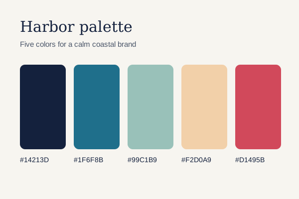
Harbor palette card

Free for commercial projects. Credit Harbor Studio somewhere in the credits or footer.

Download palette (SVG, 1 KB)

Accept the terms above to enable the download.

Click the button. Each demo saves a small text, CSV or JSON file made on the spot.

An anchor has no disabled attribute, so the link carries aria-disabled="true", stays readable and focusable, and a click handler blocks it and explains why. Ticking the box flips the attribute and the styling follows it, with :has() adding a highlight to the card.

View code
.dl-gate {
  width: 100%;
  display: grid;
  place-items: center;
}
.dl-gate__card {
  width: min(100%, 400px);
  padding: 22px;
  border: 2px solid #e7e5e4;
  border-radius: 14px;
  background: #fffdfb;
  transition: border-color .2s ease;
}
.dl-gate__card:has(.dl-gate__check:checked) {
  border-color: #c2410c;
}
.dl-gate__title {
  margin: 0;
  color: #1c1917;
  font-size: 1.0625rem;
  font-weight: 700;
}
.dl-gate__text {
  margin: 4px 0 14px;
  color: #57534e;
  font-size: .875rem;
  line-height: 1.5;
}
.dl-gate__terms {
  display: flex;
  align-items: flex-start;
  gap: 10px;
  margin: 0 0 16px;
  padding: 10px 12px;
  border-radius: 8px;
  background: #f5f5f4;
  color: #1c1917;
  font-size: .875rem;
  line-height: 1.4;
  cursor: pointer;
}
.dl-gate__check {
  flex: none;
  width: 20px;
  height: 20px;
  margin: 0;
  accent-color: #c2410c;
}
.dl-gate__btn {
  display: inline-flex;
  align-items: center;
  min-height: 44px;
  padding: 10px 18px;
  border-radius: 8px;
  background: #c2410c;
  color: #fff;
  font-weight: 600;
  text-decoration: none;
  transition: background-color .15s ease, color .15s ease;
}
.dl-gate__btn:hover {
  background: #9a3412;
  color: #fff;
}
.dl-gate__btn[aria-disabled="true"] {
  background: #e7e5e4;
  color: #57534e;
  cursor: not-allowed;
}
.dl-gate__btn:focus-visible {
  outline: 3px solid #1c1917;
  outline-offset: 3px;
}
.dl-gate__check:focus-visible {
  outline: 3px solid #1c1917;
  outline-offset: 2px;
}
.dl-gate__hint {
  margin: 10px 0 0;
  color: #57534e;
  font-size: .8125rem;
}

Download sections, file lists and sheets

Download buttons in context: a desktop app section, a project file list, a report card, a select-and-zip list and a mobile bottom sheet. The PDF and the ZIP are built byte by byte in the browser.

App download section with platform buttons

  • generic platform icons
  • userAgent match
  • grid auto-fit

Tidepool for desktop

Offline notes that sync when you are back online. Version 4.2, released 20 October 2026.

Demo buttons save a short install note (TXT), not an installer.

Three platform buttons with a generic device icon, the requirement under each name and the matching platform highlighted. Store badges are trademarks with their own artwork rules, so a section like this uses plain buttons. In this demo each button saves a short install note as TXT instead of an installer.

View code
.dl-app {
  width: 100%;
  background: #0b3b4a;
  color: #e6f4f1;
}
.dl-app__inner {
  max-width: 760px;
  margin: 0 auto;
  padding: clamp(28px, 6vw, 56px) clamp(16px, 4vw, 32px);
}
.dl-app__title {
  margin: 0;
  color: #fff;
  font: 600 clamp(1.5rem, 4vw, 2rem)/1.15 "Fraunces", Georgia, serif;
  letter-spacing: 0;
}
.dl-app__text {
  max-width: 46ch;
  margin: 8px 0 24px;
  color: #b8dcd5;
  font-size: 1rem;
  line-height: 1.5;
}
.dl-app__list {
  display: grid;
  grid-template-columns: repeat(auto-fit, minmax(190px, 1fr));
  gap: 12px;
  margin: 0;
  padding: 0;
  list-style: none;
}
.dl-app__list li {
  margin: 0;
  padding: 0;
}
.dl-app__btn {
  display: grid;
  grid-template-columns: auto 1fr;
  column-gap: 12px;
  align-items: center;
  width: 100%;
  min-height: 64px;
  padding: 12px 16px;
  border: 1.5px solid #2f6b78;
  border-radius: 12px;
  background: #114c5d;
  color: #fff;
  font: inherit;
  text-align: left;
  cursor: pointer;
  transition: background-color .15s ease, border-color .15s ease;
}
.dl-app__btn svg {
  grid-row: span 2;
  fill: none;
  stroke: currentColor;
  stroke-width: 1.8;
  stroke-linecap: round;
  stroke-linejoin: round;
}
.dl-app__name {
  font-weight: 700;
}
.dl-app__req {
  color: #b8dcd5;
  font-size: .8125rem;
}
.dl-app__mine {
  display: none;
  margin-left: 6px;
  padding: 1px 7px;
  border-radius: 999px;
  background: #0b3b4a;
  color: #f4c95d;
  font-size: .6875rem;
  font-weight: 700;
  vertical-align: 2px;
}
.dl-app__btn:hover {
  background: #17607a;
  border-color: #6fb3c0;
}
.dl-app__btn.is-mine {
  background: #f4c95d;
  border-color: #f4c95d;
  color: #0b2a33;
}
.dl-app__btn.is-mine .dl-app__req {
  color: #3b4a3f;
}
.dl-app__btn.is-mine .dl-app__mine {
  display: inline-block;
}
.dl-app__btn.is-mine:hover {
  background: #f7d983;
}
.dl-app__btn:focus-visible {
  outline: 3px solid #fff;
  outline-offset: 3px;
}
.dl-app__status {
  margin: 16px 0 0;
  color: #b8dcd5;
  font-size: .8125rem;
}

File card list with download actions

  • type badges
  • visually hidden text
  • mixed href + Blob

Project files

4 files

A project file list where every row has a 44px icon action. The visible icon is the same in each row, so each action gets hidden text with the file name, which keeps the screen reader link list unambiguous. Three rows link to real same-origin files and the release notes are built as a Blob.

View code
.dl-files {
  width: 100%;
  display: grid;
  place-items: center;
}
.dl-files__card {
  width: min(100%, 460px);
  border: 1px solid #e5e7eb;
  border-radius: 14px;
  background: #fff;
}
.dl-files__head {
  display: flex;
  justify-content: space-between;
  align-items: baseline;
  padding: 14px 18px;
  border-bottom: 1px solid #e5e7eb;
}
.dl-files__title {
  margin: 0;
  color: #111827;
  font-weight: 700;
}
.dl-files__count {
  margin: 0;
  color: #6b7280;
  font-size: .8125rem;
}
.dl-files__list {
  margin: 0;
  padding: 6px;
  list-style: none;
}
.dl-files__row {
  display: flex;
  align-items: center;
  gap: 12px;
  margin: 0;
  padding: 8px 10px;
  border-radius: 10px;
  transition: background-color .15s ease;
}
.dl-files__row:hover,
.dl-files__row:focus-within {
  background: #f9fafb;
}
.dl-files__type {
  flex: none;
  display: grid;
  place-items: center;
  width: 40px;
  height: 46px;
  border-radius: 6px 12px 6px 6px;
  font: 700 .6875rem/1 ui-monospace, Consolas, monospace;
}
.dl-files__type--svg {
  background: #fef3c7;
  color: #92400e;
}
.dl-files__type--txt {
  background: #e0e7ff;
  color: #3730a3;
}
.dl-files__info {
  display: grid;
  flex: 1;
  min-width: 0;
}
.dl-files__name {
  overflow-wrap: anywhere;
  color: #111827;
  font-size: .9375rem;
  font-weight: 600;
  line-height: 1.3;
}
.dl-files__meta {
  color: #6b7280;
  font-size: .8125rem;
}
.dl-files__act {
  flex: none;
  display: grid;
  place-items: center;
  width: 44px;
  height: 44px;
  padding: 0;
  border: 1px solid #d1d5db;
  border-radius: 10px;
  background: #fff;
  color: #374151;
  cursor: pointer;
  transition: background-color .15s ease, color .15s ease, border-color .15s ease;
}
.dl-files__act svg {
  fill: none;
  stroke: currentColor;
  stroke-width: 2;
  stroke-linecap: round;
  stroke-linejoin: round;
}
.dl-files__act:hover {
  background: #111827;
  border-color: #111827;
  color: #fff;
}
.dl-files__act:focus-visible {
  outline: 3px solid #2563eb;
  outline-offset: 2px;
}
.dl-files__vh {
  position: absolute;
  width: 1px;
  height: 1px;
  overflow: hidden;
  clip-path: inset(50%);
  white-space: nowrap;
}

PDF report card with a generated file

  • CSS page thumbnail
  • PDF built in JS
  • Fraunces

Coastal erosion survey

Northshore field team · October 2026

Shoreline retreat at four stations since March, with notes on the storm of 2 October.

A report card with a page thumbnail drawn in CSS, the format, page count and size in the label, and a real one-page PDF assembled in the browser, cross-reference table included. The size shown is the byte length of that PDF, measured when the page loads.

View code
.dl-pdf {
  width: min(100%, 560px);
  container-type: inline-size;
}
.dl-pdf__card {
  display: grid;
  gap: 20px;
  padding: 20px;
  border-radius: 6px;
  background: #fbf8f1;
  border: 1px solid #e8e0cf;
}
.dl-pdf__thumb {
  position: relative;
  display: grid;
  align-content: start;
  gap: 7px;
  width: 132px;
  aspect-ratio: 1 / 1.414;
  padding: 18px 14px;
  border-radius: 3px;
  background: #fff;
  box-shadow: 0 1px 2px rgba(60, 45, 20, .15), 6px 6px 0 #ece3d0;
}
.dl-pdf__badge {
  position: absolute;
  top: 8px;
  right: -8px;
  padding: 2px 6px;
  border-radius: 3px;
  background: #b42318;
  color: #fff;
  font: 700 .625rem/1.3 ui-monospace, Consolas, monospace;
}
.dl-pdf__h {
  height: 8px;
  width: 80%;
  border-radius: 2px;
  background: #1f2a24;
}
.dl-pdf__l {
  height: 4px;
  border-radius: 2px;
  background: #d9d3c4;
}
.dl-pdf__l--short {
  width: 60%;
}
.dl-pdf__chart {
  display: flex;
  align-items: flex-end;
  gap: 5px;
  height: 34px;
  margin: 4px 0;
}
.dl-pdf__chart i {
  flex: 1;
  border-radius: 1px;
  background: #3f6f5b;
}
.dl-pdf__chart i:nth-child(1) { height: 40%; }
.dl-pdf__chart i:nth-child(2) { height: 100%; }
.dl-pdf__chart i:nth-child(3) { height: 15%; }
.dl-pdf__chart i:nth-child(4) { height: 70%; }
.dl-pdf__title {
  margin: 0;
  color: #1f2a24;
  font: 600 1.375rem/1.2 "Fraunces", Georgia, serif;
  letter-spacing: 0;
}
.dl-pdf__by {
  margin: 4px 0 10px;
  color: #5b5446;
  font-size: .8125rem;
}
.dl-pdf__text {
  margin: 0 0 16px;
  color: #3f3a30;
  font-size: .9375rem;
  line-height: 1.5;
}
.dl-pdf__btn {
  display: inline-flex;
  align-items: center;
  gap: 8px;
  min-height: 44px;
  padding: 10px 18px;
  border: 0;
  border-radius: 4px;
  background: #1f2a24;
  color: #fbf8f1;
  font: inherit;
  font-weight: 600;
  text-align: left;
  cursor: pointer;
  transition: background-color .15s ease;
}
.dl-pdf__btn svg {
  flex: none;
  fill: none;
  stroke: currentColor;
  stroke-width: 2.2;
  stroke-linecap: round;
  stroke-linejoin: round;
}
.dl-pdf__meta {
  color: #d7d0bf;
  font-weight: 400;
}
.dl-pdf__btn:hover {
  background: #3f6f5b;
}
.dl-pdf__btn:focus-visible {
  outline: 3px solid #1f2a24;
  outline-offset: 3px;
}
.dl-pdf__status {
  min-height: 1.4em;
  margin: 10px 0 0;
  color: #5b5446;
  font-size: .8125rem;
}
@container (min-width: 460px) {
  .dl-pdf__card {
    grid-template-columns: 132px 1fr;
    align-items: center;
    gap: 28px;
    padding: 28px;
  }
}

Select files and download all as one ZIP

  • indeterminate checkbox
  • ZIP built in JS
  • button disabled

Several automatic downloads from one click trigger a permission prompt in Chrome, so a download all button should hand over one archive. This one writes an uncompressed ZIP in the browser, with CRC-32 checksums and a central directory, and the label counts the selection as you tick boxes.

View code
.dl-zip {
  width: 100%;
  display: grid;
  place-items: center;
}
.dl-zip__card {
  width: min(100%, 380px);
  padding: 18px;
  border-radius: 14px;
  background: #fff;
  box-shadow: 0 1px 2px rgba(15, 23, 42, .06), 0 10px 28px rgba(15, 23, 42, .08);
}
.dl-zip__all,
.dl-zip__item {
  display: flex;
  align-items: center;
  gap: 10px;
  min-height: 44px;
  padding: 0 10px;
  border-radius: 8px;
  cursor: pointer;
}
.dl-zip__all {
  margin-bottom: 4px;
  border-bottom: 1px solid #e2e8f0;
  border-radius: 8px 8px 0 0;
  color: #0f172a;
  font-weight: 700;
}
.dl-zip__all input,
.dl-zip__item input {
  flex: none;
  width: 18px;
  height: 18px;
  margin: 0;
  accent-color: #334e68;
}
.dl-zip__list {
  margin: 0 0 14px;
  padding: 0;
  list-style: none;
}
.dl-zip__list li {
  margin: 0;
  padding: 0;
}
.dl-zip__item:hover {
  background: #f1f5f9;
}
.dl-zip__item:has(input:checked) {
  background: #eef4fa;
}
.dl-zip__name {
  flex: 1;
  min-width: 0;
  overflow-wrap: anywhere;
  color: #1e293b;
  font: .875rem/1.4 ui-monospace, Consolas, monospace;
}
.dl-zip__size {
  color: #52606d;
  font-size: .75rem;
}
.dl-zip__all input:focus-visible,
.dl-zip__item input:focus-visible {
  outline: 3px solid #334e68;
  outline-offset: 2px;
}
.dl-zip__btn {
  width: 100%;
  min-height: 46px;
  padding: 10px 16px;
  border: 0;
  border-radius: 10px;
  background: #334e68;
  color: #fff;
  font: inherit;
  font-weight: 600;
  cursor: pointer;
  transition: background-color .15s ease;
}
.dl-zip__btn:hover {
  background: #243b53;
}
.dl-zip__btn:disabled {
  background: #e4e7eb;
  color: #52606d;
  cursor: not-allowed;
}
.dl-zip__btn:focus-visible {
  outline: 3px solid #102a43;
  outline-offset: 3px;
}
.dl-zip__status {
  min-height: 1.4em;
  margin: 10px 0 0;
  color: #52606d;
  font-size: .8125rem;
}

Mobile download sheet in a phone frame

  • bottom sheet
  • @starting-style
  • focus return

North Ridge loop

9.4 km · 610 m climb

An offline map download on a phone. The sheet is a non-modal dialog that slides up with @starting-style when motion is allowed, moves focus to its first option, closes on Escape or Cancel and returns focus to the trigger. Sizes come from the generated GeoJSON itself.

View code
.dl-sheet {
  position: relative;
  display: flex;
  flex-direction: column;
  height: 100%;
  overflow: hidden;
  background: #e4ecd9;
}
.dl-sheet__bar {
  padding: 14px 18px 12px;
  background: #fff;
  border-bottom: 1px solid #dfe5d6;
}
.dl-sheet__title {
  margin: 0;
  color: #14532d;
  font-size: 1.0625rem;
  font-weight: 700;
}
.dl-sheet__sub {
  margin: 2px 0 0;
  color: #4b5a45;
  font-size: .8125rem;
}
.dl-sheet__map {
  flex: 1;
  min-height: 0;
}
.dl-sheet__map svg {
  display: block;
  width: 100%;
  height: 100%;
}
.dl-sheet__foot {
  padding: 14px 16px 18px;
  background: #fff;
}
.dl-sheet__open {
  display: flex;
  align-items: center;
  justify-content: center;
  gap: 8px;
  width: 100%;
  min-height: 48px;
  border: 0;
  border-radius: 12px;
  background: #14532d;
  color: #fff;
  font: inherit;
  font-weight: 700;
  cursor: pointer;
}
.dl-sheet__open svg {
  fill: none;
  stroke: currentColor;
  stroke-width: 2.2;
  stroke-linecap: round;
  stroke-linejoin: round;
}
.dl-sheet__open:hover {
  background: #166534;
}
.dl-sheet__open:focus-visible,
.dl-sheet__go:focus-visible,
.dl-sheet__cancel:focus-visible {
  outline: 3px solid #0f172a;
  outline-offset: 3px;
}
.dl-sheet__scrim {
  position: absolute;
  inset: 0;
  background: rgba(15, 23, 42, .45);
}
.dl-sheet__scrim[hidden],
.dl-sheet__panel[hidden] {
  display: none;
}
.dl-sheet__panel {
  position: absolute;
  right: 0;
  bottom: 0;
  left: 0;
  padding: 10px 18px 20px;
  border-radius: 20px 20px 0 0;
  background: #fff;
  box-shadow: 0 -10px 30px rgba(15, 23, 42, .2);
}
.dl-sheet__grip {
  display: block;
  width: 40px;
  height: 4px;
  margin: 0 auto 12px;
  border-radius: 2px;
  background: #cbd5e1;
}
.dl-sheet__heading {
  margin: 0 0 10px;
  color: #0f172a;
  font-size: 1.0625rem;
  font-weight: 700;
}
.dl-sheet__set {
  margin: 0 0 16px;
  padding: 0;
  border: 0;
}
.dl-sheet__legend {
  margin-bottom: 6px;
  padding: 0;
  color: #4b5563;
  font-size: .8125rem;
}
.dl-sheet__opt {
  display: flex;
  align-items: center;
  gap: 10px;
  min-height: 48px;
  margin-bottom: 6px;
  padding: 0 12px;
  border: 1.5px solid #e2e8f0;
  border-radius: 10px;
  color: #0f172a;
  font-size: .9375rem;
  cursor: pointer;
}
.dl-sheet__opt:has(input:checked) {
  border-color: #14532d;
  background: #f0fdf4;
}
.dl-sheet__opt input {
  flex: none;
  width: 18px;
  height: 18px;
  margin: 0;
  accent-color: #14532d;
}
.dl-sheet__opt input:focus-visible {
  outline: 3px solid #0f172a;
  outline-offset: 2px;
}
.dl-sheet__size {
  margin-left: auto;
  color: #4b5563;
  font-size: .8125rem;
}
.dl-sheet__actions {
  display: grid;
  grid-template-columns: 1fr 1.6fr;
  gap: 10px;
}
.dl-sheet__cancel,
.dl-sheet__go {
  min-height: 48px;
  border-radius: 12px;
  font: inherit;
  font-weight: 700;
  cursor: pointer;
}
.dl-sheet__cancel {
  border: 1.5px solid #cbd5e1;
  background: #fff;
  color: #0f172a;
}
.dl-sheet__go {
  border: 0;
  background: #14532d;
  color: #fff;
}
.dl-sheet__go:hover {
  background: #166534;
}
.dl-sheet__status {
  position: absolute;
  top: 70px;
  right: 12px;
  left: 12px;
  margin: 0;
  color: #14532d;
  font-size: .8125rem;
  font-weight: 600;
  text-align: center;
}
.dl-sheet__status:not(:empty) {
  padding: 8px 10px;
  border-radius: 8px;
  background: #fff;
  box-shadow: 0 4px 14px rgba(15, 23, 42, .15);
}
@media (prefers-reduced-motion: no-preference) {
  .dl-sheet__panel {
    transition: transform .3s cubic-bezier(.2, .8, .2, 1);
  }
  .dl-sheet__scrim {
    transition: opacity .3s ease;
  }
  @starting-style {
    .dl-sheet__panel {
      transform: translateY(100%);
    }
    .dl-sheet__scrim {
      opacity: 0;
    }
  }
}

Which element should a CSS download button use?

An a element, with an href that points to the file and the download attribute. A button element has no URL to save, so it cannot download anything until JavaScript steps in.

That gap shows up in a lot of copy-paste examples. W3Schools’ download button how-to, for one, styles a button with an icon and a hover color, but the markup carries no file at all.

The anchor route also keeps everything in plain HTML, so the download still works when scripts fail to load.

What the download attribute does

Add it and the browser saves the linked URL instead of navigating to it (MDN Web Docs). The WHATWG HTML Living Standard defines the behavior. Safari on iOS 13 finished cross-browser support in September 2019, and the web-features project lists the attribute as Baseline widely available since March 2022.

Leave the attribute without a value and the browser picks a file name itself. The filename in the server’s Content-Disposition header is one source, and the last segment of the URL path is another. The Content-Type header gets a say too, mostly to settle the extension.

Anything on another domain behaves differently (more on that below).

How to set a custom file name

Give the attribute a value and the browser suggests it as the file name.

<a class="btn-download" href="/files/pricing-guide-2026.pdf" download="acme-pricing-guide.pdf">Download the pricing guide</a>

Slashes and backslashes in the value turn into underscores, and the browser adjusts any character the filesystem forbids.

One catch. If the server sends a Content-Disposition header with a filename parameter, that name overrides the one in your markup.

I’d pick the anchor whenever a real URL exists, even for generated files. MDN’s own example saves a canvas as a PNG with an anchor and a data: URL. Its guidance says a hyperlink is for navigating to a real URL, while a button belongs to script-driven actions. A click that calls an API before the file exists is one example.

Core styles that turn an anchor into a button

An anchor looks like a button once it has padding, a solid background, rounded corners and no underline. Add a font weight, a text color and a soft shadow and nobody will guess it started as a link.

  1. Write the anchor with a class, a real file path in href and the download attribute.
  2. Strip the link defaults with text-decoration: none and an explicit color.
  3. Set the shape with display: inline-flex, padding: 0.75rem 1.5rem and border-radius: 8px.
  4. Give it weight and depth with font-weight: 600, a background and a soft box-shadow.
  5. Move colors and radius into custom properties so every state reuses them.
:root {
  --btn-bg: #0b5fff;
  --btn-bg-hover: #0847c4;
  --btn-text: #ffffff;
  --btn-radius: 8px;
}

.btn-download {
  display: inline-flex;
  align-items: center;
  gap: 0.5rem;
  padding: 0.75rem 1.5rem;
  border-radius: var(--btn-radius);
  background: var(--btn-bg);
  color: var(--btn-text);
  font-weight: 600;
  text-decoration: none;
  box-shadow: 0 2px 6px rgba(0, 0, 0, 0.2);
}

inline-flex beats inline-block here. It centers an icon and label on one axis and spaces them with gap, so no margin hacks.

Radius depends on context. Somewhere between 4px and 8px reads as a standard interface button. 999px gives you a pill.

If you’d rather start from something visual, a CSS button generator outputs the same declarations. Paste its values into the custom properties above.

A gradient background works too. A CSS gradient generator speeds up the color picking, but checking the lightest stop against the label color is still on you.

How to style hover, focus-visible, active and disabled states

Hover, keyboard focus, press and disabled each get a selector of their own (:hover, :focus-visible, :active and [aria-disabled="true"]). Each one changes a property or two, so the base class stays untouched.

StateSelectorTypical change
Hover:hoverDarker background
Keyboard focus:focus-visibleOutline with offset
Pressed:active1px shift or deeper shade
Disabled[aria-disabled="true"]Reduced opacity, no pointer cursor

Hover is the easy one. Swap the background to the darker custom property, and if a plain color change feels flat, browse a longer list of button hover effects.

.btn-download:hover { background: var(--btn-bg-hover); }
.btn-download:active { transform: translateY(1px); }

Why :focus-visible beats :focus

MDN’s :focus-visible reference points to WCAG 2.1 SC 1.4.11, which sets the floor for a visual focus indicator at 3:1 contrast. It also warns that removing focus styles makes keyboard navigation inaccessible for sighted users.

:focus-visible matches only when the browser decides the user needs to see where focus sits. A mouse click on the button stays clean, while tabbing to it shows the ring.

.btn-download:focus-visible {
  outline: 3px solid #111111;
  outline-offset: 3px;
}

Pick an outline color that holds 3:1 against the page background, not just against the button. The offset leaves a gap, so the page color is what the ring sits on.

MDN lists :focus-visible as Baseline widely available, with support across browsers since March 2022. A :focus fallback now only matters for very old browsers.

Disabling a link styled as a button

An anchor has no disabled attribute, so a disabled download link takes ARIA plus some code of your own. Add aria-disabled="true" so assistive technology announces the state. The browser draws no disabled look for it, which means you style [aria-disabled="true"] yourself, and the click gets blocked in JavaScript.

That state comes from ARIA, and it only changes what screen readers announce. The link stays focusable and clickable.

[aria-disabled="true"] {
  opacity: 0.5;
  cursor: not-allowed;
}

pointer-events: none stops mouse clicks but not keyboard activation, so pair it with a click handler that calls preventDefault(). If the disabled button stays in the tab order, keep its text legible, since MDN notes that such styling may still need to pass color contrast requirements.

The blunt alternative is dropping the href. Without it the element is no longer a hyperlink (MDN lists its implicit role as generic), so no download starts.

How to add a download icon, file type and file size

Inline SVG is the icon I’d pick. It takes the text color through currentColor, so hover and disabled colors follow along automatically, and nothing extra loads.

Icon fonts are the usual choice in tutorials, Font Awesome especially, but that loads a whole font file for one glyph. A background image can’t change color with the text, so each state needs its own file.

Paste the markup straight into the anchor, as explained in this walkthrough of SVG in HTML.

<a class="btn-download" href="/files/pricing-guide-2026.pdf" download>
<svg width="20" height="20" viewBox="0 0 24 24" fill="currentColor" aria-hidden="true">
  <path d="M12 16 6 10h4V3h4v7h4l-6 6zm-8 3h16v2H4z"/>
</svg>
Download the pricing guide (PDF, 2.4 MB)
  </a>

The gap from the base style spaces the icon from the label, so the SVG needs no margin. Alignment comes from align-items: center on the anchor.

The icon is decorative here because the visible label already names the action, so aria-hidden="true" keeps screen readers from reading it twice. The same logic for other graphics is covered in this piece on accessible SVG files.

If the icon is the only sign of the file type, give it a text alternative instead. MDN’s anchor reference does this with an alt on a file-type icon.

Showing file type and file size

GOV.UK’s attachment link component prints file details in brackets after the link text, as in “Temporary snow ploughs: guidance note (PDF, 19.5 KB, 1 page)”. The GOV.UK publishing design guide requires that a link meant for downloading a file, rather than opening a page, specify the file type and size.

The type is just the format name, such as PDF, ZIP or MP3, and the size goes in KB or MB, like the 19.5 KB in the GOV.UK example. Put both inside the link text so screen readers announce them together with the button name.

GOV.UK’s component takes the size and content type as parameters instead of hand-typed text, so the label follows the file. The Scottish Government Design System goes further and uses ARIA attributes so VoiceOver announces type and size together, for example a 44 page PDF at 7.2 megabytes.

Generate the label from the file itself at build time. A typed-in “2.4 MB” goes stale the day someone replaces the PDF.

How to animate a download button with CSS

A transition on background and transform covers hover and press feedback. Keyframes take over for loading and success states, which a transition cannot script.

Bootstrap 5.3 sets its button transition to 0.15 seconds with ease-in-out across color, background-color, border-color and box-shadow (Bootstrap documentation). Anything much slower reads as lag on a control people click once.

.btn-download {
  transition: background-color 0.15s ease-in-out,
  transform 0.15s ease-in-out;
}

Add it to the base class. The :hover and :active rules already change the two properties it watches.

Keyframes for the arrow and the success state

A looping arrow needs keyframes, because a transition only moves between two states. This guide to CSS keyframes covers the syntax, and the rule itself is short.

@keyframes nudge {
  0%, 100% { transform: translateY(0); }
  50% { transform: translateY(3px); }
}

.btn-download:hover svg {
  animation: nudge 0.6s ease-in-out 2;
}

Why a CSS progress bar can only be decoration

CSS can run a bar on a fixed timer after the click, and it can swap the label to “Preparing” and back, much like the CSS loaders people already use for waiting states. It cannot read how many bytes the browser has saved, and it has no idea whether the download finished or failed.

Vaadin’s download documentation notes that the browser shows no progress percentage when the content length is not known in advance. Real progress needs a streamed fetch response and a Content-Length header, the route the hx-download extension in htmx 4 takes with its progress events.

If the server needs time to generate the file, a CSS progress bar can show that preparation is under way. Label it that way, so the bar never promises a transfer percentage it cannot measure.

Pure CSS state tricks carry a cost too. A button driven by the checkbox hack is a label, and one driven by :target is a hash link, so neither points at a file.

Respecting reduced motion

MDN lists the prefers-reduced-motion media feature as Baseline widely available, with support across browsers since January 2020. It exists for people who set their device to minimize non-essential motion, and a nudging arrow counts as non-essential.

@media (prefers-reduced-motion: reduce) {
  .btn-download,
  .btn-download svg,
  .btn-download:hover svg {
    transition: none;
    animation: none;
  }
}

Place the block after the animation rules. Where two rules have equal specificity, the later one in source order wins (MDN). The hover rule above is more specific than .btn-download svg, which is why the block lists .btn-download:hover svg as well.

When the download attribute does not work

A file on another origin, a conflicting Content-Disposition header, a browser without support and a cross-origin fetch without CORS headers will each break it. The table shows what the browser does in every case and how to fix it.

ConditionWhat happensFix
File on another origin (CDN host, subdomain, other port)Attribute ignored, normal navigationServe from your origin or send Content-Disposition: attachment
Same-origin file with an inline headerAttribute wins in current Chrome and Firefox (Firefox 82 and later)Send attachment and remove the doubt
Opera MiniAttribute unsupported in every version (Can I use)Accept the plain-link fallback
Fetch and blob from another hostBlocked without CORS headersAdd Access-Control-Allow-Origin on the file host

Cross-origin files, engine by engine

Chrome 65, in beta from February 2018, made Blink ignore the attribute on cross-origin anchors. Chrome’s developer blog gives the reason: it closes a route for leaking cross-origin information through user actions.

WebKit’s changeset 206478 ignores the attribute the same way, and its commit message notes that this matches Firefox.

Before shipping, run the button through the routine in this guide to cross-browser compatibility. Chrome, Firefox and Safari are the minimum set.

Fixing it on the server

Fix the headers before reaching for scripts. MDN notes that a target page can still instruct a download through Content-Disposition, even when the attribute is ignored.

Content-Disposition: attachment; filename="pricing-guide-2026.pdf"

One case used to differ by browser. Older MDN notes said Firefox before version 82 let an inline header win over the attribute, while Chrome honored the attribute. MDN’s current text says an honored attribute overrides inline.

Testing both browsers settles it for your files. An attachment header removes the question.

The fetch and blob workaround

When the server headers are out of reach, JavaScript can fetch the file and hand the browser a blob: URL that sits on the page’s own origin. It only works if the file host sends CORS headers. The whole file also loads into memory before saving, so keep it to small files, and if scripts fail the link falls back to a plain navigation.

const link = document.querySelector(".btn-download");

link.addEventListener("click", async (event) => {
  event.preventDefault();
  const response = await fetch(link.href);
  const blob = await response.blob();
  const url = URL.createObjectURL(blob);
  const temp = document.createElement("a");
  temp.href = url;
  temp.download = "pricing-guide-2026.pdf";
  temp.click();
  setTimeout(() => URL.revokeObjectURL(url), 1000);
});

What does an accessible download button need?

The checks come from the WCAG 2.2 rules behind web accessibility, and most of them take one line of CSS. The button needs a target of at least 24 by 24 CSS pixels, 4.5:1 contrast for the label and a visible focus indicator. The link text has to name the file as well.

On the numbers, W3C sets the minimum target size at 24 by 24 CSS pixels for Level AA (SC 2.5.8), while MDN, citing SC 2.5.5, recommends 44 by 44 CSS pixels at Level AAA. Normal text needs 4.5:1 contrast at Level AA (W3C, SC 1.4.3).

Target size and spacing

Padding sets the target, not the icon. The base style from earlier lands at roughly 42 to 48 pixels tall depending on the font and its line height, so it clears the 24 pixel minimum and sits near the 44 pixel recommendation.

.btn-download {
  min-height: 44px;
}

W3C lists min-height and min-width on the target container as a sufficient technique (C42). Stacked download buttons need a gap between them as well, because W3C’s own toolbar example shows small targets passing with space around them and failing when packed together.

Contrast in every state

W3C’s guidance applies the ratio to text shown on hover or keyboard focus too, so the darker hover background must still hold 4.5:1 against the label. Checking takes seconds once you know how color contrast is calculated.

The sources split on disabled buttons. W3C exempts text on inactive controls, but MDN still advises legible styling when an aria-disabled control stays in the tab order. I’d treat the exemption as a floor and keep the disabled label readable.

Accessible name

Say what the file is. “Download the 2026 pricing guide” works, “Click here” doesn’t.

Each button on a page needs its own name, since screen reader link lists show names out of context. Strong link text helps sighted users too, because they scan links the same way (MDN).

Plain CSS, Bootstrap or Tailwind: which fits a download button?

Plain CSS fits a single button. Bootstrap or Tailwind win only when the site already runs on one of them.

ApproachSetupControlMain drawback
Plain CSSOne class, no dependencyFullEvery state is yours to write
Bootstrap 5.3btn btn-primary on the anchorCSS variables on .btnPulls in a framework for one control
TailwindUtility classes on the anchorPer-utility variantsLong class strings in the markup

Bootstrap

The Bootstrap button classes work on a elements, so the anchor from earlier takes them unchanged. Bootstrap asks for role="button" only when an anchor triggers in-page behavior, and a link to a file is navigation, so the attribute stays off.

Disabling gets awkward. Bootstrap’s docs say a disabled anchor button should drop the href. If the href must stay, add tabindex="-1" and custom JavaScript, because pointer-events: none leaves keyboard activation untouched.

<a class="btn btn-primary" href="/files/pricing-guide-2026.pdf" download>Download the pricing guide</a>

Tailwind

<a class="inline-flex items-center gap-2 rounded-lg bg-blue-600 px-6 py-3 font-semibold text-white hover:bg-blue-700 focus-visible:outline-2 focus-visible:outline-offset-2 focus-visible:outline-blue-600" href="/files/pricing-guide-2026.pdf" download>Download the pricing guide</a>

Tailwind’s documentation applies every utility conditionally through a variant prefix, and it includes hover, focus, active and focus-visible variants. The Tailwind button patterns in that style stack on top of the same anchor.

The cost is the class string, which grows with every state you add.

Reuse the framework’s button class if the site already loads one. Loading Bootstrap for a single download anchor is the wrong trade.

CSS Download Button FAQ

How do you make a download button full width on mobile?

Set display: flex inside a max-width media query, so the anchor fills its container on phones and keeps its inline-flex size elsewhere. Leave the padding from the base style alone, because it holds the target size.

Which color should a download button use?

Use the site’s primary action color, provided the label passes the contrast check covered earlier. Bootstrap’s documentation adds a warning that color alone is not conveyed to screen reader users, so the label text must name the action.

How do you add a download button in WordPress or Divi without writing CSS?

In WordPress, the File block has a Show download button toggle in its settings, and no CSS is needed.

Divi’s Button module links to a file, but adding the download attribute takes a jQuery snippet, per Elegant Themes’ Divi 4 tutorial. A third-party module such as Divi Supreme offers a Download button type instead, in its Pro version.

Should a download button open in a new tab?

No. The download attribute makes the browser treat the URL as a download, so a new tab adds nothing. If a link does open a new tab, the link text should say so, as MDN advises.

Can CSS or HTML force a Save As dialog?

No. MDN states that the browser, user settings and other factors decide whether the user is prompted, the file saves automatically, or it opens in an application or the browser. A Content-Disposition: attachment header set on the server triggers a download in all major browsers, though whether a dialog appears still depends on browser settings.

What to Check Before Shipping a CSS Download Button

Check the button on the production host first, then by keyboard, then on a phone.

Localhost hides cross-origin failures, which is why production goes first. The keyboard pass should cover every state, focus included. On the phone, look at target size and tap spacing.

The order follows where failures hide. A local server delivers the file from the page’s own origin, so the button downloads in development and opens a page once the file moves to a CDN, with every style intact.

Moving the file onto the page’s origin removes that failure at the cost of serving the traffic from the main host. The fetch and blob route avoids that cost but holds the whole file in memory.

This advice was verified on October 27, 2026, against MDN’s anchor element page, last modified October 12, 2026. A browser that lifts the same-origin restriction would remove the first check.