Tooltips tend to get noticed only when they’re missing, usually on an icon button nobody can identify. The component shows a short text hint for one element on hover or keyboard focus, without taking focus or interrupting the task.
Design systems like Carbon, Visa and Michelin use it to name icon-only buttons and explain truncated text. Defining terms is another common job.
Custom versions have to meet WCAG 2.1 success criterion 1.4.13 (Level AA), which asks that the content be dismissible, hoverable and persistent (W3C, 2026). Hints the browser draws from the HTML title attribute are exempt.
A tooltip holds text and nothing else. Anything with a link or button inside is a toggletip or popover.
What is a tooltip in UI?
Hover over the trigger, or Tab onto it, and the hint appears. It never takes focus and it doesn’t interrupt the task. Once the pointer or focus moves away, it closes.
Because it is tied to a single part of the user interface, a tooltip explains that element and nothing else. Typical triggers are icon buttons without visible labels, truncated text, abbreviations and table headers.
In Carbon, IBM’s design system, a tooltip can name a control that has no visible label or give a focusable element more context. It can also explain one specific element, or define a term inside text or a table (Carbon Design System, 2026).
Most icon buttons, icon tabs, sliders and copy buttons in Carbon already ship with a built-in tooltip, so adding another by hand duplicates work. And unlike a modal window, a tooltip never blocks the page underneath.
Plain and rich tooltips
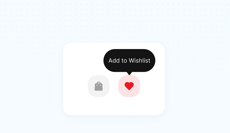
Plain tooltips carry text only, either a name or a one-line description. Rich ones add an optional title and more detail, and in Material’s version they can hold links or buttons. Carbon has its own variant, the definition tooltip, for terms inside text, labels and compact tables.
Android’s Compose documentation uses plain tooltips to describe icon button actions and rich ones to describe the value of a feature (Android Developers, 2026).
Interactive content is where sources split. Material allows links and buttons in a rich tooltip, while Carbon, Visa and Michelin all rule them out.
Carbon’s reason is that a tooltip never receives focus, so controls inside it are hard to reach.
I’ll stick with the narrower reading here. A hint that holds a link or button behaves like a toggletip or popover.
Where the term gets stretched
Product-tour vendors use the word more loosely.
Chameleon’s pattern library counts any small text box that opens on hover, focus or click, including onboarding steps.
Nielsen Norman Group draws a sharper line. Tooltips start from mouse or keyboard hover, and popup tips start from touch or click (Nielsen Norman Group, 2019).
The narrow definition is the one I use. The hint opens on hover or focus and holds only text, and it closes when either ends.
How does a tooltip behave on hover, focus and touch?
Hovering the trigger, or landing on it with keyboard focus, opens the tooltip. It stays open while the pointer is over the trigger or the tooltip, and it closes on mouse leave or blur, or when Esc is pressed.
On touch screens there is no hover, so the trigger depends on the platform.
Triggers
Pointer hover is the default trigger, usually after a short delay. Pressing Tab onto the trigger opens it too, through keyboard focus. Touch works differently, and in Android’s Material 3 tooltips a long press does the job (Android Developers, 2026).
Keyboard support is where sites slip. Nielsen Norman Group’s 2019 review set two sites side by side. McDonald’s showed a tooltip on mouse hover but not when a user tabbed to the element. Wikipedia showed the same tooltips both ways.
WCAG guidance says content triggered by pointer hover should also trigger on keyboard focus (W3C, 2026). Hover-initiated tooltips are not normally available on touchscreens, which is why Android’s implementation substitutes long press.
Timing
Visa’s design system sets the hover delay at up to 500 milliseconds and the keyboard delay at none (Visa Product Design System, 2026).
The APG pattern describes the same shape: a small delay before the tooltip appears, then it stays open while the cursor is over the trigger or the tooltip (W3C, 2026).
Android differs. A Compose tooltip opened by long press or hover is displayed for about one second (Android Developers, 2026).
On the web, a timer that hides hover or focus content fails the persistent condition of WCAG 1.4.13 (W3C, 2026). Android’s one-second display time applies to hover as well as long press, but it belongs to a native toolkit, not to web content.
Dismissal
Pressing Esc closes the tooltip. So does the pointer leaving both the trigger and the tooltip, or focus leaving the trigger.
Esc matters most for screen magnifier users. A tooltip that covers neighboring content otherwise forces them to move the pointer or focus just to clear it (W3C, 2026).
How long should tooltip text be, and where should it appear?
Keep the text brief. An icon-only control needs a short label, and anything else gets brief plain text. Place the tooltip beside the trigger and clear of neighboring controls.
What the text should say
Say something the visible label does not.
Nielsen Norman Group’s review of Sprint.com found a button labeled Add new line with a tooltip that read Add new line, a repeat with no value (Nielsen Norman Group, 2019). Michelin’s design system states the rule outright: do not repeat the label (Michelin Design System, 2026).
Length follows the job. A label only names a control, while a description explains truncated text or a term. Michelin caps everything at a fixed number of sentences.
Tooltip text counts as text for color contrast rules, including text revealed on hover or keyboard focus (W3C, 2016).
Where the tooltip should sit
Keep it close to the trigger so the pairing is obvious. It should never sit over the element it describes or that element’s neighbors, and it needs to stay inside the screen, shifting when space runs out.
Carbon sets the direction to auto by default, so the tooltip detects the edges of the visible viewport and moves into view instead of being cut off (Carbon Design System, 2026).
Nielsen Norman Group recommends an arrow when several elements sit close together, and warns that a tooltip covering its own trigger makes users repeat steps (2019).
Labels for icon-only controls run 1 to 2 words (Carbon Design System, 2026; Michelin Design System, 2026), and Michelin tops out at 3 sentences for any tooltip content (Michelin Design System, 2026). Carbon picks among 4 directions, top, right, bottom and left, automatically by default (Carbon Design System, 2026). Regular text still needs a contrast ratio of at least 4.5:1 (W3C, WCAG 2.1, 2018).
What does an accessible tooltip require?
Meeting WCAG 2.1 success criterion 1.4.13 (Level AA) is the baseline. The tooltip has to be dismissible, hoverable and persistent, it has to open on keyboard focus as well as hover, and focus stays on the trigger. For markup, role=”tooltip” goes on the container and aria-describedby on the trigger.
| Condition | What passes | Typical failure |
|---|---|---|
| Dismissible | Esc clears the tooltip without moving pointer or focus | No way to close it while it covers content |
| Hoverable | Pointer can move onto the tooltip without it vanishing | Tooltip closes the moment the pointer leaves the trigger |
| Persistent | Stays until hover or focus ends or the user dismisses it | A timer hides it |
These conditions apply to custom tooltips. The HTML title attribute is exempt because the browser controls how it looks, not the author (W3C, 2026).
The exemption does not make title tooltips accessible. In Steve Faulkner’s September 2024 tests, showing title content on keyboard focus was not implemented interoperably: Chrome 128 mostly showed it, while Firefox, Safari and mobile browsers with an external keyboard did not (Faulkner, HTML Accessibility, 2024).
On the markup side, the container gets role=”tooltip” and the trigger gets aria-describedby pointing to the tooltip’s id. Focus stays on the trigger, since the tooltip never takes it, and Esc dismisses the tooltip.
These ARIA roles and properties describe the tooltip to assistive technology. They do not make it appear on focus, so the script still has to do that (W3C, 2026).
The pattern itself is unsettled. The APG page still carries a note that the tooltip pattern is work in progress and has no task force consensus (W3C, 2026).
In a 2018 APG discussion on GitHub (issue 811), a participant questioned what role=”tooltip” adds beyond aria-describedby. WCAG’s Understanding document lists the role only as a potential future technique, while the documented sufficient technique is SCR39: making content hoverable, dismissible and persistent (W3C, 2026).
Pass the three conditions first. The role attribute is labeling, not what passes the audit.
Icon-only buttons need one more step. Android’s Compose sample gives the icon a contentDescription that matches the tooltip text, so the name survives when the tooltip is not shown (Android Developers, 2026).
Visa’s design system adds that a tooltip is not a substitute for alt text (Visa Product Design System, 2026).
Tooltip, toggletip or popover: which one fits?
Read-only text that shows on hover or focus goes in a tooltip. Text revealed by a click suits a toggletip, and a popover is for content that holds links, buttons or inputs. What matters is what the reader has to do with the content.
| Component | Opens on | Holds | Closes on |
|---|---|---|---|
| Tooltip | Hover, keyboard focus | Plain text | Esc, hover or focus leaving |
| Toggletip | Click, Enter, Space | Text, and links or buttons in some builds | Esc, outside click |
| Popover | Click on a trigger, or script | Any content, controls included | Outside click, Esc |
| Title attribute | Mouse hover | Plain text | Browser decides |
The line is interaction. Once content holds interactive elements, it needs keyboard focus, and a tooltip never takes it.
For hover content that contains focusable elements, the APG points to a non-modal dialog (W3C, 2026). Michelin’s design system positions its custom tooltip as the replacement for the browser’s title tooltip wherever more emphasis is needed (Michelin Design System, 2026).
How a toggletip works
Steve Faulkner coined the pattern in 2016, and Heydon Pickering documented it in Inclusive Components in 2017. A toggletip is a button whose only job is to reveal an information bubble. A click, Enter or Space fills an empty live region (role=”status”), and the screen reader announces the text.
Pickering rules out aria-describedby here. A screen reader user would hear the text before pressing the button, so the press would appear to do nothing.
Sources disagree on what a toggletip may hold.
Carbon lists links and buttons as valid toggletip content (Carbon Design System, 2026). Pickering’s checklist sends close buttons, confirm buttons and links to menu and dialog components.
The gap follows the build. Pickering’s toggletip is a live region that announces text, while Carbon’s rests on the disclosure pattern, which keeps interactive elements in the page’s tab order.
Where the Popover API fits
MDN lists the popover attribute as Baseline widely available, with support across browsers since April 2024. It gives the platform its own top-layer overlay with built-in light dismiss.
The auto type closes on an outside click or Esc, and only one is open at a time by default. The manual type stays open until the page closes it. Then there’s hint, which landed in Chrome 133 (February 2025) and Firefox 149 (March 2026), is meant for hover and focus events, and leaves open auto popovers alone.
Safari does not support hint yet, so it is still Baseline limited availability, and browsers without it fall back to manual (MDN). For a true tooltip, hint is the closest native type, and for anything interactive, auto is the one to reach for.
When not to use a tooltip
A tooltip is the wrong tool if the label fits on screen. It is also wrong when the information is needed to finish the task, or when most of the audience is on touch. A visible label or inline text does the job better.
Carbon keeps required-field rules in always-visible helper text, and Michelin sends errors and other feedback to a notification or alert (Carbon Design System, 2026; Michelin Design System, 2026).
Pickering’s checklist opens with a flat rule. If there is space, write a clear label instead.
Michelin reads a screen full of tooltips as a design problem, to be fixed in the interface and its content. A toolbar with too many controls to label is the case where a tooltip earns its place.
Touch is the sharpest failure. On a touch screen the focus and active states happen together, so the tooltip shows only while the button is pressed (Inclusive Components, 2017).
In mobile-first design, hover is the enhancement, not the baseline. Pickering suggests inline text labels for new users and icon-only controls for experienced ones.
ustwo’s March 2025 component for an energy-company client reveals on hover for desktop and toggles on tap for mobile, with tap as the default behavior.
On the plus side, a tooltip needs no permanent screen space, and it keeps the interface clean while still naming or clarifying a control (ustwo, 2025). The limits are real, though. It is invisible until triggered and unreliable on touch, it cannot hold actions, and it has to pass the three WCAG 1.4.13 conditions.
How to build an accessible tooltip
- Use a button, link or other focusable element as the trigger. Carbon pairs tooltips with focusable elements, and Pickering’s markup puts the tooltip element right after a real button.
- Give the tooltip an id and decide its job. A primary label goes through aria-labelledby, and a supplementary description goes through aria-describedby with visually hidden label text on the button (Inclusive Components, 2017).
- Show it on hover and on focus. Adjacent-sibling selectors on :hover and :focus do this in CSS alone.
- Add a few lines of script so Esc closes it, because CSS cannot listen for a keypress.
- Keep the pointer path open. No dead gap between trigger and tooltip, and keep it visible while the tooltip itself is hovered.
- Test with Tab, Esc, a pointer moving from the trigger onto the tooltip, a screen reader and a touch device.
A CSS-only tooltip stops at step 3. W3C lists CSS hover and focus pseudo classes among the potential future techniques for 1.4.13, not as a documented sufficient technique (W3C, 2026).
The adjacent-sibling pattern in Inclusive Components shows the tooltip only while the button is hovered or focused. WCAG failure F95 covers exactly that case, hover content that cannot itself be hovered.
Positioning and library options
| Approach | Handles | Still on you |
|---|---|---|
| Native: popover=”hint”, interestfor, anchor positioning | Hover, focus and long-press opening, top layer, flip fallbacks | Checking browser support per feature |
| Floating UI | Placement, flip, shift, auto-update, hover and focus hooks | Markup and styling |
| Radix UI Tooltip | Hover, focus, Esc, delays, collision avoidance | React only, wrapped in a Provider |
Floating UI’s React documentation composes offset(), flip() and shift() middleware with autoUpdate for placement. Its useHover, useFocus, useDismiss and useRole hooks add the interaction layer.
Radix supplies the behavior of accessible UI components and leaves the styling to your own CSS. In its tooltip 1.3.0 documentation, collision avoidance is on by default, Esc closes the tooltip, and Tab opens it without delay.
The default hover delay is 700 milliseconds, longer than the ceiling in Visa’s guidance. Set delayDuration on the Provider or on a single tooltip to match your design system (Radix Primitives, 1.3.0).
On the native side, MDN reports position-try-fallbacks as Baseline newly available since January 2026. It flips an anchored element along the block or inline axis when the anchor nears the viewport edge.
Chrome shipped interest invokers, the interestfor attribute, in Chrome 142, as listed in the October 2025 web platform release notes. They open a target on hover or focus, and on long press too, so check support before relying on them. Firefox and Safari do not support them yet.
Tooltip FAQ
What else is a tooltip called?
Visa’s design system lists help text, hint, info tip and screen tip as other names, and Android code uses the class TooltipCompat (Visa Product Design System, 2026).
Carbon keeps helper text separate, because it stays visible on screen while a tooltip does not.
Can a tooltip open on click?
Sometimes. Carbon’s definition tooltip accepts hover or click, so a user who needs more time can click to keep it open (Carbon Design System, 2026).
A hint that opens only on click behaves like a toggletip.
Does a tooltip need an arrow?
No, the arrow is optional. Carbon’s anatomy includes a caret tip that ties the container to its trigger, while Radix ships its Arrow as a separate part that defaults to 10 by 5 pixels (Radix Primitives, 1.3.0).
How do tooltips work in charts?
A chart tooltip appears when the cursor sits over a data point, icon button or truncated text. Carbon builds that behavior into its chart components instead of leaving it to each team (Carbon Design System, 2026).
Which Tooltips Stay and Which Get Replaced
A product should keep a tooltip only where it names an icon-only control or adds a fact the visible label lacks. Everything else becomes visible text, and anything with links or buttons moves to a toggletip or popover.
When auditing existing tooltips, move task-critical text into helper text first. Links and buttons go into a toggletip or popover next, and repeated labels get deleted.
Hidden task text stops users from finishing, and unreachable controls lock out keyboard users. A repeated label only wastes a hover, so it goes last.
The trade-off is screen space. Helper text and inline labels take room that a tooltip never did.
This position was verified on 26 October 2026. Once popover=”hint” reaches Safari and interest invokers work in every major browser, native markup can replace a positioning library for hover and focus opening.

Many of his resources are available on various design marketplaces. Over the years, he's worked with a range of clients and contributed to design publications like Designmodo, WebDesignerDepot, and Speckyboy, Slider Revolution among others.
- How to Insert Image in Figma With Ease - November 3, 2026
- How to Download Figma Files Fast and Free - October 30, 2026
- Figma Keyboard Shortcuts That Will 10x Your Speed - October 25, 2026