

Over 1.3 billion people live with a disability worldwide, and most of them use a smartphone every day.
Yet a 2023 audit found that more than 70% of popular mobile apps had critical accessibility issues blocking screen reader users, motor-impaired users, and people with low vision from basic functions.
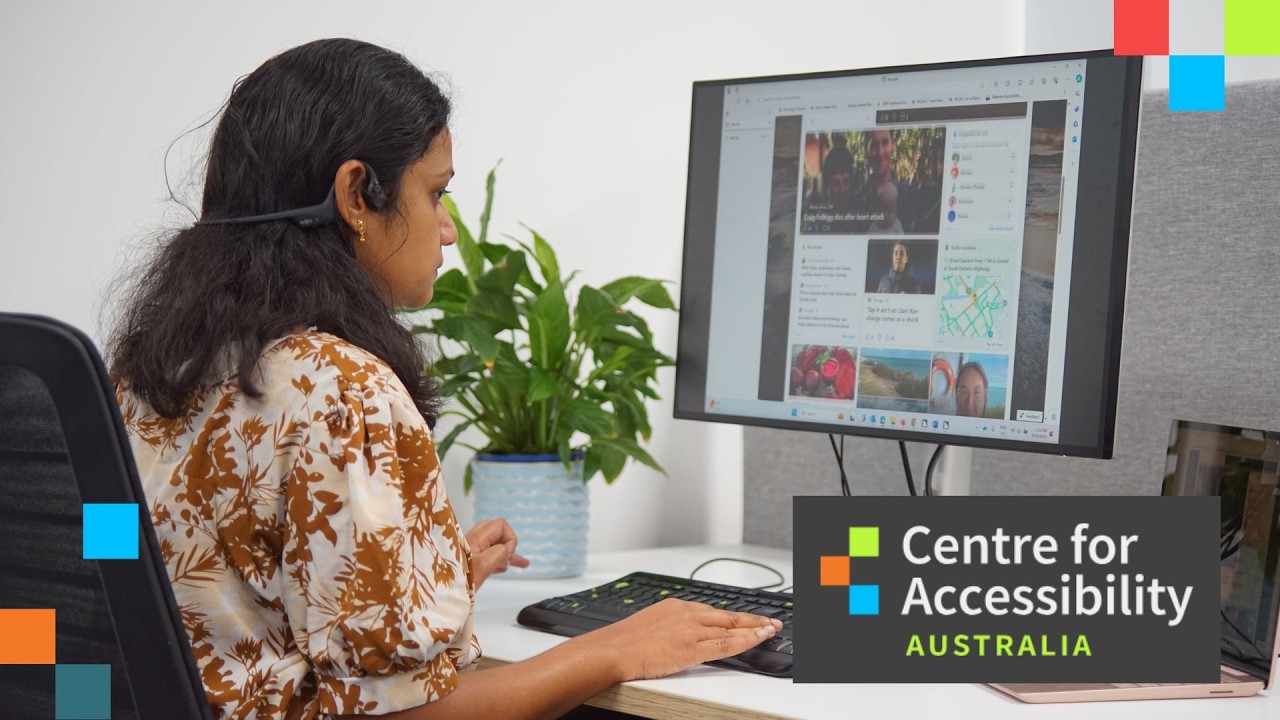
Mobile app accessibility is the practice of building apps that work for everyone, regardless of disability type, assistive technology, or input method. It covers everything from color contrast and touch target size to screen reader compatibility and gesture alternatives.
This article covers what mobile app accessibility means, which WCAG standards apply, how iOS and Android handle it differently, and what the real business and legal consequences of getting it wrong look like.
What Is Mobile App Accessibility?

Mobile app accessibility is the practice of designing and building apps so people with disabilities can use them fully, without workarounds or assistive technology failures. It covers the full spectrum of disability types: visual, auditory, motor, and cognitive.
This is distinct from usability. Usability measures how easy an app is to use. Accessibility measures whether it can be used at all by someone relying on a screen reader, switch access, or voice control. An app can score well on usability metrics while being completely unusable for a blind user.
Mobile accessibility applies equally to native iOS apps, native Android apps, and cross-platform builds using frameworks like React Native or Flutter. The platform changes. The obligation does not.
According to the World Health Organization, 1.3 billion people globally live with some form of significant disability. That is 16% of the global population. And 72% of adults with disabilities own a smartphone (DDIY, 2024).
Those two numbers together make the case plainly. The audience is large, mobile-first, and currently blocked by apps built without them in mind.
Accessibility vs. Inclusive Design
Accessibility focuses on removing specific barriers for users with disabilities, meeting defined technical standards.
Inclusive design is broader. It considers the full range of human diversity from the start of the design process, including situational disabilities like bright sunlight, one-handed use, or a noisy environment where audio is useless.
Both matter. But accessibility has legal teeth. Inclusive design does not (at least not yet).
What Disability Categories Does Mobile Accessibility Cover?
Mobile accessibility addresses 4 primary disability categories, each requiring different technical solutions.
| Disability Type | What It Affects | Key Assistive Technology |
|---|---|---|
| Visual | Reading text, identifying images, screen navigation | VoiceOver (iOS), TalkBack (Android) |
| Auditory | Audio content, alerts, video | Captions, visual alerts, vibration |
| Motor | Touch gestures, small targets, timed inputs | Switch Access, voice control, AssistiveTouch |
| Cognitive | Complex navigation, dense content, error recovery | Simplified UI, consistent patterns, timeout control |
More than 2.2 billion people worldwide have visual impairments (Microsoft). Roughly 466 million have disabling hearing loss (WHO). In the US alone, 61 million adults have a mobility-affecting disability (CDC). Cognitive and learning disabilities add further millions across every demographic.
Who Does Mobile App Accessibility Affect?

The honest answer: more users than most teams expect. The common mental model is that accessibility exists for a small, niche group. The data does not support that.
68% of users with disabilities rely on mobile devices as their primary means of internet access (Keevee, 2025). When a mobile app is inaccessible, it does not inconvenience them. It cuts them off entirely.
The Situational Disability Argument
Permanent disabilities are one part of the picture. Situational and temporary impairments expand the affected audience significantly.
- Bright sunlight makes low-contrast text unreadable for anyone
- A broken arm forces single-handed use for weeks
- A noisy environment makes audio content inaccessible without captions
- Age-related changes reduce contrast sensitivity, fine motor control, and cognitive processing for most people eventually
Microsoft’s Inclusive Design research framework calls this the “curb-cut effect.” Features built for users with permanent disabilities end up helping everyone. Captions are used heavily by people without hearing impairments. Large touch targets reduce errors for all users, not just those with motor disabilities.
The Aging Population Factor
About 12% of Americans over 40 have moderate to severe vision impairment affecting their ability to read digital content (CDC). That percentage rises sharply with age.
Apps built with good font scaling, strong color contrast, and simple navigation patterns directly serve aging users. That is not a niche demographic. By 2030, one in five Americans will be over 65.
Teams that frame accessibility as “disability accommodation” miss half the story. The better frame is: accessible apps work better for a wider range of people in a wider range of contexts.
What Are the Core Accessibility Standards for Mobile Apps?

The primary technical standard is the Web Content Accessibility Guidelines (WCAG), developed and maintained by the W3C. Despite the name, WCAG applies directly to mobile apps. WCAG 2.1 Level AA is the accepted compliance benchmark under the ADA, Section 508, and the European Accessibility Act.
WCAG is built on 4 principles, known as POUR: Perceivable, Operable, Understandable, Robust.
WCAG 2.2 Criteria Specific to Mobile Interactions
WCAG 2.2 (published October 2023) added and refined several criteria with direct mobile implications. These are not optional extras. Most are Level AA, meaning legally required under the standards mentioned above.
- 2.5.8 Target Size Minimum (AA): Interactive targets must be at least 24×24 CSS pixels, with adequate spacing from adjacent targets
- 2.5.7 Dragging Movements (AA): Any action that requires dragging must have a single-pointer alternative
- 2.5.1 Pointer Gestures (A): Multi-finger gestures must have a single-pointer alternative
- 2.5.4 Motion Actuation (A): Actions triggered by device motion (shake to undo) must have an alternative input
- 1.3.4 Orientation (AA): Content must not be locked to portrait or landscape orientation
- 1.4.10 Reflow (AA): Content must reflow at 400% zoom without horizontal scrolling
The W3C Mobile Accessibility Task Force (MATF), which regrouped in January 2024, is currently finalizing WCAG2Mobile, a dedicated guidance document mapping all WCAG 2.2 criteria to mobile-specific implementation.
Platform-Level Guidelines from Apple and Google
WCAG sets the floor. Apple and Google both publish platform-specific guidelines that go further in some areas.
Apple Human Interface Guidelines (HIG) recommend a minimum touch target of 44×44 points. This is stricter than WCAG 2.5.8’s 24px minimum and reflects the physical reality of fingertip size. Apple’s UIAccessibility API is the mechanism developers use to expose interface elements to VoiceOver.
Google’s Material Design 3 recommends 48x48dp as the minimum touch target for interactive elements. Google’s AccessibilityService API serves the same purpose on Android as UIAccessibility does on iOS, connecting app elements to TalkBack and other assistive technologies.
Both platforms provide extensive documentation and built-in testing tools. The gap is not in resources. It is in developer awareness and implementation. Only 30% of developers have received formal accessibility training (Pandey and Dong, 2023).
What Legal Requirements Apply to Mobile App Accessibility?

Legal pressure on mobile app accessibility has increased significantly since 2022. The US, EU, and UK all have active frameworks with real enforcement mechanisms. In the first half of 2025 alone, more than 2,000 ADA website and app accessibility lawsuits were filed, a 37% increase compared to the same period in 2024 (AudioEye, 2025).
United States: ADA and Section 508
The ADA does not mention mobile apps by name. Courts have extended Title III to digital properties, including mobile apps, through repeated rulings. The DOJ issued a final rule in April 2024 requiring state and local government web content and mobile apps to meet WCAG 2.1 Level AA within 3 to 4 years of publication.
First violation penalties under the ADA can reach $50,000. Subsequent violations reach $100,000. That excludes legal fees and remediation costs.
Section 508 applies to federal agencies and their contractors. Any app used by or built for a US federal agency must meet Section 508, which references WCAG 2.0 Level AA as the technical standard.
European Accessibility Act (EAA)
The EAA entered full enforcement on June 28, 2025. It covers digital products and services offered in EU member states, including mobile apps. The standard required is EN 301 549, which maps to WCAG 2.1 Level AA for digital content.
Non-EU companies are not exempt. Any app distributed through EU app stores or used by EU residents falls within scope. Enforcement is handled at the national level by each member state.
UK Equality Act and CVAA
UK Equality Act 2010: Requires service providers to make reasonable adjustments for users with disabilities. Applied to mobile apps through court precedent.
CVAA (Communications and Video Accessibility Act): US federal law requiring communications and video apps to be accessible, with specific obligations for apps that handle real-time voice or video communications.
| Jurisdiction | Law / Standard | Technical Benchmark | Applies To |
|---|---|---|---|
| United States | ADA Title III / DOJ 2024 Rule | WCAG 2.1 Level AA | State and local government apps; commercial apps through case law |
| United States | Section 508 | WCAG 2.0 Level AA | Federal agencies and contractors |
| European Union | European Accessibility Act | EN 301 549 / WCAG 2.1 AA | Most commercial digital products from June 2025 |
| United Kingdom | Equality Act 2010 | WCAG 2.1 Level AA (recommended) | Service providers, including app developers |
How Do iOS and Android Handle Accessibility Differently?

Both platforms provide mature accessibility APIs. The technical approaches differ enough that testing on one platform does not validate the other. Teams that test only on iOS will miss Android-specific failures and vice versa.
VoiceOver accounts for 70.6% of mobile screen reader usage. TalkBack covers 34.7% (WebAIM Screen Reader Survey, 2023-2024). Supporting both is not optional for any app with meaningful reach.
iOS Accessibility APIs and Features
VoiceOver is Apple’s built-in screen reader, first introduced with the iPhone 3GS in 2009. It uses multi-touch gestures: single-finger swipes to move between elements, double-tap to activate, three-finger swipes to scroll.
The UIAccessibility API is how developers expose interface elements to VoiceOver. Key properties include accessibilityLabel (what VoiceOver reads), accessibilityHint (additional context), and accessibilityTraits (element role: button, header, image, etc.).
Other iOS accessibility features relevant to app development:
- Dynamic Type: System-level font scaling that apps must respect
- Switch Control: Allows navigation using external switches for motor-impaired users
- AssistiveTouch: Creates on-screen gesture shortcuts for users who cannot perform standard multi-touch gestures
- Reduce Motion: System setting that apps should respect to avoid triggering vestibular disorders
VoiceOver is consistent across iPhone and iPad, which simplifies testing. One device configuration covers the full iOS ecosystem.
Android Accessibility APIs and Features
TalkBack is Google’s screen reader for Android. It uses linear navigation by default: single-finger swipe right to move to the next element, left to go back, double-tap to activate. TalkBack by default announces more detail about component types and interaction instructions than VoiceOver does.
The AccessibilityService API handles the connection between app UI and assistive technologies on Android. Developers use contentDescription to label non-text elements and android:importantForAccessibility to control which elements TalkBack reads.
Android fragmentation creates a testing challenge that iOS does not have. TalkBack behavior can vary between Android versions and device manufacturers. A 2024 study found Android apps tend to have higher accessibility violation rates than iOS apps, partly because standard enforcement is weaker on Android (Google, 2024; W3C, 2023).
BrailleBack adds braille display support. Switch Access is the Android equivalent of iOS Switch Control. Both platforms also support voice control input, though implementation differs.
Cross-platform frameworks like React Native and Flutter add another layer of complexity. Flutter’s Semantics widget and React Native’s accessibility props translate to native APIs, but the translation is imperfect. Gaps exist in both frameworks that require native-specific handling for full screen reader compatibility.
What Are the Main Accessibility Barriers in Mobile Apps?
A 2023 audit of popular mobile apps found that over 70% had critical accessibility issues, including unlabeled buttons, poor color contrast, or layouts that were unusable with screen readers (Deque Systems, 2023). These are not obscure edge cases. They are consistent, recurring failures that appear across every app category.
A 2025 assessment of 50 popular iOS and Android apps by ArcTouch and Fable found that 72% of user journeys contained accessibility barriers. Only 2 of those 50 apps scored above 85 on accessibility.
Screen Reader Support Failures
Unlabeled buttons and links are the most commonly reported barrier by assistive technology users (Smashing Magazine, 2024).
When a screen reader encounters an interactive element with no label, it announces “unlabeled button.” The user has no way to know what that button does. This is a complete block, not an inconvenience. A University of Washington large-scale analysis found that 93% of Android floating action buttons lacked a content description.
Related failures:
- Non-descriptive labels (“Click here,” “Submit,” “Image”) that carry no meaning in isolation
- Incorrect reading order causing screen readers to jump between unrelated content
- Dynamic content (modals, alerts, loading states) that does not announce to screen readers when it appears
- Missing ARIA roles on custom components built without semantic structure
Color Contrast and Visual Design Failures
WCAG requires a minimum contrast ratio of 4.5:1 for normal text and 3:1 for large text (18pt or 14pt bold) against backgrounds.
Apps that rely on color alone to communicate state create barriers for users with color blindness. Red for error, green for success. Both appear similar to someone with deuteranopia (the most common form of color blindness, affecting roughly 1 in 12 men).
Tools like Stark and Colour Contrast Analyser check contrast ratios during design. The accessible color palette generator approach, building contrast compliance into the design system from the start, prevents most of these failures before any code is written. Retrofitting contrast after launch is significantly more expensive.
Touch Target and Gesture Failures
MIT’s Touch Lab research found that the average human fingertip is 16-20mm wide. Users with motor impairments experience error rates up to 75% higher on small touch targets.
Targets below the recommended minimums (44x44pt on iOS, 48x48dp on Android) cause consistent problems. Two buttons placed close together with inadequate spacing compound the issue.
Custom gesture requirements are the other major motor barrier. An app that requires a specific swipe pattern, pinch-zoom sequence, or multi-finger gesture with no alternative excludes users who cannot perform that gesture. Switch Access and VoiceOver users navigate through sequential focus traversal, not gestures. Multi-step gestures without alternatives block them entirely.
Form and Input Failures
Forms are where a significant portion of accessibility failures cluster in apps with transactional flows.
Common form failures include:
- Input fields without associated labels (placeholder text is not a label)
- Error messages that identify the error by color only, not by text
- Error text that is not programmatically associated with the field that caused it
- Session timeouts without warning or extension options
- CAPTCHAs with no audio or text alternative
Banking, healthcare, and government apps fail on forms most frequently. These are also the apps where accessibility is most consequential, since users are completing transactions that affect their finances, health, and legal standing. A properly structured accessible form uses programmatic label associations, clear error identification, and logical focus management throughout the input process.
What Is the Accessible Mobile App Design Process?
IBM research on the cost of fixing accessibility post-launch versus addressing it during design has become something of a standard reference in the field. The finding: fixing an accessibility issue after release costs roughly 30 times more than catching it during the design phase. Whether the exact multiplier holds across all contexts, the directional truth is consistent with how software defects generally work. Catching things early is cheaper. Always.
The accessible design process does not look dramatically different from standard product design. It adds specific checks at each stage rather than creating a parallel workflow.
Color and Contrast in Mobile UI Design
Contrast decisions happen at the design system level, not the component level. If your color tokens meet 4.5:1 contrast requirements by default, individual component decisions inherit that compliance automatically.
Stark (the Figma plugin) and the standalone Colour Contrast Analyser are the standard tools here. Both check foreground-background pairs against WCAG thresholds in real time during design.
Do not rely on contrast alone for meaning. State indicators (error, success, warning, disabled) need a second signal beyond color: an icon, a label, a pattern, or a border change. This is the color contrast principle combined with the “no color alone” rule from WCAG 1.4.1.
Touch Target and Gesture Design
Minimum sizes by platform:
- Apple HIG: 44×44 points minimum
- Material Design 3: 48x48dp minimum
- WCAG 2.5.8: 24×24 CSS pixels minimum with adequate spacing (Level AA)
Apple and Google both set stricter minimums than WCAG. The physical reality of fingertip size drives this. Meeting WCAG 2.5.8 alone does not guarantee usability for motor-impaired users on mobile.
Every gesture that performs a key action needs a button or other non-gesture alternative. Swipe-to-delete is a usability pattern with broad adoption. But without a visible “Delete” button, switch control and keyboard users have no path to that action.
Accessible Component Libraries and Annotations
Building accessibility into components at the design system level is the most effective approach for teams at scale.
Material Design 3 includes accessibility annotations in its component documentation. The Apple Human Interface Guidelines specify accessibility behavior for every native UI element. Both are worth treating as the baseline specification, not as supplemental reading.
Figma-based workflows benefit from accessibility annotation plugins that add screen reader labels, focus order indicators, and heading level markers directly to design files. This creates a handoff document that developers can implement against, rather than leaving accessibility decisions to the implementation phase.
The accessible UI components approach, building compliance into the component library rather than applying it per-screen, reduces both the volume of QA work and the risk of regression when components update.
User-centered design processes that include disabled users in early testing consistently catch barriers that annotation reviews and automated scans miss. At least in my experience, the most revealing findings in any accessibility review come from watching a screen reader user navigate a flow you thought was complete. It is rarely what you expected.
How Is Mobile App Accessibility Tested?

Automated tools catch roughly 30% of WCAG issues in a mobile app (Accessibility.Works). The other 70% require manual testing, screen reader navigation, and real users with disabilities.
That 30% figure is not a reason to skip automation. It is a reason to treat automation as the starting point, not the finish line.
Automated Accessibility Testing Tools
Platform-native tools:
- Xcode Accessibility Inspector (iOS): Audits apps in the simulator or on-device; flags missing labels, contrast failures, and focus order issues
- Google Accessibility Scanner (Android): Runs on-device scans and flags touch target size, content labeling, and contrast problems
Third-party tools worth using:
- Axe DevTools for Mobile (Deque): runs against iOS and Android; maps findings to specific WCAG criteria
- BrowserStack: cloud-based testing across real devices; 5x faster scans with WCAG violation grouping
Over 100 lawsuits have targeted companies using automated-only “overlay” solutions as their entire accessibility strategy (TestPros, 2024). Automated tools find categories of errors, not all errors.
Manual and User Testing Methods
ArcTouch and Fable’s 2025 assessment of 50 popular apps found 72% of user journeys contained accessibility barriers, with only 2 apps scoring above 85. Most of those barriers would not appear in an automated scan.
Manual testing checklist for screen reader coverage:
- Navigate every interactive flow using VoiceOver (iOS) and TalkBack (Android) exclusively
- Verify focus order is logical from top to bottom through each screen
- Test zoom at 200% and confirm no content is clipped or hidden
- Check that all dynamic content (modals, alerts, loading states) announces to the screen reader when it appears
- Confirm gestures all have a single-pointer alternative
User testing with disabled participants surfaces what no checklist catches. A blind user navigating a checkout flow with TalkBack for 20 minutes will find things a sighted tester running manual checks will miss entirely. At least, that is consistently what I see when clients run their first real user sessions.
The hybrid approach, automated scanning followed by manual screen reader testing followed by user sessions with disabled participants, is the standard used by testing firms like Level Access, Deque, and accessible.org. Each layer catches what the previous layer misses.
What WCAG Success Criteria Apply Specifically to Mobile?

WCAG was originally written for web content. The W3C Mobile Accessibility Task Force (MATF) has worked since 2018 to ensure mobile considerations are explicitly addressed in WCAG 2.1 and 2.2. The criteria below have distinct behavior on mobile that differs from desktop implementation.
| Criterion | Level | Mobile-Specific Requirement |
|---|---|---|
| 1.3.4 Orientation | AA | Content must not be locked to portrait or landscape |
| 1.4.10 Reflow | AA | Content reflows at 400% zoom without horizontal scrolling |
| 2.5.1 Pointer Gestures | A | Multi-finger gestures need a single-pointer alternative |
| 2.5.4 Motion Actuation | A | Shake or tilt actions must have a UI alternative |
| 2.5.8 Target Size Minimum | AA | Interactive targets must be at least 24×24 CSS pixels or have adequate spacing |
| 2.5.7 Dragging Movements | AA | Drag interactions must provide a single-pointer alternative |
Orientation and Reflow on Small Screens
1.3.4 Orientation (AA) directly addresses a common mobile UX pattern: locking the app to portrait mode.
For users with wheelchairs who mount phones in a fixed landscape position, or users with low vision who use landscape mode to increase text size, orientation lock is a genuine barrier. Not an inconvenience.
The only exception WCAG allows is when a specific orientation is “essential,” like a piano keyboard app or a fitness tracker showing horizontal data.
Gesture and Motion Alternatives
2.5.1, 2.5.4, and 2.5.7 address the same underlying problem from 3 different angles: touch gestures that have no alternative.
Pointer Gestures (2.5.1): any multi-finger gesture (two-finger scroll, pinch-zoom) needs a single-pointer path to the same action.
Motion Actuation (2.5.4): shake to undo is the canonical example. It must have a UI equivalent, and users must be able to turn off motion triggering.
Dragging Movements (2.5.7): new in WCAG 2.2. Sliders, sortable lists, and drag-to-dismiss patterns all fall here. Each needs a button or other non-drag input.
Switch Access users and users with tremors or limited grip strength cannot perform these gestures. These criteria exist because those users have no fallback when gesture alternatives are missing.
Text Resize and Focus Order
1.4.4 Resize Text (AA): text must scale up to 200% without loss of content or functionality. On mobile, this means apps must respect system Dynamic Type settings (iOS) and font scaling preferences (Android).
Many apps override system font size settings entirely. That is a direct failure of this criterion, and it is common enough to appear consistently in accessibility audits across app categories.
2.4.3 Focus Order (A): the order that VoiceOver and TalkBack move through interactive elements must be logical and consistent with the visual layout. Custom component ordering, modal overlays, and bottom sheets frequently break this. A screen reader user encountering a broken focus order effectively loses their place in the app with no way to recover cleanly.
What Is the Business Case for Mobile App Accessibility?
People with disabilities and their immediate networks control an estimated $13 trillion in annual disposable income globally (Return on Disability Group, 2024). Working-age adults with disabilities in the US alone hold roughly $490 billion in purchasing power (Deque). That is a market segment comparable in size to the US Hispanic or African American consumer markets.
Accessibility is not charity. It is market access.
Revenue and Conversion Impact
Forrester Research found that every $1 invested in accessibility yields up to $100 in benefits.
The conversion math is direct. If an inaccessible checkout flow prevents a screen reader user from completing a purchase, that is a lost transaction. No marketing budget recovers revenue from a user who cannot physically complete the flow.
Accessible e-commerce sites see 15% higher sales compared to inaccessible alternatives (Statista). Tesco invested £35,000 in accessibility improvements and saw online sales reach £13 million annually. Legal and General improved accessibility and saw a 50% increase in organic search traffic within 12 months.
Accenture’s 2023 research found companies leading on disability inclusion generate 1.6x more revenue and 2.6x more net income than their peers.
Legal Cost Avoidance
Nearly 4,000 ADA digital accessibility lawsuits were filed in the US in 2024 (TestParty). A single lawsuit costs on average $200,000 including settlement, legal fees, and emergency remediation work.
Proactive accessibility investment typically costs a fraction of that, especially when integrated early in the development cycle. IBM’s research consistently shows post-launch remediation costs 30x more than building accessibly from the start.
Domino’s and Target have both faced multimillion-dollar accessibility lawsuits. Target’s settlement ran to $6 million. These cases are frequently cited in procurement conversations as the cost floor for ignoring accessibility.
Brand and Procurement Effects
73% of senior leaders say accessibility is a requirement for digital product procurement most or all of the time (Level Access, State of Digital Accessibility Report).
Since the EAA entered enforcement in June 2025, accessible apps are not just preferred in European procurement. They are required. Apps that cannot demonstrate WCAG 2.1 AA conformance are disqualified from enterprise and government contracts in EU member states.
Nearly 70% of consumers say diversity, equity, and inclusion factors play a role in which brands they support (Level Access). Accessible apps communicate that a company builds for everyone, not just the majority use case.
How Is Mobile App Accessibility Audited?

A mobile accessibility audit is a structured evaluation of an app against WCAG criteria, conducted across specific user flows, on both iOS and Android, using a combination of automated scanning, manual expert testing, and screen reader navigation.
WCAG 2.1 Level AA is the legally required benchmark in most jurisdictions. Automated tools catch roughly 30% of issues. The audit process exists to find the other 70%.
Audit Scope and Process
A well-scoped audit covers:
- A defined screen inventory (typically the core user journeys, not every screen)
- Both iOS and Android, tested separately
- Screen reader testing on physical devices, not simulators
- Keyboard and switch access navigation
- Zoom behavior at 200% and 400%
Each finding is logged with a severity rating: critical, serious, moderate, or minor. Every finding maps to a specific WCAG success criterion. A well-structured audit report makes remediation straightforward because developers can filter by criterion and fix systematically.
VPAT and ACR Documentation
The VPAT (Voluntary Product Accessibility Template), developed by the Information Technology Industry Council (ITI), is the standard format for documenting accessibility conformance. The completed document is called an Accessibility Conformance Report (ACR).
VPAT 2.5 is the current version. It comes in 4 editions:
- 508: for US federal agency procurement
- EU: for EN 301 549 / European Accessibility Act compliance
- WCAG: for general WCAG 2.0, 2.1, or 2.2 reporting
- INT: combines all three standards
Microsoft, Oracle, and Google all publish ACRs for their products. For any app sold into government or enterprise procurement channels, an accurate, third-party-audited ACR is increasingly a hard requirement, not a nice-to-have.
Third-party audits carry more credibility than self-assessments in procurement. The key word is “accurate.” A VPAT authored against a superficial scan that marks criteria as “Supports” when they do not creates legal exposure when a buyer tests the app independently.
How Does Mobile App Accessibility Relate to App Store Compliance?

Both Apple and Google reference accessibility in their platform guidelines. Neither enforces it comprehensively at the review stage. But the consequences of poor accessibility still reach teams through app store channels, just not always directly.
Apple App Store Accessibility Requirements
Apple’s 2025 App Store Review Guidelines explicitly state that text resizing, adequate color contrast, and VoiceOver support have become mandatory considerations in the review process.
Apple’s Human Interface Guidelines require apps to follow accessibility standards as part of the broader design quality assessment. Apps that perform poorly on accessibility features risk rejection during review, particularly in healthcare, finance, and education categories where Apple applies stricter scrutiny.
Apple rejected nearly 1.93 million app submissions in 2024 alone for not meeting quality, safety, or design guidelines (Apple Transparency Report, 2024). Accessibility failures are listed as a named rejection category in Apple’s internal review criteria.
Google Play Accessibility Expectations
Google Play’s developer guidelines require apps to meet accessibility standards as part of the core quality requirements. Developers must use APIs correctly and adhere to Material Design principles, which include accessibility specifications for touch targets, contrast, and labeling.
Google removed over 1.4 million apps from the Play Store in 2024 for policy violations. Accessibility is part of the quality baseline that informs those removals, though the primary drivers are safety and privacy violations.
Android apps tend to have higher accessibility violation rates than iOS apps, partly because Play Store enforcement of accessibility standards is weaker than Apple’s manual review process (Google, 2024; W3C, 2023). The result is that Android users with disabilities face more barriers on average than iOS users.
App Store Rankings and User Engagement
App store search ranking is influenced by user engagement signals: ratings, reviews, session length, and retention.
A screen reader user who cannot complete onboarding will leave a 1-star review explaining exactly why. 61% of users are unlikely to return to an app that was difficult to use on mobile, and 79% will switch to a competitor (McKinsey). Users with disabilities behave exactly the same way.
Accessibility improvements that reduce friction for disabled users (larger targets, cleaner navigation, better labeling) produce better engagement metrics for all users. Better engagement metrics improve store ranking. The performance feedback loop runs in both directions.
Apps like Cash App and DoorDash have received public criticism in accessibility community forums for specific screen reader failures. Those conversations show up in app store reviews and affect download decisions for a segment of users who research accessibility before installing.
FAQ on What Is Mobile App Accessibility
What is mobile app accessibility?
Mobile app accessibility is the practice of designing and building apps so people with disabilities can use them fully. It covers visual, auditory, motor, and cognitive disabilities, and applies equally to native iOS, Android, and cross-platform apps.
Why does mobile app accessibility matter?
1.3 billion people globally live with a disability. 72% of adults with disabilities own a smartphone. When an app is inaccessible, it does not inconvenience those users. It cuts them off entirely from services, transactions, and information.
What is WCAG and how does it apply to mobile apps?
WCAG (Web Content Accessibility Guidelines), developed by the W3C, sets the technical standard for accessible digital content. Despite the name, WCAG applies directly to mobile apps. WCAG 2.1 Level AA is the accepted benchmark under the ADA, Section 508, and the European Accessibility Act.
Is mobile app accessibility legally required?
Yes, in most major jurisdictions. The ADA covers mobile apps in the US through court precedent. The European Accessibility Act entered full enforcement in June 2025. Section 508 applies to any app built for or used by US federal agencies.
What are the most common mobile accessibility barriers?
The most frequent failures are unlabeled buttons and images, insufficient color contrast, touch targets below minimum size, broken focus order, and gesture-based interactions with no single-pointer alternative. These appear consistently across app categories.
How does VoiceOver differ from TalkBack?
VoiceOver is Apple’s screen reader for iOS. TalkBack is Google’s equivalent on Android. VoiceOver uses multi-touch gestures and is consistent across devices. TalkBack uses linear single-finger navigation and announces more component detail by default. Testing one does not validate the other.
What touch target size is required for accessibility?
WCAG 2.2 requires a minimum of 24×24 CSS pixels with adequate spacing (criterion 2.5.8, Level AA). Apple’s Human Interface Guidelines recommend 44×44 points. Google’s Material Design recommends 48x48dp. Platform guidelines are stricter than WCAG on this point.
How is mobile app accessibility tested?
Testing combines three methods: automated scanning with tools like Xcode Accessibility Inspector or Google Accessibility Scanner, manual screen reader navigation on physical devices, and user testing with disabled participants. Automated tools catch roughly 30% of issues. Manual and user testing find the rest.
What is a VPAT and when does a mobile app need one?
A VPAT (Voluntary Product Accessibility Template) documents how well an app conforms to accessibility standards. The completed report is called an ACR (Accessibility Conformance Report). Any app sold into government or enterprise procurement channels typically requires one.
Does fixing accessibility improve app store performance?
Yes. Accessible apps produce better engagement metrics: lower bounce rates, higher task completion, and stronger ratings. Apple’s 2025 guidelines list VoiceOver support and adequate contrast as mandatory review criteria. Better engagement signals improve store ranking for all users, not just disabled ones.
Conclusion
This conclusion is for an article presenting what is mobile app accessibility, and the core takeaway is straightforward: accessible app development is no longer optional.
WCAG 2.1 Level AA sets the technical floor. The ADA, Section 508, and the European Accessibility Act enforce it legally. And the disability market, worth trillions in global spending power, rewards teams that build inclusively.
Inclusive design, proper web accessibility principles applied to native apps, and rigorous screen reader testing are what separate compliant apps from genuinely usable ones.
The barriers are known. The standards are published. The tools exist. What remains is treating assistive technology support as a baseline requirement, not an afterthought.


