Picture this: you’ve meticulously sculpted a sleek web interface, only to hit a snag. Your content demands a polished, compact stage without compromising on accessibility or style. Enter the Tailwind accordion—the unsung hero of contemporary web design.
Diving into this topic, we’re stripping away the excess, zooming in on a single element that elevates user interfaces from functional to fantastic.
Tailwind CSS, that ever-so-agile framework, offers a gateway to creating accordions that not only look outstanding but also function seamlessly across devices.
By the end of our exploration, you’ll have unlocked the secrets to crafting responsive accordions, complete with CSS transitions that animate with precision.
What’s more, you’ll ensure your creations are tuned to the melody of web accessibility standards, ensuring a universal user-friendly experience.
Ready to transform your digital canvases? We’ll dissect dynamic UI components, tailor user experiences, and keep you in tune with the latest front-end development practices. Let the show begin.
Tailwind Accordion Examples
Tailwind Accordion component Example

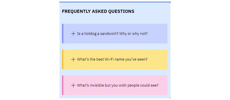
Hey, ever heard of an accordion? No, not the musical instrument, but a cool web design element. It’s like a vertical closet that opens and closes to show or hide content. Imagine you’ve got a ton of stuff to say but not much space. That’s where the Tailwind accordion comes in handy. You can use it for FAQs or even those super complicated contact forms. And guess what? It’s responsive and built with Tailwind CSS. Neat, right?
FAQ Accordion Section Without Using Any Javascript

Sophia Baker’s got something cool for you. It’s a Tailwind example that doesn’t even need Javascript. Made with Tailwind CSS v3, it’s responsive and sleek. Perfect for those who like to keep things simple.
Tailwind Pure CSS Accordion By stripedpurple

Stripedpurple’s creation is something else. It’s a Tailwind Pure CSS Accordion, and it’s all about organizing dynamic material. Want to arrange and interact with content sections? This CSS-only accordion component is your friend. It’s like a virtual guide, offering streamlined navigation to make your user’s experience a breeze. Plus, it’s pretty to look at.
Accordion – Radix

This one’s a bit different. It’s a vertically stacked set of interactive headings, each revealing a secret section of content. It’s like a treasure hunt on your webpage!
Tailwind CSS Accordion – Flowbite

Flowbite’s accordion component is a collection of vertically collapsing header and body elements. It’s like a magic show, revealing hidden information based on Tailwind CSS utility classes and JavaScript. It’s all about the collapse and expand state, and it’s pretty fun to play with.
Tailwind CSS Accordion Example – CodePel

CodePel’s accordion is like a user-friendly puzzle. It’s a list of items that collapse or expand to show or hide content. Made with Alpine.js and Tailwind CSS, it’s smooth and interactive. Perfect for FAQs, content summaries, or any collapsible content on your webpage.
Horizontal Accordion

Cameron’s Horizontal Accordion is a twist on the classic. You can customize it, make it yours, and it’s all horizontal. A fresh take on a classic design.
Accordion section by Lyra

Lyra Ravensong’s Accordion Section is thoughtful and interactive. Made with Tailwind CSS v3, it’s all about improving content presentation and accessibility. It’s like having a personal assistant on your webpage, helping users navigate through content.
Simple Colorful Accordion

George Gabriel’s Simple Colorful Accordion is a burst of color and fun. Customize it, play with it, and make it yours.
FAQ Component with Details Summary Open Animation By surjithctly

Last but not least, Surjithctly’s FAQ Component is flexible and dynamic. Made with Tailwind CSS 3.0.18, it’s got details, summary tags, and a custom open animation. It’s like having a virtual assistant ready to answer all the common queries on your website. Cool, huh?
Tailwind CSS React Accordion – Horizon UI

So, you want to show and hide stuff on your webpage? Horizon UI’s got this Tailwind CSS React Accordion component that’s like a magician’s hat. FAQs, menus, submenus, company locations – you name it, this accordion can handle it. It’s like having a secret drawer on your webpage.
Tailwind CSS Accordion

Material Tailwind’s accordion component is like a Swiss Army knife. It’s simple, versatile, and you can use it for all sorts of things. FAQs, menus, company locations – it’s all there. And it’s all Tailwind CSS. Check out this example, and you’ll see what I mean.
Tailwind CSS Accordion – Preline

Preline’s got this cool thing where you can build vertically collapsing accordions. Think of it like a digital bookshelf for your FAQs. You can show questions and answers for each child element. It’s neat, organized, and all Tailwind.
Accordion by Piet Vriend

Piet Vriend’s creation is something else. It’s a dynamic component using Tailwind CSS v3 and Flobite.js. Imagine an interactive section that lets users toggle content like flipping pages in a book. It’s smooth, attractive, and it makes your website feel alive. It’s like adding a touch of magic to your webpage.
Smooth Accordion with TailwindCSS & Alpine.js

Jan’s Smooth Accordion is like butter. It’s made with TailwindCSS & Alpine.js, and you can customize it to your heart’s content. It’s like having a personal stylist for your webpage.
Tailwind CSS Simple collapse/accordion with alpine.js By Anonymous

Anonymous has come up with this Tailwind CSS Simple Collapse/Accordion with Alpine.js. It’s like a dance, with seamless transitions and smooth moves. Swap content portions in your web projects like a pro. It’s dynamic, it’s fun, and it’s all Tailwind.
Lo-fi Tailwind CSS Accordion Menu

Rob Stinson’s LO-FI TAILWIND CSS ACCORDION MENU is like a vintage record player. It’s got that classic feel with Tailwind CSS 1.8.10, and it’s both simple and functional. Organize and interact with content sections like flipping through a vinyl collection. It’s responsive, beautiful, and it adds a touch of class to your website. It’s like having a personal DJ for your webpage. Cool, huh?
Tailwind CSS Accordions Components

Imagine having a toolbox that you can carry anywhere. That’s what TailGrids has done with their Tailwind CSS Accordions. It’s like a Swiss Army knife for your website. Need to list product features? Got some FAQs to share? Want to spice up your blog post? This Tailwind accordion component has got you covered. It’s crafted with Tailwind CSS & Alpine.js, and it’s ready to rock your website.
Tailwind CSS: Accordions (collapsible content)

Ever wanted to create those cool collapsible content sections but didn’t know how? This example is like a cooking recipe for web designers. It shows you how to whip up accordions using only Tailwind CSS, no Javascript needed. It’s succinct, straight-to-the-point, and it’s all Tailwind.
Tailwind CSS Simple Accordion By Shrihari

Shrihari’s Tailwind CSS Simple Accordion is like a sleek sports car. It runs on Tailwind CSS 3.0.18, and it’s all about offering a quick and attractive approach to access collapsible material. It’s like opening a door to a whole new world on your webpage. It’s all about improving the user experience, and it’s all Tailwind.
Tailwind CSS Simple Accordion (FAQ) Examples

Want to see some real-world examples of Tailwind accordions? Or maybe you want to build one step by step? This link is like a treasure trove of Tailwind CSS accordion examples. It’s like a DIY workshop for web designers. Let’s dive in and see what we can create.
A collapsible accordion

This one’s a collapsible accordion, and it’s responsive with Tailwind and Javascript. It’s like having a secret compartment on your webpage. Click, and it opens. Click again, and it hides away. It’s like magic, but it’s all Tailwind.
Tailwind CSS Accordion By sohanemon

Sohanemon’s Tailwind CSS Accordion is like a minimalist’s dream. It’s driven by Tailwind CSS 3.0.18, and it’s interactive and simple. No JavaScript, just pure CSS. It’s like having a zen garden on your webpage. Use this dynamic accordion to arrange and interact with content sections. It’s all about providing a fast and attractive way to access collapsible information, and it’s all Tailwind. Cool, huh?
FAQ On Tailwind Accordion
How do you implement a Tailwind accordion in your project?
Well, it starts with the basics. Grab the Tailwind CSS framework and ensure it’s configured for your project. Create a basic structure with divs representing each accordion item.
Use @apply to sprinkle in Tailwind’s utility classes. JavaScript will handle your click events, adding open or closed state classes to toggle visibility.
Can you make a Tailwind accordion without JavaScript?
Absolutely. Lean on HTML5’s <details> and <summary> elements to craft a no-JS accordion. Style it with Tailwind’s utility classes for a sleek look.
However, you lose custom animation control and more advanced interactive features JavaScript offers. Quick and dirty solution, but it checks out.
Are Tailwind accordions responsive and mobile-friendly?
Tailwind’s DNA is responsive design. Using its utility-first classes, you can ensure that your accordion scales down beautifully for mobile views. Tweak breakpoints and the display utilities, and your accordion will feel right at home, no matter the device.
How do you ensure accessibility with a Tailwind accordion?
Accessibility is key. Use semantic HTML and appropriate ARIA attributes. Ensure focus states are manageable, and keyboard navigation is smooth.
Tailwind’s classes can style these states without hindrance. Plus, paying close attention to screen reader friendly practices will make your accordion sing for all users.
How can you animate a Tailwind accordion?
Spice things up with Tailwind’s CSS transitions and animate classes. Hook those into your expanding and collapsing elements.
Want more control? It’s okay to reach into the custom CSS sidekick and choreograph more complex animations, especially for specific user interface designs where default utilities don’t cut it.
What are the best practices for Tailwind accordion content?
Keep it digestible. Your accordion should house bite-sized gems of info, not sprawling novels.
This not only helps with user experience but also makes sure your responsive web design principles hold up under the pressure of content that needs to accordion-ize gracefully across all browsing environments.
Can you style a Tailwind accordion to match your branding?
Match it? Nail it! Cyan or cerulean, minimalist or extravagant, Tailwind’s configuration file is your canvas. Define your color palette, border radii, shadows.
All that good stuff. Then, apply them with utility classes. Your brand identity will echo through each interactive fold of the accordion.
How do you troubleshoot common issues with Tailwind accordions?
Frustrations flaring up? Take a breath. Check your HTML structure, validate with a web developer’s tool, and peek at those console logs for JavaScript-related mishaps.
Ensure your Tailwind classes aren’t at war with each other. If you’re in a customization maze, backtrack to basics with front-end development smarts.
How do you optimize Tailwind accordions for SEO?
Even though accordions can hide content from plain view, search engines like Google still parse through. Ensure to use semantically correct tags, clear headings, and keywords where natural. Plus, don’t forget to keep your slat of content accessible—it’s good UX and good SEO.
What are creative ways to use Tailwind accordions?
Think outside the box, literally. Multi-level accordions for FAQs, animated product feature lists, nested menus in the sidebars, progressive disclosure forms where each section hands off to the next—a creative mind finds no limits.
And with Tailwind’s limitless utilities, you’re set to defy the mundane.
Conclusion
Wrapping this up, we’ve traversed the terrain of the Tailwind accordion—a nifty, nimble player in the arsenal of sleek web interfaces. You’ve glimpsed behind the curtain, seeing how this component is not just a UI protégé but a beacon of responsive design and accessibility.
- You’ve dug into the guts of implementation, untangling the collapsible sections with finesse.
- Responsive, user-friendly—if these words had a home, it’s right in the folds of these accordions.
- CSS transitions? Check. Accessibility best practices? Double-check.
- All that, while keeping your branding’s heart beating strong through every expanded section and collapsed panel.
And let’s not overlook the SEO front—structured, accessible content speaks volumes to search engines, echoing the clarity of your design intent. So, as we pull down the curtain on our Tailwind accordion tale, remember: you’re equipped to architect these dynamic sections with confidence—go forth and fold the web in style.
If you liked this article about Tailwind accordions, you should check out this article about Tailwind tabs.
There are also similar articles discussing Tailwind sidebars, Tailwind progress bars, Tailwind inputs, and Tailwind select forms.
And let’s not forget about articles on Tailwind dashboards, Tailwind footers, Tailwind sliders, and Tailwind search bars.