Picture this: you’ve crafted a stunning website. The content? Stellar. But it’s the ease of navigation that keeps users coming back for more. That’s where a sleek CSS menu makes its grand entrance, the silent maestro of your website’s symphony. In the digital universe, navigation bars and dropdowns do more than guide visitors; they encapsulate the essence of user experience.
Sifting through lines of codes and contemplating design options, one settles on the perfect blend of function and flair.
We’re delving into the nitty-gritty of CSS menu design—a realm where hover effects, responsive navigation bars, and mobile menu CSS are the core tools at your disposal.
By the end of this read, expect to have unraveled the secrets to crafting navigation menus that not only complement your content but enhance accessibility, ensuring your website stands out in the infinite abyss of the internet.
Anticipate a journey through pure CSS dropdowns, animated navigation, and the subtleties of media queries. Let’s sculpt a digital pathway that beckons and easily guides through every click.
CSS Menu Examples To Check Out
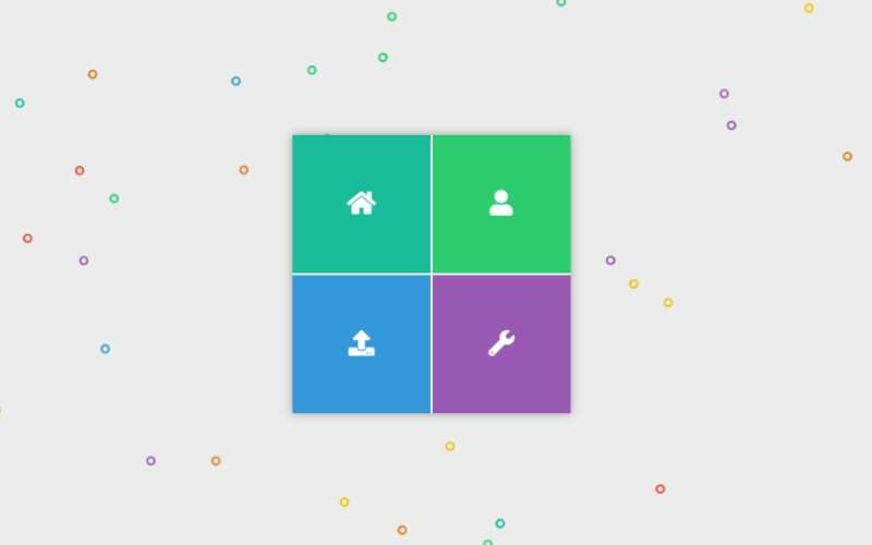
Fully Responsive CSS3 Menu: A Dash of Colors!

Imagine a menu for your admin dashboard, jazzed up with colors to make it pop. That’s what this menu brings to the table.
Mobile Menu: Stickiness on Mobile

Ever felt the need for a menu that clings onto your mobile screen? gslyle offers just that! Optimized to save that precious mobile real estate.
Pure CSS Collapsible Tree Menu: Nature’s Touch

A menu resembling a tree, by Anchen. Click and explore the branches. Made with love using HTML and CSS.
Morphing Circular Menu By Sergio: Creativity Unleashed!

Responsivity isn’t just functional; it can be a gateway to creativity. Sergio’s design is a testament to that.
Animated CSS3 Mega Menu: The Pure Blend!

HTML5 and CSS3 join hands here. Compatibility with major browsers, ease of integration, and edit-friendly.
Gooey Menu: Keeping It Light and Tasty

A delightful menu design made airy with just HTML5 and CSS3. The lighter, the better!
Pure CSS Hamburger Fold-Out Menu: The Classic Unfolding

Three dashes, a click, and voila! Erik Terwan’s fold-out magic, powered by HTML and CSS.
Off-Canvas Sidebar Menu With A Twist: Dance of Elements

A unique off-canvas menu infused with HTML, CSS, and a pinch of jQuery. Crafted by the Devilish Alchemist.
One Page Navigation CSS Menu: Seamless Flow

Alberto Hartzet’s one-page wonder, great for hopping from one section to another. Purely based on CSS transitions.
Pure CSS Fullscreen Navigation Menu: Immerse Yourself

Bask in the beauty of a menu built with just HTML5 and CSS3. Dive in and pick what resonates with your vibe.
Only CSS3 Dropdown Menu: The Pedro’s Drop

Dropdown love by Pedro Nauck. Click, and witness the cascade, all draped in white and hints of red.
Overlay CSS Menu: The Animated Overlay Saga

A creation by Thibault D that boasts an overlay menu sprinkled with animation.
Clip-path CSS Menu Concept: Fun-filled Adventures

A menu bursting with joyous animations! Perfect for a school website or lively events. Dive into the fun!
Pure CSS3 Round Menu: Sleek & Customizable

Ever wanted a menu that’s fresh and flexible? Here’s one that’s entirely built with CSS and HTML. Fancy a touch of personalization? Dive in, tweak the colors, play with combinations. The sky’s the limit.
Lavalamp CSS Menu: Dancing Colored Box

Check out this wicked design by Patak. A box that moves and grooves as you hover over links. Super smooth and catchy!
Purple Sidebar Menu: Space Saver

Got content? Need space? Say no more. Slide this purple sidebar into your site. It’s minimal, neat, and a great fit for just about any site.
Simple Active Menu: Keeping It Basic

Sometimes, simplicity wins the game. This menu’s all about that. Pure HTML and CSS goodness.
Menu With a Splash of Awesome

Hexagons and animations? Swarup Kumar Kuila is speaking my language! Dive into a menu that lights up with attention-grabbing animations.
Floating Draggable Menu: Move It Your Way

Inspired by those Facebook chat bubbles? This menu’s got that vibe. Drag. Drop. Float around.
Fullscreen Menu: Own the Screen

Big shoutout to Paul van Oijen for this. It’s bold. It’s big. It takes up your whole screen and makes a statement.
Pure CSS Menu Transition: Slide & Glide

Nathan Schmidt’s serving pure hamburger goodness with this one. Slide it, glide it, and enjoy those smooth CSS transitions.
Pull Menu: A New Interaction Concept

HTML5, SCSS, Javascript – this menu has got the whole techy cocktail. Pull it, and watch magic unfold.
Explosive Menu: Boom! Goes Dynamic

Who doesn’t love a little boom in their design? This menu, my friend, is dynamite. Click and watch it burst to life.
Vertical Dark Menu: The Mysterious Vibe

Alberto Leon’s brainchild brings some mystery to the table. Slide through a vertical, dark themed CSS menu.
CSS Menu by Adam: Pure & Simple

When you’re looking for a no-frills menu, Adam’s got you covered. A sprinkle of HTML5 and CSS3, and you’re good to go.
Off Canvas Menu: Peek-a-Boo

Here’s a menu that plays hide and seek. Hidden initially, but with a click, it’s ready to play.
CSS Swinging Panel Menu: Dance With Panels!

You ever seen panels dancing? Well, now you have! Made by Seth Abbott, this CSS menu swings down and says hello with some extra categories. Like opening a surprise box, but it’s a menu!
Burger Menu: A Hint of Android Flavour

This ain’t just a burger; it’s a burger menu with a Material Design touch. You know, that sleek Android feel? Yup, that’s the one.
Simple Radial Menu: Square-ly Bugged

Heads up! This cool radial dude has a tiny bug when you hover over buttons with square backgrounds. Just a little quirk!
CSS Mobile Fold-out: Perfect Pocket Size

Cyd Stumpel whipped up this snazzy fold-out, designed especially for your mobile. No fluff, just pure CSS goodness.
Bounce Menu: Hop to It!

Feeling bouncy? Dive into this animated delight inspired by CreativeDash.
CSS Folding Menu: Origami Vibes

Animated Creativity brings in the aesthetic pleasure of origami, but in a menu! Pure CSS magic, unfolding before you.
Colourful Flower Popup: Blooming Beauty

Click and watch it bloom! Jasper LaChance gives you a flower of menus, each petal guiding you somewhere new, all thanks to some shadowy CSS.
Quick, Easy, Fullscreen: In a Jiffy

Need something in a snap? Luigi Mannoni’s got your back with this swift, modern menu solution.
Skewed Menu: Tilt Your World

No mainstream, straight lines here! Dive into this skewed world, all made possible by CSS3.
The Circular Menu: Spin the Wheel!

Made by Mikael Ainalem, this circular delight invites you to play spin the wheel. Click, and watch the options fan out.
Pure CSS 3D Radial Menu: Dive Into the Third Dimension!

Radial menus? Cool. 3D radial menus? Insanely cool! Step into this hyperactive CSS wonder.
FAQ On CSS Menu
How do I create a responsive CSS menu?
Creating a responsive CSS menu boils down to using media queries and flexible layouts—think flexbox or grid. It’s like a dance, ensuring your menu adapts gracefully between desktops and smartphones.
Remember, we’re shooting for a design that’s roomy on a big screen yet cozy on mobile.
Can I build a dropdown menu using only CSS?
Absolutely, yes. Use the :hover or :focus-within pseudo-classes. Picture each menu item as a parent holding hands with its child dropdown. They show up to play when hovered over—pure CSS, no JavaScript involved. It’s a minimalist’s trick to keep things slick and fast.
What’s the best practice for CSS menu accessibility?
Stick to semantic HTML with <nav> and <ul>, and then pepper it with ARIA roles and properties. Key is to ensure keyboard navigability and screen reader compatibility.
By adopting these best practices, you’re inviting everyone to the party, no one left behind, which is how the web should be.
How do I animate a CSS menu?
We’re talking smooth transitions and subtle animations here. Utilize CSS properties like transition or @keyframes for those.
Add a dash of transform and opacity to menu items or dropdown effects, and you’ve got movement that’s snappy and never dizzying. Keep animations purposeful; don’t overdo the salt.
What’s the secret to a sticky CSS menu?
The position: sticky; property is your best pal. Stick it to the top. And voilà, as users scroll, the menu hangs tight, tagging along. It’s a balancing act to ensure it’s not obstructive yet remains ever-present, a guiding star through your content cosmos.
Can I use icons in my CSS menu?
For sure. Toss in SVGs or iconic fonts; they’re the confetti in your menu. They help point the way, offering visual cues that are both appealing and informative. They’re like silent shout-outs to what’s on the menu, making choices clearer at a glance.
What is a hamburger menu and how is it implemented in CSS?
The hamburger menu, three stacked lines, it’s a sandwich of possibilities. It’s your go-to for minimal real estate on mobile views. Keep it simple with a button element styled with CSS.
Transforming this icon into a navigational drawer requires some CSS wizardry and maybe a pinch of JavaScript for interaction.
How do I ensure my CSS menu is mobile-friendly?
Start with a responsive design. Use flexbox or grid systems for layout flow. Then, test your menu’s touchscreen navigation—your fingers are the judge. Optimize the size and spacing of menu items.
Nothing’s too small or too cramped. Your menu should feel like a welcome mat for fingertips.
What are CSS pre-processors and how can they be used to streamline menu creation?
Think of CSS pre-processors like Sass or LESS as your kitchen hands prepping the ingredients. They mix in variables, mixins, and functions, which transmutes into your classic CSS.
This assembly line approach streamlines the process of whipping up intricate CSS menus, making maintenance a breeze.
How does a mega menu differ from a regular dropdown menu in CSS?
Mega menus are like dropdowns on steroids—loaded with options and sometimes rich content like images. They unfold into columns of submenus upon activation, catering to websites with extensive navigation requirements.
It’s like laying out a smorgasbord when a salad won’t do. But plan carefully; a mega menu is an art and science.
Conclusion
And there it is. CSS menu mastery within reach. We’ve traversed through media queries, hover effects, and even dipped our toes into responsive design waters.
Take pride in those smooth animations and user-friendly dropdowns crafted from scratch. They’re no longer mysteries but tools in your creative arsenal. Flexbox and grid lent their robust shoulders for us to stand on, while icons sprinkled that extra dash of clarity.
As you step forward, remember the accessibility guidelines that ensure your site’s welcoming handshake to all. The magic is in details that speak in silent nods: “Yeah, this feels right.”
So, churn out those CSS menus that stick, slide, and dazzle. Put the right ingredients together, mix them well, and the results? Tantalizing digital dishes that beckon visitors to explore every corner of your site with ease and anticipation. Let that menu be where fingers pause, and minds decide, “I’ll stay a while.”
If you liked this article about CSS menus, you should check out this article about jQuery tabs.
There are also similar articles discussing CSS border animations, CSS flip cards, HTML resume templates, and CSS loaders.
And let’s not forget about articles on CSS timelines, cool CSS buttons, CSS animations libraries, and CSS masonry examples.