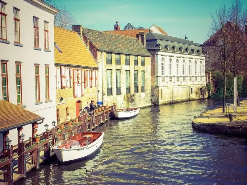
CSS Masonry: grid-lanes, Browser Support and 16 Examples

Pinterest-style card walls used to need JavaScript. CSS masonry now runs natively with display: grid-lanes, which drops each item into the lane with the most room left.

Only Safari 26.4 and later ships it unflagged (12.49% of global usage, Can I Use). Below are 16 CSS masonry examples to try and copy, then a guide to syntax, support and fallbacks.

By Bogdan Sandu · Updated October 28, 2026

Native grid-lanes with a fallback

Real masonry layouts written with display: grid-lanes, each one inside @supports so browsers without it get a working layout. Safari 26.4 and later draws the lanes; Chrome, Edge and Firefox show the fallback until they ship it.

Photo wall with grid-lanes

  • display: grid-lanes
  • @supports
  • columns fallback
Deep blue fjord between steep granite cliffs, seen from a clifftop
Cliff path above the fjord
Orange jellyfish trailing long red tentacles in deep blue water
Aquarium, blue hour tank
Downtown towers beside a lake, seen from above at sunrise
Skyline from the 94th floor
Tall waterfall dropping into a mossy green gorge in a pine forest
Falls trail, mile three
Old gabled houses and moored rowboats along a canal
Canal houses
Yellow tents in fresh snow below jagged mountain peaks
Base camp, day two
Narrow brick alley with fire escapes and towers at the far end
Back alley shortcut
Red sandstone cliffs glowing orange in low evening sun
Canyon rim at sunset
Green coastal mountains dropping steeply into a calm sea
Coast road lookout

The base layout is CSS multi-column, which every browser draws. Inside @supports (display: grid-lanes) the same wall switches to lanes, so photos are placed across the top first instead of down the first column. For a photo wall the fallback order rarely matters, which makes this the safest place to start.

View code
.ms-wall {
  width: 100%;
  columns: 3 9rem;
  column-gap: 12px;
}
.ms-wall__item {
  margin: 0 0 14px;
  break-inside: avoid;
}
.ms-wall__img {
  display: block;
  width: 100%;
  height: auto;
  aspect-ratio: 4 / 3;
  object-fit: cover;
  border-radius: 10px;
  background: #1c2333;
}
.ms-wall__img--45 {
  aspect-ratio: 4 / 5;
}
.ms-wall__img--34 {
  aspect-ratio: 3 / 4;
}
.ms-wall__img--23 {
  aspect-ratio: 2 / 3;
}
.ms-wall__img--11 {
  aspect-ratio: 1;
}
.ms-wall__item figcaption {
  padding: 7px 2px 0;
  color: #b7bfcf;
  font-size: .8rem;
  line-height: 1.35;
}
@supports (display: grid-lanes) {
  .ms-wall {
    display: grid-lanes;
    grid-template-columns: repeat(auto-fill, minmax(9rem, 1fr));
    gap: 14px 12px;
  }
  .ms-wall__item {
    margin: 0;
  }
}

Pinterest-style board with save buttons

  • grid-lanes
  • aria-pressed
  • mixed card types
Deep blue fjord between granite cliffs

Ferry routes worth the detour

Lena Ness

Packing list for three nights in the snow

  • Liner gloves and a spare pair
  • Stove, two gas canisters
  • Head torch with fresh batteries
  • Foam pad under the air mat

Tomas Kade

Gabled houses and rowboats along a canal

A slow weekend by the canals

Mira Voss

Hiker with a large backpack looking over a hazy mountain valley

Ridge walk at first light

Lena Ness

Leave the itinerary one afternoon short. That is where the trip happens.

Ana Ruel

Granite cliffs above pine trees and a calm river

Valley campsites that take walk-ins

Tomas Kade

Narrow road winding below green ridges under low cloud

Single-track roads, a driving guide

Mira Voss

Click Save on a pin.

Photo pins and text-only pins share one board, which is where masonry earns its keep: the heights differ a lot, and a regular grid would leave holes under every short card. Each Save button is a toggle with aria-pressed and a visually hidden pin name, so a screen reader hears which pin it saves.

View code
.ms-board {
  width: 100%;
  columns: 4 9rem;
  column-gap: 14px;
}
.ms-board__pin {
  position: relative;
  margin: 0 0 16px;
  break-inside: avoid;
}
.ms-board__img {
  display: block;
  width: 100%;
  height: auto;
  aspect-ratio: 4 / 3;
  object-fit: cover;
  border-radius: 16px;
}
.ms-board__img--tall {
  aspect-ratio: 3 / 4;
}
.ms-board__img--portrait {
  aspect-ratio: 2 / 3;
}
.ms-board__img--square {
  aspect-ratio: 1;
}
.ms-board__pin--note,
.ms-board__pin--quote {
  padding: 16px 14px 12px;
  border-radius: 16px;
  background: #ffe7c2;
}
.ms-board__pin--quote {
  background: #1f2a44;
  color: #f4f1ea;
}
.ms-board__title {
  margin: 8px 2px 4px;
  color: #161b26;
  font-size: .9rem;
  font-weight: 600;
  line-height: 1.3;
}
.ms-board__pin--note .ms-board__title {
  margin: 0 0 8px;
  padding-right: 48px;
  font-family: "Fraunces", serif;
  font-size: 1.05rem;
}
.ms-board__list {
  margin: 0 0 10px;
  padding-left: 18px;
  color: #3b2a12;
  font-size: .82rem;
  line-height: 1.5;
}
.ms-board__quote {
  margin: 4px 0 14px;
  padding-right: 40px;
  font-family: "Fraunces", serif;
  font-size: 1.15rem;
  line-height: 1.35;
}
.ms-board__by {
  display: flex;
  align-items: center;
  gap: 6px;
  margin: 0 2px;
  color: #4a5162;
  font-size: .78rem;
}
.ms-board__pin--quote .ms-board__by {
  color: #c9cedb;
}
.ms-board__avatar {
  display: grid;
  place-items: center;
  width: 22px;
  height: 22px;
  border-radius: 50%;
  background: #d9dde8;
  color: #161b26;
  font-size: .6rem;
  font-weight: 700;
}
.ms-board__save {
  position: absolute;
  top: 8px;
  right: 8px;
  min-width: 44px;
  min-height: 32px;
  padding: 0 12px;
  border: 0;
  border-radius: 999px;
  background: #fff;
  color: #161b26;
  font: inherit;
  font-size: .78rem;
  font-weight: 700;
  cursor: pointer;
  box-shadow: 0 2px 8px rgba(10, 14, 24, .18);
  transition: background-color .2s, color .2s;
}
.ms-board__save[aria-pressed="true"] {
  background: #161b26;
  color: #fff;
}
.ms-board__save:focus-visible {
  outline: 3px solid #2f6bff;
  outline-offset: 2px;
}
.ms-board__sr {
  position: absolute;
  width: 1px;
  height: 1px;
  overflow: hidden;
  clip-path: inset(50%);
  white-space: nowrap;
}
@supports (display: grid-lanes) {
  .ms-board {
    display: grid-lanes;
    grid-template-columns: repeat(auto-fill, minmax(9rem, 1fr));
    gap: 16px 14px;
  }
  .ms-board__pin {
    margin: 0;
  }
}

Blog card wall with a wide lead story

  • grid fallback
  • grid-column: span 2
  • @container

We rebuilt our docs site in six weeks. Here is what broke.

Search, redirects and one very old table layout. A frank look at the migration, with the numbers before and after.

Engineering · 9 min read

The case for fewer breakpoints

Intrinsic layouts handle most of the work. Keep media queries for the moments that change the content.

CSS · 5 min read

Release notes, October

  • Dark mode for embeds
  • Faster image uploads
  • Keyboard shortcuts panel

Product · 2 min read

Notes from a week of user interviews

Research · 7 min read

Hiring our first designer

What we asked, what we got wrong in the first round, and the portfolio that changed our minds about take-home tasks.

Team · 6 min read

A color token naming scheme that survived a rebrand

Design systems · 8 min read

Here the fallback is a plain CSS grid, the pattern the spec itself shows: browsers without lanes keep the reading order and accept some empty space under short cards. The lead story spans two lanes once the container is wide enough, which works the same way in grid and in grid-lanes.

View code
.ms-blog {
  width: 100%;
  container-type: inline-size;
}
.ms-blog__grid {
  display: grid;
  grid-template-columns: repeat(auto-fill, minmax(12rem, 1fr));
  gap: 16px;
  align-items: start;
}
.ms-blog__post {
  overflow: hidden;
  border: 1px solid #dfe3ec;
  border-radius: 14px;
  background: #fff;
}
.ms-blog__post--tint {
  border-color: #c9e4d6;
  background: #eaf6ef;
}
.ms-blog__img {
  display: block;
  width: 100%;
  height: auto;
  aspect-ratio: 16 / 9;
  object-fit: cover;
}
.ms-blog__body {
  padding: 16px 16px 14px;
}
.ms-blog__title {
  margin: 0 0 8px;
  color: #141925;
  font-family: "Fraunces", serif;
  font-size: 1.1rem;
  font-weight: 600;
  line-height: 1.25;
}
.ms-blog__post--lead .ms-blog__title {
  font-size: 1.35rem;
}
.ms-blog__excerpt {
  margin: 0 0 10px;
  color: #444c5c;
  font-size: .88rem;
  line-height: 1.5;
}
.ms-blog__list {
  margin: 0 0 10px;
  padding-left: 18px;
  color: #23402f;
  font-size: .86rem;
  line-height: 1.6;
}
.ms-blog__meta {
  margin: 0;
  color: #596173;
  font-size: .76rem;
}
@container (min-width: 40rem) {
  .ms-blog__post--lead {
    grid-column: span 2;
  }
}
@supports (display: grid-lanes) {
  .ms-blog__grid {
    display: grid-lanes;
  }
}

Filterable portfolio with a pinned intro card

  • grid-column: -3 / -1
  • hidden filter
  • role="status"

7 projects

Kessel & Rand

A two-person studio for identities, websites and the printed matter in between.

Harbor Oat Co.

Harbor Oat Co.

Branding, packaging

City skyline at sunrise used as the hero of a property website

Lakeline Properties

Website

Canal houses on the cover of a city guide

Small Bridges city guide

Print, editorial

Northpine

Northpine Outdoor

Branding, website

Granite valley photo in a national park booking app

Trailpass booking app

Web app

Ceramica Lume

Ceramica Lume

Branding

Highland road photo on a festival poster

Glen Road Festival poster

Print

Pick a filter.

The studio intro is placed explicitly in the last two lanes, so in grid-lanes the projects flow around it whatever the lane count. Filtering just sets the hidden attribute and the layout repacks on its own, with no layout script. The fallback grid gives the intro a full-width row instead.

View code
.ms-folio {
  width: 100%;
  container-type: inline-size;
}
.ms-folio__bar {
  display: flex;
  flex-wrap: wrap;
  align-items: center;
  justify-content: space-between;
  gap: 10px;
  margin-bottom: 16px;
}
.ms-folio__chips {
  display: flex;
  flex-wrap: wrap;
  gap: 6px;
}
.ms-folio__chip {
  min-height: 36px;
  padding: 0 14px;
  border: 1px solid #c4cad6;
  border-radius: 999px;
  background: #fff;
  color: #1b2030;
  font: inherit;
  font-size: .82rem;
  font-weight: 600;
  cursor: pointer;
  transition: background-color .2s, color .2s, border-color .2s;
}
.ms-folio__chip[aria-pressed="true"] {
  border-color: #1b2030;
  background: #1b2030;
  color: #fff;
}
.ms-folio__chip:focus-visible {
  outline: 3px solid #d9480f;
  outline-offset: 2px;
}
.ms-folio__status {
  margin: 0;
  color: #4d5466;
  font-size: .8rem;
}
.ms-folio__grid {
  display: grid;
  grid-template-columns: repeat(auto-fill, minmax(9rem, 1fr));
  gap: 18px 14px;
  align-items: start;
}
.ms-folio__item[hidden] {
  display: none;
}
.ms-folio__intro {
  grid-column: 1 / -1;
  padding: 18px;
  border-radius: 14px;
  background: #d9480f;
  color: #fff;
}
.ms-folio__studio {
  margin: 0 0 6px;
  font-family: "Fraunces", serif;
  font-size: 1.4rem;
  font-weight: 600;
}
.ms-folio__pitch {
  margin: 0;
  font-size: .88rem;
  line-height: 1.5;
}
.ms-folio__img {
  display: block;
  width: 100%;
  height: auto;
  aspect-ratio: 4 / 3;
  object-fit: cover;
  border-radius: 10px;
}
.ms-folio__img--tall {
  aspect-ratio: 3 / 4;
}
.ms-folio__img--square {
  aspect-ratio: 1;
}
.ms-folio__mark {
  display: grid;
  place-items: center;
  aspect-ratio: 4 / 3;
  padding: 12px;
  border-radius: 10px;
  font-family: "Fraunces", serif;
  font-size: 1.15rem;
  font-weight: 600;
  text-align: center;
}
.ms-folio__mark--tall {
  aspect-ratio: 4 / 5;
}
.ms-folio__mark--olive {
  background: #e4e7c9;
  color: #3b4214;
}
.ms-folio__mark--ink {
  background: #142033;
  color: #f2efe6;
  font-style: italic;
}
.ms-folio__mark--clay {
  background: #f1d5c4;
  color: #6b2b10;
}
.ms-folio__title {
  margin: 8px 0 2px;
  color: #161b26;
  font-size: .88rem;
  font-weight: 600;
}
.ms-folio__tags {
  margin: 0;
  color: #555c6e;
  font-size: .76rem;
}
@supports (display: grid-lanes) {
  .ms-folio__grid {
    display: grid-lanes;
  }
  @container (min-width: 36rem) {
    .ms-folio__intro {
      grid-column: -3 / -1;
    }
  }
}

Masonry without grid-lanes

The techniques that work in every browser today: CSS multi-column, grid with dense packing, flexbox column wrap and a small JavaScript helper. Each note says what the technique costs.

Testimonials wall with CSS columns

  • columns
  • break-inside: avoid
  • figure + blockquote

Invoices used to eat my Sunday. Now they go out on Friday afternoon and I get paid faster.

Ada KowalBakery owner

We moved four freelancers and two retainers over in an afternoon. The recurring invoice rules are the part I did not know I needed: every retainer now goes out on the first, with the right tax line, without anyone touching it.

Jonas MeierStudio director

Clean, quick, and the reminder emails sound like a person wrote them.

Priya RamanIllustrator

Support answered at 7 in the morning. On a Saturday.

Tom BrandtPlumber, two vans

My accountant asked which tool I switched to, because the exports finally match her spreadsheet columns. That alone saves us an hour every quarter.

Lucia SerraTranslator

I would like more invoice templates, but the default one already looks better than what I had.

Omar DialloPhotographer

Multi-column layout is the oldest masonry trick and works everywhere. break-inside: avoid stops a card from splitting across two columns. The cost is order: cards fill the first column top to bottom before the second starts, so the third quote you wrote may sit at the bottom of column one. For testimonials nobody minds.

View code
.ms-quotes {
  width: 100%;
  columns: 3 14rem;
  column-gap: 16px;
}
.ms-quotes__card {
  margin: 0 0 16px;
  padding: 18px;
  border-radius: 14px;
  background: #fffdf8;
  box-shadow: 0 1px 0 #e6e0d2, 0 6px 18px rgba(60, 48, 20, .07);
  break-inside: avoid;
}
.ms-quotes__card--feature {
  background: #20352b;
  box-shadow: none;
}
.ms-quotes__stars {
  margin: 0 0 8px;
  color: #a4580a;
  font-size: .9rem;
  letter-spacing: 2px;
}
.ms-quotes__off {
  color: #cfc8b8;
}
.ms-quotes__card--feature .ms-quotes__stars {
  color: #f6c453;
}
.ms-quotes__text {
  margin: 0 0 14px;
}
.ms-quotes__text p {
  margin: 0;
  color: #2a2620;
  font-family: "Fraunces", serif;
  font-size: 1rem;
  line-height: 1.5;
}
.ms-quotes__card--feature .ms-quotes__text p {
  color: #f3f1ea;
  font-size: 1.1rem;
}
.ms-quotes__who {
  display: flex;
  align-items: center;
  gap: 10px;
  font-size: .8rem;
}
.ms-quotes__who strong {
  display: block;
  color: #1f1c17;
}
.ms-quotes__who strong + span {
  color: #5c564b;
}
.ms-quotes__card--feature .ms-quotes__who strong {
  color: #fff;
}
.ms-quotes__card--feature .ms-quotes__who strong + span {
  color: #c4d3ca;
}
.ms-quotes__avatar {
  display: grid;
  flex: none;
  place-items: center;
  width: 34px;
  height: 34px;
  border-radius: 50%;
  background: #efe6d2;
  color: #4a3b1c;
  font-size: .72rem;
  font-weight: 700;
}

Recipe cards with grid-auto-flow: dense

  • grid-auto-flow: dense
  • grid-row: span 2
  • grid-auto-rows
  • Saffron chicken traybake

    50 min · Serves 4

    • Chicken thighs
    • Saffron, lemon
    • New potatoes
    • Green olives
  • Pea and mint soup

    20 min · Freezes well · Vegan

  • Plum crumble

    45 min

  • Miso glazed aubergine

    35 min · Serves 2

  • Green shakshuka

    25 min

  • Overnight focaccia

    18 h · mostly waiting

    • Strong white flour
    • Olive oil
    • Flaky salt
    • Rosemary
  • Chili oil noodles

    15 min

  • Lentil ragu

    40 min

Regular grid with fixed row heights, where tall cards span two rows and wide cards span two columns. The dense keyword lets later cards backfill the holes, which is why the small numbers (the source order) no longer read in sequence. Card heights are chosen up front, so this only suits content you control.

View code
.ms-recipes {
  display: grid;
  grid-template-columns: repeat(auto-fill, minmax(9rem, 1fr));
  grid-auto-rows: 6.75rem;
  grid-auto-flow: dense;
  gap: 12px;
  width: 100%;
  margin: 0;
  padding: 0;
  list-style: none;
}
.ms-recipes__card {
  position: relative;
  overflow: hidden;
  padding: 14px 14px 12px;
  border-radius: 14px;
  color: #1d2230;
}
.ms-recipes__card--tall {
  grid-row: span 2;
}
.ms-recipes__card--wide {
  grid-column: span 2;
}
.ms-recipes__card--saffron {
  background: #fde3bd;
}
.ms-recipes__card--herb {
  background: #d7efd9;
}
.ms-recipes__card--plum {
  background: #f0dcef;
}
.ms-recipes__card--sky {
  background: #dce8fb;
}
.ms-recipes__n {
  position: absolute;
  top: 10px;
  right: 12px;
  color: #4b5162;
  font-family: ui-monospace, Consolas, monospace;
  font-size: .72rem;
}
.ms-recipes__title {
  margin: 0 0 6px;
  padding-right: 18px;
  font-family: "Fraunces", serif;
  font-size: 1rem;
  font-weight: 600;
  line-height: 1.2;
}
.ms-recipes__meta {
  margin: 0;
  color: #464c5c;
  font-size: .76rem;
}
.ms-recipes__list {
  margin: 10px 0 0;
  padding: 10px 0 0 16px;
  border-top: 1px solid rgba(29, 34, 48, .15);
  font-size: .8rem;
  line-height: 1.6;
}

Dashboard widgets with flexbox column wrap

  • flex-flow: column wrap
  • fixed height
  • @container

Visitors

48.2k

Last 7 days

Revenue

$12,480

+8.4% vs last week

Top pages

  • /pricing2.1k
  • /blog1.7k
  • /docs1.2k
  • /signup860

Goals

Signups

326

-2.1% vs last week

Activity

  • Invoice 2041 paid2 min ago
  • New team member1 h ago
  • Plan upgraded3 h ago
  • Export finishedYesterday

A column flex container wraps into a new column only when it runs out of height, so the board needs a fixed height that matches the widgets. That works for a dashboard, where widget heights are known; it breaks the moment content can grow. A container query switches from two columns to three and sets the matching height.

View code
.ms-dash {
  width: 100%;
  container-type: inline-size;
}
.ms-dash__board {
  display: flex;
  flex-flow: column wrap;
  align-content: flex-start;
  gap: 1rem;
  height: 38.1rem;
}
.ms-dash__w {
  box-sizing: border-box;
  width: calc((100% - 1rem) / 2);
  overflow: hidden;
  padding: 14px;
  border: 1px solid #263048;
  border-radius: 14px;
  background: #151b2a;
  color: #e9edf5;
}
.ms-dash__w--10 {
  height: 10rem;
}
.ms-dash__w--12 {
  height: 12rem;
}
.ms-dash__w--14 {
  height: 14rem;
}
.ms-dash__label {
  margin: 0 0 8px;
  color: #a3adc2;
  font-size: .78rem;
  font-weight: 600;
}
.ms-dash__big {
  margin: 0 0 6px;
  font-size: 1.6rem;
  font-weight: 700;
  line-height: 1.1;
}
.ms-dash__up,
.ms-dash__down,
.ms-dash__sub {
  margin: 0;
  font-size: .76rem;
}
.ms-dash__up {
  color: #7fdcae;
}
.ms-dash__down {
  color: #ff9a8f;
}
.ms-dash__sub {
  color: #a3adc2;
}
.ms-dash__bars {
  display: block;
  width: 100%;
  height: 70px;
  margin: 8px 0;
  fill: #6fcfa0;
}
.ms-dash__rows,
.ms-dash__feed {
  margin: 0;
  padding: 0;
  list-style: none;
  font-size: .8rem;
}
.ms-dash__rows li {
  display: flex;
  justify-content: space-between;
  padding: 6px 0;
  border-bottom: 1px solid #263048;
}
.ms-dash__rows li span:last-child {
  color: #a3adc2;
}
.ms-dash__feed li {
  padding: 5px 0;
  border-bottom: 1px solid #263048;
  line-height: 1.3;
}
.ms-dash__feed span {
  display: block;
  color: #a3adc2;
  font-size: .7rem;
}
.ms-dash__goal {
  display: block;
  margin-bottom: 10px;
  color: #d5dbe7;
  font-size: .78rem;
}
.ms-dash__goal progress {
  display: block;
  width: 100%;
  height: 8px;
  margin-top: 5px;
  accent-color: #6fcfa0;
}
@container (min-width: 36rem) {
  .ms-dash__board {
    height: 25.1rem;
  }
  .ms-dash__w {
    width: calc((100% - 2rem) / 3);
  }
}

Notes board with a ResizeObserver row-span fallback

  • ResizeObserver
  • grid-row-end: span
  • CSS.supports()

Standup moved

From Monday we meet at 9:45, not 9:30.

Launch week

Copy freeze on Tuesday. Screenshots need the new pricing table.

Ideas

Saved filters. Keyboard shortcut for search. A smaller mobile header that hides on scroll down and comes back on scroll up.

Ask Ines

Font license for the app.

Bug bash results

23 issues logged, 6 blockers. Most are in the export flow, two in onboarding.

Lunch

Thursday, the noodle place.

Click Show checklist.

A small script measures each note and sets grid-row-end: span n on a grid with 4px rows, so the notes pack like masonry in any browser. It skips itself when display: grid-lanes is supported, and ResizeObserver keeps the spans right when a note grows, as the checklist toggle shows. Without JavaScript the notes still sit in a plain grid.

View code
.ms-notes {
  display: grid;
  grid-template-columns: repeat(auto-fill, minmax(9rem, 1fr));
  gap: 12px;
  align-items: start;
  width: 100%;
}
.ms-notes--js {
  grid-auto-rows: 4px;
  row-gap: 0;
}
.ms-notes__item {
  border-radius: 4px 4px 14px 4px;
  box-shadow: 0 1px 2px rgba(30, 30, 20, .12), 0 6px 14px rgba(30, 30, 20, .08);
}
.ms-notes__inner {
  padding: 14px;
  color: #26231a;
  font-size: .85rem;
  line-height: 1.45;
}
.ms-notes__inner p {
  margin: 0;
}
.ms-notes__item--sun {
  background: #fff1a6;
}
.ms-notes__item--rose {
  background: #ffd9e1;
}
.ms-notes__item--sky {
  background: #d3e9ff;
}
.ms-notes__item--mint {
  background: #d5f4d2;
}
.ms-notes__title {
  margin: 0 0 6px;
  font-size: .92rem;
  font-weight: 700;
}
.ms-notes__more {
  min-height: 32px;
  margin-top: 10px;
  padding: 0 12px;
  border: 1.5px solid #5a2433;
  border-radius: 999px;
  background: transparent;
  color: #5a2433;
  font: inherit;
  font-size: .78rem;
  font-weight: 700;
  cursor: pointer;
}
.ms-notes__more:focus-visible {
  outline: 3px solid #1d4ed8;
  outline-offset: 2px;
}
.ms-notes__list {
  margin: 10px 0 0;
  padding-left: 18px;
}
@supports (display: grid-lanes) {
  .ms-notes {
    display: grid-lanes;
  }
}

Horizontal and image masonry

Masonry does not have to run in columns. These three lay items out in rows, and handle photos whose shapes all differ.

Brick layout for a festival lineup

  • grid-template-rows lanes
  • overflow-x scroller
  • flex-wrap fallback
  • Fri 18:00Paper Lanterns
  • Fri 18:40Juno
  • Fri 19:30The Low Tide Orchestra
  • Fri 20:15Marrow
  • Fri 21:00Kite Season
  • Fri 22:30Dena and the Night Bus
  • Sat 15:00Oak
  • Sat 16:00Saltmarsh Choir
  • Sat 17:10Velvet Static
  • Sat 18:20Ferns
  • Sat 19:30Glass Harbour Sound System
  • Sat 21:00Hollis
  • Sat 22:15Northbound
  • Sun 14:00Little Weather

Scroll the lineup sideways.

Define rows instead of columns and grid-lanes turns sideways: each act goes into the row that is shortest so far, and the wall grows to the right inside a scroller. The fallback is a wrapped flex row at a fixed width, which keeps the brick look but fills one row at a time. The scroller is focusable so keyboard users can scroll it too.

View code
.ms-brick {
  width: 100%;
  overflow-x: auto;
  padding-bottom: 10px;
  border-radius: 12px;
  scrollbar-color: #4b5670 transparent;
}
.ms-brick:focus-visible {
  outline: 3px solid #f6e05e;
  outline-offset: 3px;
}
.ms-brick__lanes {
  display: flex;
  flex-wrap: wrap;
  gap: 8px;
  width: 64rem;
  margin: 0;
  padding: 0;
  list-style: none;
}
.ms-brick__act {
  box-sizing: border-box;
  width: max-content;
  height: 4.25rem;
  padding: 10px 16px;
  border-radius: 10px;
  color: #12141a;
  font-size: .95rem;
  font-weight: 700;
  line-height: 1.2;
  white-space: nowrap;
}
.ms-brick__time {
  display: block;
  margin-bottom: 4px;
  font-family: ui-monospace, Consolas, monospace;
  font-size: .72rem;
  font-weight: 500;
}
.ms-brick__act--coral {
  background: #ff9f80;
}
.ms-brick__act--lemon {
  background: #f6e27a;
}
.ms-brick__act--teal {
  background: #63d6c6;
}
.ms-brick__act--lilac {
  background: #c7a8f7;
}
.ms-brick__act--sky {
  background: #9fd2f7;
}
@supports (display: grid-lanes) {
  .ms-brick__lanes {
    display: grid-lanes;
    grid-template-rows: repeat(3, 4.25rem);
    width: max-content;
  }
}

Justified photo rows with flex-grow

  • flex-wrap
  • flex-grow by aspect ratio
  • ::after spacer
Fjord between granite cliffs under a blue sky
Waterfall dropping into a green gorge
Gabled houses and rowboats along a canal
Orange jellyfish in deep blue water
City skyline beside a lake at sunrise
Hiker looking over a hazy valley
Yellow tents in snow below jagged peaks
Red sandstone cliffs at sunset
Brick alley with fire escapes
Coastal mountains above a calm sea

Horizontal masonry in plain flexbox, in the style of photo-sharing sites. Each photo grows in proportion to its aspect ratio, so every photo in a row ends up the same height and the row fills the width exactly. An ::after spacer with a huge flex-grow keeps the last row from stretching. Order stays row by row, in every browser.

View code
.ms-just {
  display: flex;
  flex-wrap: wrap;
  gap: 6px;
  width: 100%;
  container-type: inline-size;
}
.ms-just::after {
  content: "";
  flex-grow: 1000000;
}
.ms-just__item {
  flex-grow: calc(var(--ms-w) / var(--ms-h) * 100);
  flex-basis: calc(var(--ms-w) / var(--ms-h) * clamp(6rem, 20cqi, 10rem));
  margin: 0;
}
.ms-just__item img {
  display: block;
  width: 100%;
  height: auto;
  aspect-ratio: var(--ms-w) / var(--ms-h);
  object-fit: cover;
  border-radius: 6px;
}

Mood board with mixed aspect ratios

  • aspect-ratio
  • width and height attributes
  • grid-lanes

Coastal cabin rebrand

Moodboard, round 2. Weathered, salty, quiet.

Green cliffs dropping into a calm sea

Palette

  • #1F3A4D
  • #7A9E9F
  • #E8DCC6
  • #C4572E
Blue fjord water between grey cliffs

Aa

Fraunces for headings, DM Sans for everything else.

Painted house fronts reflected in a canal Pine trees and granite walls by a river

Avoid: nautical stripes, anchors, anything that looks like a seafood chain.

Tents in snow below sharp peaks

Photos, swatches and type samples of every shape on one board. Each image carries width and height attributes plus a CSS aspect-ratio, so its box is reserved before the file arrives and a late image cannot push the layout around. Lanes where supported, multi-column everywhere else.

View code
.ms-mood {
  width: 100%;
  padding: 16px;
  box-sizing: border-box;
  border-radius: 16px;
  background: #efe9df;
  columns: 4 8rem;
  column-gap: 10px;
}
.ms-mood > * {
  margin: 0 0 10px;
  break-inside: avoid;
}
.ms-mood__img {
  display: block;
  width: 100%;
  height: auto;
  object-fit: cover;
  border-radius: 4px;
}
.ms-mood__img--34 {
  aspect-ratio: 3 / 4;
}
.ms-mood__img--169 {
  aspect-ratio: 16 / 9;
}
.ms-mood__img--11 {
  aspect-ratio: 1;
}
.ms-mood__img--23 {
  aspect-ratio: 2 / 3;
}
.ms-mood__img--43 {
  aspect-ratio: 4 / 3;
}
.ms-mood__card {
  padding: 12px;
  border-radius: 4px;
  background: #fbf8f2;
  color: #2b2a26;
  font-size: .8rem;
  line-height: 1.45;
}
.ms-mood__card p {
  margin: 0;
}
.ms-mood__card--title {
  background: #1f3a4d;
  color: #f1ece2;
}
.ms-mood__h {
  margin: 0 0 6px;
  font-family: "Fraunces", serif;
  font-size: 1.15rem;
  font-weight: 600;
  line-height: 1.2;
}
.ms-mood__label {
  margin-bottom: 8px;
  font-weight: 700;
}
.ms-mood__chips {
  display: grid;
  gap: 6px;
  margin: 0;
  padding: 0;
  list-style: none;
  font-family: ui-monospace, Consolas, monospace;
  font-size: .74rem;
}
.ms-mood__chips li {
  display: flex;
  align-items: center;
  gap: 8px;
}
.ms-mood__chips span {
  flex: none;
  width: 22px;
  height: 22px;
  border-radius: 50%;
  box-shadow: inset 0 0 0 1px rgba(0, 0, 0, .15);
}
.ms-mood__aa {
  font-family: "Fraunces", serif;
  font-size: 2.6rem;
  line-height: 1;
}
.ms-mood__card--type .ms-mood__aa {
  margin-bottom: 6px;
}
.ms-mood__card--note {
  background: #c4572e;
  color: #fff;
}
@supports (display: grid-lanes) {
  .ms-mood {
    display: grid-lanes;
    grid-template-columns: repeat(auto-fill, minmax(8rem, 1fr));
    gap: 10px;
  }
  .ms-mood > * {
    margin: 0;
  }
}

Order, responsiveness and behavior

The parts that screenshots do not show: tab order, column counts that follow the container, content that arrives later, and the fit-tolerance setting.

Tab order in columns versus lanes

  • focus order
  • columns vs grid-lanes
  • aria-pressed

Multi-column

Tab runs down each column

Grid lanes

Tab runs across the top first

Showing the grid fallback: same order, gaps under short cards

Press Tab through the cards, or click Play tab order.

The same seven cards, in the same DOM order, in two layouts. Multi-column puts 1, 2 and 3 down the first column, so Tab runs down the page and then jumps back up. Grid lanes (or the plain grid fallback) puts 1, 2 and 3 across the top, so focus follows the eye far more closely. Lanes still backtrack a little once heights differ, which is what reading-flow is meant to fix later.

View code
.ms-order {
  display: grid;
  justify-items: center;
  gap: 16px;
  width: 100%;
}
.ms-order__panels {
  display: grid;
  grid-template-columns: repeat(auto-fit, minmax(min(100%, 15rem), 1fr));
  gap: 16px;
  width: 100%;
}
.ms-order__panel {
  padding: 14px;
  border-radius: 14px;
  background: #fff;
}
.ms-order__h {
  margin: 0;
  color: #151a26;
  font-size: .95rem;
}
.ms-order__rule {
  margin: 2px 0 12px;
  color: #535a6b;
  font-size: .78rem;
}
.ms-order__rule--fallback {
  display: none;
}
.ms-order__cols {
  columns: 3;
  column-gap: 8px;
}
.ms-order__cols .ms-order__tile {
  margin-bottom: 8px;
  break-inside: avoid;
}
.ms-order__lanes {
  display: grid;
  grid-template-columns: repeat(3, 1fr);
  gap: 8px;
  align-items: start;
}
.ms-order__tile {
  display: flex;
  align-items: flex-start;
  justify-content: flex-start;
  box-sizing: border-box;
  width: 100%;
  padding: 8px 10px;
  border: 0;
  border-radius: 10px;
  background: #e8ebf3;
  color: #1c2233;
  font: inherit;
  font-family: "Fraunces", serif;
  font-size: 1.3rem;
  font-weight: 600;
  cursor: pointer;
  transition: background-color .2s, color .2s;
}
.ms-order__tile--s {
  height: 3rem;
}
.ms-order__tile--m {
  height: 4.5rem;
}
.ms-order__tile--l {
  height: 6rem;
}
.ms-order__tile.is-done {
  background: #c9d6f6;
}
.ms-order__tile.is-on,
.ms-order__tile:focus-visible {
  background: #2448c8;
  color: #fff;
  outline: 3px solid #f2a33a;
  outline-offset: 2px;
}
.ms-order__play {
  min-height: 44px;
  padding: 0 22px;
  border: 0;
  border-radius: 999px;
  background: #151a26;
  color: #fff;
  font: inherit;
  font-weight: 700;
  cursor: pointer;
}
.ms-order__play:focus-visible {
  outline: 3px solid #2448c8;
  outline-offset: 3px;
}
@supports not (display: grid-lanes) {
  .ms-order__rule--lanes {
    display: none;
  }
  .ms-order__rule--fallback {
    display: block;
  }
}
@supports (display: grid-lanes) {
  .ms-order__lanes {
    display: grid-lanes;
  }
}

Column counts from container queries

  • @container
  • custom property count
  • range input
100%

Columns: ?

Container queries in production

Ana Ruel · 25 min

Fonts

Tomas Kade · 10 min

Keynote: the next ten years of layout on the web

Mira Voss · 45 min

Design tokens without the tears

Jonas Meier · 30 min

Lightning round

Five speakers · 25 min

Accessible charts: patterns that hold up with a screen reader

Priya Raman · 30 min

Q and A

Panel · 20 min

Drag the slot width slider.

auto-fill already adapts to width, but sometimes the design calls for exact counts at exact sizes. Container queries set one custom property, --ms-n, from the width of the slot the component sits in, and both the multi-column fallback and the grid-lanes template read it. Drag the slider to resize the slot: the count changes with the container, not the viewport.

View code
.ms-cq {
  width: 100%;
}
.ms-cq__controls {
  display: flex;
  flex-wrap: wrap;
  align-items: center;
  gap: 8px 12px;
  margin-bottom: 14px;
  color: #232838;
  font-size: .85rem;
}
.ms-cq__label {
  font-weight: 700;
}
.ms-cq__range {
  flex: 1 1 8rem;
  min-width: 0;
  min-height: 24px;
  accent-color: #0f766e;
}
.ms-cq__range:focus-visible {
  outline: 3px solid #0f766e;
  outline-offset: 3px;
}
.ms-cq__out {
  min-width: 3ch;
  font-family: ui-monospace, Consolas, monospace;
}
.ms-cq__count {
  margin: 0;
  padding: 3px 10px;
  border-radius: 999px;
  background: #d4f1ec;
  color: #0b4d47;
  font-weight: 700;
}
.ms-cq__slot {
  box-sizing: border-box;
  padding: 10px;
  border: 2px dashed #9aa3b5;
  border-radius: 14px;
  container-type: inline-size;
}
.ms-cq__grid {
  --ms-n: 1;
  columns: var(--ms-n);
  column-gap: 10px;
}
.ms-cq__talk {
  margin: 0 0 10px;
  padding: 12px;
  border-left: 4px solid #0f766e;
  border-radius: 8px;
  background: #fff;
  break-inside: avoid;
}
.ms-cq__talk--key {
  border-left-color: #b45309;
  background: #fff7eb;
}
.ms-cq__talk h4 {
  margin: 0 0 4px;
  color: #161b26;
  font-size: .88rem;
  line-height: 1.3;
}
.ms-cq__talk p {
  margin: 0;
  color: #525a6b;
  font-size: .75rem;
}
@container (min-width: 17rem) {
  .ms-cq__grid {
    --ms-n: 2;
  }
}
@container (min-width: 30rem) {
  .ms-cq__grid {
    --ms-n: 3;
  }
}
@container (min-width: 42rem) {
  .ms-cq__grid {
    --ms-n: 4;
  }
}
@supports (display: grid-lanes) {
  .ms-cq__grid {
    display: grid-lanes;
    grid-template-columns: repeat(var(--ms-n), 1fr);
    gap: 10px;
  }
  .ms-cq__talk {
    margin: 0;
  }
}

Story feed with Load more

  • <template> clones
  • focus management
  • grid fallback

Driving the single-track roads

Travel · 6 min

What a ranger wishes every hiker knew before setting out

Interview · 9 min

Alone on the ridge

Essay · 4 min

Rowing the old canals

Travel · 5 min

Click Load more stories.

New stories are cloned from a template element and appended, and with grid-lanes they drop into the shortest lanes without moving anything already on screen. The fallback is a plain grid rather than multi-column on purpose: columns would reshuffle every card each time the list grows. Focus moves to the first new story so keyboard users carry on reading where the new content starts.

View code
.ms-feed {
  width: 100%;
}
.ms-feed__grid {
  display: grid;
  grid-template-columns: repeat(auto-fill, minmax(9rem, 1fr));
  gap: 16px 12px;
  align-items: start;
}
.ms-feed__story {
  overflow: hidden;
  border-radius: 12px;
  background: #fff;
  box-shadow: 0 1px 2px rgba(20, 24, 34, .1);
}
.ms-feed__story:focus-visible {
  outline: 3px solid #7c3aed;
  outline-offset: 2px;
}
.ms-feed__story img {
  display: block;
  width: 100%;
  height: auto;
  aspect-ratio: 4 / 3;
  object-fit: cover;
}
.ms-feed__story img.ms-feed__tall {
  aspect-ratio: 3 / 4;
}
.ms-feed__story--text {
  padding-top: 6px;
  background: #ede6fb;
}
.ms-feed__story h4 {
  margin: 10px 12px 4px;
  color: #171b27;
  font-size: .9rem;
  line-height: 1.3;
}
.ms-feed__story--text h4 {
  font-family: "Fraunces", serif;
  font-size: 1.05rem;
}
.ms-feed__story p {
  margin: 0 12px 12px;
  color: #535a6b;
  font-size: .75rem;
}
.ms-feed__foot {
  display: grid;
  justify-items: center;
  gap: 6px;
  margin-top: 18px;
}
.ms-feed__btn {
  min-height: 44px;
  padding: 0 22px;
  border: 2px solid #5b21b6;
  border-radius: 999px;
  background: #fff;
  color: #5b21b6;
  font: inherit;
  font-weight: 700;
  cursor: pointer;
}
.ms-feed__btn:disabled {
  border-color: #b9b2c9;
  color: #5d566b;
  cursor: default;
}
.ms-feed__btn:focus-visible {
  outline: 3px solid #7c3aed;
  outline-offset: 3px;
}
.ms-feed__status {
  min-height: 1.2em;
  margin: 0;
  color: #4a5161;
  font-size: .8rem;
}
@supports (display: grid-lanes) {
  .ms-feed__grid {
    display: grid-lanes;
  }
}

fit-tolerance playground

  • fit-tolerance
  • flow-tolerance alias
  • :has()
fit-tolerance

Your browser draws grid lanes, so the numbered boxes move between lanes as you switch.

No grid-lanes in this browser, so you see the grid fallback and the setting has no effect. Open the page in Safari 26.4 or later to watch the boxes move.

  1. 1
  2. 2
  3. 3
  4. 4
  5. 5
  6. 6
  7. 7
  8. 8
  9. 9

Pick a tolerance, then watch the numbers.

fit-tolerance sets how close two lanes must be to count as tied. At 0 every item chases the strictly shortest lane; at normal (1em) small differences are ignored and items keep moving forward; at infinite the lane lengths are ignored and items go strictly in order. Safari 26.4 shipped the property as flow-tolerance and Safari 27.2 renamed it, so the demo sets both names.

View code
.ms-tol {
  --ms-tol: normal;
  width: 100%;
  max-width: 30rem;
}
.ms-tol:has(input[value="zero"]:checked) {
  --ms-tol: 0px;
}
.ms-tol:has(input[value="wide"]:checked) {
  --ms-tol: 3em;
}
.ms-tol:has(input[value="infinite"]:checked) {
  --ms-tol: infinite;
}
.ms-tol__set {
  display: flex;
  flex-wrap: wrap;
  gap: 6px;
  margin: 0 0 10px;
  padding: 0;
  border: 0;
}
.ms-tol__legend {
  width: 100%;
  margin-bottom: 6px;
  padding: 0;
  color: #1a1f2c;
  font-family: ui-monospace, Consolas, monospace;
  font-size: .85rem;
  font-weight: 700;
}
.ms-tol__opt {
  display: inline-flex;
  align-items: center;
  gap: 6px;
  min-height: 36px;
  padding: 0 12px;
  border: 1px solid #c3c9d6;
  border-radius: 8px;
  background: #fff;
  color: #1a1f2c;
  font-family: ui-monospace, Consolas, monospace;
  font-size: .8rem;
  cursor: pointer;
}
.ms-tol__opt:has(:checked) {
  border-color: #0e7490;
  background: #e0f4f8;
}
.ms-tol__opt input {
  accent-color: #0e7490;
}
.ms-tol__opt:has(:focus-visible) {
  outline: 3px solid #0e7490;
  outline-offset: 2px;
}
.ms-tol__msg {
  margin: 0 0 12px;
  color: #474e5f;
  font-size: .78rem;
  line-height: 1.45;
}
.ms-tol__msg--yes {
  display: none;
}
.ms-tol__lanes {
  display: grid;
  grid-template-columns: repeat(3, 1fr);
  gap: 6px;
  align-items: start;
  margin: 0;
  padding: 0;
  list-style: none;
}
.ms-tol__lanes li {
  display: grid;
  place-items: center;
  height: calc(var(--ms-h) * 1rem);
  border-radius: 8px;
  background: #164e63;
  color: #fff;
  font-family: "Fraunces", serif;
  font-size: 1.25rem;
  font-weight: 600;
}
.ms-tol__lanes li:nth-child(3n + 2) {
  background: #0e7490;
}
.ms-tol__lanes li:nth-child(3n) {
  background: #155e75;
}
@supports (display: grid-lanes) {
  .ms-tol__msg--yes {
    display: block;
  }
  .ms-tol__msg--no {
    display: none;
  }
  .ms-tol__lanes {
    display: grid-lanes;
    flow-tolerance: var(--ms-tol);
    fit-tolerance: var(--ms-tol);
  }
}

What Is CSS Masonry?

Items of different heights get packed into parallel lanes, and shorter items leave no gaps beneath them.

In the W3C editor’s draft of CSS Grid Layout Module Level 3 (21 October 2026), the official name is grid lanes layout. Masonry layout and waterfall layout are listed as alternative names.

Unlike a regular grid layout, rows do not line up across lanes. Each item drops into whichever lane has the most room left.

The draft’s reference example is the Pinterest search results page, where every card has a different height. Earlier CSS could not produce that layout unless item heights were known up front or JavaScript measured them, the draft states.

Masonry, waterfall and brick layouts

Masonry is the umbrella term and usually implies columns. Waterfall means the same thing in practice, with lanes as columns and items stacking downward. Brick flips the direction: lanes become rows and items run left to right.

The spec’s own name, grid lanes, covers both directions.

How the syntax changed

Mozilla’s team wrote the original Grid Level 3 draft in 2019 and 2020, and the feature reached Firefox Nightly in very early 2020, according to WebKit’s January 2026 post. Chrome’s team later argued for a separate display value instead.

ProposalSyntaxStatus
Mozilla (2019 to 2020)grid-template-rows: masonryOn by default only in Firefox Nightly, removed in Firefox 159 (27 October 2026)
Chrome teamdisplay: masonry with masonry-template-tracks (the Chrome and Edge 140 flagged build reuses grid-template-* and adds masonry-direction)Alternative proposal, not used by the current draft
WebKit and CSS Working Groupdisplay: grid-lanesIn the Level 3 draft, shipped in Safari 26.4

Tutorials built on grid-template-rows: masonry or display: masonry describe syntax that no browser ships unflagged. Worth knowing before you copy anything from an older post.

How Does CSS Masonry Place Each Item?

Each item goes into the lane that is currently least filled, taken in DOM order.

The W3C draft keeps a running position for every lane. For each item, the browser picks the lane where it would sit highest, then advances that lane by the item’s height plus the gap.

Multi-column layout and wrapped flex columns fill the first column to the bottom before spilling into the second, so reading order runs down each column.

Grid lanes picks a lane for every new item instead. Earlier items stay nearer the top, and scrolling down reaches later items.

Flow-tolerance and tie-breaking

The default tie threshold is 1em. Lanes within 1em of the shortest one count as equal, and the browser takes the first tied lane after the previous item, so placement keeps moving forward.

At zero tolerance, WebKit’s highway drawing places the second group of items as 7, 5, 6. With a tolerance of half an item height, the groups read 1 to 4, then 5 to 7.

Setting the value to normal resolves to 1em in grid lanes and 0 in every other layout mode, while a length or percentage sets your own tie distance. Infinite gives strict source order and ignores lane lengths entirely.

The draft warns that infinite can put consecutive items far apart vertically. It suggests a large finite value such as 10em or 50vh instead.

WebKit’s introductory post (19 December 2025) adds the keyboard side. A value too high makes focus jump up and down the layout, and one too low makes it jump sideways more than needed.

The property has been renamed along the way. It was item-tolerance in Safari Technology Preview 234, the CSS Working Group renamed it flow-tolerance on 7 January 2026, and Safari 26.4 shipped that name. A later CSSWG rename made it fit-tolerance, which the 21 October 2026 editor’s draft lists and Safari 27.2 (26 October 2026) uses, keeping flow-tolerance as a deprecated alias for now.

Check which name your target browser accepts before shipping, or declare both.

Writing a Masonry Layout with display: grid-lanes

A basic masonry layout is a grid-lanes container with columns defined and a gap. That’s all it takes.

.gallery {
  display: grid-lanes;
  grid-template-columns: repeat(auto-fill, minmax(250px, 1fr));
  gap: 16px;
}

That is the example from WebKit’s introductory post, and the steps below unpack it.

  1. Place all items as direct children of one container. Only direct children become lane items.
  2. Set display: grid-lanes on that container. Use inline-grid-lanes when the container should be inline-level.
  3. Define the lanes with grid-template-columns. The repeat(auto-fill, minmax(250px, 1fr)) value makes columns at least 250px wide and lets the browser decide how many fit.
  4. Add gap. One value spaces both the lanes and the items inside each lane.

Because the browser sets the lane count from the container width, the layout needs no breakpoints written with media queries, WebKit notes.

Switching to a brick layout

Define rows instead of columns and the lanes run horizontally.

.gallery {
  display: grid-lanes;
  grid-template-rows: 1fr 1fr 1fr;
}

The browser reads the direction from whichever template you wrote. The orientation property’s initial value, normal, makes that call.

Define both templates and columns win, per the draft. Rows only become the lane axis when grid-template-columns is none.

The property that will control orientation explicitly is still undecided in the 21 October 2026 draft. The options on the table are reusing grid-auto-flow or adding a new property such as grid-lanes-direction. Since normal stays the initial value either way, nothing here blocks you from writing layouts today.

If a layout refuses to flip, check that grid-template-columns is none.

Lane Sizing, Spanning and Explicit Placement

Lane sizes work like track sizes in CSS Grid, so fixed lengths, fr units, minmax() and repeat() all apply.

Since auto-fill derives the lane count from the container width, the layout follows the viewport without extra rules. That covers most responsive design needs.

Varying lane sizes

The everyday choice is repeat(auto-fill, minmax(250px, 1fr)), which gives equal lanes at least 250px wide.

If you want the first and last lanes to stay narrow while the lane count changes, repeat(auto-fill, minmax(8rem, 1fr) minmax(16rem, 2fr)) minmax(8rem, 1fr) does that.

Lanes sized to their content work too. WebKit’s demo uses repeat(auto-fill, minmax(max-content, 24ch)) for a footer mega menu.

Level 3 relaxes repeat() so auto-fill accepts tracks with no definite size, which the max-content pattern above relies on.

One documented constraint applies to intrinsic lanes. Auto-placed items contribute to the size of every lane, not only the one they land in, so a single wide item widens each content-sized lane. The draft guarantees an exact fit only when all items are the same size or all are placed explicitly.

Spanning items

WebKit’s newspaper demo spans the first teaser across 4 lanes and teasers 2 to 8 across 2 lanes, but only above a viewport width of 1250px. To do the same, set grid-column: span n on the item and the others pack around it.

Spanning has a documented failure mode. A spanner that does not fit in the remaining empty lanes drops into the first lane where it fits, and later single-lane items rise above it, breaking the natural reading order (W3C draft).

The draft suggests a tolerance large enough to ignore tiny height differences, and placing related items explicitly so they stay grouped. It also says to avoid mixing span sizes with very uneven item heights.

Explicit placement

An item with a definite lane position goes exactly there, and auto-placed items flow around it. WebKit’s museum demo pins the site header to the last two lanes with grid-column: -3 / -1, whatever the lane count.

Placement works along the lane axis only. The grid-column-* and grid-row-* properties position items across lanes, while the position within a lane is always decided by the browser.

Which Browsers Support CSS Masonry?

Only Safari supports CSS masonry without a flag, starting with Safari 26.4 on macOS and iOS (released 24 March 2026).

Chrome, Edge and Firefox keep it behind flags, according to the Can I Use table read on 27 October 2026.

Safari 26.4 and later covers Safari on iOS 26.4 and later too (WebKit, 24 March 2026). Global usage sits at 12.49% (Can I Use, checked 27 October 2026).

Chrome and Edge have it disabled by default from version 140, with the flagged build announced in July 2025. Firefox kept the earlier syntax behind a flag from version 77, and Firefox 159 replaced it with display: grid-lanes, still off by default outside Nightly.

Treat the usage share as a dated snapshot and recheck it before sizing a fallback.

Chrome, Edge and Firefox

WebKit wrote in January 2026 that Edge, Chrome and Firefox had all made significant progress, so arrival would come sooner than expected. As of October 2026, none of them has taken the feature out of its flag.

Chromium engineers at Edge were moving their flagged build to the finalized syntax in January, and by late June 2026 published demos already ran on display: grid-lanes with the Chrome or Edge flag on (Manuel Matuzović, 24 June 2026). Current Chromium source also parses fit-tolerance, still as an experimental feature.

Firefox changed course this autumn. WebKit’s January 2026 guidance still told Firefox testers to use the original grid-template-*: masonry syntax, but Firefox 159 (27 October 2026) removed that syntax. It now parses display: grid-lanes behind the layout.css.display-grid-lanes.enabled preference in about:config, on by default only in Nightly, and fit-tolerance parsing landed in Firefox 160 builds.

Until the flags come off, cross-browser compatibility decides how you can use it. Treat it as an enhancement, never as the only layout.

Shipping Masonry Today with a Fallback

Safari 26.4 gets lanes. Everyone else gets either a plain CSS Grid layout or a JavaScript library, and WebKit’s January 2026 guidance covers both.

Grid lanes over a CSS Grid base

Declare display twice. Browsers that do not recognize grid-lanes discard the second declaration and keep grid.

.gallery {
  display: grid;
  display: grid-lanes;
  grid-template-columns: repeat(auto-fill, minmax(200px, 1fr));
  gap: 1lh;
}

The W3C draft shows the same pattern and notes the fallback has more vertical gaps under shorter items.

WebKit adds an @supports not (display: grid-lanes) block that crops every image to a square with aspect-ratio and object-fit: cover, limits headlines to one line and teasers to three lines. The result looks tidy, but the cropped and truncated content is simply missing, as WebKit’s own side-by-side comparison shows.

Accept the gaps for editorial cards where cropping changes meaning. Crop for product tiles where a uniform shape is the design anyway.

JavaScript only where lanes are missing

if (!CSS.supports('display', 'grid-lanes')) {
  /* load the library here */
}

CSS.supports returns false in browsers without grid-lanes, so that check decides whether to pull in masonry-layout. Keep the native rules inside @supports (display: grid-lanes) and give other browsers the item margins the library needs.

Structured this way, the library code can sit untouched until every browser supports lanes, and users on supporting browsers never download it.

Testing both paths

The Grid Inspector in Safari 26.4’s Web Inspector overlays order numbers on grid lanes items, so you can see the placement sequence.

Open the page in a browser without support as well, since WebKit recommends confirming that the JavaScript path lays out correctly there.

Choosing a Masonry Technique

Default to grid-lanes with a fallback. Column-count is fine when item order does not matter, and a library only earns its place when the layout has to filter or sort.

Smashing Magazine’s May 2025 survey of workarounds covered manual row-span hacks and CSS columns alongside JavaScript libraries. The table sets those against grid-lanes.

TechniqueItem orderJavaScript neededMain failure mode
grid-lanesDOM order, placed across lanesNoSafari 26.4 and later only
CSS multi-column (column-count)Down each columnNoCards split across columns without break-inside: avoid
Flexbox column wrapDown each columnNoWraps only when the container height is constrained
CSS Grid with row spansDOM orderUsuallySpans hand-tuned to item heights
JS library (Masonry, Isotope)DOM orderYesOverlap when media loads late; Isotope is paid for commercial work

When column-count is enough

No JavaScript is needed and every browser handles it. Adding break-inside: avoid keeps a card from splitting between columns (MDN).

The downside is order. Items fill each column top to bottom, so tab order runs down the first column before the second.

WebKit points out the two layouts look alike but differ in tab order, scanability and user experience. Column-count suits image walls where nobody cares which tile is first.

When a JavaScript library still wins

A library still wins when the layout must filter or sort items.

Masonry places items by available vertical space using JavaScript, and Isotope adds sorting and filtering on top, according to David DeSandro’s documentation.

Masonry is MIT-licensed. Isotope needs a purchased license for commercial projects, though open-source use is free.

Both libraries share a quirk. Items overlap when images, web fonts or embedded buttons change size after layout, and the fix is to run layout again once media has loaded, for example with imagesLoaded.

When CSS Masonry Does Not Fit

Skip masonry when the order of items carries meaning. Leaderboards, step lists and timelines depend on sequence, and a lane-by-lane layout hides that sequence. A single column or a regular grid keeps it.

It’s also a poor fit when item heights barely differ. A plain responsive grid is simpler and works everywhere, so masonry earns its cost only when heights vary widely.

Late-loading media is the other risk. Heights drive placement, so an image that loads late can move the items placed after it. Reserve space with aspect-ratio or width and height attributes.

If design sign-off requires identical rendering in every browser, masonry also fails that test, because only Safari 26.4 and later draws the lanes layout.

Source order, focus order and reading-flow

Grid lanes leaves DOM order untouched, so a keyboard user tabs in source order while the eye reads lane by lane.

WCAG 2.2 Success Criterion 2.4.3 Focus Order (Level A) requires focus to follow an order that preserves meaning and operability. The W3C’s Understanding document, says focus order does not have to match the visual layout but should reinforce the reading order the layout implies.

That is the baseline tier of web accessibility conformance. The same document lists making the DOM order match the visual order as a sufficient technique, and lanes bend that match by design.

The W3C draft points to reading-flow as the remedy for items without an inherent order. The property sets the order in which flex or grid items reach speech and focus navigation, and web-features lists it in Chrome 137 (27 May 2025) and Edge 137 (29 May 2025) but not in Firefox or Safari.

That leaves a gap. Safari ships grid lanes without reading-flow. Chrome and Edge ship reading-flow, but grid lanes sits behind a flag there, and as of June 2026 reading-flow did not yet apply to grid lanes containers (Manuel Matuzović).

No browser has both working together.

CSS Masonry FAQ

When will Chrome and Firefox ship CSS masonry?

Neither browser has published a stable release date in the sources checked as of 27 October 2026. WebKit’s January 2026 guidance points readers to Chrome Status for Chromium updates, and Edge engineers were moving the flagged build to the finalized syntax.

How does CSS masonry handle infinite scroll?

Appended items continue in the shortest lane, in DOM order, so the browser needs no JavaScript layout step. WebKit’s introductory post says a page can keep loading content as the user scrolls.

Your script still fetches and inserts the new items.

Can I use CSS masonry in WordPress?

Yes, anywhere that accepts CSS, such as a theme stylesheet or the Customizer’s Additional CSS panel.

Browser support limits stay the same, so wrap the rules in @supports (display: grid-lanes) and keep a base layout for other browsers.

Is subgrid supported in a masonry layout?

Yes, but only along the lane axis, according to the W3C draft of 21 October 2026.

Subgridding the stacking axis converts the nested grid into a lanes container instead.

Does the order property work in CSS masonry?

Yes. The W3C draft says all properties behave as in a regular grid container unless stated otherwise, so order sets a different layout order.

The same reordering and accessibility caveats as in grid and flex apply.

Moving from a JavaScript Library to CSS Masonry

A JavaScript masonry library moves to CSS masonry safely as a fallback, not a deletion. Lanes go first, and the library loads only where display: grid-lanes is missing.

Audit the items whose position carries meaning before anything else, because source order is the one change a screenshot will not reveal. After that, gate the library behind a feature check and test in Safari 26.4 and one unsupported browser.

The price is two layout paths in one codebase, which means two paths to test on every release.

Delete the library once Chrome, Edge and Firefox list grid-lanes as supported (position verified 27 October 2026).

Photo walls are the usual first project, and a CSS gallery is the natural next build.