CSS Card Hover Effects: 16 Examples That Stay Smooth

CSS card hover effects need no JavaScript. Put a transition on the card's resting rule, change transform or box-shadow inside :hover, and the card moves. Touch screens only emulate hover, so treat the effect as a bonus, never the only signal.

Below are 16 CSS card hover effects you can try and copy, followed by a guide to timing, performance, accessibility and touch.

By Bogdan Sandu · Updated October 28, 2026

Lift, zoom and overlay effects

The four card hovers people build most, written the way that stays smooth: shadows faded in on a pre-rendered layer, zoom kept inside a clipped frame, and every state also reached by keyboard focus.

Product card lift with a pre-rendered shadow

  • opacity on ::before
  • translateY
  • :focus-within

Hover a card, or press Tab to reach its link.

The deep shadow is painted once on a ::before layer behind the card and only its opacity changes, so the browser never repaints a growing blur. The lift itself is a transform inside a reduced-motion query, while the shadow fade stays for everyone.

View code
.hc-lift {
  position: relative;
  isolation: isolate;
  width: min(100%, 290px);
  border-radius: 20px;
  background: #fffaf5;
  color: #2b1d14;
  box-shadow: 0 1px 2px rgba(43, 29, 20, .08), 0 3px 8px rgba(43, 29, 20, .06);
}
.hc-lift::before {
  content: "";
  position: absolute;
  inset: 0;
  z-index: -1;
  border-radius: inherit;
  box-shadow: 0 24px 44px -14px rgba(150, 62, 22, .45), 0 8px 18px rgba(43, 29, 20, .1);
  opacity: 0;
  transition: opacity .3s ease-out;
}
.hc-lift__media {
  margin: 8px 8px 0;
  aspect-ratio: 4 / 3;
  border-radius: 14px;
  overflow: hidden;
}
.hc-lift__media img {
  display: block;
  width: 100%;
  height: 100%;
  object-fit: cover;
}
.hc-lift__body {
  padding: 14px 18px 18px;
}
.hc-lift__title {
  margin: 0;
  font-family: inherit;
  font-size: 18px;
  font-weight: 700;
  line-height: 1.3;
  letter-spacing: -.01em;
  color: inherit;
}
.hc-lift__link {
  color: inherit;
  text-decoration: none;
}
.hc-lift__link::after {
  content: "";
  position: absolute;
  inset: 0;
  border-radius: 20px;
}
.hc-lift__link:focus-visible {
  outline: none;
}
.hc-lift__link:focus-visible::after {
  outline: 3px solid #b4461b;
  outline-offset: 4px;
}
.hc-lift__spec {
  margin: 4px 0 0;
  font-size: 14px;
  color: #6b5547;
}
.hc-lift__row {
  display: flex;
  align-items: baseline;
  justify-content: space-between;
  gap: 12px;
  margin: 14px 0 0;
}
.hc-lift__price {
  font-size: 20px;
  font-weight: 700;
  color: #b4461b;
}
.hc-lift__stock {
  font-size: 13px;
  color: #2f6b3a;
}
.hc-lift:focus-within::before {
  opacity: 1;
}
@media (hover: hover) {
  .hc-lift:hover::before {
    opacity: 1;
  }
}
@media (prefers-reduced-motion: no-preference) {
  .hc-lift {
    transition: transform .3s cubic-bezier(.2, .7, .3, 1);
  }
  .hc-lift:focus-within {
    transform: translateY(-6px);
  }
}
@media (hover: hover) and (prefers-reduced-motion: no-preference) {
  .hc-lift:hover {
    transform: translateY(-6px);
  }
}

Blog card with the photo zooming inside its frame

  • scale on the img
  • overflow: hidden
  • container query

Hover a card, or press Tab to reach its link.

Only the photo scales, inside a frame with overflow: hidden, so the card edges and the text never move. A container query switches the card to a side-by-side layout once its wrapper is wide enough, and the title color change works with or without motion.

View code
.hc-zoom-wrap {
  width: min(100%, 580px);
  container-type: inline-size;
}
.hc-zoom {
  position: relative;
  display: grid;
  border: 1px solid #dfe4ee;
  border-radius: 16px;
  background: #fff;
  color: #14213d;
}
.hc-zoom__frame {
  aspect-ratio: 16 / 10;
  overflow: hidden;
  isolation: isolate;
  border-radius: 15px 15px 0 0;
}
.hc-zoom__frame img {
  display: block;
  width: 100%;
  height: 100%;
  object-fit: cover;
}
.hc-zoom__body {
  padding: 18px 20px 20px;
}
.hc-zoom__title {
  margin: 0;
  font-family: inherit;
  font-size: 19px;
  font-weight: 700;
  line-height: 1.3;
  letter-spacing: -.01em;
  color: inherit;
}
.hc-zoom__link {
  color: inherit;
  text-decoration: none;
  transition: color .2s ease-out;
}
.hc-zoom__link::after {
  content: "";
  position: absolute;
  inset: 0;
  border-radius: 16px;
}
.hc-zoom__link:focus-visible {
  outline: none;
}
.hc-zoom__link:focus-visible::after {
  outline: 3px solid #1d4ed8;
  outline-offset: 3px;
}
.hc-zoom__excerpt {
  margin: 8px 0 0;
  font-size: 15px;
  line-height: 1.55;
  color: #4a5568;
}
.hc-zoom__meta {
  margin: 12px 0 0;
  font-size: 13px;
  color: #5b6474;
}
@container (min-width: 480px) {
  .hc-zoom {
    grid-template-columns: 220px 1fr;
    align-items: center;
  }
  .hc-zoom__frame {
    height: 100%;
    aspect-ratio: auto;
    border-radius: 15px 0 0 15px;
  }
}
.hc-zoom:focus-within .hc-zoom__link {
  color: #1d4ed8;
}
@media (hover: hover) {
  .hc-zoom:hover .hc-zoom__link {
    color: #1d4ed8;
  }
}
@media (prefers-reduced-motion: no-preference) {
  .hc-zoom__frame img {
    transition: transform .6s cubic-bezier(.2, .7, .3, 1);
  }
  .hc-zoom:focus-within .hc-zoom__frame img {
    transform: scale(1.08);
  }
}
@media (hover: hover) and (prefers-reduced-motion: no-preference) {
  .hc-zoom:hover .hc-zoom__frame img {
    transform: scale(1.08);
  }
}

Travel card with details sliding up

  • translateY with calc()
  • hover and pointer query
  • Escape to dismiss
A deep blue fjord winding between grey granite cliffs

Lysefjord by kayak

Norway, 3 days, small group

  • 42 km of paddling on sheltered water
  • Two nights in lakeside cabins
  • Boats, dry bags and guide included

From €640 per person

Hover a card, or press Tab to reach its link.

The details sheet rests mostly below the card edge and slides up on hover or focus. It is hidden only inside (hover: hover) and (pointer: fine), so on touch screens the whole sheet is visible from the start. Escape tucks it away again, whether the sheet was opened by hover or by focus, which covers the dismissible rule of WCAG 1.4.13. The document-level key listener only acts while this card is hovered or holds focus.

View code
.hc-ovl {
  position: relative;
  width: min(100%, 300px);
  aspect-ratio: 3 / 4;
  overflow: hidden;
  border-radius: 20px;
  background: #0d2230;
  color: #f1f6f9;
}
.hc-ovl__img {
  position: absolute;
  inset: 0;
  width: 100%;
  height: 100%;
  object-fit: cover;
}
.hc-ovl__sheet {
  position: absolute;
  inset: auto 0 0;
  padding: 0 20px 20px;
  background: rgba(9, 27, 38, .9);
}
.hc-ovl__head {
  display: flex;
  flex-direction: column;
  justify-content: center;
  height: 76px;
}
.hc-ovl__title {
  margin: 0;
  font-family: inherit;
  font-size: 19px;
  font-weight: 700;
  line-height: 1.25;
  letter-spacing: -.01em;
  color: #fff;
}
.hc-ovl__sub {
  margin: 3px 0 0;
  font-size: 13.5px;
  color: #bcd3df;
}
.hc-ovl__facts {
  margin: 0;
  padding: 0;
  list-style: none;
}
.hc-ovl__facts li {
  padding: 7px 0;
  border-top: 1px solid rgba(255, 255, 255, .16);
  font-size: 14px;
  line-height: 1.4;
}
.hc-ovl__price {
  margin: 10px 0 0;
  font-size: 14px;
  color: #d7e4eb;
}
.hc-ovl__price strong {
  font-size: 19px;
  color: #ffd27a;
}
.hc-ovl__link {
  position: absolute;
  inset: 0;
  z-index: 2;
  border-radius: 20px;
}
.hc-ovl__link:focus-visible {
  outline: 3px solid #ffd27a;
  outline-offset: -5px;
}
@media (hover: hover) and (pointer: fine) {
  .hc-ovl__sheet {
    transform: translateY(calc(100% - 76px));
  }
  .hc-ovl:hover .hc-ovl__sheet,
  .hc-ovl:focus-within .hc-ovl__sheet {
    transform: none;
  }
  .hc-ovl.hc-ovl--dismissed:hover .hc-ovl__sheet,
  .hc-ovl.hc-ovl--dismissed:focus-within .hc-ovl__sheet {
    transform: translateY(calc(100% - 76px));
  }
}
@media (prefers-reduced-motion: no-preference) {
  .hc-ovl__sheet {
    transition: transform .4s cubic-bezier(.2, .7, .3, 1);
  }
}

Team card with a ring that snaps into place

  • ::before ring
  • opacity + scale
  • ring as focus indicator

Ama Kessie

Lead type designer

Draws display faces for Latin and Greek, and runs the variable font work at the studio.

  • Variable fonts
  • Hinting
  • Lettering

Hover a card, or press Tab to reach its link.

An outline ring sits on a ::before layer a few pixels outside the card. On hover it fades in and, with motion allowed, shrinks from 104 percent to its final size. The same ring appears on focus, so it doubles as the keyboard focus indicator and no extra outline is needed.

View code
.hc-bdr {
  position: relative;
  width: min(100%, 300px);
  padding: 26px 24px 24px;
  border: 1px solid #e3e8e5;
  border-radius: 22px;
  background: #fff;
  color: #17211d;
  text-align: center;
}
.hc-bdr::before {
  content: "";
  position: absolute;
  inset: -7px;
  border: 2px solid #0e7a62;
  border-radius: 28px;
  opacity: 0;
  pointer-events: none;
  transition: opacity .25s ease-out;
}
.hc-bdr__avatar {
  display: grid;
  place-items: center;
  width: 72px;
  height: 72px;
  margin: 0 auto 14px;
  border-radius: 50%;
  background: #d9efe8;
  color: #0b5e4b;
  font-family: "Fraunces", serif;
  font-size: 26px;
  font-weight: 600;
  transition: background-color .25s ease-out, color .25s ease-out;
}
.hc-bdr__name {
  margin: 0;
  font-family: inherit;
  font-size: 19px;
  font-weight: 700;
  line-height: 1.3;
  letter-spacing: -.01em;
  color: inherit;
}
.hc-bdr__link {
  color: inherit;
  text-decoration: none;
}
.hc-bdr__link::after {
  content: "";
  position: absolute;
  inset: 0;
  border-radius: 22px;
}
.hc-bdr__link:focus-visible {
  outline: none;
}
.hc-bdr__role {
  margin: 2px 0 0;
  font-size: 14px;
  font-weight: 600;
  color: #0b6a55;
}
.hc-bdr__bio {
  margin: 12px 0 0;
  font-size: 14.5px;
  line-height: 1.55;
  color: #4b5a54;
}
.hc-bdr__tags {
  display: flex;
  flex-wrap: wrap;
  justify-content: center;
  gap: 6px;
  margin: 16px 0 0;
  padding: 0;
  list-style: none;
}
.hc-bdr__tags li {
  padding: 4px 10px;
  border-radius: 999px;
  background: #eef4f1;
  color: #1e4a3e;
  font-size: 12.5px;
}
.hc-bdr:focus-within::before {
  opacity: 1;
}
.hc-bdr:focus-within .hc-bdr__avatar {
  background: #0e7a62;
  color: #fff;
}
@media (hover: hover) {
  .hc-bdr:hover::before {
    opacity: 1;
  }
  .hc-bdr:hover .hc-bdr__avatar {
    background: #0e7a62;
    color: #fff;
  }
}
@media (prefers-reduced-motion: no-preference) {
  .hc-bdr::before {
    transform: scale(1.04);
    transition: opacity .25s ease-out, transform .35s cubic-bezier(.2, .7, .3, 1);
  }
  .hc-bdr:focus-within::before {
    transform: none;
  }
}
@media (hover: hover) and (prefers-reduced-motion: no-preference) {
  .hc-bdr:hover::before {
    transform: none;
  }
}

Tilt, light and depth

Effects that make a card feel physical. Two of them read the pointer position with a few lines of script, and both stay still for touch input and for anyone who asks for reduced motion.

Portfolio card that tilts toward the pointer

  • custom properties
  • pointermove
  • opt-in toggle

Move the pointer across the card.

Tilt is off until the visitor switches it on. The script only writes two custom properties, and CSS turns them into a perspective rotation, so the effect is one transform per frame. It ignores touch and pen input, and it does nothing when reduced motion is requested.

View code
.hc-tilt {
  display: grid;
  justify-items: center;
  gap: 18px;
  width: min(100%, 320px);
}
.hc-tilt__toggle {
  display: inline-flex;
  align-items: center;
  gap: 10px;
  min-height: 44px;
  padding: 0 16px 0 10px;
  border: 1px solid #c9cfdf;
  border-radius: 999px;
  background: #fff;
  color: #1b2033;
  font: inherit;
  font-size: 14px;
  font-weight: 600;
  cursor: pointer;
}
.hc-tilt__toggle:focus-visible {
  outline: 3px solid #4b5bd6;
  outline-offset: 3px;
}
.hc-tilt__switch {
  position: relative;
  width: 36px;
  height: 20px;
  border-radius: 999px;
  background: #8a92a8;
  transition: background-color .2s ease-out;
}
.hc-tilt__switch::after {
  content: "";
  position: absolute;
  top: 3px;
  left: 3px;
  width: 14px;
  height: 14px;
  border-radius: 50%;
  background: #fff;
}
.hc-tilt__toggle[aria-pressed="true"] .hc-tilt__switch {
  background: #4b5bd6;
}
.hc-tilt__toggle[aria-pressed="true"] .hc-tilt__switch::after {
  transform: translateX(16px);
}
.hc-tilt__card {
  position: relative;
  width: 100%;
  border-radius: 18px;
  background: #161b2e;
  color: #eef0f8;
  box-shadow: 0 16px 32px -14px rgba(22, 27, 46, .55);
  transform: perspective(900px) rotateX(var(--hc-rx, 0deg)) rotateY(var(--hc-ry, 0deg));
}
.hc-tilt__shot {
  margin: 10px 10px 0;
  aspect-ratio: 16 / 10;
  overflow: hidden;
  border-radius: 12px;
}
.hc-tilt__shot img {
  display: block;
  width: 100%;
  height: 100%;
  object-fit: cover;
}
.hc-tilt__body {
  padding: 14px 18px 18px;
}
.hc-tilt__title {
  margin: 0;
  font-family: inherit;
  font-size: 18px;
  font-weight: 700;
  line-height: 1.3;
  letter-spacing: -.01em;
  color: inherit;
}
.hc-tilt__link {
  color: inherit;
  text-decoration: none;
}
.hc-tilt__link::after {
  content: "";
  position: absolute;
  inset: 0;
  border-radius: 18px;
}
.hc-tilt__link:focus-visible {
  outline: none;
}
.hc-tilt__link:focus-visible::after {
  outline: 3px solid #4b5bd6;
  outline-offset: 4px;
}
.hc-tilt__meta {
  margin: 4px 0 0;
  font-size: 13.5px;
  color: #a9b1cc;
}
@media (prefers-reduced-motion: no-preference) {
  .hc-tilt__switch::after {
    transition: transform .2s ease-out;
  }
  .hc-tilt__card {
    transition: transform .2s ease-out;
  }
  .hc-tilt__card:focus-within {
    --hc-rx: 4deg;
  }
}

Pricing card with a spotlight that follows the pointer

  • CSS variables from JS
  • filter: blur
  • opacity fade

Studio

$24 per editor, billed monthly

  • Unlimited projects and client portals
  • Version history for 180 days
  • Priority support, 4-hour response
Start a 14-day trial

Move the pointer across the card.

The light is a blurred translucent circle, not a gradient. The blur is painted once and the script only moves the circle with translate through two custom properties. When the pricing button gets keyboard focus, the light fades in at the card center, and touch input leaves it there.

View code
.hc-spot {
  position: relative;
  isolation: isolate;
  overflow: hidden;
  width: min(100%, 320px);
  padding: 28px 26px 26px;
  border: 1px solid #2a3150;
  border-radius: 22px;
  background: #121726;
  color: #e9ecf7;
  transition: border-color .3s ease-out;
}
.hc-spot__light {
  position: absolute;
  top: 50%;
  left: 50%;
  z-index: -1;
  width: 240px;
  height: 240px;
  margin: -120px 0 0 -120px;
  border-radius: 50%;
  background: rgba(110, 140, 255, .32);
  filter: blur(48px);
  opacity: 0;
  pointer-events: none;
  transform: translate(var(--hc-dx, 0px), var(--hc-dy, -40px));
  transition: opacity .3s ease-out;
}
.hc-spot__plan {
  margin: 0;
  font-family: "Fraunces", serif;
  font-size: 26px;
  font-weight: 600;
  line-height: 1.2;
  letter-spacing: normal;
  color: #fff;
}
.hc-spot__price {
  margin: 10px 0 0;
  font-size: 14px;
  color: #aab2d4;
}
.hc-spot__price strong {
  display: block;
  font-size: 42px;
  line-height: 1.1;
  color: #fff;
}
.hc-spot__list {
  margin: 18px 0 0;
  padding: 0;
  list-style: none;
}
.hc-spot__list li {
  position: relative;
  padding: 6px 0 6px 24px;
  font-size: 14.5px;
  line-height: 1.45;
}
.hc-spot__list li::before {
  content: "";
  position: absolute;
  top: 11px;
  left: 3px;
  width: 9px;
  height: 5px;
  border-bottom: 2px solid #8fa2ff;
  border-left: 2px solid #8fa2ff;
  transform: rotate(-45deg);
}
.hc-spot__cta {
  display: flex;
  align-items: center;
  justify-content: center;
  min-height: 48px;
  margin-top: 22px;
  border-radius: 12px;
  background: #e9ecf7;
  color: #121726;
  font-weight: 700;
  text-decoration: none;
  transition: background-color .2s ease-out;
}
.hc-spot__cta:hover {
  background: #fff;
}
.hc-spot__cta:focus-visible {
  outline: 3px solid #8fa2ff;
  outline-offset: 3px;
}
.hc-spot:focus-within {
  border-color: #4a56a3;
}
.hc-spot:focus-within .hc-spot__light {
  opacity: 1;
}
@media (hover: hover) {
  .hc-spot:hover {
    border-color: #4a56a3;
  }
  .hc-spot:hover .hc-spot__light {
    opacity: 1;
  }
}
@media (prefers-reduced-motion: no-preference) {
  .hc-spot__light {
    transition: opacity .3s ease-out, transform .15s ease-out;
  }
}

Event ticket with a glare band sweeping across

  • solid translucent band
  • transition only on :hover
  • skewed pseudo-element

Move the pointer across the card.

The glare is a plain translucent band on ::before, rotated and parked off the left edge. Its transition is declared only in the hover rule, so it sweeps across on the way in and jumps back unseen on the way out. With reduced motion the band stays parked and the title simply brightens.

View code
.hc-glare {
  position: relative;
  display: grid;
  grid-template-columns: 1fr auto;
  overflow: hidden;
  width: min(100%, 370px);
  border-radius: 18px;
  background: #1d2b53;
  color: #f6f1e3;
}
.hc-glare::before {
  content: "";
  position: absolute;
  top: -40%;
  bottom: -40%;
  left: 0;
  z-index: 1;
  width: 64px;
  background: rgba(255, 255, 255, .2);
  pointer-events: none;
  transform: translateX(-140px) rotate(18deg);
}
.hc-glare__main {
  padding: 22px 18px 22px 22px;
}
.hc-glare__title {
  margin: 0;
  font-family: "Fraunces", serif;
  font-size: 22px;
  font-weight: 600;
  line-height: 1.2;
  letter-spacing: normal;
  color: #f6f1e3;
  transition: color .3s ease-out;
}
.hc-glare__link {
  color: inherit;
  text-decoration: none;
}
.hc-glare__link::after {
  content: "";
  position: absolute;
  inset: 0;
  z-index: 2;
  border-radius: 18px;
}
.hc-glare__link:focus-visible {
  outline: none;
}
.hc-glare__link:focus-visible::after {
  outline: 3px solid #ffcd4d;
  outline-offset: -5px;
}
.hc-glare__venue {
  margin: 6px 0 0;
  font-size: 14px;
  color: #d5dcef;
}
.hc-glare__date {
  margin: 14px 0 0;
  font-size: 13px;
  font-weight: 600;
  color: #ffcd4d;
}
.hc-glare__stub {
  position: relative;
  display: flex;
  flex-direction: column;
  align-items: center;
  justify-content: center;
  gap: 4px;
  padding: 22px 16px;
  border-left: 2px dashed rgba(246, 241, 227, .35);
}
.hc-glare__stub::before,
.hc-glare__stub::after {
  content: "";
  position: absolute;
  left: -11px;
  width: 20px;
  height: 20px;
  border-radius: 50%;
  background: #f2f4fa;
}
.hc-glare__stub::before {
  top: -10px;
}
.hc-glare__stub::after {
  bottom: -10px;
}
.hc-glare__price {
  font-family: "Fraunces", serif;
  font-size: 28px;
  font-weight: 600;
  color: #ffcd4d;
}
.hc-glare__type {
  font-size: 12px;
  color: #d5dcef;
}
.hc-glare:focus-within .hc-glare__title {
  color: #ffe6a0;
}
@media (hover: hover) {
  .hc-glare:hover .hc-glare__title {
    color: #ffe6a0;
  }
}
@media (prefers-reduced-motion: no-preference) {
  .hc-glare:focus-within::before {
    transform: translateX(480px) rotate(18deg);
    transition: transform .8s cubic-bezier(.3, .6, .3, 1);
  }
}
@media (hover: hover) and (prefers-reduced-motion: no-preference) {
  .hc-glare:hover::before {
    transform: translateX(480px) rotate(18deg);
    transition: transform .8s cubic-bezier(.3, .6, .3, 1);
  }
}

Trail card with parallax layers inside

  • layered SVG
  • different translate per layer
  • transform-origin

Move the pointer across the card.

Three landscape layers and a sun sit in one clipped scene. On hover each layer moves a different distance, the near hills most and the far ridge least, which reads as depth without any 3D context. All of it is transform, and the layers stay put under reduced motion.

View code
.hc-depth {
  position: relative;
  width: min(100%, 300px);
  border-radius: 20px;
  background: #fff;
  color: #2a2240;
  box-shadow: 0 12px 28px -14px rgba(42, 34, 64, .45);
}
.hc-depth__scene {
  position: relative;
  height: 190px;
  overflow: hidden;
  border-radius: 20px 20px 0 0;
  background: #ffd9b8;
}
.hc-depth__sun {
  position: absolute;
  top: 30px;
  left: 60%;
  width: 54px;
  height: 54px;
  border-radius: 50%;
  background: #ff8a5b;
}
.hc-depth__layer {
  position: absolute;
  left: -12%;
  width: 124%;
  max-width: none;
  height: auto;
  transform-origin: 50% 100%;
}
.hc-depth__layer--far {
  bottom: 34px;
}
.hc-depth__layer--mid {
  bottom: 4px;
}
.hc-depth__layer--near {
  bottom: -18px;
}
.hc-depth__body {
  padding: 16px 18px 18px;
}
.hc-depth__title {
  margin: 0;
  font-family: inherit;
  font-size: 18px;
  font-weight: 700;
  line-height: 1.3;
  letter-spacing: -.01em;
  color: inherit;
}
.hc-depth__link {
  color: inherit;
  text-decoration: none;
  transition: color .25s ease-out;
}
.hc-depth__link::after {
  content: "";
  position: absolute;
  inset: 0;
  border-radius: 20px;
}
.hc-depth__link:focus-visible {
  outline: none;
}
.hc-depth__link:focus-visible::after {
  outline: 3px solid #5a3e6e;
  outline-offset: 4px;
}
.hc-depth__meta {
  margin: 4px 0 0;
  font-size: 13.5px;
  color: #5d5470;
}
.hc-depth:focus-within .hc-depth__link {
  color: #8a3566;
}
@media (hover: hover) {
  .hc-depth:hover .hc-depth__link {
    color: #8a3566;
  }
}
@media (prefers-reduced-motion: no-preference) {
  .hc-depth__sun,
  .hc-depth__layer {
    transition: transform .7s cubic-bezier(.2, .7, .3, 1);
  }
  .hc-depth:focus-within .hc-depth__sun {
    transform: translateY(18px);
  }
  .hc-depth:focus-within .hc-depth__layer--far {
    transform: translateX(-6px);
  }
  .hc-depth:focus-within .hc-depth__layer--mid {
    transform: translateX(-16px);
  }
  .hc-depth:focus-within .hc-depth__layer--near {
    transform: translateX(-28px) scale(1.06);
  }
}
@media (hover: hover) and (prefers-reduced-motion: no-preference) {
  .hc-depth:hover .hc-depth__sun {
    transform: translateY(18px);
  }
  .hc-depth:hover .hc-depth__layer--far {
    transform: translateX(-6px);
  }
  .hc-depth:hover .hc-depth__layer--mid {
    transform: translateX(-16px);
  }
  .hc-depth:hover .hc-depth__layer--near {
    transform: translateX(-28px) scale(1.06);
  }
}

Cards that reveal a little more

Hover adds detail here, never the main message. On touch screens the extra content is visible at rest, because the hidden state only exists inside a hover media query.

Course card that shifts up to reveal a call to action

  • translateY on the body
  • card-level link
  • hover and pointer query

Winter camping, from tent pitch to warm breakfast

Course 9 lessons 1 h 40 min

Hover a card, or press Tab to reach its link.

The text panel rests 52 pixels low, with its call-to-action row clipped below the card edge, and slides up over the photo on hover. Because the moving panel is transformed, the link covers the card from its own layer instead of a pseudo-element inside the panel. Touch screens get the panel in its raised position from the start.

View code
.hc-shift {
  position: relative;
  isolation: isolate;
  overflow: hidden;
  width: min(100%, 300px);
  padding-top: 170px;
  border-radius: 20px;
  background: #fff;
  color: #10243a;
  box-shadow: 0 1px 3px rgba(16, 36, 58, .12), 0 8px 22px -12px rgba(16, 36, 58, .3);
}
.hc-shift__img {
  position: absolute;
  top: 0;
  left: 0;
  z-index: -1;
  width: 100%;
  height: 222px;
  object-fit: cover;
}
.hc-shift__body {
  padding: 18px 20px 0;
  background: #fff;
}
.hc-shift__title {
  margin: 0;
  font-family: inherit;
  font-size: 18px;
  font-weight: 700;
  line-height: 1.3;
  letter-spacing: -.01em;
  color: inherit;
}
.hc-shift__meta {
  margin: 6px 0 0;
  font-size: 13.5px;
  color: #4f6175;
}
.hc-shift__cta {
  display: flex;
  align-items: center;
  gap: 8px;
  height: 52px;
  margin: 14px -20px 0;
  padding: 0 20px;
  border-top: 1px solid #e3e9f0;
  color: #0b5cad;
  font-size: 14.5px;
  font-weight: 700;
}
.hc-shift__cta svg {
  flex: none;
}
.hc-shift__link {
  position: absolute;
  inset: 0;
  z-index: 2;
  border-radius: 20px;
}
.hc-shift__link:focus-visible {
  outline: 3px solid #0b5cad;
  outline-offset: -4px;
}
@media (hover: hover) and (pointer: fine) {
  .hc-shift__body {
    transform: translateY(52px);
  }
  .hc-shift:hover .hc-shift__body,
  .hc-shift:focus-within .hc-shift__body {
    transform: none;
  }
}
@media (prefers-reduced-motion: no-preference) {
  .hc-shift__body,
  .hc-shift__cta svg {
    transition: transform .35s cubic-bezier(.2, .7, .3, 1);
  }
  .hc-shift:focus-within .hc-shift__cta svg {
    transform: translateX(4px);
  }
}
@media (hover: hover) and (prefers-reduced-motion: no-preference) {
  .hc-shift:hover .hc-shift__cta svg {
    transform: translateX(4px);
  }
}

Photo series card going from grayscale to color

  • two stacked images
  • opacity cross-fade
  • (hover: none)
14 frames

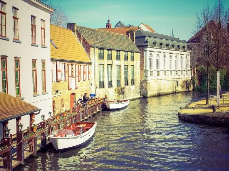
Canal Light

A series by Noor Dekker, shot on 35 mm film

Hover a card, or press Tab to reach its link.

Animating filter: grayscale() repaints the photo on every frame in most engines. Here the grayscale copy sits underneath and the color copy fades in over it, so only opacity changes. Both images share one URL, so the browser downloads it once, and touch screens get the color version straight away.

View code
.hc-gray {
  position: relative;
  width: min(100%, 300px);
  padding: 14px 14px 20px;
  border: 1px solid #e6e2d9;
  border-radius: 6px;
  background: #fbfaf7;
  color: #1a1a1a;
}
.hc-gray__photo {
  position: relative;
  aspect-ratio: 4 / 5;
  overflow: hidden;
  background: #d8d6d0;
}
.hc-gray__photo img {
  position: absolute;
  inset: 0;
  width: 100%;
  height: 100%;
  object-fit: cover;
}
.hc-gray__mono {
  filter: grayscale(1) contrast(1.05);
}
.hc-gray__color {
  opacity: 0;
  transition: opacity .5s ease-out;
}
.hc-gray__count {
  position: absolute;
  bottom: 10px;
  left: 10px;
  padding: 4px 9px;
  border-radius: 3px;
  background: rgba(20, 20, 20, .76);
  color: #fff;
  font-size: 12px;
  font-weight: 600;
}
.hc-gray__title {
  margin: 14px 2px 0;
  font-family: "Fraunces", serif;
  font-size: 24px;
  font-weight: 600;
  line-height: 1.2;
  letter-spacing: normal;
  color: inherit;
}
.hc-gray__link {
  color: inherit;
  text-decoration: none;
}
.hc-gray__link::after {
  content: "";
  position: absolute;
  inset: 0;
  border-radius: 6px;
}
.hc-gray__link:focus-visible {
  outline: none;
}
.hc-gray__link:focus-visible::after {
  outline: 3px solid #1a1a1a;
  outline-offset: 4px;
}
.hc-gray__by {
  margin: 4px 2px 0;
  font-size: 14px;
  color: #5c5750;
}
.hc-gray:focus-within .hc-gray__color {
  opacity: 1;
}
@media (hover: hover) {
  .hc-gray:hover .hc-gray__color {
    opacity: 1;
  }
}
@media (hover: none) {
  .hc-gray__color {
    opacity: 1;
  }
}

Recipe card with a folding corner

  • clip-path triangles
  • scale from a corner
  • opacity fallback

Charred leek and white bean soup

35 min Serves 4 Vegetarian

Blacken the leeks under the grill, then blend half the beans for body and keep the rest whole.

Saved by 2,140 cooks

Hover a card, or press Tab to reach its link.

Two clip-path triangles share one square in the top-right corner: the accent area with a bookmark, and the folded-back paper. The square scales out from the corner with transform-origin: 100% 0, and under reduced motion it simply fades in at full size. The fold is decoration, so nothing is lost on touch.

View code
.hc-fold {
  position: relative;
  width: min(100%, 320px);
  padding: 26px 24px 22px;
  border-radius: 16px 0 16px 16px;
  background: #f7efe0;
  color: #2b2116;
  box-shadow: 0 1px 2px rgba(43, 33, 22, .1), 0 10px 24px -14px rgba(43, 33, 22, .35);
}
.hc-fold__corner {
  position: absolute;
  top: 0;
  right: 0;
  width: 64px;
  height: 64px;
  color: #fff;
  opacity: 0;
  pointer-events: none;
  transform-origin: 100% 0;
  transition: opacity .25s ease-out;
}
.hc-fold__corner::before,
.hc-fold__corner::after {
  content: "";
  position: absolute;
  inset: 0;
}
.hc-fold__corner::before {
  background: #c2410c;
  clip-path: polygon(0 0, 100% 0, 100% 100%);
}
.hc-fold__corner::after {
  background: #e2d0ad;
  clip-path: polygon(0 0, 0 100%, 100% 100%);
}
.hc-fold__corner svg {
  position: absolute;
  top: 9px;
  right: 9px;
  z-index: 1;
}
.hc-fold__title {
  margin: 0;
  padding-right: 34px;
  font-family: "Fraunces", serif;
  font-size: 22px;
  font-weight: 600;
  line-height: 1.2;
  letter-spacing: normal;
  color: inherit;
}
.hc-fold__link {
  color: inherit;
  text-decoration: none;
}
.hc-fold__link::after {
  content: "";
  position: absolute;
  inset: 0;
  border-radius: 16px 0 16px 16px;
}
.hc-fold__link:focus-visible {
  outline: none;
}
.hc-fold__link:focus-visible::after {
  outline: 3px solid #c2410c;
  outline-offset: 3px;
}
.hc-fold__meta {
  margin: 8px 0 0;
  font-size: 13.5px;
  font-weight: 600;
  color: #6b5640;
}
.hc-fold__text {
  margin: 12px 0 0;
  font-size: 14.5px;
  line-height: 1.55;
  color: #4a3c2c;
}
.hc-fold__save {
  margin: 16px 0 0;
  font-size: 13px;
  color: #8a3a0e;
}
.hc-fold:focus-within .hc-fold__corner {
  opacity: 1;
}
@media (hover: hover) {
  .hc-fold:hover .hc-fold__corner {
    opacity: 1;
  }
}
@media (prefers-reduced-motion: no-preference) {
  .hc-fold__corner {
    transform: scale(.3);
    transition: opacity .25s ease-out, transform .35s cubic-bezier(.2, .7, .3, 1);
  }
  .hc-fold:focus-within .hc-fold__corner {
    transform: none;
  }
}
@media (hover: hover) and (prefers-reduced-motion: no-preference) {
  .hc-fold:hover .hc-fold__corner {
    transform: none;
  }
}

Service card with a plus that morphs into an arrow

  • three CSS bars
  • translate + rotate + scaleX
  • instant swap without motion

Brand identity

Naming, logo systems and the guidelines that keep them consistent across print, product and motion.

From 6 weeks

Hover a card, or press Tab to reach its link.

The icon is three bars. At rest two of them overlap vertically to form a plus, and on hover they slide right, rotate 45 degrees each way and shorten into the arrowhead. The transforms apply for everyone, but the transition only runs when motion is allowed, so reduced-motion users see the icon swap instantly.

View code
.hc-morph {
  position: relative;
  width: min(100%, 310px);
  padding: 26px 24px 22px;
  border-radius: 24px;
  background: #ffd84d;
  color: #1a1505;
  transition: background-color .3s ease-out;
}
.hc-morph__title {
  margin: 0;
  font-family: "Fraunces", serif;
  font-size: 30px;
  font-weight: 600;
  line-height: 1.1;
  letter-spacing: -.02em;
  color: inherit;
}
.hc-morph__link {
  color: inherit;
  text-decoration: none;
}
.hc-morph__link::after {
  content: "";
  position: absolute;
  inset: 0;
  border-radius: 24px;
}
.hc-morph__link:focus-visible {
  outline: none;
}
.hc-morph__link:focus-visible::after {
  outline: 3px solid #1a1505;
  outline-offset: 4px;
}
.hc-morph__text {
  margin: 12px 0 0;
  font-size: 15px;
  line-height: 1.55;
  color: #3d3410;
}
.hc-morph__foot {
  display: flex;
  align-items: center;
  justify-content: space-between;
  gap: 12px;
  margin: 26px 0 0;
  font-size: 13.5px;
  font-weight: 700;
}
.hc-morph__icon {
  position: relative;
  flex: none;
  width: 48px;
  height: 48px;
  border-radius: 50%;
  background: #1a1505;
  color: #ffd84d;
}
.hc-morph__bar {
  position: absolute;
  top: 50%;
  left: 50%;
  width: 18px;
  height: 2.5px;
  margin: -1.25px 0 0 -9px;
  border-radius: 2px;
  background: currentColor;
}
.hc-morph__bar:nth-child(2),
.hc-morph__bar:nth-child(3) {
  transform: rotate(90deg);
}
.hc-morph:focus-within {
  background: #ffcd1a;
}
.hc-morph:focus-within .hc-morph__bar:nth-child(2) {
  transform: translate(5.5px, -3.5px) rotate(45deg) scaleX(.55);
}
.hc-morph:focus-within .hc-morph__bar:nth-child(3) {
  transform: translate(5.5px, 3.5px) rotate(-45deg) scaleX(.55);
}
@media (hover: hover) {
  .hc-morph:hover {
    background: #ffcd1a;
  }
  .hc-morph:hover .hc-morph__bar:nth-child(2) {
    transform: translate(5.5px, -3.5px) rotate(45deg) scaleX(.55);
  }
  .hc-morph:hover .hc-morph__bar:nth-child(3) {
    transform: translate(5.5px, 3.5px) rotate(-45deg) scaleX(.55);
  }
}
@media (prefers-reduced-motion: no-preference) {
  .hc-morph__bar {
    transition: transform .35s cubic-bezier(.5, 0, .2, 1);
  }
}

Journal card with the title underline drawing in

  • scaleX on ::after
  • transform-origin swap
  • stretched link

Slow coast road

Ninety kilometres of switchbacks, six villages and one very good bakery.

Travel journal, 12 Oct

Hover a card, or press Tab to reach its link.

The underline is a 2px bar on ::after, scaled to zero from the right and drawn back from the left on hover, because the origin swaps with the state. It suits short, one-line titles; a long wrapping title is better served by a text-decoration-color change. The whole card stays clickable through the stretched title link.

View code
.hc-line {
  position: relative;
  display: flex;
  align-items: flex-start;
  gap: 16px;
  width: min(100%, 400px);
  padding: 14px;
  border: 1px solid #dbe5e3;
  border-radius: 16px;
  background: #fff;
  color: #10302c;
}
.hc-line__thumb {
  flex: none;
  width: 88px;
  height: 88px;
  border-radius: 10px;
  object-fit: cover;
}
.hc-line__body {
  min-width: 0;
}
.hc-line__title {
  margin: 2px 0 0;
  font-family: "Fraunces", serif;
  font-size: 20px;
  font-weight: 600;
  line-height: 1.25;
  letter-spacing: normal;
  color: inherit;
}
.hc-line__link {
  color: inherit;
  text-decoration: none;
}
.hc-line__link::after {
  content: "";
  position: absolute;
  inset: 0;
  border-radius: 16px;
}
.hc-line__link:focus-visible {
  outline: none;
}
.hc-line__link:focus-visible::after {
  outline: 3px solid #0f766e;
  outline-offset: 3px;
}
.hc-line__text {
  position: relative;
  display: inline-block;
}
.hc-line__text::after {
  content: "";
  position: absolute;
  right: 0;
  bottom: -3px;
  left: 0;
  height: 2px;
  border-radius: 2px;
  background: #0f766e;
  transform: scaleX(0);
  transform-origin: 100% 50%;
}
.hc-line__excerpt {
  margin: 6px 0 0;
  font-size: 14px;
  line-height: 1.5;
  color: #44605b;
}
.hc-line__meta {
  margin: 8px 0 0;
  font-size: 12.5px;
  color: #56706b;
}
.hc-line:focus-within .hc-line__text::after {
  transform: scaleX(1);
  transform-origin: 0 50%;
}
@media (hover: hover) {
  .hc-line:hover .hc-line__text::after {
    transform: scaleX(1);
    transform-origin: 0 50%;
  }
}
@media (prefers-reduced-motion: no-preference) {
  .hc-line__text::after {
    transition: transform .35s cubic-bezier(.4, 0, .2, 1);
  }
}

Card grids and stacks

Hover effects that involve more than one card. The :has() selector lets the grid react to the hovered or focused card, so siblings can shrink or fade without any script.

Photo album card with a stack that fans out

  • stacked absolute images
  • rotate + translate
  • overshoot easing

Hover one card in the group.

Three photos sit on top of each other with small resting angles, so the stack already reads as an album on touch screens. On hover the outer photos swing out from their bottom edges and the top one rises a little. The overshoot in the cubic-bezier gives the fan a soft settle.

View code
.hc-fan {
  position: relative;
  width: min(100%, 320px);
  padding: 20px 20px 22px;
  border-radius: 22px;
  background: #fff;
  color: #1f2430;
  text-align: center;
  box-shadow: 0 1px 3px rgba(31, 36, 48, .1);
}
.hc-fan__stack {
  position: relative;
  height: 150px;
  margin-bottom: 16px;
}
.hc-fan__photo {
  position: absolute;
  top: 14px;
  left: 50%;
  width: 140px;
  height: 105px;
  margin-left: -70px;
  border: 4px solid #fff;
  border-radius: 10px;
  object-fit: cover;
  box-shadow: 0 6px 16px rgba(31, 36, 48, .2);
  transform-origin: 50% 100%;
}
.hc-fan__photo--1 {
  transform: translateX(-10px) rotate(-6deg);
}
.hc-fan__photo--2 {
  transform: translateX(10px) rotate(5deg);
}
.hc-fan__title {
  margin: 0;
  font-family: inherit;
  font-size: 18px;
  font-weight: 700;
  line-height: 1.3;
  letter-spacing: -.01em;
  color: inherit;
}
.hc-fan__link {
  color: inherit;
  text-decoration: none;
}
.hc-fan__link::after {
  content: "";
  position: absolute;
  inset: 0;
  border-radius: 22px;
}
.hc-fan__link:focus-visible {
  outline: none;
}
.hc-fan__link:focus-visible::after {
  outline: 3px solid #2457c5;
  outline-offset: 4px;
}
.hc-fan__meta {
  margin: 4px 0 0;
  font-size: 13.5px;
  color: #59606f;
}
@media (prefers-reduced-motion: no-preference) {
  .hc-fan__photo {
    transition: transform .5s cubic-bezier(.3, 1.4, .5, 1);
  }
  .hc-fan:focus-within .hc-fan__photo--1 {
    transform: translateX(-62px) rotate(-11deg);
  }
  .hc-fan:focus-within .hc-fan__photo--2 {
    transform: translateX(62px) rotate(11deg);
  }
  .hc-fan:focus-within .hc-fan__photo--3 {
    transform: translateY(-8px);
  }
}
@media (hover: hover) and (prefers-reduced-motion: no-preference) {
  .hc-fan:hover .hc-fan__photo--1 {
    transform: translateX(-62px) rotate(-11deg);
  }
  .hc-fan:hover .hc-fan__photo--2 {
    transform: translateX(62px) rotate(11deg);
  }
  .hc-fan:hover .hc-fan__photo--3 {
    transform: translateY(-8px);
  }
}

Destination cards where the hovered one expands

  • :has() on the grid
  • grid-template transition
  • container query

Hover one card in the group.

The grid uses :has() to find which card is hovered or focused and gives that column, or row on narrow screens, more of the space. This is the one effect in the set that animates layout, so keep it to small grids of a few cards. Browsers without :has() drop the rule and show three equal cards.

View code
.hc-grow-wrap {
  width: min(100%, 640px);
  container-type: inline-size;
}
.hc-grow {
  display: grid;
  grid-template-rows: 1fr 1fr 1fr;
  gap: 10px;
  height: 320px;
}
.hc-grow__card {
  position: relative;
  min-width: 0;
  min-height: 0;
  overflow: hidden;
  border-radius: 16px;
  background: #253041;
}
.hc-grow__card img {
  position: absolute;
  inset: 0;
  width: 100%;
  height: 100%;
  object-fit: cover;
}
.hc-grow__label {
  position: absolute;
  right: 0;
  bottom: 0;
  left: 0;
  padding: 10px 14px;
  background: rgba(12, 16, 24, .74);
  color: #fff;
}
.hc-grow__name {
  margin: 0;
  font-family: inherit;
  font-size: 16px;
  font-weight: 700;
  line-height: 1.2;
  letter-spacing: normal;
  color: #fff;
}
.hc-grow__link {
  color: inherit;
  text-decoration: none;
}
.hc-grow__link::after {
  content: "";
  position: absolute;
  inset: 0;
  border-radius: 16px;
}
.hc-grow__link:focus-visible {
  outline: none;
}
.hc-grow__link:focus-visible::after {
  outline: 3px solid #ffd27a;
  outline-offset: -5px;
}
.hc-grow__count {
  margin: 2px 0 0;
  font-size: 12.5px;
  color: #d5dbe6;
}
.hc-grow:has(> :nth-child(1):focus-within) {
  grid-template-rows: 2fr 1fr 1fr;
}
.hc-grow:has(> :nth-child(2):focus-within) {
  grid-template-rows: 1fr 2fr 1fr;
}
.hc-grow:has(> :nth-child(3):focus-within) {
  grid-template-rows: 1fr 1fr 2fr;
}
@media (hover: hover) {
  .hc-grow:has(> :nth-child(1):hover) {
    grid-template-rows: 2fr 1fr 1fr;
  }
  .hc-grow:has(> :nth-child(2):hover) {
    grid-template-rows: 1fr 2fr 1fr;
  }
  .hc-grow:has(> :nth-child(3):hover) {
    grid-template-rows: 1fr 1fr 2fr;
  }
}
@container (min-width: 480px) {
  .hc-grow {
    grid-template-rows: none;
    grid-template-columns: 1fr 1fr 1fr;
    height: 280px;
  }
  .hc-grow:has(> :nth-child(1):focus-within) {
    grid-template-rows: none;
    grid-template-columns: 2.2fr 1fr 1fr;
  }
  .hc-grow:has(> :nth-child(2):focus-within) {
    grid-template-rows: none;
    grid-template-columns: 1fr 2.2fr 1fr;
  }
  .hc-grow:has(> :nth-child(3):focus-within) {
    grid-template-rows: none;
    grid-template-columns: 1fr 1fr 2.2fr;
  }
}
@container (min-width: 480px) {
  @media (hover: hover) {
    .hc-grow:has(> :nth-child(1):hover) {
      grid-template-rows: none;
      grid-template-columns: 2.2fr 1fr 1fr;
    }
    .hc-grow:has(> :nth-child(2):hover) {
      grid-template-rows: none;
      grid-template-columns: 1fr 2.2fr 1fr;
    }
    .hc-grow:has(> :nth-child(3):hover) {
      grid-template-rows: none;
      grid-template-columns: 1fr 1fr 2.2fr;
    }
  }
}
@media (prefers-reduced-motion: no-preference) {
  .hc-grow {
    transition: grid-template-columns .5s cubic-bezier(.2, .7, .3, 1), grid-template-rows .5s cubic-bezier(.2, .7, .3, 1);
  }
}

Podcast grid that dims the cards you are not on

  • :has(:hover)
  • :not(:hover)
  • opacity only

Hover one card in the group.

The grid checks with :has() whether any card is hovered and fades every other card to 45 percent opacity. Because the test is on a card rather than on the grid itself, moving the pointer through a gap does not dim everything. Keyboard focus does the same through :focus-visible, so a mouse click does not leave the grid dimmed.

View code
.hc-dim {
  display: grid;
  grid-template-columns: repeat(auto-fit, minmax(min(100%, 140px), 1fr));
  gap: 12px;
  width: min(100%, 700px);
}
.hc-dim__card {
  position: relative;
  padding: 8px 8px 12px;
  border-radius: 14px;
  background: #fff;
  color: #1c1f2b;
  box-shadow: 0 1px 3px rgba(28, 31, 43, .1);
  transition: opacity .25s ease-out;
}
.hc-dim__card img {
  display: block;
  width: 100%;
  aspect-ratio: 1;
  height: auto;
  border-radius: 9px;
  object-fit: cover;
}
.hc-dim__title {
  margin: 10px 4px 0;
  font-family: inherit;
  font-size: 14.5px;
  font-weight: 700;
  line-height: 1.3;
  letter-spacing: normal;
  color: inherit;
}
.hc-dim__link {
  color: inherit;
  text-decoration: none;
}
.hc-dim__link::after {
  content: "";
  position: absolute;
  inset: 0;
  border-radius: 14px;
}
.hc-dim__link:focus-visible {
  outline: none;
}
.hc-dim__link:focus-visible::after {
  outline: 3px solid #3b2fd0;
  outline-offset: 3px;
}
.hc-dim__meta {
  margin: 3px 4px 0;
  font-size: 12.5px;
  color: #5a6070;
}
.hc-dim:has(.hc-dim__link:focus-visible) .hc-dim__card:not(:focus-within) {
  opacity: .45;
}
@media (hover: hover) {
  .hc-dim:has(.hc-dim__card:hover) .hc-dim__card:not(:hover) {
    opacity: .45;
  }
}
@media (hover: hover) and (prefers-reduced-motion: no-preference) {
  .hc-dim__card {
    transition: opacity .25s ease-out, transform .3s cubic-bezier(.2, .7, .3, 1);
  }
  .hc-dim__card:hover {
    transform: translateY(-4px);
  }
}

How to Build a Basic Card Hover Effect in CSS

The transition goes on the card’s resting rule. The hover rule changes transform and box-shadow, and it sits inside a hover media query.

The :hover pseudo-class matches while a pointer sits over the card or anything inside it. Hovering the image, or just the padding, counts as hovering the card.

If the card markup itself is still unsettled, a guide to building cards in CSS covers structure and layout first, and a roundup of CSS hover effects covers hover beyond cards.

  1. Wrap the content in one .card container holding the image, heading, text and a single link.
  2. Style the resting state with border-radius, a soft box-shadow and overflow: hidden when the card carries an image.
  3. Declare the transition on that same rule, listing transform and box-shadow with a duration such as 200ms ease-out.
  4. Write the hover rule inside @media (hover: hover), applying translateY(-4px) and a deeper shadow to .card:hover.
  5. Add .card:focus-within to the same selector so a focused link inside the card triggers the same change.

Put together, those steps come out as two rules:

.card {
  border-radius: 12px;
  box-shadow: 0 2px 6px rgba(0, 0, 0, 0.1);
  transition: transform 200ms ease-out, box-shadow 200ms ease-out;
}

@media (hover: hover) {
  .card:hover,
  .card:focus-within {
    transform: translateY(-4px);
    box-shadow: 0 12px 24px rgba(0, 0, 0, 0.18);
  }
}

The transition belongs on the resting rule. Declared only inside :hover, it animates the card on the way in and snaps it back instantly on the way out.

Without a duration nothing moves, because the initial transition-duration is 0s (MDN Web Docs, 2026).

The hover media query keeps the lifted state off touch screens, where a tap can leave a hover state stuck on the card.

Common CSS Card Hover Effects, From Lift to 3D Flip

Almost all of them animate only transform or opacity. Shadow growth is the exception, and any colored glow built on box-shadow shares its cost.

Lift and Shadow

Lift moves the card up with transform: translateY(-4px), and a deeper box-shadow sells the movement. The shadow grows in offset and blur at the same time, so the card looks further from the page.

Travel of 4px to 8px suits compact cards. Go longer and the card starts to look like it’s leaving the grid. For a colored glow, swap the neutral shadow for something like 0 0 20px in the brand color.

Layered shadows read softer than one heavy shadow, and a rundown of shadow effects in CSS shows several ways to stack them.

Scale and Image Zoom

Scale makes the whole card bigger. Zoom works on the image alone, which is usually what you actually want.

Use transform: scale(1.03) on a card and a stronger value such as scale(1.08) on the image, with overflow: hidden on the image wrapper so the zoom stays inside the card edges.

Zoom is the safer pick for tight grids. A scaled card pushes its edges over the neighbors, so give the hovered card a higher z-index when the neighbors are positioned too.

Overlay and Text Reveal

An overlay is an absolutely positioned child at opacity: 0 that moves to opacity: 1 on hover. A caption slide works a little differently. The text starts at translateY(100%) inside an overflow: hidden container and slides to translateY(0).

Set pointer-events: none on the overlay so clicks reach the link underneath. Stack the layers with z-index so the heading stays readable above the dim layer.

Anything revealed only on hover is invisible to keyboard and touch users, so the same reveal has to fire on focus too.

3D Flip and Tilt

A flip card starts with perspective on the parent and transform-style: preserve-3d on the inner wrapper. Both faces get backface-visibility: hidden. On hover the wrapper rotates with rotateY(180deg), and the back face is pre-rotated by the same angle.

A step-by-step flip card in CSS shows the markup for both faces.

Pure CSS tilt stops at a fixed angle such as rotateX(4deg). Tilting toward the cursor needs JavaScript to read pointer position.

Flip hides the back face from anyone who never hovers, so keep key information on the front.

Dimming Sibling Cards With :has()

The :has() selector reads the hover state of a child to style its siblings:

.grid:has(.card:hover) .card:not(:hover) {
  opacity: 0.6;
}

The grid container (CSS Grid or flexbox) notices a hovered card and dims every card that is not hovered. Dimming runs on opacity, so it stays on the compositor.

Baseline defines “widely available” as 30 months after a feature reaches all core browsers, which is exactly the gap between :has() becoming newly available in December 2023 (MDN Web Docs) and widely available in June 2026 (web.dev).

A browser without :has() drops the entire rule, so the cards simply stay at full opacity (MDN Web Docs).

What Transition Duration and Easing Suit Card Hover Effects?

Around 200ms with ease-out suits most card hovers. Treat it as a starting value rather than a standard, because lift distance and card size both shift the right number.

Nielsen Norman Group’s response time limits mark the outer bounds. A reaction under 0.1 second feels instantaneous, and 1.0 second is about the limit for keeping the user’s flow of thought uninterrupted (Nielsen Norman Group, 1993).

A card that takes 800ms to lift sits under that second and still feels sluggish. Hover feedback should register without drawing attention to itself.

For reference, ease is cubic-bezier(0.25, 0.1, 0.25, 1), the initial timing function of transitions (MDN Web Docs, 2026). ease-out is cubic-bezier(0, 0, 0.58, 1), a fast start and a slow finish (MDN Web Docs, 2026).

For hover, ease-out reads better than the default because the card responds fast and settles gently. linear looks mechanical on moving cards, so keep it for opacity fades.

A custom cubic-bezier() takes two control points with x values held between 0 and 1. The y values are unrestricted, which allows a slight overshoot (MDN Web Docs).

The destination state decides which transition runs. A transition declared in the :hover rule governs the way in, and the one on the resting rule governs the way out.

That split allows a quick 150ms entry and a slower 250ms return, which tends to feel natural on cards.

A card hover is about the smallest micro-interaction an interface has. It’s brief, and it belongs to a single action.

A transition generator for CSS is handy for comparing durations and curves before they go into the stylesheet.

Performance of Card Hover Effects: What to Animate and What to Avoid

Animate transform and opacity, and treat every other property as a cost to justify. Web.dev’s animation guide tells authors to restrict animations to those two so they stay on the compositing stage of the rendering path.

Browsers typically run CSS animations that touch only those properties on the compositor thread, so the motion keeps going while the main thread is busy (web.dev).

Transform (translateY, scale, rotate) and opacity are the cheap ones. Everything else needs checking. Box-shadow, border-color and background-color are the usual suspects, while width, height, margin, top and left are best avoided because they move the neighbors.

Box-shadow is the property cards animate most often from outside the cheap list. Chrome DevTools shows which areas repaint, so check it there instead of guessing.

The workaround is a pre-rendered shadow. Paint the final shadow on a ::after layer behind the card content, start it at opacity: 0, and fade it in on hover. The browser then animates opacity only.

Work out the target shadow in a box shadow generator for CSS first, then paste the values into the pseudo-element.

MDN treats will-change as a last resort for existing performance problems and advises against adding it to pages that already run well. Chrome reacts to some values by creating a compositing layer or a new stacking context.

That side effect matters on grids, because will-change: opacity creates the stacking context up front and can change which card paints on top.

In most cases MDN recommends applying the hint from a script around the interaction instead of leaving it in the stylesheet.

Record a Performance trace in Chrome DevTools while moving the pointer across the grid. Dropped frames point to the property that needs replacing.

Large blurred shadows across a dense grid are where box-shadow transitions tend to drop frames first.

Choosing a Hover Effect by Card Type

Link-only cards need little more than a lift with a one-step shadow increase. On image-led cards, zoom the image and leave the frame still. Text-dense cards get a border color or shadow change and nothing else, so reading is never interrupted.

Product cards can take a lift too. A quick-add button that appears only on hover is a bad idea.

Flip and reveal effects earn their place only when the extra content is optional. The flip card gets built most and delivers least, because it hides half the content behind a hover.

Price and the buy action belong in the resting state, which is where product card design conventions put them.

EffectAnimatesBest forReduced motion and touch
Lift and shadowtransform, box-shadowLink-only, blog and profile cardsDrop the lift, keep the shadow change
Image zoomtransform on the imageImage-led cards, galleriesDrop the zoom, change the border instead
Overlay revealopacityImage cards with short captionsFade stays; show the caption at rest on touch
3D fliptransformCards with an optional back faceSwap the flip for a fade
Sibling dimmingopacityGrids of equal cardsNo movement, so it stays; irrelevant on touch

Material’s web components limit elevation to levels 0 to 5 and animate shadows from one level to another with an ordinary transition (material-web.dev).

Borrow the idea and raise a card by one level on hover instead of inventing a new shadow for every card type.

A hover effect should support the card’s place in the page’s visual hierarchy, not compete with it. On a grid of equal cards, every card moves the same distance.

How Do You Make Card Hover Effects Accessible?

Every hover rule needs a keyboard focus twin, and movement should switch off for users who ask for reduced motion. Hover also shouldn’t be the only route to any information on the card.

Together these cover most of the places where hover effects touch web accessibility, and each one has its own trigger and its own rule.

Keyboard Focus Parity

W3C’s Understanding document for SC 1.4.13 states that content triggered by pointer hover should also be triggerable by keyboard focus.

The :focus-within selector matches a card whenever the card or a descendant holds focus, however focus arrived (MDN Web Docs). :focus-visible matches only when the browser decides focus should be evident, and W3C’s technique C45 notes that browsers always show it for keyboard users but generally not after a mouse click.

A keyboard rule that reacts only to keyboard focus looks like this:

.card:has(a:focus-visible) {
  transform: translateY(-4px);
  box-shadow: 0 12px 24px rgba(0, 0, 0, 0.18);
}

.card a:focus-visible {
  outline: 3px solid currentColor;
  outline-offset: 4px;
}

The rule repeats the hover transform and shadow, and the link gets its own visible outline. Don’t strip that outline with outline: none unless a replacement indicator is in place.

Reduced Motion

MDN lists scaling or panning large objects among the motion types that can trigger vestibular discomfort. Card zoom and card flip cover large areas, so they sit closest to that list.

Opacity fades, color shifts, border changes and shadow changes can stay. The translateY lift, scale, image zoom, 3D flip and tilt should go.

@media (prefers-reduced-motion: reduce) {
  .card:hover,
  .card:focus-within {
    transform: none;
  }

  .card:has(a:focus-visible) {
    transform: none;
  }
}

The override works because it has the same specificity as the hover rule and comes later in the source (MDN Web Docs).

WCAG splits the issue across levels. SC 2.3.3, Animation from Interactions, is Level AAA and asks that interaction-triggered motion can be disabled unless the motion is needed to convey information (W3C).

AA conformance does not require it, but the rule costs a few lines of CSS.

Content Revealed on Hover

Hide extras, not the main message.

SC 1.4.13, Content on Hover or Focus, is Level AA and applies to anything a card reveals on hover or focus (W3C Understanding document, revised July 2026). Escape has to close the reveal without moving the pointer or focus, unless the reveal covers nothing. An overlay inside the card stays hovered while the pointer crosses it. Persistence is the last condition, and it means the reveal stays until hover or focus leaves, the user dismisses it, or the information is no longer valid.

An overlay that covers the card’s own image or text falls under the dismissible condition, so it needs a small script for the Escape key.

W3C adds that more predictable ways of adding content usually exist and recommends them, which is why a caption shown at rest beats a caption revealed on hover. The same reasoning runs through accessible UI components in general: visible by default, enhanced on hover.

Why Does Card Hover Stick on Touch Screens?

Touch browsers emulate hover on tap, and the emulated state stays on the tapped element until the user taps somewhere else (Stefan Judis; MDN Web Docs).

Browsers built it that way on purpose, to give touch users a way to reach hover-only content.

The hover media feature reports whether the primary input can hover conveniently, and any-hover reports whether any available input can. Both have been available across browsers since December 2018 (MDN Web Docs).

Cards should key off the primary input. On a tablet with a trackpad attached, any-hover reports true even while a finger does the tapping, which brings the sticky state back.

.card .caption {
  opacity: 1;
}

@media (hover: hover) and (pointer: fine) {
  .card .caption {
    opacity: 0;
    transition: opacity 200ms ease-out;
  }

  .card:hover .caption {
    opacity: 1;
  }

  .card:has(a:focus-visible) .caption {
    opacity: 1;
  }
}

The caption is visible by default and hidden only where hover exists, which applies the logic of mobile-first design to a single effect.

Detection isn’t perfect either. Some Android browsers can match (hover: hover) on a touchscreen. Michelle Barker traces it to a long-press hover emulation on some Android versions, and ctrl.blog reports that Chromium on Samsung devices identifies touchscreens as touchpads.

The reverse happens as well. A WebKit bug report documented hover and pointer: fine failing to evaluate true when the mouse support added in iOS 13.4 was in use.

Pairing the hover query with (pointer: fine) filters the long-press case, as Michelle Barker documents. Neither failure breaks a card whose hover effect is decoration only.

Don’t detect touch devices, as Judis advises. Design for touch, mouse, stylus and keyboard together.

When Card Hover Effects Fail or Need a Fallback

A hover effect falls apart when it’s the only signal on a card, and again whenever the input can’t hover or the browser doesn’t know the selector behind it.

Failure Cases

  • Hover as the only sign that a card is clickable, so the card looks static at rest
  • A lift on the whole card when only the title is a link, which promises a click target the card does not deliver
  • Flip cards whose back face holds more text than the front, because both faces share one height
  • A quick-view panel beside the card that closes as the pointer crosses the gap, which W3C lists as failure F95 of SC 1.4.13

Each failure has the same cure. Build the card to work without the effect, then add the effect on top.

Browser Support Gaps

The four features behind keyboard, reduced-motion and touch handling on a card all carry Baseline status.

FeatureRole on a cardBaseline status
:focus-withinStyles the card when a child holds focusWidely available since July 2022
:focus-visibleStyles keyboard focus onlyWidely available since September 2024
hover media queryLimits hover rules to hover-capable inputWidely available since June 2021
prefers-reduced-motionRemoves movement on requestWidely available since July 2022

Status per MDN Web Docs and the web-features Baseline data. A fallback now matters mainly for older browsers that still sit in a project’s support list.

The @supports not selector() test from MDN’s @supports reference wraps a :focus fallback in a feature query:

@supports not selector(:focus-visible) {
  .card a:focus {
    outline: 3px solid #1a5fb4;
    outline-offset: 4px;
  }
}

Keep selectors built on newer pseudo-classes in their own rules, so one unsupported selector cannot discard the rest of a selector list.

Testing those older engines belongs to a wider cross-browser compatibility routine.

CSS Card Hover Effects FAQ

What is the difference between a hover transition and a keyframe animation on a card?

Transitions need a trigger such as :hover and play between two states, in both directions. Keyframe animations follow steps defined in @keyframes and can start on their own, which suits looping motion better than hover feedback.

Can you build card hover effects without JavaScript?

Yes. Lift, shadow growth, zoom, overlay reveal, flip and sibling dimming all run on CSS alone. JavaScript is needed only for cursor-tracking tilt or spotlights and for an Escape handler that dismisses a revealed overlay.

How do you make an entire card clickable without nesting links?

Put one link on the card heading, make the card position: relative, and stretch the link’s ::after pseudo-element over the card with position: absolute and inset: 0. The pseudo-element sits inside the card, so the hover rule keeps firing.

How do you add hover effects to a Tailwind CSS card?

Add transition, hover:-translate-y-1 and hover:shadow-lg to the card’s classes. Tailwind CSS v4 applies hover: utilities only on devices that support hover (Tailwind Labs), and the motion-safe: prefix drops the movement under reduced motion. A set of Tailwind card layouts supplies the markup.

How do you add a hover effect to a Bootstrap card?

Start from standard Bootstrap cards and write a custom rule on .card:hover for the transform and shadow. Then add .stretched-link to the card’s link. Bootstrap cards already carry position: relative, so no extra markup is needed (Bootstrap documentation).

How do you force a card’s hover state in Chrome DevTools?

Select the card in the Elements panel, click the :hov button in the Styles pane, and tick :hover under Force element state. The hover rule stays applied while the pointer sits over DevTools, and the same panel forces :focus.

Testing CSS Card Hover Effects Before Shipping

Hover with a mouse first, since that’s the check everybody already does. Then tab through the card grid, switch on reduced motion, and tap on a real phone. That order runs from cheapest to most expensive.

Keyboard and reduced-motion failures stay invisible to a developer using a mouse, yet both take minutes to check. Touch comes last because it needs hardware.

DevTools forces the :hover state only and leaves the hover media query untouched. The Samsung false positive and the iOS 13.4 false negative therefore show up only on physical devices.

The cost is a plainer card for reduced-motion and touch users, who lose the lift and the reveal. Verified in October 2026, this advice holds until browsers correct hover reporting on hybrid devices.