Your landing page gets about three seconds to make an impression. That’s it.
Bootstrap hero section templates solve this problem by giving you ready-made, professional header designs that grab attention immediately. No need to start from scratch or wrestle with CSS for hours.
These pre-built components handle the heavy lifting. Responsive layouts, mobile-first design, proper spacing, all sorted. You get clean HTML5 structure and modern styling without the usual frontend development headaches.
This guide walks through the best hero section examples available. You’ll see different layout structures, learn which templates work for specific use cases, and understand how to customize them for your projects.
Whether you need a minimal hero section with centered content or a full-width banner with video backgrounds, the right template saves hours of work.
Bootstrap Hero Section Templates
SaaS Hero Section with Bootstrap

This hero layout puts your value proposition front and center. The orange CTA button grabs attention (because let’s be honest, subtle doesn’t convert). You get an interactive dashboard mockup that shows what your product actually does, plus those company logos at the bottom that tell visitors “hey, real businesses use this thing.”
UX/UI Portfolio Hero Section Design

Here’s a portfolio intro that doesn’t mess around. Gradients flow across the screen while animated elements float around, creating that depth everyone’s after these days. The 3D card element adds some visual punch. Navigation sits clean at the top, and the CTAs are exactly where they need to be.
Personal Coach Hero Section Design

Teal and gold work surprisingly well together here. The headline hooks visitors right away, and those stats scattered throughout? They build credibility fast.
A professional photo of the coach anchors everything, making the whole thing feel personal rather than corporate.
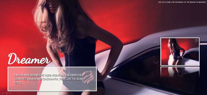
Photographer Portfolio Hero Section Design

Dark theme with golden highlights. That’s it, that’s the vibe.
Full-screen background imagery sets the mood immediately, while Playfair Display handles the typography (classic choice for photography sites). Floating images create layers of interest without cluttering things up.
Home Decor Hero Section Design

Full-screen lifestyle photography does the heavy lifting. White navigation bar keeps things readable against any background, and the CTAs invite people to actually explore rather than just bounce. Typography stays elegant but readable.
Digital Agency Hero Section Design

Gradient backgrounds with floating service cards that animate in. Stats display front and center because agencies need to prove themselves quickly. Fixed nav bar responds to hover states smoothly, and the whole thing pushes visitors toward engagement without feeling pushy.
Consulting Hero Section with Bootstrap

Professional gradient, floating service cards, animated statistics. The nav bar scrolls nicely, and CTAs stand out without screaming.
It’s that balance between looking credible and being approachable. The interactive elements keep things from feeling too corporate.
Startup Hero Section with Bootstrap

Fixed nav, clean layout, animations that don’t overdo it. The headline needs to work hard here (and it does), supported by a subheading that actually explains something. Floating elements add movement without distraction. Works on phones, tablets, whatever.
Real Estate Hero Section Design

Navigation maintains readability no matter what photo sits behind it. The property search form integrates directly into the hero rather than hiding somewhere below. Stats reinforce trust, and the gradient overlay keeps text legible while letting that beautiful property image shine through.
Accounting Firm Hero Section Design

Gradient background keeps things modern while staying professional. That fixed nav bar follows users down the page (helpful for sites with lots of content). Achievement stats build confidence, and the animations are subtle enough that they don’t feel gimmicky for a financial services firm.
Law Firm Hero Section Design

Blue and gold scream “trust me with your legal problems” in the best way possible. Fixed navigation, bold headline about expertise, and that free consultation CTA positioned prominently. The statistics bar showcases wins and satisfaction ratings because law firms need credibility markers more than most industries.
Beauty Brand Hero Section

Soft pink tones create that premium feel without going overboard. Typography stays clean and readable, which matters when you’re selling products people put on their faces. The product imagery gets space to breathe, and CTAs guide visitors naturally toward exploring more.
Jewelry Store Hero Section

Full-screen jewelry photography because these products need to sparkle. Fixed nav with gold accents (obviously), and that “timeless elegance” headline does exactly what it should. Featured products section includes hover animations that add polish without slowing things down. Built on Bootstrap, so it adapts to any screen size.
Graphic Design Portfolio Hero

Gradient accents with geometric shapes floating around. The portfolio showcase is interactive, stats animate in as you scroll, and typography uses that modern clean look designers expect. Hover animations feel smooth rather than janky. Everything responds properly on mobile because a broken portfolio site is embarrassing for a designer.
FAQ on Bootstrap Hero Section Templates
What is a Bootstrap hero section?
A hero section is the first full-width component visitors see on your landing page. It typically includes a headline, supporting text, call-to-action buttons, and background imagery. Bootstrap provides the grid system and utility classes to build these headers quickly.
Are Bootstrap 5 hero templates responsive by default?
Yes. Bootstrap 5 uses a mobile-first approach, so hero section templates automatically adapt to different screen sizes. The flexbox-based grid system handles responsive breakpoints without extra CSS, though you can customize behavior for specific devices.
Can I use video backgrounds in Bootstrap hero sections?
Absolutely. You can embed video backgrounds using HTML5 video tags or YouTube embeds. Just add proper CSS for positioning and ensure mobile users get optimized alternatives since autoplay videos drain battery and consume data unnecessarily.
How do I customize the hero background image?
Use Bootstrap’s background utility classes or custom CSS. Set background-size: cover for full coverage, adjust background-position for alignment, and add overlay gradients through pseudo-elements. Most ready-made templates include these styles already.
What’s the difference between a hero section and jumbotron?
Jumbotron was Bootstrap 4’s dedicated hero component. Bootstrap 5 removed it entirely. Now you build hero sections using container classes, grid layouts, and spacing utilities. The functionality remains identical, just more flexible and lightweight.
Do I need JavaScript for hero section animations?
Not necessarily. CSS animations and transitions handle most hero section effects like fade-ins or slide-ups. JavaScript adds interactivity for parallax scrolling, dynamic content loading, or complex animation sequences that pure CSS can’t achieve efficiently.
How do I center content in a Bootstrap hero?
Use flexbox utility classes: d-flex, align-items-center, and justify-content-center on your container. Set a minimum height with min-vh-100 for full viewport coverage. This centered hero content approach works across all responsive breakpoints without media queries.
Can I integrate a navbar with my hero section?
Yes, and it’s common practice. Position the Bootstrap navbar either above the hero or as an overlay using position: absolute. Transparent navbars work well with hero backgrounds. Just ensure proper z-index layering and contrast for readability.
Where can I find free Bootstrap hero section code?
GitHub repositories, Bootstrap documentation examples, and frontend development resources like CodePen offer free snippets. Many template libraries provide copy-paste hero code. Always check the license before using in commercial projects, though most are MIT-licensed.
How much padding should a hero section have?
Typical hero section spacing uses 80-120px top and bottom padding on desktop, reduced to 40-60px on mobile. Bootstrap’s spacing utilities like py-5 or custom classes handle this. Balance whitespace with content density based on your design hierarchy and conversion goals.
Conclusion
Bootstrap hero section templates give you a massive head start on landing page design. Instead of building header layouts from scratch, you get pre-built components that already handle responsive breakpoints and modern web design standards.
The right hero banner design makes your site memorable. Whether you choose a split-screen layout, gradient backgrounds, or video hero effects, these ready-made snippets save hours of frontend development work.
Start with a template that matches your vision. Customize the typography, adjust the spacing utilities, swap background images. The Bootstrap grid system handles the complexity while you focus on content and conversion goals.
Your landing page deserves better than generic headers. Pick a template, integrate it with your navbar, and watch how proper visual hierarchy transforms that critical above-the-fold content into something visitors actually remember.