JavaScript Carousels: 16 Examples + Which Library to Pick

JavaScript carousels move several slides through one fixed viewport with buttons, dots, swipe and sometimes autoplay. Google's web.dev guide calls loading slides with script "probably the single biggest performance mistake", so the slides belong in the page's HTML.

Below are 16 JavaScript carousel examples you can try and copy, followed by a guide to accessibility, autoplay, performance and libraries.

By Bogdan Sandu · Updated October 28, 2026

Accessible controls and autoplay

The ARIA Authoring Practices carousel and its close relatives. Anything that rotates on its own has a visible stop or pause button, stops when keyboard focus arrives, pauses under the pointer and stays still for visitors who asked for reduced motion.

APG carousel with a rotation control and tabs

  • aria-roledescription
  • role="tablist"
  • aria-live off/polite

Weekend escapes

A deep blue fjord between grey granite cliffs, seen from a rocky ledge

Three nights above the fjordTimber cabins from €180 a night

Orange sandstone cliffs lit by low sun under a cloudy sky

Sunrise hikes in red rock countryTwo guided days, small groups

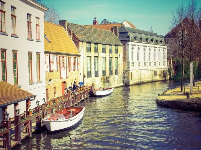
Old gabled houses along a canal with small white boats moored at the water

A slow weekend on the canalsBoat breakfast included

Two yellow tents pitched on snow beside a stone wall, with snowy peaks behind

Winter camp under the peaksGear and a mountain guide provided

It rotates every 6 seconds. Hover to pause, press the round button to stop, or Tab in and use the arrow keys on the tabs.

This follows the tabbed style of the W3C carousel pattern: the rotation button comes first in the tab order and its label switches between Stop and Start slide rotation, so it needs no aria-pressed. Keyboard focus anywhere inside stops rotation for good, hovering only pauses it, and the slide wrapper switches from aria-live off to polite once rotation stops. Under reduced motion it starts stopped, and it only counts down while it is on screen.

View code
.jc-apg {
  container-type: inline-size;
  width: min(100%, 660px);
  padding: 18px;
  border-radius: 22px;
  background: #fff;
  color: #13212c;
  box-shadow: 0 18px 44px rgba(19, 33, 44, .12);
}
.jc-apg__bar {
  display: flex;
  align-items: center;
  gap: 8px;
  margin-bottom: 14px;
}
.jc-apg__title {
  margin: 0 auto 0 0;
  font-family: "Fraunces", serif;
  font-size: 21px;
  font-weight: 600;
  line-height: 1.2;
  letter-spacing: 0;
  color: #13212c;
}
.jc-apg__btn {
  flex: none;
  display: grid;
  place-items: center;
  width: 44px;
  height: 44px;
  padding: 0;
  border: 1.5px solid #c5d0d9;
  border-radius: 50%;
  background: #fff;
  color: #13212c;
  cursor: pointer;
  transition: background-color .2s, border-color .2s;
}
.jc-apg__btn:hover {
  background: #edf3f6;
  border-color: #8fa2b1;
}
.jc-apg__btn svg {
  width: 20px;
  height: 20px;
}
.jc-apg__rot {
  border-color: #0b6e69;
  background: #0b6e69;
  color: #fff;
}
.jc-apg__rot:hover {
  border-color: #08524e;
  background: #08524e;
}
.jc-apg.is-playing .jc-apg__play,
.jc-apg:not(.is-playing) .jc-apg__pause {
  display: none;
}
.jc-apg__btn:focus-visible,
.jc-apg__tab:focus-visible {
  outline: 3px solid #d9661a;
  outline-offset: 2px;
}
.jc-apg__view {
  overflow: hidden;
  border-radius: 14px;
  background: #dfe6ea;
}
.jc-apg__items {
  display: flex;
}
.jc-apg__slide {
  position: relative;
  flex: 0 0 100%;
}
.jc-apg__slide img {
  display: block;
  width: 100%;
  height: auto;
  aspect-ratio: 16 / 10;
  object-fit: cover;
}
.jc-apg__cap {
  position: absolute;
  left: 12px;
  right: 12px;
  bottom: 12px;
  max-width: 330px;
  margin: 0;
  padding: 11px 14px;
  border-radius: 10px;
  background: rgba(9, 22, 30, .88);
  color: #fff;
  font-size: 13.5px;
  line-height: 1.4;
}
.jc-apg__cap strong {
  display: block;
  font-size: 16px;
}
.jc-apg__cap span {
  display: block;
  margin-top: 2px;
  color: #d4e3eb;
}
.jc-apg__tabs {
  display: flex;
  gap: 8px;
  margin-top: 10px;
}
.jc-apg__tab {
  position: relative;
  flex: 1 1 0;
  min-width: 0;
  min-height: 44px;
  padding: 12px 0 4px;
  border: 0;
  border-radius: 0;
  background: none;
  color: #4b5d6b;
  font: inherit;
  font-size: 14px;
  font-weight: 600;
  text-align: start;
  cursor: pointer;
}
.jc-apg__tab::before {
  content: "";
  position: absolute;
  top: 2px;
  left: 0;
  right: 0;
  height: 4px;
  border-radius: 4px;
  background: #d5dee4;
}
.jc-apg__tab[aria-selected="true"] {
  color: #13212c;
}
.jc-apg__tab[aria-selected="true"]::before {
  background: #0b6e69;
}
@media (prefers-reduced-motion: no-preference) {
  .jc-apg__items {
    transition: transform .6s cubic-bezier(.22, .7, .2, 1);
  }
}

Story autoplay with progress bars

  • animationend
  • animation-play-state
  • IntersectionObserver

Northline JournalCity field notes

Downtown skyscrapers at sunrise beside a wide lake

Six rooftops you can visit for free

Most open before 10 am on weekdays. 4 min read

Narrow brick alley with fire escapes, leading toward office towers

The murals behind Mill Street

A ten-minute loop past nine painted walls. 3 min read

Old gabled houses along a canal with small white boats moored at the water

Breakfast boats on the old canal

Saturday mornings from April to October. 5 min read

A single-lane road winding through a green valley below steep grassy cliffs

A day trip with no rental car

Two buses and a short walk from the station. 6 min read

Each bar fills for 6 seconds. Hover to hold it, or press the pause button.

The progress bar is the timer: a CSS animation fills the current segment and its animationend event advances the slide, so pausing is one animation-play-state rule and the bar and the timing can never disagree. Hover and scrolling the card out of view pause it for the moment, while the pause button is the control WCAG 2.2.2 asks for. Under reduced motion there is no animation, so nothing advances and the button is removed.

View code
.jc-story {
  container-type: inline-size;
  position: relative;
  width: min(100%, 400px);
  aspect-ratio: 4 / 5;
  overflow: hidden;
  border-radius: 24px;
  background: #1a1f29;
  color: #fff;
}
.jc-story__bars {
  position: absolute;
  z-index: 2;
  top: 12px;
  left: 14px;
  right: 14px;
  display: flex;
  gap: 5px;
}
.jc-story__bars span {
  flex: 1;
  height: 3px;
  overflow: hidden;
  border-radius: 3px;
  background: rgba(255, 255, 255, .38);
}
.jc-story__bars i {
  display: block;
  height: 100%;
  background: #fff;
  transform: scaleX(0);
  transform-origin: left center;
}
.jc-story__bars .is-done i,
.jc-story__bars .is-current i {
  transform: scaleX(1);
}
.jc-story__top {
  position: absolute;
  z-index: 2;
  top: 26px;
  left: 14px;
  right: 14px;
  display: flex;
  align-items: center;
  justify-content: space-between;
  gap: 10px;
}
.jc-story__who {
  display: flex;
  flex-direction: column;
  margin: 0;
  padding: 6px 10px;
  border-radius: 10px;
  background: rgba(10, 12, 16, .78);
  font-size: 12.5px;
  line-height: 1.3;
}
.jc-story__who b {
  font-size: 14px;
}
.jc-story__who span {
  color: #d9dde6;
}
.jc-story__btn {
  flex: none;
  display: grid;
  place-items: center;
  width: 44px;
  height: 44px;
  padding: 0;
  border: 0;
  border-radius: 50%;
  background: #fff;
  color: #10141c;
  cursor: pointer;
  transition: background-color .2s;
}
.jc-story__btn:hover {
  background: #e3e7ef;
}
.jc-story__btn:focus-visible {
  outline: 3px solid #ffcf5c;
  outline-offset: 3px;
}
.jc-story__btn svg {
  width: 20px;
  height: 20px;
}
.jc-story__btn[hidden] {
  display: none;
}
.jc-story:not(.is-paused) .jc-story__i-play,
.jc-story.is-paused .jc-story__i-pause {
  display: none;
}
.jc-story__slides {
  position: absolute;
  inset: 0;
}
.jc-story__slide {
  position: absolute;
  inset: 0;
  opacity: 0;
  visibility: hidden;
  transition: opacity .4s ease, visibility 0s linear .4s;
}
.jc-story__slide.is-active {
  opacity: 1;
  visibility: visible;
  transition: opacity .4s ease;
}
.jc-story__slide img {
  display: block;
  width: 100%;
  height: 100%;
  object-fit: cover;
}
.jc-story__text {
  position: absolute;
  left: 14px;
  right: 14px;
  bottom: 74px;
  padding: 14px 16px;
  border-radius: 14px;
  background: rgba(10, 12, 16, .86);
}
.jc-story__title {
  margin: 0 0 4px;
  font-family: "Fraunces", serif;
  font-size: 20px;
  font-weight: 600;
  line-height: 1.2;
  letter-spacing: 0;
  color: #fff;
}
.jc-story__text p {
  margin: 0;
  font-size: 14px;
  line-height: 1.45;
  color: #dfe3ea;
}
.jc-story__nav {
  position: absolute;
  z-index: 2;
  left: 14px;
  right: 14px;
  bottom: 16px;
  display: flex;
  align-items: center;
  justify-content: space-between;
}
.jc-story__count {
  margin: 0;
  padding: 4px 10px;
  border-radius: 99px;
  background: rgba(10, 12, 16, .78);
  font-size: 13px;
  font-weight: 700;
  font-variant-numeric: tabular-nums;
}
@media (prefers-reduced-motion: no-preference) {
  .jc-story__bars .is-current i {
    animation: jc-story-fill 6s linear both;
  }
  .jc-story.is-paused .jc-story__bars .is-current i,
  .jc-story.is-away .jc-story__bars .is-current i,
  .jc-story:hover .jc-story__bars .is-current i {
    animation-play-state: paused;
  }
}
@keyframes jc-story-fill {
  from { transform: scaleX(0); }
  to { transform: scaleX(1); }
}

Testimonial fade carousel

  • grid stacking
  • opacity + visibility
  • inert

We replaced a heavy slider plugin with sixty lines of our own script, and the product page finally passed its accessibility review.

Mara LindqvistFront-end lead, Fernhill Supply

The stop button sits first in the tab order now. Our screen reader testers stopped asking where the slides went.

Daniel OkaforAccessibility consultant, Brightline Audit

Swipe, arrows and keys all call the same function, so we fix one bug instead of four.

Priya RamanEngineer, Tidewater Labs

Three slides, the strongest one first, and no autoplay. The homepage feels calmer and the team stopped arguing about the order.

Lucas FerreiraProduct designer, Oakbridge Studio

All four quotes sit in the same grid cell, so the box is always as tall as the longest one and nothing jumps when they swap. The active quote fades in while the others get visibility hidden and inert, which keeps their text away from screen readers and the tab order. It never moves on its own, so the slide wrapper can stay aria-live polite.

View code
.jc-quote {
  container-type: inline-size;
  width: min(100%, 580px);
  padding: clamp(22px, 6cqi, 40px);
  border-radius: 20px;
  background: #fbf5ec;
  color: #2b1d14;
  box-shadow: 0 1px 0 #eadfce, 0 20px 40px rgba(60, 40, 20, .08);
}
.jc-quote__slides {
  display: grid;
}
.jc-quote__slide {
  grid-area: 1 / 1;
  margin: 0;
  opacity: 0;
  visibility: hidden;
  transition: opacity .45s ease, visibility 0s linear .45s;
}
.jc-quote__slide.is-active {
  opacity: 1;
  visibility: visible;
  transition: opacity .45s ease;
}
.jc-quote__text {
  position: relative;
  margin: 0;
  padding: 34px 0 0;
  border: 0;
  background: none;
  quotes: none;
  font-style: normal;
}
.jc-quote__text::before {
  content: "\201C";
  position: absolute;
  top: -14px;
  left: -4px;
  font-family: "Fraunces", serif;
  font-size: 76px;
  line-height: 1;
  color: #c9792f;
}
.jc-quote__text p {
  margin: 0;
  font-family: "Fraunces", serif;
  font-size: clamp(19px, 4.4cqi, 24px);
  font-weight: 500;
  line-height: 1.45;
  color: #2b1d14;
}
.jc-quote__who {
  display: flex;
  align-items: center;
  gap: 12px;
  margin-top: 22px;
  font-size: 14px;
  line-height: 1.35;
}
.jc-quote__who b {
  display: block;
  font-size: 15px;
}
.jc-quote__who span span {
  color: #6b5444;
}
.jc-quote__avatar {
  flex: none;
  display: grid;
  place-items: center;
  width: 44px;
  height: 44px;
  border-radius: 50%;
  background: #2f5d50;
  color: #fff;
  font-size: 14px;
  font-weight: 700;
}
.jc-quote__avatar--b {
  background: #8a3b26;
}
.jc-quote__avatar--c {
  background: #3d4f8a;
}
.jc-quote__avatar--d {
  background: #6b4c1e;
}
.jc-quote__nav {
  display: flex;
  align-items: center;
  gap: 8px;
  margin-top: 24px;
  padding-top: 18px;
  border-top: 1px solid #eadfce;
}
.jc-quote__btn {
  display: grid;
  place-items: center;
  width: 44px;
  height: 44px;
  padding: 0;
  border: 1.5px solid #2b1d14;
  border-radius: 12px;
  background: transparent;
  color: #2b1d14;
  cursor: pointer;
  transition: background-color .2s, color .2s;
}
.jc-quote__btn:hover {
  background: #2b1d14;
  color: #fbf5ec;
}
.jc-quote__btn:focus-visible {
  outline: 3px solid #2f6fd6;
  outline-offset: 2px;
}
.jc-quote__btn svg {
  width: 20px;
  height: 20px;
}
.jc-quote__count {
  margin: 0 0 0 auto;
  font-size: 14px;
  color: #6b5444;
  font-variant-numeric: tabular-nums;
}
.jc-quote__count b {
  color: #2b1d14;
  font-size: 18px;
}

Arrow keys when the carousel is focused

  • tabindex="0"
  • keydown
  • aria-disabled

Late Shift Radio

  • Episode 41

    Why the stop button comes first

    38 min

  • Episode 40

    Dots, tabs or thumbnails?

    44 min

  • Episode 39

    The banner nobody clicked

    29 min

  • Episode 38

    Swipe without breaking scroll

    51 min

  • Episode 37

    Lazy images and the first slide

    33 min

  • Episode 36

    Deleting our homepage slider

    47 min

Use ← →, Home and End while the row is focused.

Episode 1 of 6

Click the row or Tab to it, then press the left and right arrow keys, Home or End.

The region itself takes focus with tabindex 0, so one Tab lands on it and the arrow keys move a card at a time, while Home and End jump to the ends. The keys are only handled while focus is inside the carousel and preventDefault stops Home and End from scrolling the page. The buttons use aria-disabled at the ends instead of disabled, so a keyboard user pressing them never loses focus.

View code
.jc-keys {
  container-type: inline-size;
  width: min(100%, 640px);
  padding: 20px;
  border-radius: 20px;
  background: #fff;
  color: #151b26;
  box-shadow: 0 16px 36px rgba(21, 27, 38, .1);
}
.jc-keys:focus-visible {
  outline: 3px solid #1d3557;
  outline-offset: 4px;
}
.jc-keys__head {
  display: flex;
  align-items: center;
  gap: 8px;
  margin-bottom: 16px;
}
.jc-keys__title {
  margin: 0 auto 0 0;
  font-family: "Fraunces", serif;
  font-size: 22px;
  font-weight: 700;
  line-height: 1.2;
  letter-spacing: 0;
  color: #151b26;
}
.jc-keys__btn {
  display: grid;
  place-items: center;
  width: 44px;
  height: 44px;
  padding: 0;
  border: 0;
  border-radius: 50%;
  background: #eef1f6;
  color: #151b26;
  cursor: pointer;
  transition: background-color .2s;
}
.jc-keys__btn:hover {
  background: #dde3ec;
}
.jc-keys__btn[aria-disabled="true"] {
  color: #8b93a1;
  cursor: default;
}
.jc-keys__btn:focus-visible {
  outline: 3px solid #1d3557;
  outline-offset: 2px;
}
.jc-keys__btn svg {
  width: 20px;
  height: 20px;
}
.jc-keys__view {
  overflow: hidden;
  border-radius: 16px;
}
.jc-keys__track {
  position: relative;
  display: flex;
  gap: 14px;
  margin: 0;
  padding: 0;
  list-style: none;
}
.jc-keys__card {
  display: flex;
  flex-direction: column;
  flex: 0 0 100%;
  min-height: 190px;
  margin: 0;
  padding: 20px;
  border-radius: 16px;
  background: #1d3557;
  color: #fff;
}
.jc-keys__card--b { background: #f1c453; color: #2b2100; }
.jc-keys__card--c { background: #1f6f66; color: #fff; }
.jc-keys__card--d { background: #f4e3d7; color: #4a1d12; }
.jc-keys__card--e { background: #a3382b; color: #fff; }
.jc-keys__card--f { background: #dfe7f2; color: #13233a; }
.jc-keys__ep {
  margin: 0;
  font-size: 13px;
  font-weight: 700;
}
.jc-keys__name {
  margin: 10px 0 auto;
  font-family: "Fraunces", serif;
  font-size: 24px;
  font-weight: 600;
  line-height: 1.2;
}
.jc-keys__len {
  margin: 18px 0 0;
  font-size: 14px;
  font-variant-numeric: tabular-nums;
}
.jc-keys__foot {
  display: flex;
  flex-wrap: wrap;
  align-items: center;
  justify-content: space-between;
  gap: 6px 16px;
  margin-top: 14px;
  font-size: 13.5px;
  color: #4b5568;
}
.jc-keys__foot p {
  margin: 0;
}
.jc-keys__help kbd {
  display: inline-block;
  min-width: 22px;
  padding: 1px 6px;
  border: 1px solid #c8cfda;
  border-bottom-width: 2px;
  border-radius: 6px;
  background: #f6f8fb;
  color: #151b26;
  font: 600 12px/1.5 ui-monospace, Consolas, monospace;
  text-align: center;
}
.jc-keys:focus-visible .jc-keys__help {
  color: #151b26;
}
.jc-keys__count {
  font-weight: 700;
  color: #151b26;
}
@container (min-width: 520px) {
  .jc-keys__card {
    flex-basis: calc((100% - 14px) / 2);
  }
}
@media (prefers-reduced-motion: no-preference) {
  .jc-keys__track {
    transition: transform .45s cubic-bezier(.22, .7, .2, 1);
  }
}

Dragging, looping and scrolling

Four ways to move the track: a pointer drag that snaps to the nearest slide, a seamless loop built from cloned slides, native scroll snap with script on top, and a vertical track inside a phone.

Drag and swipe with pointer capture

  • Pointer Events
  • setPointerCapture
  • touch-action: pan-y

Trails this weekend

A hiker with a large orange backpack standing on a rock above a hazy mountain valley

Ridge loop

11.4 km, 640 m climb, about 4 h

A tall waterfall dropping into a mossy green gorge surrounded by pine forest

Gorge falls

6.8 km, 310 m climb, about 2 h 30

Granite cliffs above pine trees and a calm river with a sandy bank

River beaches

9.1 km, flat, about 3 h

A single-lane road winding through a green valley below steep grassy cliffs

Valley road

14.0 km, 420 m climb, about 5 h

A road cut into a green hillside above the sea, with headlands fading into haze

Headland path

7.5 km, 260 m climb, about 2 h 45

Drag the photos with a mouse or swipe them on a phone. Let go and the row snaps to the nearest slide.

One set of Pointer Events handles mouse, pen and touch. setPointerCapture keeps the drag alive when the pointer leaves the track, and touch-action pan-y leaves vertical page scrolling to the browser. There is no momentum: on release a drag longer than a fifth of a slide moves one slide in that direction, anything shorter springs back, and the arrow buttons are the non-gesture alternative WCAG 2.5.1 asks for.

View code
.jc-drag {
  container-type: inline-size;
  width: min(100%, 720px);
  padding: 20px;
  border-radius: 20px;
  background: #f9faf6;
  color: #1c2a1f;
  box-shadow: inset 0 0 0 1px #dde3d6;
}
.jc-drag__head {
  display: flex;
  align-items: center;
  gap: 8px;
  margin-bottom: 16px;
}
.jc-drag__title {
  margin: 0 auto 0 0;
  font-family: inherit;
  font-size: 20px;
  font-weight: 800;
  line-height: 1.2;
  letter-spacing: -.01em;
  color: #1c2a1f;
}
.jc-drag__count {
  margin: 0 6px 0 0;
  white-space: nowrap;
  font-size: 14px;
  font-weight: 700;
  color: #4a5a4d;
  font-variant-numeric: tabular-nums;
}
.jc-drag__btn {
  display: grid;
  place-items: center;
  width: 44px;
  height: 44px;
  padding: 0;
  border: 0;
  border-radius: 14px;
  background: #2f5d3a;
  color: #fff;
  cursor: pointer;
  transition: background-color .2s;
}
.jc-drag__btn:hover {
  background: #22462b;
}
.jc-drag__btn:focus-visible {
  outline: 3px solid #d9661a;
  outline-offset: 2px;
}
.jc-drag__btn svg {
  width: 20px;
  height: 20px;
}
.jc-drag__view {
  overflow: hidden;
}
.jc-drag__track {
  position: relative;
  display: flex;
  gap: 14px;
  touch-action: pan-y;
  cursor: grab;
  user-select: none;
  -webkit-user-select: none;
}
.jc-drag.is-dragging .jc-drag__track {
  cursor: grabbing;
}
.jc-drag__slide {
  flex: 0 0 86%;
}
.jc-drag__slide img {
  display: block;
  width: 100%;
  height: auto;
  aspect-ratio: 4 / 3;
  object-fit: cover;
  border-radius: 14px;
  pointer-events: none;
}
.jc-drag__name {
  margin: 12px 0 0;
  font-size: 17px;
  font-weight: 700;
}
.jc-drag__meta {
  margin: 2px 0 0;
  font-size: 14px;
  color: #4a5a4d;
}
@container (min-width: 560px) {
  .jc-drag__slide {
    flex-basis: calc((100% - 14px) / 2.15);
  }
}
@media (prefers-reduced-motion: no-preference) {
  .jc-drag__track {
    transition: transform .35s cubic-bezier(.22, .7, .2, 1);
  }
  .jc-drag.is-dragging .jc-drag__track {
    transition: none;
  }
}

Infinite loop with cloned slides

  • cloneNode
  • transitionend
  • aria-hidden + inert
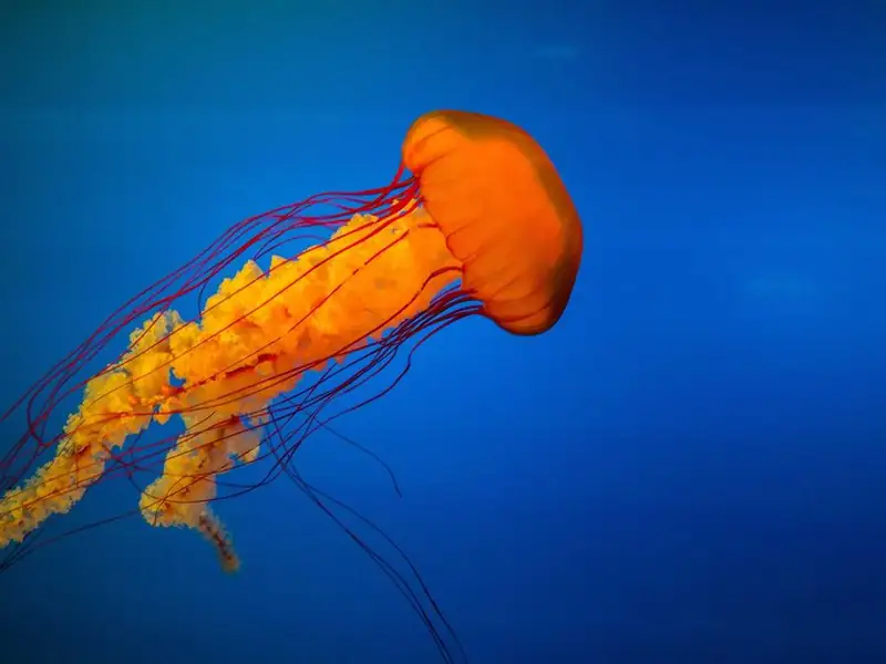
Orange jellyfish trailing long tentacles through deep blue water
Deep WaterGiclee print, A3, €48
A tall waterfall dropping into a mossy green gorge surrounded by pine forest
Moss GorgeGiclee print, A3, €48
Orange sandstone cliffs lit by low sun under a cloudy sky
Red HourGiclee print, A2, €72
A deep blue fjord between grey granite cliffs, seen from a rocky ledge
Fjord LedgeGiclee print, A3, €48
Downtown skyscrapers at sunrise beside a wide lake
Lake City DawnGiclee print, A2, €72

Print 1 of 5

Press previous on the first print. The track slides onto a copy, then jumps back without a visible seam.

The script copies the last slide in front of the first and the first after the last. When a transition ends on one of those copies, the track jumps to the matching real slide with transitions switched off, so the loop never shows a rewind. The copies get aria-hidden and inert because they are only scenery, and the buttons ignore clicks while a move is running, which is what breaks most hand-made loops.

View code
.jc-loop {
  container-type: inline-size;
  width: min(100%, 560px);
  color: #eef1f6;
}
.jc-loop__view {
  overflow: hidden;
  border-radius: 18px;
  background: #161c28;
}
.jc-loop__track {
  display: flex;
}
.jc-loop__slide {
  flex: 0 0 100%;
  margin: 0;
  padding: 14px;
}
.jc-loop__slide img {
  display: block;
  width: 100%;
  height: auto;
  aspect-ratio: 3 / 2;
  object-fit: cover;
  border: 8px solid #f4efe6;
  border-radius: 4px;
}
.jc-loop__slide figcaption {
  display: flex;
  flex-wrap: wrap;
  align-items: baseline;
  justify-content: space-between;
  gap: 4px 12px;
  padding: 14px 4px 4px;
  font-size: 14px;
  color: #b9c2d3;
}
.jc-loop__slide figcaption b {
  font-family: "Fraunces", serif;
  font-size: 21px;
  font-weight: 600;
  color: #fff;
}
.jc-loop__nav {
  display: flex;
  align-items: center;
  justify-content: space-between;
  gap: 12px;
  margin-top: 16px;
}
.jc-loop__btn {
  display: grid;
  place-items: center;
  width: 48px;
  height: 48px;
  padding: 0;
  border: 1.5px solid #4a5468;
  border-radius: 50%;
  background: transparent;
  color: #fff;
  cursor: pointer;
  transition: background-color .2s, border-color .2s;
}
.jc-loop__btn:hover {
  border-color: #f4efe6;
  background: #222a3a;
}
.jc-loop__btn:focus-visible {
  outline: 3px solid #ffcf5c;
  outline-offset: 3px;
}
.jc-loop__btn svg {
  width: 20px;
  height: 20px;
}
.jc-loop__count {
  margin: 0;
  font-size: 14px;
  font-weight: 600;
  color: #d5dbe6;
  font-variant-numeric: tabular-nums;
}
@media (prefers-reduced-motion: no-preference) {
  .jc-loop__track {
    transition: transform .55s cubic-bezier(.3, .7, .2, 1);
  }
  .jc-loop__track.is-instant {
    transition: none;
  }
}

Scroll snap with script buttons and an indicator

  • scroll-snap-type
  • scrollBy
  • IntersectionObserver

Neighbourhood guides

  • Narrow brick alley with fire escapes, leading toward office towers

    Old Mill Quarter

    14 places, 2 km on foot

  • Old gabled houses along a canal with small white boats moored at the water

    Harbour canals

    9 places, 1.5 km on foot

  • Downtown skyscrapers at sunrise beside a wide lake

    Lakefront towers

    11 places, 3 km on foot

  • A road cut into a green hillside above the sea, with headlands fading into haze

    Cliff road

    6 stops, best by bike

  • Granite cliffs above pine trees and a calm river with a sandy bank

    River valley

    8 places, 5 km on foot

  • A single-lane road winding through a green valley below steep grassy cliffs

    Highland pass

    5 stops, half a day by car

Swipe or scroll the row, or use the arrows. The dots and the counter follow the cards in view.

Without JavaScript this is a plain scroll-snapping row with a scrollbar. The script reveals the buttons, which call scrollBy by one card width and let snapping land the card, and an IntersectionObserver rooted on the row marks every card that is at least 60 percent visible. The same observer data drives the dots, the counter and aria-disabled on the buttons, so nothing has to read scrollLeft on every scroll event.

View code
.jc-snap {
  container-type: inline-size;
  width: 100%;
  max-width: 820px;
  color: #191c22;
}
.jc-snap__head {
  display: flex;
  align-items: center;
  gap: 8px;
  margin-bottom: 14px;
}
.jc-snap__title {
  margin: 0 auto 0 0;
  font-family: "Fraunces", serif;
  font-size: 22px;
  font-weight: 600;
  line-height: 1.2;
  letter-spacing: 0;
  color: #191c22;
}
.jc-snap__nav {
  display: flex;
  gap: 8px;
}
.jc-snap__nav[hidden],
.jc-snap__foot[hidden] {
  display: none;
}
.jc-snap__btn {
  display: grid;
  place-items: center;
  width: 44px;
  height: 44px;
  padding: 0;
  border: 1.5px solid #191c22;
  border-radius: 50%;
  background: #fff;
  color: #191c22;
  cursor: pointer;
  transition: background-color .2s, color .2s;
}
.jc-snap__btn:hover {
  background: #191c22;
  color: #fff;
}
.jc-snap__btn[aria-disabled="true"] {
  border-color: #b9bec8;
  background: #fff;
  color: #858b97;
  cursor: default;
}
.jc-snap__btn:focus-visible {
  outline: 3px solid #c2410c;
  outline-offset: 2px;
}
.jc-snap__btn svg {
  width: 20px;
  height: 20px;
}
.jc-snap__list {
  display: flex;
  gap: 16px;
  margin: 0;
  padding: 0 0 12px;
  list-style: none;
  overflow-x: auto;
  overscroll-behavior-x: contain;
  scroll-snap-type: x mandatory;
}
.jc-snap.is-enhanced .jc-snap__list {
  padding-bottom: 0;
  scrollbar-width: none;
}
.jc-snap.is-enhanced .jc-snap__list::-webkit-scrollbar {
  display: none;
}
.jc-snap__card {
  flex: 0 0 80%;
  margin: 0;
  padding: 10px 10px 14px;
  border-radius: 16px;
  background: #fff;
  scroll-snap-align: start;
  box-shadow: 0 1px 2px rgba(25, 28, 34, .08);
}
.jc-snap__card img {
  display: block;
  width: 100%;
  height: auto;
  aspect-ratio: 4 / 3;
  object-fit: cover;
  border-radius: 10px;
}
.jc-snap__name {
  margin: 12px 4px 0;
  font-size: 16.5px;
  font-weight: 700;
}
.jc-snap__meta {
  margin: 2px 4px 0;
  font-size: 14px;
  color: #535a66;
}
.jc-snap__foot {
  display: flex;
  align-items: center;
  justify-content: space-between;
  gap: 12px;
  margin-top: 14px;
}
.jc-snap__dots {
  display: flex;
  gap: 6px;
}
.jc-snap__dots i {
  width: 8px;
  height: 8px;
  border-radius: 8px;
  background: #c3c8d1;
  transition: background-color .2s;
}
.jc-snap__dots i.is-on {
  background: #191c22;
}
.jc-snap__status {
  margin: 0;
  font-size: 14px;
  font-weight: 600;
  color: #3f4550;
}
@container (min-width: 540px) {
  .jc-snap__card {
    flex-basis: calc((100% - 16px) / 2);
  }
}
@container (min-width: 760px) {
  .jc-snap__card {
    flex-basis: calc((100% - 32px) / 3);
  }
}
@media (prefers-reduced-motion: no-preference) {
  .jc-snap__dots i.is-on {
    width: 22px;
    transition: width .25s ease, background-color .2s;
  }
}

Vertical carousel in a phone

  • translateY
  • ArrowUp / ArrowDown
  • flex-direction: column

Trailmate

Routes near you

A hiker with a large orange backpack standing on a rock above a hazy mountain valley

Ridge above the valley

8.2 km, moderate, 3 h 10 min

A tall waterfall dropping into a mossy green gorge surrounded by pine forest

Waterfall gorge

5.4 km, easy, 1 h 50 min

Two yellow tents pitched on snow beside a stone wall, with snowy peaks behind

Hut-to-hut in snow

2 days, hard, guide advised

A single-lane road winding through a green valley below steep grassy cliffs

Old drovers road

12.6 km, moderate, 4 h 20 min

Use the up and down buttons, or focus one and press the up and down arrow keys.

The same index-to-transform idea turned on its side: the track is a column as tall as the view, each slide takes 100 percent of that height, and translateY moves one full slide per step. Percentages in translate refer to the element itself, so the step stays correct at any phone height. The up and down arrow keys work while focus is on the controls, and the position dots are decoration because each slide already has a name.

View code
.jc-vert {
  display: flex;
  flex-direction: column;
  height: 100%;
  background: #0f1713;
  color: #f1f5f2;
}
.jc-vert__bar {
  padding: 10px 18px 14px;
}
.jc-vert__app {
  margin: 0;
  font-size: 13px;
  font-weight: 700;
  color: #9fd3b4;
}
.jc-vert__title {
  margin: 2px 0 0;
  font-family: "Fraunces", serif;
  font-size: 24px;
  font-weight: 600;
  line-height: 1.2;
  letter-spacing: 0;
  color: #f1f5f2;
}
.jc-vert__view {
  position: relative;
  flex: 1;
  min-height: 0;
  margin: 0 10px 10px;
  overflow: hidden;
  border-radius: 22px;
}
.jc-vert__track {
  display: flex;
  flex-direction: column;
  height: 100%;
}
.jc-vert__slide {
  position: relative;
  flex: 0 0 100%;
}
.jc-vert__slide img {
  position: absolute;
  inset: 0;
  width: 100%;
  height: 100%;
  object-fit: cover;
}
.jc-vert__info {
  position: absolute;
  left: 12px;
  right: 72px;
  bottom: 12px;
  padding: 12px 14px;
  border-radius: 14px;
  background: rgba(10, 16, 13, .88);
}
.jc-vert__name {
  margin: 0;
  font-size: 17px;
  font-weight: 700;
  line-height: 1.25;
}
.jc-vert__meta {
  margin: 3px 0 0;
  font-size: 13.5px;
  color: #cfdcd4;
}
.jc-vert__dots {
  position: absolute;
  top: 50%;
  left: 12px;
  display: flex;
  flex-direction: column;
  gap: 6px;
  padding: 7px 5px;
  border-radius: 99px;
  background: rgba(10, 16, 13, .7);
  transform: translateY(-50%);
}
.jc-vert__dots i {
  width: 6px;
  height: 6px;
  border-radius: 6px;
  background: #6f8277;
}
.jc-vert__dots i.is-on {
  height: 18px;
  background: #fff;
}
.jc-vert__nav {
  position: absolute;
  right: 12px;
  bottom: 12px;
  display: flex;
  flex-direction: column;
  gap: 8px;
}
.jc-vert__btn {
  display: grid;
  place-items: center;
  width: 48px;
  height: 48px;
  padding: 0;
  border: 0;
  border-radius: 50%;
  background: #f1f5f2;
  color: #0f1713;
  cursor: pointer;
  transition: background-color .2s;
}
.jc-vert__btn:hover {
  background: #cfe7d8;
}
.jc-vert__btn[aria-disabled="true"] {
  background: #56635b;
  color: #d6ddd8;
  cursor: default;
}
.jc-vert__btn:focus-visible {
  outline: 3px solid #ffcf5c;
  outline-offset: 2px;
}
.jc-vert__btn svg {
  width: 22px;
  height: 22px;
}
@media (prefers-reduced-motion: no-preference) {
  .jc-vert__track {
    transition: transform .55s cubic-bezier(.22, .7, .2, 1);
  }
  .jc-vert__dots i {
    transition: height .3s ease, background-color .3s;
  }
}

Layouts that adapt

Carousels where the script has to know about the layout: a thumbnail strip that follows the main image, a slides-per-view count that changes with the width, a centered slide with smaller neighbours, and a row that turns into a plain grid on wide screens.

Thumbnails synced to the main slider

  • aria-current
  • scrollTo
  • two-way sync
A deep blue fjord between grey granite cliffs, seen from a rocky ledge
A tall waterfall dropping into a mossy green gorge surrounded by pine forest
Granite cliffs above pine trees and a calm river with a sandy bank
Two yellow tents pitched on snow beside a stone wall, with snowy peaks behind
A hiker with a large orange backpack standing on a rock above a hazy mountain valley
A road cut into a green hillside above the sea, with headlands fading into haze

Press a thumbnail, or use the arrows on the photo. On a phone the strip scrolls to keep the active thumbnail in view.

The thumbnails and the arrows both call the same go function, which moves the main track and then updates the strip, so the two can never point at different photos. The active thumbnail gets aria-current and a ring, and the strip scrolls with scrollTo on its own scroll container rather than scrollIntoView, which would also scroll the page. Thumbnail images have empty alt text because each button already has a name.

View code
.jc-thumbs {
  container-type: inline-size;
  width: min(100%, 640px);
  padding: 12px;
  border-radius: 20px;
  background: #1c1917;
  color: #fff;
}
.jc-thumbs__main {
  position: relative;
  overflow: hidden;
  border-radius: 12px;
}
.jc-thumbs__track {
  display: flex;
}
.jc-thumbs__slide {
  flex: 0 0 100%;
}
.jc-thumbs__slide img {
  display: block;
  width: 100%;
  height: auto;
  aspect-ratio: 16 / 10;
  object-fit: cover;
}
.jc-thumbs__arrow {
  position: absolute;
  top: 50%;
  display: grid;
  place-items: center;
  width: 44px;
  height: 44px;
  padding: 0;
  border: 0;
  border-radius: 50%;
  background: rgba(255, 255, 255, .94);
  color: #1c1917;
  cursor: pointer;
  transform: translateY(-50%);
  box-shadow: 0 4px 14px rgba(0, 0, 0, .25);
  transition: background-color .2s;
}
.jc-thumbs__arrow:hover {
  background: #fff;
}
.jc-thumbs__arrow--prev {
  left: 10px;
}
.jc-thumbs__arrow--next {
  right: 10px;
}
.jc-thumbs__arrow svg {
  width: 20px;
  height: 20px;
}
.jc-thumbs__arrow:focus-visible,
.jc-thumbs__thumb:focus-visible {
  outline: 3px solid #fbbf24;
  outline-offset: 2px;
}
.jc-thumbs__count {
  position: absolute;
  right: 10px;
  bottom: 10px;
  margin: 0;
  padding: 3px 10px;
  border-radius: 99px;
  background: rgba(28, 25, 23, .82);
  font-size: 13px;
  font-weight: 700;
  font-variant-numeric: tabular-nums;
}
.jc-thumbs__strip {
  position: relative;
  display: flex;
  gap: 8px;
  margin-top: 10px;
  padding: 5px;
  overflow-x: auto;
  scrollbar-width: thin;
  scrollbar-color: #57534e transparent;
}
.jc-thumbs__thumb {
  position: relative;
  flex: 0 0 auto;
  width: 88px;
  padding: 0;
  border: 0;
  border-radius: 8px;
  overflow: hidden;
  background: #292524;
  cursor: pointer;
}
.jc-thumbs__thumb img {
  display: block;
  width: 100%;
  height: auto;
  aspect-ratio: 4 / 3;
  object-fit: cover;
  opacity: .6;
  transition: opacity .2s;
}
.jc-thumbs__thumb:hover img,
.jc-thumbs__thumb[aria-current="true"] img {
  opacity: 1;
}
.jc-thumbs__thumb::after {
  content: "";
  position: absolute;
  inset: 0;
  border: 3px solid transparent;
  border-radius: 8px;
}
.jc-thumbs__thumb[aria-current="true"]::after {
  border-color: #fff;
}
@media (prefers-reduced-motion: no-preference) {
  .jc-thumbs__track {
    transition: transform .5s cubic-bezier(.22, .7, .2, 1);
  }
}

Slides per view with ResizeObserver

  • ResizeObserver
  • custom property
  • clamped index

Upcoming workshops

Showing 1 of 8

  • 14Nov

    Grid layouts from sketch to code

    18:30, Studio Halvorne

    €25

  • 16Nov

    Variable fonts, hands on

    10:00, Kestrova Hall

    €30

  • 19Nov

    Accessible motion design

    18:00, online

    Free

  • 21Nov

    Color systems for dark mode

    17:00, Mosswell Rooms

    €20

  • 25Nov

    Prototyping with real data

    18:30, Studio Halvorne

    €25

  • 28Nov

    Design tokens in practice

    14:00, online

    €15

  • 2Dec

    Lettering for the web

    19:00, Vellira Library

    €35

  • 5Dec

    Portfolio review night

    18:00, Kestrova Hall

    Free

Shows 3 cards on a wide stage and 1 on a phone. Press the arrows to move one card at a time.

A ResizeObserver on the carousel turns its own width into a slides-per-view number and writes it to a custom property that the card widths read, so the layout and the script use the same count. The last valid index is the card count minus that number, which is why the track never slides into empty space after a resize. Cards outside the window get inert, and the status line says which cards are showing.

View code
.jc-pv {
  --jc-pv-per: 1;
  container-type: inline-size;
  width: 100%;
  max-width: 860px;
  color: #1d2521;
}
.jc-pv__head {
  display: flex;
  align-items: center;
  gap: 8px;
  margin-bottom: 16px;
}
.jc-pv__heading {
  margin-right: auto;
}
.jc-pv__title {
  margin: 0;
  font-family: inherit;
  font-size: 21px;
  font-weight: 800;
  line-height: 1.2;
  letter-spacing: -.01em;
  color: #1d2521;
}
.jc-pv__status {
  margin: 2px 0 0;
  font-size: 14px;
  color: #4d5852;
}
.jc-pv__btn {
  display: grid;
  place-items: center;
  width: 44px;
  height: 44px;
  padding: 0;
  border: 0;
  border-radius: 50%;
  background: #1b4332;
  color: #fff;
  cursor: pointer;
  transition: background-color .2s;
}
.jc-pv__btn:hover {
  background: #123024;
}
.jc-pv__btn[aria-disabled="true"] {
  background: #d3dbd6;
  color: #59645e;
  cursor: default;
}
.jc-pv__btn:focus-visible {
  outline: 3px solid #b45309;
  outline-offset: 2px;
}
.jc-pv__btn svg {
  width: 20px;
  height: 20px;
}
.jc-pv__view {
  overflow: hidden;
  padding: 2px;
  margin: -2px;
}
.jc-pv__track {
  position: relative;
  display: flex;
  gap: 16px;
  margin: 0;
  padding: 0;
  list-style: none;
}
.jc-pv__card {
  display: flex;
  flex-direction: column;
  flex: 0 0 calc((100% - (var(--jc-pv-per) - 1) * 16px) / var(--jc-pv-per));
  min-height: 210px;
  margin: 0;
  padding: 18px;
  border: 1px solid #dfe2db;
  border-radius: 16px;
  background: #fff;
}
.jc-pv__date {
  display: flex;
  align-items: baseline;
  gap: 6px;
  margin: 0;
  font-size: 13px;
  font-weight: 700;
  text-transform: uppercase;
  letter-spacing: .06em;
  color: #9a3412;
}
.jc-pv__date b {
  font-family: "Fraunces", serif;
  font-size: 36px;
  font-weight: 600;
  line-height: 1;
  letter-spacing: 0;
}
.jc-pv__name {
  margin: 12px 0 4px;
  font-size: 17px;
  font-weight: 700;
  line-height: 1.3;
}
.jc-pv__meta {
  margin: 0 0 auto;
  font-size: 14px;
  color: #4d5852;
}
.jc-pv__price {
  align-self: flex-start;
  margin: 16px 0 0;
  padding: 3px 10px;
  border-radius: 99px;
  background: #e7efe9;
  color: #1b4332;
  font-size: 13.5px;
  font-weight: 700;
}
@media (prefers-reduced-motion: no-preference) {
  .jc-pv__track {
    transition: transform .45s cubic-bezier(.22, .7, .2, 1);
  }
}

Center mode with scaled neighbours

  • offsetLeft math
  • scale()
  • aria-hidden neighbours
Album cover: an orange jellyfish trailing long red tentacles through deep blue water
Album cover: a deep blue fjord between grey granite cliffs
Album cover: orange sandstone cliffs lit by low sun under a cloudy sky
Album cover: downtown skyscrapers at sunrise beside a wide lake
Album cover: a tall waterfall dropping into a mossy green gorge

Desert RadioAmaro Vale, 8 tracks

Press the arrows or click a smaller cover to bring it to the center.

The offset centers the active slide: half the view width minus the slide offset and half its width. Neighbours shrink with scale, which does not change layout, so offsetLeft stays valid and nothing reflows while it animates. The covers hold no focusable content, so the side ones are hidden from screen readers with aria-hidden and the title line below is a polite live region.

View code
.jc-center {
  container-type: inline-size;
  width: min(100%, 760px);
  color: #f4f1ea;
}
.jc-center__view {
  overflow: hidden;
  padding: 8px 0;
}
.jc-center__track {
  position: relative;
  display: flex;
}
.jc-center__slide {
  flex: 0 0 66%;
  padding: 0 4px;
  opacity: .45;
  transform: scale(.8);
  cursor: pointer;
  transition: opacity .3s ease;
}
.jc-center__slide.is-active {
  opacity: 1;
  transform: none;
  cursor: default;
}
.jc-center__slide img {
  display: block;
  width: 100%;
  height: auto;
  aspect-ratio: 1;
  object-fit: cover;
  border-radius: 14px;
  box-shadow: 0 24px 40px rgba(0, 0, 0, .45);
}
.jc-center__foot {
  display: flex;
  align-items: center;
  gap: 14px;
  width: min(100%, 460px);
  margin: 18px auto 0;
}
.jc-center__info {
  flex: 1;
  min-width: 0;
  margin: 0;
  text-align: center;
}
.jc-center__name {
  display: block;
  font-family: "Fraunces", serif;
  font-size: 22px;
  font-weight: 600;
  line-height: 1.25;
}
.jc-center__artist {
  display: block;
  margin-top: 2px;
  font-size: 14px;
  color: #c9c3b6;
}
.jc-center__btn {
  flex: none;
  display: grid;
  place-items: center;
  width: 46px;
  height: 46px;
  padding: 0;
  border: 0;
  border-radius: 50%;
  background: #f4f1ea;
  color: #0b0f1a;
  cursor: pointer;
  transition: background-color .2s;
}
.jc-center__btn:hover {
  background: #ffd88a;
}
.jc-center__btn[aria-disabled="true"] {
  background: #3a3f4c;
  color: #a7adba;
  cursor: default;
}
.jc-center__btn:focus-visible {
  outline: 3px solid #ffd88a;
  outline-offset: 3px;
}
.jc-center__btn svg {
  width: 20px;
  height: 20px;
}
@container (min-width: 600px) {
  .jc-center__slide {
    flex-basis: 42%;
  }
}
@media (prefers-reduced-motion: no-preference) {
  .jc-center__track {
    transition: transform .55s cubic-bezier(.22, .7, .2, 1);
  }
  .jc-center__slide {
    transition: opacity .4s ease, transform .55s cubic-bezier(.22, .7, .2, 1);
  }
}

Carousel that becomes a grid on wide screens

  • matchMedia
  • change event
  • roles added and removed

Included in every plan

  • Shared libraries

    Publish a component once and every file picks up the change.

  • Version history

    Step back through 90 days of edits and restore any frame.

  • Comment threads

    Pin feedback to a layer and resolve it when the fix ships.

  • Offline mode

    Keep editing on a train. Changes sync when you reconnect.

On a window 1100px or wider the four cards sit in a grid with no controls. Narrow the window and it turns into a carousel.

matchMedia reports whether the window is at least 1100px wide and its change event switches modes without a resize listener. In grid mode the script removes the transform, the inert attributes, the buttons and the carousel role and role description, because a grid of four cards is not a carousel and should not be announced as one. Narrow screens get the carousel back with the same markup.

View code
.jc-grid {
  container-type: inline-size;
  width: 100%;
  max-width: 900px;
  padding: 22px;
  border-radius: 22px;
  background: #23203a;
  color: #f3f1fb;
}
.jc-grid__head {
  display: flex;
  align-items: center;
  gap: 8px;
  margin-bottom: 18px;
}
.jc-grid__title {
  margin: 0 auto 0 0;
  font-family: "Fraunces", serif;
  font-size: 22px;
  font-weight: 600;
  line-height: 1.2;
  letter-spacing: 0;
  color: #f3f1fb;
}
.jc-grid__nav {
  display: flex;
  gap: 8px;
}
.jc-grid__nav[hidden] {
  display: none;
}
.jc-grid__btn {
  display: grid;
  place-items: center;
  width: 44px;
  height: 44px;
  padding: 0;
  border: 0;
  border-radius: 12px;
  background: #c9f06b;
  color: #1b1830;
  cursor: pointer;
  transition: background-color .2s;
}
.jc-grid__btn:hover {
  background: #b5e04a;
}
.jc-grid__btn[aria-disabled="true"] {
  background: #403c5c;
  color: #b7b2cf;
  cursor: default;
}
.jc-grid__btn:focus-visible {
  outline: 3px solid #fff;
  outline-offset: 2px;
}
.jc-grid__btn svg {
  width: 20px;
  height: 20px;
}
.jc-grid__view {
  overflow: hidden;
}
.jc-grid:not(.is-ready) .jc-grid__view {
  overflow-x: auto;
}
.jc-grid__track {
  position: relative;
  display: flex;
  gap: 14px;
  margin: 0;
  padding: 0;
  list-style: none;
}
.jc-grid__card {
  flex: 0 0 82%;
  margin: 0;
  padding: 20px;
  border-radius: 16px;
  background: #312d4f;
}
.jc-grid__icon {
  width: 34px;
  height: 34px;
  padding: 7px;
  border-radius: 10px;
  background: #c9f06b;
  color: #1b1830;
}
.jc-grid__name {
  margin: 14px 0 6px;
  font-size: 17px;
  font-weight: 700;
}
.jc-grid__text {
  margin: 0;
  font-size: 14.5px;
  line-height: 1.55;
  color: #cfcae4;
}
.jc-grid.is-grid .jc-grid__track {
  display: grid;
  grid-template-columns: repeat(auto-fit, minmax(170px, 1fr));
  transform: none;
}
@container (min-width: 520px) {
  .jc-grid__card {
    flex-basis: calc((100% - 14px) / 2);
  }
}
@media (prefers-reduced-motion: no-preference) {
  .jc-grid__track {
    transition: transform .45s cubic-bezier(.22, .7, .2, 1);
  }
}

Real slide content

The jobs carousels actually get on client sites: a hero with captions, an image gallery that loads photos lazily, a brand strip of text wordmarks, and a right-to-left layout where next points the other way.

Hero slider with captions

  • aria-labelledby slides
  • grouped pickers
  • fetchpriority

The cliff road, slowly

Five days on the coast with a driver, two ferry crossings and small family guesthouses.

Ridges without the crowds

A week of hut-to-hut walking with a guide and your bags carried ahead.

Canal towns by bike

Flat routes, four towns and a boat back on the last afternoon.

Use the dots or the arrows. The caption of each slide rises in after the photo arrives.

Each slide is labelled by its own caption heading, and the dots follow the grouped style of the APG pattern: real buttons labelled by the same headings, with aria-disabled on the current one so it stays in the tab order. Only the first photo loads eagerly with fetchpriority high, since it is the likely LCP element. It never rotates by itself, which keeps the offer on screen until the visitor moves on.

View code
.jc-hero {
  container-type: inline-size;
  position: relative;
  width: 100%;
  aspect-ratio: 2 / 1;
  min-height: 460px;
  overflow: hidden;
  background: #1d2a33;
  color: #fff;
}
.jc-hero__track {
  display: flex;
  height: 100%;
}
.jc-hero__slide {
  position: relative;
  flex: 0 0 100%;
  height: 100%;
}
.jc-hero__slide img {
  position: absolute;
  inset: 0;
  width: 100%;
  height: 100%;
  object-fit: cover;
}
.jc-hero__cap {
  position: absolute;
  left: clamp(14px, 4cqi, 36px);
  bottom: clamp(14px, 4cqi, 36px);
  width: min(440px, calc(100% - 28px));
  padding: clamp(18px, 3.4cqi, 28px);
  border-radius: 18px;
  background: rgba(14, 22, 28, .88);
}
.jc-hero__title {
  margin: 0;
  font-family: "Fraunces", serif;
  font-size: clamp(24px, 4.2cqi, 34px);
  font-weight: 600;
  line-height: 1.12;
  letter-spacing: -.01em;
  color: #fff;
}
.jc-hero__text {
  margin: 10px 0 18px;
  font-size: 15px;
  line-height: 1.55;
  color: #dbe4ea;
}
.jc-hero__cta {
  min-height: 44px;
  padding: 0 20px;
  border: 0;
  border-radius: 99px;
  background: #ffcf5c;
  color: #1d1606;
  font: inherit;
  font-size: 15px;
  font-weight: 700;
  cursor: pointer;
  transition: background-color .2s;
}
.jc-hero__cta:hover {
  background: #ffe08f;
}
.jc-hero__controls {
  position: absolute;
  top: clamp(14px, 4cqi, 28px);
  right: clamp(14px, 4cqi, 28px);
  display: flex;
  align-items: center;
  gap: 4px;
  padding: 4px;
  border-radius: 99px;
  background: #fff;
  box-shadow: 0 8px 24px rgba(0, 0, 0, .2);
}
.jc-hero__dots {
  display: flex;
  margin: 0 4px;
}
.jc-hero__dot {
  display: grid;
  place-items: center;
  width: 26px;
  height: 44px;
  padding: 0;
  border: 0;
  background: none;
  cursor: pointer;
}
.jc-hero__dot::before {
  content: "";
  width: 10px;
  height: 10px;
  border-radius: 10px;
  background: #8c98a1;
}
.jc-hero__dot[aria-disabled="true"] {
  cursor: default;
}
.jc-hero__dot[aria-disabled="true"]::before {
  width: 20px;
  background: #1d2a33;
}
.jc-hero__btn {
  display: grid;
  place-items: center;
  width: 44px;
  height: 44px;
  padding: 0;
  border: 0;
  border-radius: 50%;
  background: #eef2f4;
  color: #1d2a33;
  cursor: pointer;
  transition: background-color .2s;
}
.jc-hero__btn:hover {
  background: #dce4e8;
}
.jc-hero__btn svg {
  width: 20px;
  height: 20px;
}
.jc-hero__btn:focus-visible,
.jc-hero__dot:focus-visible,
.jc-hero__cta:focus-visible {
  outline: 3px solid #2f7de1;
  outline-offset: 2px;
}
@media (prefers-reduced-motion: no-preference) {
  .jc-hero__track {
    transition: transform .7s cubic-bezier(.22, .7, .2, 1);
  }
  .jc-hero__cap {
    opacity: 0;
    transform: translateY(18px);
    transition: opacity .3s ease, transform .3s ease;
  }
  .jc-hero__slide.is-active .jc-hero__cap {
    opacity: 1;
    transform: none;
    transition: opacity .5s ease .45s, transform .5s cubic-bezier(.22, .7, .2, 1) .45s;
  }
  .jc-hero__dot::before {
    transition: width .25s ease, background-color .25s;
  }
}

Lazy-loaded images in slides

  • loading="lazy"
  • width + height
  • img load event

Studio portfolio

Photos loaded: 0 of 6

Granite cliffs above pine trees and a calm river with a sandy bank
fetchpriority="high"Waiting
Two yellow tents pitched on snow beside a stone wall, with snowy peaks behind
loading="lazy"Waiting
Orange jellyfish trailing long tentacles through deep blue water
loading="lazy"Waiting
Narrow brick alley with fire escapes, leading toward office towers
loading="lazy"Waiting
A single-lane road winding through a green valley below steep grassy cliffs
loading="lazy"Waiting
Orange sandstone cliffs lit by low sun under a cloudy sky
loading="lazy"Waiting

Step through the photos. The tag under each one says whether the browser has fetched it yet.

The first photo loads eagerly with fetchpriority high and every later one has loading lazy, while the width and height attributes reserve a 4:3 box before any bytes arrive, so nothing shifts. The tags listen for each image load event and report what actually happened. Expect most of them to say Loaded quickly: since Chrome 121, lazy images in horizontal carousels use the same distance thresholds as vertical scrolling, so neighbours are fetched before you reach them.

View code
.jc-lazy {
  container-type: inline-size;
  width: min(100%, 560px);
  padding: 18px;
  border-radius: 18px;
  background: #fffdf8;
  color: #26221c;
  box-shadow: inset 0 0 0 1px #e6dfd1;
}
.jc-lazy__head {
  display: flex;
  flex-wrap: wrap;
  align-items: baseline;
  justify-content: space-between;
  gap: 4px 16px;
  margin-bottom: 14px;
}
.jc-lazy__title {
  margin: 0;
  font-family: "Fraunces", serif;
  font-size: 22px;
  font-weight: 600;
  line-height: 1.2;
  letter-spacing: 0;
  color: #26221c;
}
.jc-lazy__status {
  margin: 0;
  font-size: 13.5px;
  font-weight: 600;
  color: #5b5348;
}
.jc-lazy__view {
  overflow: hidden;
  border-radius: 12px;
}
.jc-lazy__track {
  display: flex;
}
.jc-lazy__slide {
  flex: 0 0 100%;
  margin: 0;
}
.jc-lazy__frame {
  display: grid;
  place-items: center;
  aspect-ratio: 4 / 3;
  border-radius: 12px;
  background: #e9e4da;
  overflow: hidden;
}
.jc-lazy__frame::before {
  content: "800 \00D7 600 reserved";
  grid-area: 1 / 1;
  font: 600 13px/1 ui-monospace, Consolas, monospace;
  color: #5b5348;
}
.jc-lazy__frame img {
  grid-area: 1 / 1;
  display: block;
  width: 100%;
  height: auto;
}
.jc-lazy__code {
  display: flex;
  flex-wrap: wrap;
  align-items: center;
  justify-content: space-between;
  gap: 6px 12px;
  padding: 12px 2px 0;
}
.jc-lazy__code code {
  padding: 3px 8px;
  border-radius: 6px;
  background: #26221c;
  color: #f6efe1;
  font: 13px/1.5 ui-monospace, Consolas, monospace;
}
.jc-lazy__flag {
  padding: 2px 10px;
  border-radius: 99px;
  background: #ece7dd;
  color: #5b5348;
  font-size: 13px;
  font-weight: 700;
}
.jc-lazy__flag.is-ok {
  background: #dcefe1;
  color: #1d5a33;
}
.jc-lazy__nav {
  display: flex;
  align-items: center;
  justify-content: space-between;
  margin-top: 14px;
}
.jc-lazy__btn {
  display: grid;
  place-items: center;
  width: 44px;
  height: 44px;
  padding: 0;
  border: 1.5px solid #26221c;
  border-radius: 50%;
  background: #fffdf8;
  color: #26221c;
  cursor: pointer;
  transition: background-color .2s, color .2s;
}
.jc-lazy__btn:hover {
  background: #26221c;
  color: #fffdf8;
}
.jc-lazy__btn:focus-visible {
  outline: 3px solid #2f6fd6;
  outline-offset: 2px;
}
.jc-lazy__btn svg {
  width: 20px;
  height: 20px;
}
.jc-lazy__count {
  margin: 0;
  font-size: 14px;
  font-weight: 700;
  font-variant-numeric: tabular-nums;
}
@media (prefers-reduced-motion: no-preference) {
  .jc-lazy__track {
    transition: transform .5s cubic-bezier(.22, .7, .2, 1);
  }
}

Logo-free brand strip

  • requestAnimationFrame
  • aria-pressed
  • cloned set

Design teams shipping with us

  • Halvorne
  • Kestrova
  • orbelin
  • pine/fold
  • Mosswell & Co.
  • Tandemry
  • Vellira
  • quillo

The names drift left. Hover to hold them, or press Pause.

A requestAnimationFrame loop moves the row by elapsed time, and once it has travelled one full set it subtracts that width, so the copied set behind it makes the loop seamless. The copies are aria-hidden and inert, and the loop stops while hovered, while scrolled out of view and when Pause is pressed. Under reduced motion the script never starts and the names simply wrap into a static row.

View code
.jc-brands {
  container-type: inline-size;
  width: 100%;
  max-width: 860px;
  padding: 22px 0 26px;
  border-radius: 18px;
  background: #fff;
  color: #39404d;
  box-shadow: 0 1px 2px rgba(20, 24, 33, .06);
}
.jc-brands__head {
  display: flex;
  align-items: center;
  justify-content: space-between;
  gap: 12px;
  padding: 0 22px;
  margin-bottom: 18px;
}
.jc-brands__lead {
  margin: 0;
  font-size: 15px;
  font-weight: 600;
  color: #4a5160;
}
.jc-brands__pause {
  display: inline-flex;
  align-items: center;
  gap: 6px;
  min-height: 36px;
  padding: 0 14px 0 10px;
  border: 1.5px solid #c9ced8;
  border-radius: 99px;
  background: #fff;
  color: #252a34;
  font: inherit;
  font-size: 14px;
  font-weight: 600;
  cursor: pointer;
  transition: border-color .2s, background-color .2s;
}
.jc-brands__pause:hover {
  border-color: #252a34;
}
.jc-brands__pause[aria-pressed="true"] {
  border-color: #252a34;
  background: #252a34;
  color: #fff;
}
.jc-brands__pause:focus-visible {
  outline: 3px solid #2f6fd6;
  outline-offset: 2px;
}
.jc-brands__pause svg {
  width: 16px;
  height: 16px;
}
.jc-brands__pause[hidden] {
  display: none;
}
.jc-brands__view {
  overflow: hidden;
}
.jc-brands__track {
  display: flex;
  align-items: center;
  width: max-content;
  margin: 0;
  padding: 0;
  list-style: none;
}
.jc-brands.is-static .jc-brands__track {
  flex-wrap: wrap;
  justify-content: center;
  width: auto;
  row-gap: 14px;
  padding: 0 12px;
}
.jc-brands__mark {
  flex: none;
  margin: 0;
  padding: 0 28px;
  line-height: 1.2;
  white-space: nowrap;
  color: #39404d;
}
.jc-brands__mark--a { font-family: "Fraunces", serif; font-size: 26px; font-style: italic; font-weight: 600; }
.jc-brands__mark--b { font-size: 17px; font-weight: 800; letter-spacing: .24em; text-transform: uppercase; }
.jc-brands__mark--c { font-size: 25px; font-weight: 700; letter-spacing: -.04em; }
.jc-brands__mark--d { font-family: ui-monospace, Consolas, monospace; font-size: 19px; font-weight: 600; }
.jc-brands__mark--e { font-family: "Fraunces", serif; font-size: 22px; font-weight: 500; }
.jc-brands__mark--f { font-family: ui-monospace, Consolas, monospace; font-size: 15px; font-weight: 700; letter-spacing: .14em; text-transform: uppercase; }
.jc-brands__mark--g { font-size: 28px; font-weight: 300; letter-spacing: .02em; }
.jc-brands__mark--h { font-family: "Fraunces", serif; font-size: 26px; font-weight: 800; letter-spacing: -.02em; }

How do JavaScript carousels work?

You will hear sliders, slideshows and rotators too, and they all mean the same widget. Designers file the lot under the carousel UI pattern.

The viewport is a fixed-size box with overflow hidden. Inside it sits the track, one wide row holding every slide side by side, and each slide is as wide as the viewport.

The track moves, not the slides. Felix Owino makes this point in his DEV Community vanilla JS walkthrough, where the motion belongs to the parent container while the other slides wait clipped on either side.

Most carousels move that track with a transform. The script sets translateX on the track and a CSS transition animates the shift.

A scroll-based version puts the slides in a scrollable row with scroll snap, and either the script or the user’s thumb changes the scroll offset.

The fade version doesn’t move anything. Slides stack in one spot, and the active one fades in while the rest fade out.

CSS handles the layout whichever way you go. The JavaScript layer covers what CSS can’t do alone, which is a current-index variable and event listeners for clicks and keys. Autoplay needs timers on top of that.

Every control a carousel offers, from dots to swipe, is just another way to change that index.

Native CSS, vanilla JavaScript or a library: which approach fits?

Scroll snap covers a plain swipeable card row without much fuss. Once you want custom looping or autoplay, you’re in vanilla JavaScript territory, and the table below shows where each option gives out.

ApproachHow slides moveYou maintainBreaks when
Scroll snap with CSS buttons and markersNative browser scrollingA few CSS rulesYou need autoplay or looping
Scroll snap plus a short scriptScroll offset set by scriptA handful of JavaScript linesYou need looping or custom transitions
Vanilla JavaScripttranslateX on the trackState, controls, edge casesRapid clicks hit a running transition
LibraryThe library’s own engineA dependency and its updatesBundle weight outgrows a single gallery

Tuts+ builds a working slider in fewer than 15 lines of JavaScript by leaning on CSS smooth scrolling.

Chrome 135 generates scroll buttons that page the scroll area by 85%, and it places those buttons and the scroll markers in the tab order with their state tracked by the browser. Screen readers report the marker links like a tablist, with focusgroup-style keyboard behavior.

Chrome for Developers published the ::scroll-button() and ::scroll-marker() features on March 20, 2025. The Chrome team’s own Carousel Gallery site is built without JavaScript.

Support is the catch. MDN’s ::scroll-button() page, last updated in April 2026, still marks the feature experimental and outside Baseline.

The Chrome post listed Chrome 135 and Edge 135 as supported and Firefox and Safari as not, and it put cyclical scrolling on the future-work list. As of that post, native carousels do not loop.

Ship the native version as progressive enhancement, with a plain scrolling row as the fallback. Our walkthrough of a CSS carousel build covers the markup step by step, and the CSS slideshow examples cover the fade version.

A library earns its place when several carousels share one codebase, or when you need touch physics and looping out of the box. For one product gallery it’s a dependency you didn’t need, and honestly I’d skip it.

How to build a JavaScript carousel step by step

You write the markup and the CSS that puts the slides in a row, then add one function that moves the track to a given index.

  1. Write the markup with a labeled wrapper, one track and one element per slide. When several carousels share a page, give each its own IDs and point aria-labelledby at its own heading.
  2. Style the viewport with overflow hidden, give the track a flex row, and set flex: 0 0 100% on each slide. Add an aspect ratio so the height is reserved before images load.
  3. Store one state value, a currentIndex variable that starts at 0.
  4. Write goTo(index) to clamp the index and set translateX(-index * 100%) on the track. Put a transition on transform.
  5. Wire previous and next to call goTo with currentIndex minus or plus 1.
  6. Handle the ends by disabling the button at the edge, or by looping.
  7. Recalculate on resize, re-applying the transform whenever slide width or slides per view changes.

Animate transform, never left, top, width or marginTop. Layout-inducing properties cause layout shifts during slide transitions, per web.dev’s carousel guide by Katie Hempenius.

Reach for requestAnimationFrame only when the script drives every frame, as in a drag that follows the finger. For plain previous and next, a CSS transition is enough.

Looping without a visible jump

Clone the first slide after the last and the last slide before the first. When a transition ends on a clone, switch the transition off and jump the track to the matching real slide.

Clicking fast during a running transition can still break the position. A public vanilla JavaScript practice project on GitHub (r0o0/carousel_vanillaJS) logs disabling both buttons while the animation runs.

Slides per view and responsive breakpoints

Slides per view is a number, not a layout.

Set each slide’s width to 100 divided by that number, in percent. Keep the number in a CSS custom property that changes inside media queries, and read it back in the script when you compute the maximum index.

Watch the last valid index. With 5 slides and 2 per view it’s 3, not 4, so clamp to slide count minus slides per view or the track slides into empty space.

How to add arrows, dots, swipe and keyboard controls

Previous and next buttons, slide pickers, swipe and keyboard keys all do the same job, which is calling goTo with a new index.

Arrows should be native button elements labeled “Previous slide” and “Next slide”. Dots and thumbnails are buttons bound to a slide index, and the active one needs marking. Swipe runs on Pointer Events on the track, with a visible alternative next to it. Keyboard users get Tab to reach the controls and Enter or Space to activate them.

For swipe, listen for pointerdown, pointermove and pointerup on the track. Move the track with the finger, then commit to the next slide once the drag passes a distance threshold.

Set touch-action to pan-y on the track so vertical page scrolling keeps working.

WCAG 2.5.1 Pointer Gestures calls for a non-gesture alternative to swiping, and the arrow buttons already supply it (Sonja Weckenmann, Smashing Magazine).

The W3C ARIA Authoring Practices Guide describes a basic carousel with rotation and previous and next controls only. The tabbed style adds one tab stop for pickers built on the tabs pattern, and the grouped style adds one tab stop per picker button.

Grouped is the least friendly for keyboard users, because every dot adds another tab stop. Pick the tabbed style when the carousel has more than a few slides.

Activating the rotation, previous and next buttons does not move focus, so users can press them repeatedly without hunting for the control again (W3C APG).

web.dev adds two usability rules. Show the total slide count and the user’s position, and make the controls large and visible, since most carousels ship small, faint arrows.

How should carousel autoplay behave?

Skip autoplay if you can. If it has to run, it needs a pause control, and it should start paused for anyone who asked for reduced motion. Stopping on hover and focus is expected too.

WCAG 2.2 success criterion 2.2.2 (Level A) covers movement that starts automatically, lasts more than five seconds and sits beside other content. It requires a way to pause, stop or hide that movement, according to W3C’s Understanding document.

Stopping on hover or focus helps, but it does not replace a pause control. W3C states that a pause lasting only while the user holds focus on the content is not a mechanism, because the page becomes unusable in the meantime.

The ARIA Authoring Practices Guide turns the requirement into concrete behavior. The rotation button comes first in the Tab order inside the carousel, and its label flips between “Stop slide rotation” and “Start slide rotation”.

Rotation stops when keyboard focus enters and stays stopped until the user restarts it. It also stops while the mouse hovers over the carousel. The slide wrapper carries aria-live=”off” while rotating and “polite” when it is not.

Read the prefers-reduced-motion media feature with matchMedia and start paused when it reports reduce. A user who set that preference in the operating system should never see slides move on their own.

web.dev is blunt about autoplay. It’s rarely a good choice, because motion pulls the eye away from more important content and users read moving banners as ads. WCAG 2.2.2 is more lenient and allows autoplay as long as the pause mechanism exists.

The two sources answer different questions. WCAG sets the minimum for conformance, while web.dev describes what works for readers.

No standard interval exists. web.dev ties display time to content: the more text on a slide, the longer it stays, because people read at different speeds.

What makes JavaScript carousels accessible?

The W3C WAI carousels tutorial boils accessibility down to 4 requirements: a way to pause motion, full keyboard operation, announced slide changes and sensible focus. Its guidance ties to 4 WCAG success criteria, all Level A: 1.3.1, 2.1.1, 2.2.2 and 4.1.2.

WCAG’s success criteria are the testable requirements. The APG carousel pattern and the WAI tutorial are guidance for meeting them, and the tutorial was last updated in April 2017, so check it against the current criterion text.

The stakes reach past the widget. Under WCAG’s non-interference requirement, every piece of content on a page must meet 2.2.2, so one rotating carousel can sink the whole page’s conformance.

That makes a carousel a page-level issue in any web accessibility audit, not a component-level one.

ARIA structure for the carousel and its slides

The APG builds the carousel from roles and role descriptions.

The container takes role region or group, with aria-roledescription set to carousel. Its label comes from aria-labelledby pointing at a visible heading, or from aria-label when no heading exists.

Each slide gets role group with aria-roledescription set to slide, plus its own label. That can be a heading, or a position such as “3 of 10” when slides have no unique names.

Neither label contains the word carousel or slide, because the role description already supplies it. Region is worth using only when the carousel deserves a landmark, and the APG leaves that call to the page’s information architecture.

The other two styles change the markup. In the tabbed style, slides become tabpanel elements without the slide role description, and the pickers become tabs in a tablist.

In the grouped style, the picker for the current slide gets aria-disabled instead of the disabled attribute. That keeps it in the tab sequence, which the APG says helps screen reader users.

ARIA names and describes, and it makes nothing operable. A div styled as an arrow that cannot take focus still fails 2.1.1, labels or not.

Hiding inactive slides badly is the other classic failure. The APG warns that slides moved off-screen instead of properly hidden leave screen reader users reading content they cannot see.

Keyboard access and focus order

Libraries disagree on where focus goes after a slide changes.

Slick’s accessibility option sets focus on the current slide after a change unless autoplay is on, and its docs tell you to enable focusOnChange as well for full accessibility compliance. That departs from the APG habit of leaving focus on the pressed control.

Both can satisfy 2.1.1. The W3C pattern is the safer default, because focus that jumps into slide content breaks repeated presses of Next.

Hide inactive slides with the hidden attribute or display none so their links leave the tab order. In scroll-snap carousels, where every slide stays in the DOM, use inert on the off-screen ones.

Keep a visible focus outline on every control, dots included.

How do JavaScript carousels affect Core Web Vitals?

web.dev’s carousel guide puts a well-built carousel at very little performance cost, so the damage comes from how the slides load. LCP and CLS are where it shows up. INP almost never does.

LCP goes first. A large above-the-fold carousel often holds the page’s LCP element. In a static carousel only the first slide is a candidate, while in an autoplay carousel any slide can end up as the final one, because candidates stop updating after the first user interaction.

Keep every slide in an autoplay carousel at the same intrinsic size. LCP uses the smaller of visible and intrinsic size, so mixed sizes let the LCP element change as slides rotate.

CLS is the sneakier one. Shifts from slide transitions in an autoplay carousel can count toward CLS and repeat indefinitely, and they are typically invisible to the eye. In a manual carousel they land in the short window after a user interaction and do not count.

Controls that move or get added on hover cause shifts too, so render them at load.

Carousels need little JavaScript, so INP rarely suffers. If a carousel script runs long tasks, web.dev says to replace the carousel tooling.

Two dated browser changes affect loading. Chrome 88 made images later removed from the DOM stay eligible as LCP candidates, which ended the LCP update that each slide swap used to trigger.

Chrome 121 gave horizontally scrolling images the same loading thresholds as vertical ones, so slides now load before they enter the viewport. The cost is more downloads, per web.dev.

So lazy loading defers less than it used to. Put the first slide in the HTML and never lazy-load it, since it is the likely LCP image. Chrome’s LCP request discovery insight (October 2025) says to add fetchpriority=”high” or a preload, and to avoid loading=”lazy”. Later slides can be lazy-loaded, with progressive enhancement for controls on top of the static first slide.

Check what your library does here, because they differ. Swiper’s lazyPreload parameter handles loading=”lazy” images and preloads neighbors through lazyPreloadPrevNext, Slick’s lazyLoad accepts ondemand or progressive, and Splide ships its own lazy loading.

Fade carousels have a trap. Browsers skip a loading=”lazy” image hidden with display none, because it never comes near the viewport, but load one hidden with opacity 0, so stacked fade slides fetch everything anyway.

An Intersection Observer can hold off autoplay or slide loading until the carousel is on screen, and Splide’s Intersection extension does this for autoplay. Lighthouse has an audit for non-composited animations, which catches the slide transitions that cause the repeating CLS above.

Best JavaScript carousel libraries compared

Swiper makes sense if you want touch features and modules out of the box. If you’d rather start from a dependency-free core and extend it with plugins, Embla Carousel is the better fit, and Splide suits projects where built-in accessibility features and a small footprint come first.

Pick Slick or Owl Carousel only to maintain an old jQuery codebase. The order below follows fit for a new project, judged on dependencies, accessibility support, framework wrappers, license and maintenance signals.

LibraryBuild modelAccessibilityFrameworks
SwiperModular coreA11y module, opt-inReact, Vue, web component
Embla CarouselDependency-free, pluginsAccessibility plugin (v9 RC)React, Vue, Svelte, Solid
SplideDependency-freeLive region, play/pauseReact, Vue, Svelte
Glide.jsDependency-free, modularNone listedNone listed
SlickjQuery pluginTab and arrow keysNone listed

Swiper

Swiper is organized as a core plus modules that you register through the modules parameter, including Navigation, Pagination, Autoplay, A11y, Keyboard, Thumbs and Zoom. The docs (v14.3.0 in October 2026) list React, Vue and a web component named Swiper Element among their framework options.

On the plus side, a breakpoints parameter changes slides per view and spacing by screen width, and cssMode switches to CSS scroll snap for simple setups, with a reduced feature set. Methods such as slideTo and slideNext support custom controls too.

The downsides are real. Accessibility is a module you switch on, not a default. Loop mode rearranges slides and sets minimum slide counts, and breakpoints cannot change loop or effect.

Some roundups say Swiper follows the W3C carousel pattern out of the box. The API docs describe accessibility as the A11y module, turned on by a parameter, with labels such as prevSlideMessage that you can override.

Embla Carousel

Embla is dependency-free and framework-agnostic under the MIT license, with plugins for Autoplay, Auto Scroll, Accessibility, Auto Height, Fade, Class Names and Wheel Gestures. The stable release on npm is 8.6.0, while version 9, which the docs now cover and which adds the Accessibility plugin, is still a release candidate. Wheel Gestures is a community plugin.

Setups are documented for React, Vue, Svelte and Solid, and there’s a third-party Angular wrapper.

One catch: the docs treat previous and next buttons as a guide to implement, not a component to import, so expect to write that markup.

Splide

Splide weighs 29 kB, or 12 kB gzipped, with no dependencies, according to its own site.

The site lists a live region, autoplay with play and pause buttons (you supply the extra HTML), breakpoints and a thumbnail slider. Extensions add Auto Scroll, Intersection, Video, Grid and URL Hash, and React, Vue and Svelte integrations exist.

One documented limit: the fade transition does not support multiple slides.

Glide.js

Glide.js is a dependency-free ES6 slider under the MIT license, and its modular build lets you drop unused modules to shrink the script.

Its homepage lists no accessibility features and no framework wrappers, so plan to add the pause control, labels and focus handling yourself.

Flickity

For open source projects, GPLv3 applies, and the project that uses Flickity has to carry GPLv3 too. Commercial sites, themes and apps are a different matter, and Metafizzy recommends a commercial license.

That license split is the deciding factor, because the library itself is solid. Its options page lists an accessibility option for keyboard navigation with the left and right arrow keys, it runs as a jQuery plugin or in vanilla JS, and npm shows 3.0.0 as the current release.

Bootstrap carousel

Bootstrap 5.3 builds its carousel from CSS 3D transforms and a little JavaScript, so a project that already ships Bootstrap gets one without another dependency.

Autoplay is opt-in with data-bs-ride, pauses on hover, and stops when the page is hidden through the Page Visibility API. Keyboard events and touch swipe are both on by default and can be switched off, and the animation depends on the prefers-reduced-motion media query.

There’s one gotcha. Without manual initialization, swipe listeners do not register until a user activates a control, except on data-bs-ride autoplaying carousels.

Bootstrap’s own docs recommend avoiding autoplay and adding your own pause control if you use it, and they list nested carousels as unsupported. Our Bootstrap carousel examples show the markup in practice.

Slick and Owl Carousel

Slick depends on jQuery (the README lists 1.7), and version 2.0, which works with jQuery 4, reached npm in September 2026. It turns its accessibility option on by default and pauses autoplay on hover and on focus.

Owl Carousel’s repository is marked deprecated, and its README calls the project dead and tells readers to switch.

Load order matters with Slick. If its script runs before jQuery, the page throws the familiar jQuery is not defined error.

Skip both on new projects, and keep Slick only where jQuery is already on the page.

When should you skip a JavaScript carousel?

Skip a carousel when its content has to be seen, such as a promotion or a main offer. Keep one for galleries, where users expect to move through related images of the same thing.

Nielsen Norman Group (January 2013) watched a user in the U.K. fail to find a £100 discount on the Siemens Appliances homepage. The offer sat in the biggest panel on the page, but the panel auto-rotated every 5 seconds.

NN/g’s case against auto-forwarding covers several kinds of user. Users with motor-skill difficulty cannot click before the panel moves, and low-literacy users often lack the time to read an item before it is removed. International users read more slowly in a non-native language and miss briefly shown panels.

Then there’s exposure. Each item is on screen only part of the time, which cuts its chance of being seen (the Siemens discount was visible 20% of the time). Losing control of the interface is plain annoying, and moving content looks like an advertisement, so users ignore it.

Erik Runyon’s numbers come from two time windows on the same site. His January 2013 post for the University of Notre Dame recorded about 1% of ND.edu visitors clicking a feature, with 84% of those clicks on position 1 (mid-October 2012 to January 22, 2013). His July 2013 update, covering January through June, put the click rate at 1.07% and position 1 at 89.1%.

Articles quote one figure or the other. Both are Runyon’s numbers for different periods.

The same update holds the awkward case for NN/g’s argument. The one auto-playing carousel Runyon tracked, on an aggregated news site, had 9.409% of visitors clicking a feature, well above the other four sites at roughly 1% to 3%.

Runyon says his team avoids autoplay anyway, and the audiences differ. The figure does not show that autoplay works, only that audience and content move click rates more than the rotation setting does.

Mobify’s e-commerce data, published in Smashing Magazine in 2015, shows the pattern succeeding elsewhere. Of the users who saw a mobile product image gallery carousel, 72% advanced it at least once, against the roughly 1% who clicked a homepage feature in Runyon’s data. The two measure different actions, which the Mobify authors acknowledge.

Read together, the sources split by purpose. A promotion asks users to leave the page, a gallery asks them to look at more of the same item, and the Mobify authors reach the same split: the answer for marketing banners might be an emphatic no, and for product galleries a definite yes.

Here are the numbers side by side.

  • 1.07% of ND.edu homepage visitors clicked a feature (Runyon, January to June 2013)
  • 89.1% of those clicks went to the first position (Runyon, same period)
  • 9.409% clicked a feature on the one auto-playing carousel Runyon tracked (June 2013 update)
  • 72% of users advanced a mobile product image gallery carousel at least once (Mobify, Smashing Magazine, 2015)

The pattern fails most often as a rotating hero image that carries the main offer, which is the Siemens setup. Put the call-to-action in static content, and let the carousel hold supporting material only.

web.dev adds a related rule: whatever the slides link to should stay reachable through other navigation paths, since most users never see every slide.

A single static panel with one message covers the same goal, and so does a visible grid where every item shows at once. A manual-only carousel with 3 or 4 slides and the strongest content first works as well.

Runyon suggests a maximum of four features, or better three, because click-throughs on later features fall sharply as the count grows.

JavaScript Carousels FAQ

Is a carousel the same thing as a slider?

Yes. The W3C WAI carousels tutorial lists slideshows and sliders as other names for the same widget, and the ARIA Authoring Practices pattern is titled Carousel (Slide Show or Image Rotator).

Libraries blur it further: Splide describes itself as a slider/carousel.

How many slides should a carousel hold?

Three or four, with the strongest slide first. Erik Runyon’s January 2013 Notre Dame data showed the most even click spread on the site with the fewest features, which had 3.

Mobify’s authors add that the first slide has to sell the next one, and that thumbnail controls get more slides viewed.

How do I use a carousel library in React, Vue or Angular?

Install the library’s framework package and use its components or hook. Swiper React ships inside the main swiper package, exports Swiper and SwiperSlide, and takes extra modules through a modules prop.

Embla’s embla-carousel-react returns a ref and an API from the useEmblaCarousel hook. Its Angular wrapper is third-party.

Do search engines index carousel slides?

Yes, when the slide content appears in the rendered HTML without a click or swipe. Google Search Central (last updated December 2025) says Google Search does not interact with the page, so native lazy loading and IntersectionObserver work, while loading that waits for a swipe is never seen.

Search Console’s URL Inspection Tool shows whether the image src attributes made it into the rendered HTML.

Testing a Carousel Before You Ship It

Test in a fixed order: keyboard, screen reader, then Lighthouse. Each pass catches failures the other two cannot see.

On the keyboard pass you Tab through every control with no mouse. The screen reader pass confirms slide labels and announcements, and the Lighthouse run confirms image loading, layout shifts and basic ARIA rules.

A keyboard failure forces a markup change, and that change alters what the screen reader announces and what Lighthouse measures. Fixing it last wastes the other 2 passes.

Lighthouse’s own report says only a subset of accessibility issues is detectable automatically, so a score of 100 never replaces the manual passes. The trade-off is time, because no CI job runs them for you.

Checked October 28, 2026: native CSS scroll markers and scroll buttons ship only in Chrome and Edge 135 and later, and this advice changes once Firefox and Safari both support them.