In the universe of web development, where every pixel counts, CSS cards have emerged as the linchpins of design. Imagine each tiny box as a container, brimming with possibility.
Not just a mere compartment, but a gateway to information with an allure that beckons the cursor. Here, within these elegantly bounded spaces, aesthetics and utility coalesce.
Diving into this article unlocks the secrets of crafting these captivating elements with meticulous precision. Textures, colors, and interactions await mastery.
We’ll deconstruct the card UI’s anatomy, piecing together HTML5 foundations bolstered by robust Flexbox layouts. The finesse of CSS transitions will be unearthed, elevating our web language fluency.
By the close of our exploration, readers will have traversed the realm of responsive cards, wielded the finesse of hover effects, and will be adept in mobilizing the grid system.
We’ll navigate through box-shadows to JavaScript interactions, clinching the essence of dynamic UI cards. Prepare to infuse your digital canvas with interactive, mobile-friendly design poised to engage and enchant.
Material Design – Responsive Card
See the Pen
Material Design – Responsive card by David Foliti (@marlenesco)
on CodePen.
Spot a photo right away, right? But, wait! That cheeky little hamburger icon on the top right? Give it a click, and boom! It unveils more details about that picture. Cool, huh?
Color Palette Trading Cards
See the Pen
Color Palette Trading Cards by Mike Mangialardi (@mikemang)
on CodePen.
Ever seen a Pokémon card? Well, this CSS card’s vibe is kinda like that. But with a touch of modern flair. Just HTML and CSS doing the magic here!
Layout Practice Using Grid
See the Pen
Layout practice, using grid by Bart Veneman (@bartveneman)
on CodePen.
If you’re into blogs and landing pages, this is the CSS card for you. Simple, sleek, and just downright gorgeous.
F1 Player Hexagon Card Responsive
See the Pen
F1 Player Hexagon Card Responsive by Shireen Taj (@TajShireen)
on CodePen.
Fancy a hexagon? This card’s made with HTML & CSS (and a pinch of SCSS). Thanks to clip-path, you can craft cards in wild shapes. The sky’s the limit!
Responsive News Card Slider
See the Pen
Responsive News Card Slider by Muhammed Erdem (@JavaScriptJunkie)
on CodePen.
Whether it’s news or blogs, slide through with style! Got some nifty animations going on hover. Plus, it’s all responsive. Thank you, swiper.js!
Modern CSS Cards Design
See the Pen
Modern css cards design by FlorinCornea (@FlorinCornea)
on CodePen.
Animated containers? Check. Place to pop in a link? Check. All whipped up by FlorinCornea with some good ol’ HTML and CSS.
Sneaker Product Cards
See the Pen
Sneaker Product Cards by ayush gupta (@ayushgptaa)
on CodePen.
Dive into the 3D realm with this ultra-modern sneaker product card. Those hover animations? Elevated vibes. Only HTML and CSS did all this? Mind. Blown.
Recipe Card
See the Pen
Recipe Card by Ahmad Nasr (@ahmadnasr)
on CodePen.
It’s a recipe card, but like, with a twist. HTML (Pug) / CSS (SCSS) stirred and shaken by ahmedhosna95. Yum!
Fairly Colourful Profile Card
See the Pen
Fairly Colourful Profile Card by Takane Ichinose (@takaneichinose)
on CodePen.
If you want your profile to pop, this is the card. Gradient background? Oh, it’s there. All crafted by Takane Ichinose with HTML and CSS.
Holiday Feature Folding Cards
See the Pen
Holiday Feature Folding Cards [Pure CSS] by Madalena (@Maza-designDev)
on CodePen.
Deck the halls with folding card designs! Perfect for those holiday deals. And guess what? Only HTML and CSS were invited to this party.
Skewed eCommerce Cards
See the Pen
Responsive skewed eCommerce CSS Grid by Andy Barefoot (@andybarefoot)
on CodePen.
An eCommerce card but with a twist, literally. Props to andybarefoot for this beauty crafted with HTML and CSS.
Card Animation
See the Pen
Card Animation by Jon Yablonski (@jonyablonski)
on CodePen.
Triangles. Stacked. Hover over and watch ’em dance. Perfect for that profile card. Jon Yablonski sprinkled his magic with HTML and CSS here.
Parallax Card
See the Pen
Parallax Card by Hakkam Abdullah (@hkmDesigner)
on CodePen.
A visual treat. Classic parallax effect meets card design. The outcome? Absolute gorgeousness.
CSS Card Grid
See the Pen
CSS Grid: Makeup Palettes by Olivia Ng (@oliviale)
on CodePen.
A masterstroke by Olivia Ng. Dive in and get inspired!
Comment Card Animation
See the Pen
Comment Card Animation by Shaw (@shshaw)
on CodePen.
Got comments? Imagine flipping them like pancakes on a Sunday morning. Yum!
Keyboard Love
See the Pen
Keyboard accessible animated card by Cristian Diaz (@ItsCrisDiaz)
on CodePen.
Just a CSS card? Nah! Hover over and it’s like disco time with animations. And yes, your keyboard is invited to the party.
Shadow Play
See the Pen
CSS cards with drop-shadow effect by Jaroslaw Hubert (@jhkepa)
on CodePen.
So, you’re into blogs, inspirations, or news? Jaroslaw Hubert got you. This card is dripping with style, color, and that oomph drop-shadow effect.
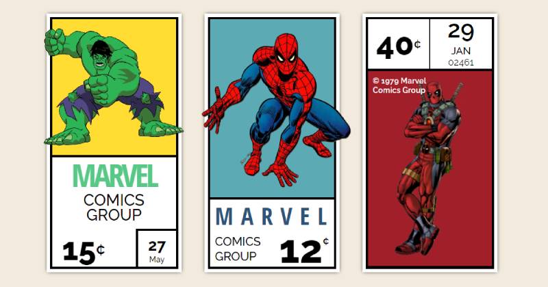
Comic Nerd Alert!
See the Pen
Marvel Corner Box Art by Aryan Tayal (@aryancodeworm)
on CodePen.
If Marvel comics get your heart racing, this CSS card might just be your soulmate.
Keep it Flippy
See the Pen
flippyCards by Kayleigh Foley (@kayfo23)
on CodePen.
Simplicity with a twist. Or maybe a flip? Showcasing raw creativity and spontaneity right there.
Flip Out
See the Pen
UI – Flip Card (using :focus-within for a11y) by Abubaker Saeed (@AbubakerSaeed)
on CodePen.
Hover and witness the card pull a 180. Thanks, Abubaker Saeed!
Glassy Dreams
See the Pen
Glass Card by Marcello Lopes (@marcell0lopes)
on CodePen.
3D. Ultra-modern. And that translucent glass finish? Chef’s kiss.
Stretch it Out
See the Pen
Expanding Card Grid With Flexbox by Naila Ahmad (@nailaahmad)
on CodePen.
Hover, click, and watch the cards expand like your favorite yoga pose.
Nostalgic Pixels
See the Pen
Polaroid Memories – CSS only by Nico (@nicokoenig)
on CodePen.
Polaroids without the shake! Nico’s cards display photos in a dance of transitions and filters.
Get Inspired
See the Pen
Inspiration Card by Dannie Vinther (@dannievinther)
on CodePen.
A promise of a smooth cruise as you navigate this CSS card.
Go Digital, Go Bold
See the Pen
Digital Business Card by Will Johnson (@willalanjohnson)
on CodePen.
Digital business card? Say less. We’re in the future now.
Dance of the Cards
See the Pen
Card Stack by Lane Olson (@Lane)
on CodePen.
Hover, tap, and watch them spread like butter on toast. Dive in card by card.
Peek-a-Boo Magic
See the Pen
Simple Animated Card by Josh (@jepooley)
on CodePen.
Hover and bam! Extra details pop up. Kinda like magic, but it’s just CSS.
Chic Grid Vibes
See the Pen
Isometric Card Grid by Jon Kantner (@jkantner)
on CodePen.
Rows and columns of cards, showing off in style. Maximum exposure guaranteed!
Bones of Design
See the Pen
Card UI Skeleton Screen by Max Böck (@mxbck)
on CodePen.
It’s not spooky! Just a skeleton screen of a card. Perfect while you’re waiting for the magic to load.
Becoming One with the Background
See the Pen
Expanding card page transition effect by Rachel Smith (@rachsmith)
on CodePen.
So, imagine a card that’s just chilling, and then boom! It becomes the entire background. And the best part? It’s all done using CSS & JS, without the need for any extras.
Meet the Two-Faced Card
See the Pen
Pure CSS Card Flip by Eddy Sims (@edeesims)
on CodePen.
So, there’s this card, right? You hover over it, and like magic, it flips, showing you its other side. Big shoutout to Eddy Sims for this one. Just some good ol’ HTML and CSS doing the trick.
The Shopper’s Delight
See the Pen
Playing card CSS Grid eCommerce layout by Andy Barefoot (@andybarefoot)
on CodePen.
Picture a lineup of cards, but when you hover, the main card? It zooms in like it’s the star of the show, while its buddies stay put.
Taking Flight in 3D
See the Pen
3D Perspective cards with depth [CSS] by Fernando Cohen (@designfenix)
on CodePen.
Got this ultra-cool 3D CSS card here. Hover over it, and you get this slick animation. Mind-blowing stuff.
Figure it Out
See the Pen
A <figure> with a <figcaption>… and .date that all:hovers by Joshua Ward (@joshuaward)
on CodePen.
Now here’s a cool one. Hover and the card’s contents slide away, making room for a fresh color and a logo. Smooth.
Eco Warrior Alert!
See the Pen
Environment Impact Cards (GSAP) by Anton Mudrenok (@mudrenok)
on CodePen.
So this card’s got some animated vibes. GSAP+MorphSVG doing their thing. Perfect for PCs and mobile taps.
Reality Flip
See the Pen
Realistic 3D Image Flip Box, Flip Card, 3d Image hover, Kallyas WordPress Theme by Nicola Mihaita (@nicolamihaita)
on CodePen.
Need a CSS card for chunky headlines? Lindsey’s got you. This card can flex to your content length, making it look just right.
Cut it Out, But in 3D!
See the Pen
3D Cutout Card by Dannie Vinther (@dannievinther)
on CodePen.
Hover over this bad boy, and it transforms. The outline? The insides? All mixing to create a square card.
The Ultimate Caption Move
See the Pen
CSS-only Slide-up Caption Hover Effect by Mojtaba Seyedi (@seyedi)
on CodePen.
Modern. Stylish. And it’s got this rad slide-up caption when you hover. That’s what’s up!
Materialize Your Dreams
See the Pen
Web Material Card Concept by Mason Fox (@masonfox)
on CodePen.
For the ones who love material design. This card? Pure UI goodness.
Black & White to Life
See the Pen
Profile Card hover over it once by Atul Prajapati (@atulcodex)
on CodePen.
Atul Prajapati’s creation here is something. Hover over, and watch it transform from a monochrome portrait.
Draggin’ Feels Real
See the Pen
Hearthstone Card CSS 3D Click/Drag by Jack Rugile (@jackrugile)
on CodePen.
Dragging this card feels like you’re moving it through thick air. And the audio? Rough, raw, but right for the effect.
Doorbell Ringer
See the Pen
Delivery Card Animation by Nikolay Talanov (@suez)
on CodePen.
Click the button inside, and watch the animation. It’s like knocking on a virtual door!
FAQ On CSS Cards
How do you create a basic CSS card?
Flexbox or Grid lend themselves beautifully to structuring CSS cards. Wrap content in a <div> tagged with a class. Style width, padding, and borders within your CSS file.
Importantly, make sure to design with mobile responsiveness in mind, utilizing media queries for seamless transitions across devices.
What’s the best way to make CSS cards responsive?
Employing CSS Grid or Flexbox ensures cards adapt fluidly across various screen sizes. Use relative units like percentages for width and vw or vh for viewport sizes.
Media queries are indispensable, allowing style adjustments at certain breakpoints, crucial for maintaining a consistent user experience.
How can I add hover effects to CSS cards?
Delve into the :hover pseudo-class in your stylesheet. Here, you can infuse life into cards with CSS transitions, transforming scales, introducing box-shadows, or subtly shifting background colors.
The result? An element that communicates interactivity, signaling to users it’s clickable.
Can CSS cards include images and how?
Absolutely. Nest an <img> element within your card container (<div>). To maintain balance, opt for object-fit: cover; in your styling to ensure the image fills the card elegantly.
Borders for images? Style to your content’s rhythm, but keep them light and in harmony with the card’s aesthetic.
What are some common mistakes when designing CSS cards?
A frequent misstep is overlooking content hierarchy – size matters, so prioritize legibility with type scaling. Beware of excessive box shadows or borders that can clutter.
Always test across browsers; what shines in Chrome may falter in Firefox. Remember, less is often more.
Do CSS cards need to be a certain size?
Not a mandate, but coherence is key. Strive for uniformity when cards are in a group, respecting the space they inhabit.
Relative sizing with respect to the viewport or container element ensures flexibility, while a grid system can shepherd your layout to cohesive dimensions.
How do you handle text overflow in CSS cards?
Grace and a touch of CSS. Overflowing text calls for overflow: hidden;, combined with text-overflow: ellipsis;. Don’t let your content spill untidily; reign it in, letting users know there’s more beneath the surface, inviting interaction.
Can CSS cards be animated?
They sing when animated. Subtlety is your conductor’s baton — use @keyframes or transitions to animate changes in color, position, or even the card’s expansion. Remember the user’s comfort; animations should serve a function and delight, not disrupt.
What is the relationship between CSS cards and accessibility?
Synergy. Accessible web design ensures CSS cards are not just visually appealing but navigable for all users.
ARIA labels guide through content, and keyboard focus indicators show where attention lies. Inclusivity in design widens your audience, improving user satisfaction.
How do CSS frameworks like Bootstrap help with designing cards?
Frameworks like Bootstrap offer pre-designed card components — they’re a scaffold for your creativity. Structure, responsive design, and consistent behavior come baked in, saving you time.
They’re customizable, but remember, reliance erodes uniqueness. Use frameworks for efficiency, not as a crutch.
Conclusion
Embarking on this expedition through the terrain of CSS cards, we’ve crafted gateways of interaction—more than mere vessels of content, they are now keystones of web aesthetics. Flexbox and Grid have been our compasses, guiding layouts to respond with grace across the digital expanse. Transitions and hover effects, our sparks of life, have lent depth and dimension to the fabric of the user interface.
Let’s encapsulate this journey:
- We’ve seen responsive cards adapt, showcasing our mastery over CSS’s fluidity.
- Moments of beauty were etched through card UI design patterns, where harmony in visuals became paramount.
- We’ve imparted motion to elements activating the static, propelling user engagement and excitement.
As architects of the web, remember that well-crafted CSS cards enrich the tapestry of user experience. They are our silent ambassadors of intent, beckoning users to interact, explore, and stay. Each card, a distilled essence of our grander vision, awaits deployment into the ever-evolving digital mosaic.
If you liked this article about CSS cards, you should check out this article about CSS tooltips.
There are also similar articles discussing CSS animations, CSS headers, CSS carousels, and CSS perspective.
And let’s not forget about articles on CSS slideshows, CSS animated backgrounds, CSS progress bars, and CSS parallax effects.