CSS Blur Effect: filter, backdrop-filter and 16 Demos

Frosted navigation bars, soft hero backgrounds and blurred modal overlays all come down to one function, blur(). filter: blur() softens the element itself, while backdrop-filter: blur() softens whatever sits behind it.

Below are 16 CSS blur effect examples you can try and copy, followed by a guide to support, performance and accessibility.

By Bogdan Sandu · Updated October 28, 2026

Blurring the element itself with filter

Four demos where filter: blur softens the element and everything inside it. Each one keeps a clear unblurred state, a real control to reach it, and a transition that only runs when the visitor has not asked for reduced motion.

Gallery that sharpens on hover or focus

  • filter: blur
  • :focus-visible
  • @media hover

Each photo starts soft and snaps into focus under the pointer or keyboard focus. The blur sits inside @media (hover: hover), so touch screens, where hover is unreliable, get sharp photos from the start. The image is scaled up slightly inside a clipped frame, which hides the faded edge that blur creates.

View code
.bl-sharp {
  width: min(100%, 600px);
}
.bl-sharp__grid {
  display: grid;
  grid-template-columns: repeat(auto-fit, minmax(150px, 1fr));
  gap: 14px;
  margin: 0;
  padding: 0;
  list-style: none;
}
.bl-sharp__tile {
  display: block;
  width: 100%;
  padding: 0;
  overflow: hidden;
  border: 0;
  border-radius: 14px;
  background: #fff;
  color: #1b1d24;
  font: inherit;
  text-align: left;
  cursor: pointer;
  box-shadow: 0 8px 24px rgb(20 24 40 / 10%);
}
.bl-sharp__frame {
  display: block;
  aspect-ratio: 4 / 3;
  overflow: hidden;
}
.bl-sharp__frame img {
  display: block;
  width: 100%;
  height: 100%;
  object-fit: cover;
}
.bl-sharp__cap {
  display: flex;
  justify-content: space-between;
  align-items: baseline;
  gap: 8px;
  padding: 10px 12px 12px;
  font-size: 14px;
}
.bl-sharp__cap strong {
  font-weight: 700;
}
.bl-sharp__cap span {
  color: #555b6b;
  font-size: 13px;
}
.bl-sharp__tile:focus-visible {
  outline: 3px solid #2f54eb;
  outline-offset: 3px;
}
@media (hover: hover) {
  .bl-sharp__frame img {
    filter: blur(6px);
    transform: scale(1.18);
  }
  .bl-sharp__tile:hover img,
  .bl-sharp__tile:focus-visible img {
    filter: blur(0);
    transform: scale(1);
  }
}
@media (prefers-reduced-motion: no-preference) {
  .bl-sharp__frame img {
    transition: filter .4s ease, transform .5s ease;
  }
}

Inline spoilers that reveal on click

  • text-shadow blur
  • aria-expanded
  • box-decoration-break

Episode review, The Salt Archive, season 2

The finale earns its quiet ending

The last episode slows right down, and it works. The reveal that lands because the show planted it back in episode three. By the end, , and nobody gets a speech about it.

Each spoiler is a real button with aria-expanded, so it works from the keyboard and announces its state. The blurred words are painted with a transparent color and a soft text-shadow, which keeps them wrapping with the sentence like normal inline text. The words are still in the markup, so this hides plot twists, not secrets.

View code
.bl-spoil {
  width: min(100%, 520px);
}
.bl-spoil__card {
  padding: 26px 26px 28px;
  border-radius: 18px;
  background: #fffdf8;
  color: #23202b;
  box-shadow: 0 12px 32px rgb(35 32 43 / 10%);
}
.bl-spoil__meta {
  margin: 0 0 8px;
  color: #5d5868;
  font-size: 13px;
}
.bl-spoil__title {
  margin: 0 0 12px;
  color: #23202b;
  font-family: "Fraunces", Georgia, serif;
  font-size: 24px;
  font-weight: 600;
  line-height: 1.2;
  letter-spacing: 0;
}
.bl-spoil__body {
  margin: 0;
  font-size: 16px;
  line-height: 1.75;
}
.bl-spoil__btn {
  display: inline;
  margin: 0;
  padding: 2px 5px;
  border: 0;
  border-radius: 5px;
  background: #ece6fb;
  color: #2a1f4d;
  font: inherit;
  line-height: inherit;
  text-align: inherit;
  cursor: pointer;
  -webkit-box-decoration-break: clone;
  box-decoration-break: clone;
}
.bl-spoil__sr {
  position: absolute;
  width: 1px;
  height: 1px;
  overflow: hidden;
  clip-path: inset(50%);
  white-space: nowrap;
}
.bl-spoil__text {
  color: transparent;
  text-shadow: 0 0 9px #2a1f4d;
  user-select: none;
  transition: color .3s ease, text-shadow .3s ease;
}
.bl-spoil__btn[aria-expanded="true"] {
  background: #f4f0fd;
  cursor: text;
}
.bl-spoil__btn[aria-expanded="true"] .bl-spoil__text {
  color: #2a1f4d;
  text-shadow: none;
  user-select: text;
}
.bl-spoil__btn:hover {
  background: #e2d9fa;
}
.bl-spoil__btn:focus-visible {
  outline: 3px solid #6440d8;
  outline-offset: 2px;
}

Blur-up loading with a tiny placeholder

  • LQIP data URI
  • filter: blur
  • role="status"
A narrow road curving through green highland ridges
Full image loaded

A 24 by 18 pixel copy of the photo is inlined as a 146-byte data URI and blurred 14px, so the frame shows the right colors before the real image arrives. The full image fades in over it once it loads. Press Replay to watch the swap again.

View code
.bl-lqip {
  width: min(100%, 440px);
}
.bl-lqip__card {
  margin: 0;
  overflow: hidden;
  border-radius: 18px;
  background: #fff;
  box-shadow: 0 12px 30px rgb(22 30 24 / 12%);
}
.bl-lqip__frame {
  position: relative;
  aspect-ratio: 4 / 3;
  overflow: hidden;
  background: #6f8462;
}
.bl-lqip__frame img {
  position: absolute;
  inset: 0;
  display: block;
  width: 100%;
  height: 100%;
  object-fit: cover;
}
.bl-lqip__ph {
  filter: blur(14px);
  transform: scale(1.12);
}
.bl-lqip__full {
  transition: opacity .6s ease;
}
.bl-lqip.is-waiting .bl-lqip__full {
  opacity: 0;
  transition: none;
}
.bl-lqip__cap {
  display: flex;
  justify-content: space-between;
  align-items: center;
  gap: 12px;
  padding: 12px 14px 12px 18px;
  color: #2b3327;
  font-size: 14px;
}
.bl-lqip__replay {
  min-height: 44px;
  padding: 0 18px;
  border: 2px solid #2b3327;
  border-radius: 999px;
  background: #fff;
  color: #2b3327;
  font: inherit;
  font-weight: 700;
  cursor: pointer;
}
.bl-lqip__replay:hover {
  background: #eef2ea;
}
.bl-lqip__replay:focus-visible {
  outline: 3px solid #2f6d3a;
  outline-offset: 2px;
}
@media (prefers-reduced-motion: no-preference) {
  .bl-lqip:not(.is-waiting) .bl-lqip__full {
    animation: bl-lqip-in .7s ease both;
  }
  @keyframes bl-lqip-in {
    from {
      filter: blur(10px);
    }
    to {
      filter: blur(0);
    }
  }
}

Privacy blur on sensitive fields

  • filter: blur
  • aria-pressed
  • :has

Billing contact

Email
m.ortega@fernline.example
Phone
+1 555 0142
Recovery code
K7QX-M2PL-9DTV

Contact details and a recovery code stay blurred until the owner presses Show details, which helps on a shared screen or a video call. The toggle is one aria-pressed button and :has() does the rest. Blur only changes painting, so anything truly secret must never reach the page at all.

View code
.bl-priv {
  width: min(100%, 460px);
}
.bl-priv__card {
  padding: 22px 22px 10px;
  border: 1px solid #dfe3ea;
  border-radius: 16px;
  background: #fff;
  color: #18202e;
}
.bl-priv__head {
  display: flex;
  flex-wrap: wrap;
  justify-content: space-between;
  align-items: center;
  gap: 12px;
  margin-bottom: 8px;
}
.bl-priv__title {
  margin: 0;
  color: #18202e;
  font-family: inherit;
  font-size: 18px;
  font-weight: 700;
  letter-spacing: 0;
}
.bl-priv__toggle {
  display: inline-flex;
  align-items: center;
  gap: 8px;
  min-height: 40px;
  padding: 0 14px;
  border: 1px solid #c9d0dc;
  border-radius: 10px;
  background: #f5f7fa;
  color: #18202e;
  font: inherit;
  font-size: 14px;
  font-weight: 600;
  cursor: pointer;
}
.bl-priv__toggle svg {
  fill: none;
  stroke: currentColor;
  stroke-width: 2;
}
.bl-priv__toggle[aria-pressed="true"] {
  border-color: #18202e;
  background: #18202e;
  color: #fff;
}
.bl-priv__toggle:focus-visible {
  outline: 3px solid #2f54eb;
  outline-offset: 2px;
}
.bl-priv__list {
  margin: 0;
}
.bl-priv__list div {
  display: grid;
  grid-template-columns: minmax(96px, 30%) 1fr;
  gap: 4px 12px;
  padding: 12px 0;
  border-top: 1px solid #eceff4;
}
.bl-priv__list dt {
  color: #556072;
  font-size: 14px;
}
.bl-priv__value {
  margin: 0;
  overflow-wrap: anywhere;
  font-weight: 600;
  filter: blur(6px);
  user-select: none;
}
.bl-priv__value--mono {
  font-family: ui-monospace, Consolas, monospace;
  letter-spacing: .04em;
}
.bl-priv:has(.bl-priv__toggle[aria-pressed="true"]) .bl-priv__value {
  filter: blur(0);
  user-select: text;
}
@media (prefers-reduced-motion: no-preference) {
  .bl-priv__value {
    transition: filter .3s ease;
  }
}

Frosted glass with backdrop-filter

Here the element stays sharp and the content behind it goes soft. Every panel starts from a solid, readable background and only switches to a translucent tint inside @supports, with the -webkit- prefix declared first for older Safari.

Frosted sticky header over scrolling content

  • backdrop-filter
  • position: sticky
  • @supports
A road cut into a green hillside above the sea, with headlands fading into haze

Twelve days on the coast road

By Ines Varga, 9 min read

The road hugs the cliffs for most of the first week, and the buses stop wherever someone waves. We started in the north with a paper map and no bookings.

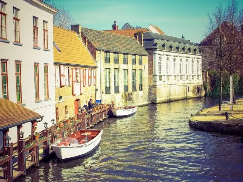
Gabled canal houses with small boats moored along the water
Book nothing past day three. The weather decides the rest.

By day five the plan had changed twice, and the best night of the trip was a harbor town we had never heard of.

Orange sandstone cliffs lit by low sun under a cloudy sky

Inland, the light turns orange in the late afternoon and the road climbs into rock country.

Scroll inside the phone. The sticky header blurs and saturates the photos and text sliding underneath, and its text stays sharp because only the backdrop is filtered. Outside @supports the header keeps a 94% opaque background, so it stays readable in any browser.

View code
.bl-nav {
  position: relative;
  height: 100%;
  overflow: hidden;
  background: #fbfaf7;
  color: #191b20;
}
.bl-nav__scroll {
  height: 100%;
  overflow-y: auto;
  overscroll-behavior: contain;
}
.bl-nav__scroll:focus-visible {
  outline: 3px solid #1f5fd1;
  outline-offset: -3px;
}
.bl-nav__bar {
  position: sticky;
  top: 0;
  z-index: 2;
  display: flex;
  justify-content: space-between;
  align-items: center;
  height: 60px;
  padding: 0 16px;
  border-bottom: 1px solid rgb(25 27 32 / 10%);
  background: rgb(251 250 247 / 94%);
}
@supports (backdrop-filter: blur(1px)) or (-webkit-backdrop-filter: blur(1px)) {
  .bl-nav__bar {
    background: rgb(251 250 247 / 62%);
    -webkit-backdrop-filter: blur(14px) saturate(160%);
    backdrop-filter: blur(14px) saturate(160%);
  }
}
.bl-nav__logo {
  font-family: "Fraunces", Georgia, serif;
  font-size: 21px;
  font-weight: 700;
}
.bl-nav__cta {
  min-height: 40px;
  padding: 0 16px;
  border: 0;
  border-radius: 999px;
  background: #191b20;
  color: #fff;
  font: inherit;
  font-size: 14px;
  font-weight: 700;
  cursor: pointer;
}
.bl-nav__cta:focus-visible {
  outline: 3px solid #1f5fd1;
  outline-offset: 2px;
}
.bl-nav__hero {
  display: block;
  width: 100%;
  height: 260px;
  margin-top: -61px;
  object-fit: cover;
}
.bl-nav__body {
  padding: 20px 18px 40px;
  font-size: 15px;
  line-height: 1.65;
}
.bl-nav__title {
  margin: 0 0 6px;
  color: #191b20;
  font-family: "Fraunces", Georgia, serif;
  font-size: 27px;
  font-weight: 700;
  line-height: 1.15;
  letter-spacing: 0;
}
.bl-nav__by {
  margin: 0 0 14px;
  color: #5b5e66;
  font-size: 13px;
}
.bl-nav__body p {
  margin: 0 0 16px;
}
.bl-nav__img {
  display: block;
  width: 100%;
  height: auto;
  margin: 0 0 16px;
  border-radius: 12px;
}
.bl-nav__quote {
  margin: 0 0 16px;
  padding: 18px;
  border-radius: 12px;
  background: #ffcf3f;
  color: #191b20;
  font-family: "Fraunces", Georgia, serif;
  font-size: 20px;
  line-height: 1.3;
}

Modal with a blurred ::backdrop

  • dialog
  • ::backdrop
  • showModal

Q4 launch board

  • Pricing page copy
  • Onboarding emails
  • Press kit

Archive this board?

All 14 cards move to Archive. You can restore the board from there for 30 days.

A native dialog opened with showModal() gets a ::backdrop pseudo-element that covers the whole viewport, and that is where the blur goes, not on the page content. The dialog traps focus, closes on Escape and returns focus to the button for free. The fade-in only runs when motion is allowed.

View code
.bl-modal {
  width: min(100%, 520px);
}
.bl-modal__app {
  padding: 20px;
  border-radius: 18px;
  background: #fff;
  color: #1a1c26;
  box-shadow: 0 12px 30px rgb(26 28 38 / 10%);
}
.bl-modal__top {
  display: flex;
  flex-wrap: wrap;
  justify-content: space-between;
  align-items: center;
  gap: 12px;
  margin-bottom: 16px;
}
.bl-modal__name {
  margin: 0;
  color: #1a1c26;
  font-family: inherit;
  font-size: 18px;
  font-weight: 700;
  letter-spacing: 0;
}
.bl-modal__open,
.bl-modal__btn {
  min-height: 44px;
  padding: 0 18px;
  border: 1px solid #c8ccd8;
  border-radius: 10px;
  background: #fff;
  color: #1a1c26;
  font: inherit;
  font-size: 15px;
  font-weight: 600;
  cursor: pointer;
}
.bl-modal__open:hover,
.bl-modal__btn:hover {
  background: #f2f3f7;
}
.bl-modal__open:focus-visible,
.bl-modal__btn:focus-visible {
  outline: 3px solid #3b4fd8;
  outline-offset: 2px;
}
.bl-modal__cards {
  display: grid;
  grid-template-columns: repeat(auto-fit, minmax(130px, 1fr));
  gap: 10px;
  margin: 0;
  padding: 0;
  list-style: none;
}
.bl-modal__card {
  min-height: 76px;
  padding: 12px;
  border-radius: 12px;
  font-size: 14px;
  font-weight: 600;
}
.bl-modal__card--a {
  background: #ffd9c7;
  color: #5a2410;
}
.bl-modal__card--b {
  background: #cfe8ff;
  color: #0f3a63;
}
.bl-modal__card--c {
  background: #d8f3dc;
  color: #1d4d2a;
}
.bl-modal__status {
  min-height: 1.5em;
  margin: 14px 0 0;
  color: #4a4f5e;
  font-size: 14px;
}
.bl-modal__dialog {
  width: min(380px, calc(100vw - 32px));
  padding: 24px;
  border: 0;
  border-radius: 18px;
  background: #fff;
  color: #1a1c26;
  box-shadow: 0 24px 60px rgb(10 12 20 / 30%);
}
.bl-modal__dialog::backdrop {
  background: rgb(16 20 32 / 40%);
  -webkit-backdrop-filter: blur(6px);
  backdrop-filter: blur(6px);
}
.bl-modal__title {
  margin: 0 0 8px;
  color: #1a1c26;
  font-family: inherit;
  font-size: 20px;
  font-weight: 700;
  letter-spacing: 0;
}
.bl-modal__text {
  margin: 0 0 20px;
  color: #444a59;
  font-size: 15px;
  line-height: 1.55;
}
.bl-modal__actions {
  display: flex;
  justify-content: flex-end;
  gap: 10px;
}
.bl-modal__btn--primary {
  border-color: #b3261e;
  background: #b3261e;
  color: #fff;
}
.bl-modal__btn--primary:hover {
  background: #93201a;
}
@media (prefers-reduced-motion: no-preference) {
  .bl-modal__dialog[open],
  .bl-modal__dialog[open]::backdrop {
    animation: bl-modal-fade .2s ease;
  }
  @keyframes bl-modal-fade {
    from {
      opacity: 0;
    }
  }
}

Progressive blur with mask-image

  • backdrop-filter
  • mask-image
  • stacked layers
Downtown skyscrapers at sunrise beside a wide lake
Lakeshore at 6:40 am 35mm, f/8, no edits

A single blur layer ends in a visible line, so this card stacks three backdrop-filter layers at 2px, 6px and 16px, each masked to start a little lower. The blur builds smoothly toward the caption. The gradients here are masks, not decoration: black means blurred, transparent means sharp.

View code
.bl-fade {
  width: min(100%, 360px);
}
.bl-fade__card {
  position: relative;
  margin: 0;
  aspect-ratio: 4 / 5;
  overflow: hidden;
  border-radius: 22px;
  background: #283041;
}
.bl-fade__card img {
  position: absolute;
  inset: 0;
  display: block;
  width: 100%;
  height: 100%;
  object-fit: cover;
}
.bl-fade__blur {
  position: absolute;
  inset: auto 0 0;
  height: 58%;
}
.bl-fade__blur::after,
.bl-fade__blur span {
  content: "";
  position: absolute;
  inset: 0;
}
.bl-fade__blur span:nth-child(1) {
  -webkit-backdrop-filter: blur(2px);
  backdrop-filter: blur(2px);
  -webkit-mask-image: linear-gradient(to bottom, transparent 0%, #000 30%);
  mask-image: linear-gradient(to bottom, transparent 0%, #000 30%);
}
.bl-fade__blur span:nth-child(2) {
  -webkit-backdrop-filter: blur(6px);
  backdrop-filter: blur(6px);
  -webkit-mask-image: linear-gradient(to bottom, transparent 20%, #000 55%);
  mask-image: linear-gradient(to bottom, transparent 20%, #000 55%);
}
.bl-fade__blur span:nth-child(3) {
  -webkit-backdrop-filter: blur(16px);
  backdrop-filter: blur(16px);
  -webkit-mask-image: linear-gradient(to bottom, transparent 45%, #000 80%);
  mask-image: linear-gradient(to bottom, transparent 45%, #000 80%);
}
.bl-fade__blur::after {
  background: rgb(10 14 24 / 58%);
  -webkit-mask-image: linear-gradient(to bottom, transparent 25%, #000 70%);
  mask-image: linear-gradient(to bottom, transparent 25%, #000 70%);
}
.bl-fade__cap {
  position: absolute;
  inset: auto 0 0;
  display: grid;
  gap: 4px;
  padding: 22px 22px 24px;
  color: #fff;
}
.bl-fade__cap strong {
  font-family: "Fraunces", Georgia, serif;
  font-size: 24px;
  font-weight: 600;
  line-height: 1.2;
}
.bl-fade__cap span {
  color: #e6e9f0;
  font-size: 14px;
}

backdrop-filter fallback with @supports

  • @supports
  • -webkit-backdrop-filter
  • :has
Dry Wash Sessions Episode 41, 38 min

Your browser takes the blur branch.Your browser takes the solid fallback.

The panel is written fallback first: a 90% opaque background that passes contrast on its own. Only inside @supports does it drop to a 42% tint with the blur, prefixed line first. The switch forces the fallback branch so you can compare, and the line under the player reports which branch your browser takes.

View code
.bl-sup {
  display: grid;
  justify-items: center;
  gap: 12px;
  width: min(100%, 460px);
}
.bl-sup__scene {
  position: relative;
  display: grid;
  align-items: end;
  width: 100%;
  aspect-ratio: 4 / 3;
  padding: 16px;
  overflow: hidden;
  border-radius: 20px;
  box-sizing: border-box;
  background: #6a3a22;
}
.bl-sup__scene img {
  position: absolute;
  inset: 0;
  display: block;
  width: 100%;
  height: 100%;
  object-fit: cover;
}
.bl-sup__panel {
  position: relative;
  display: flex;
  align-items: center;
  gap: 14px;
  padding: 14px 16px;
  border: 1px solid rgb(255 255 255 / 18%);
  border-radius: 16px;
  background: rgb(26 20 17 / 90%);
  color: #fff;
}
@supports (backdrop-filter: blur(1px)) or (-webkit-backdrop-filter: blur(1px)) {
  .bl-sup:not(:has(.bl-sup__switch input:checked)) .bl-sup__panel {
    background: rgb(26 20 17 / 42%);
    -webkit-backdrop-filter: blur(16px) saturate(140%);
    backdrop-filter: blur(16px) saturate(140%);
  }
}
.bl-sup__play {
  display: grid;
  flex: none;
  place-items: center;
  width: 46px;
  height: 46px;
  padding: 0;
  border: 0;
  border-radius: 50%;
  background: #fff;
  color: #1a1411;
  cursor: pointer;
}
.bl-sup__play svg {
  fill: currentColor;
}
.bl-sup__play:focus-visible {
  outline: 3px solid #fff;
  outline-offset: 3px;
}
.bl-sup__info {
  display: grid;
  gap: 2px;
}
.bl-sup__info strong {
  font-size: 16px;
}
.bl-sup__info span {
  color: #f1e8e2;
  font-size: 13px;
}
.bl-sup__readout {
  margin: 0;
  color: #3d3a40;
  font-size: 14px;
  text-align: center;
}
.bl-sup__yes {
  display: none;
}
@supports (backdrop-filter: blur(1px)) or (-webkit-backdrop-filter: blur(1px)) {
  .bl-sup__yes {
    display: inline;
  }
  .bl-sup__no {
    display: none;
  }
}
.bl-sup__switch {
  display: inline-flex;
  align-items: center;
  gap: 10px;
  min-height: 44px;
  color: #1f1d22;
  font-size: 15px;
  font-weight: 600;
  cursor: pointer;
}
.bl-sup__switch input {
  appearance: none;
  position: relative;
  width: 46px;
  height: 26px;
  margin: 0;
  border-radius: 999px;
  background: #8a8590;
  cursor: pointer;
}
.bl-sup__switch input::after {
  content: "";
  position: absolute;
  top: 3px;
  left: 3px;
  width: 20px;
  height: 20px;
  border-radius: 50%;
  background: #fff;
}
.bl-sup__switch input:checked {
  background: #b24a1f;
}
.bl-sup__switch input:checked::after {
  left: 23px;
}
.bl-sup__switch input:focus-visible {
  outline: 3px solid #b24a1f;
  outline-offset: 3px;
}
@media (prefers-reduced-motion: no-preference) {
  .bl-sup__switch input::after {
    transition: left .2s ease;
  }
}

Dark mode quick settings panel

  • backdrop-filter
  • saturate
  • prefers-reduced-transparency

On a dark theme a white tint looks foggy, so the panel uses a near-black tint at 55% and adds saturate() to the blur, which keeps the colors behind it rich instead of muddy. Visitors who ask for reduced transparency get a 95% opaque panel, and browsers without backdrop-filter get a solid one.

View code
.bl-cc {
  width: min(100%, 420px);
  padding: 24px 20px 20px;
  overflow: hidden;
  border-radius: 26px;
  box-sizing: border-box;
  background: #11142a url(plx-scene-night.svg) center / cover;
}
.bl-cc__home {
  display: grid;
  grid-template-columns: repeat(4, 1fr);
  gap: 18px;
  padding: 0 6px;
}
.bl-cc__home span {
  aspect-ratio: 1;
  border-radius: 22%;
  background: #ff7a59;
}
.bl-cc__home span:nth-child(2) { background: #3ecf8e; }
.bl-cc__home span:nth-child(3) { background: #4f8bff; }
.bl-cc__home span:nth-child(4) { background: #ffd23f; }
.bl-cc__home span:nth-child(5) { background: #c86bff; }
.bl-cc__home span:nth-child(6) { background: #ff4f8b; }
.bl-cc__home span:nth-child(7) { background: #36c5f0; }
.bl-cc__home span:nth-child(8) { background: #f3f4f8; }
.bl-cc__panel {
  position: relative;
  margin-top: -64px;
  padding: 16px;
  border: 1px solid rgb(255 255 255 / 12%);
  border-radius: 22px;
  background: rgb(22 24 36 / 94%);
  color: #f4f5fa;
}
@supports (backdrop-filter: blur(1px)) or (-webkit-backdrop-filter: blur(1px)) {
  .bl-cc__panel {
    background: rgb(22 24 36 / 55%);
    -webkit-backdrop-filter: blur(20px) saturate(170%);
    backdrop-filter: blur(20px) saturate(170%);
  }
}
@media (prefers-reduced-transparency: reduce) {
  .bl-cc__panel {
    background: rgb(22 24 36 / 95%);
  }
}
.bl-cc__grid {
  display: grid;
  grid-template-columns: repeat(2, 1fr);
  gap: 10px;
}
.bl-cc__tile {
  display: flex;
  align-items: center;
  gap: 10px;
  min-height: 52px;
  padding: 0 12px;
  border: 0;
  border-radius: 14px;
  background: rgb(255 255 255 / 12%);
  color: #f4f5fa;
  font: inherit;
  font-size: 14px;
  font-weight: 600;
  text-align: left;
  cursor: pointer;
}
.bl-cc__tile svg {
  flex: none;
  fill: none;
  stroke: currentColor;
  stroke-width: 2;
  stroke-linecap: round;
  stroke-linejoin: round;
}
.bl-cc__tile[aria-pressed="true"] {
  background: #9cbcff;
  color: #0b1230;
}
.bl-cc__tile:focus-visible {
  outline: 3px solid #fff;
  outline-offset: 2px;
}
.bl-cc__range {
  display: grid;
  gap: 8px;
  margin-top: 14px;
  font-size: 13px;
  font-weight: 600;
}
.bl-cc__range input {
  width: 100%;
  margin: 0;
  accent-color: #9cbcff;
}
.bl-cc__range input:focus-visible {
  outline: 3px solid #fff;
  outline-offset: 3px;
}

Blurred backgrounds, heroes and edge fixes

Blur on a separate background layer, so the content on top stays crisp. These demos also show the two edge problems every blurred background runs into, and what the radius does to the area the browser has to repaint.

Blurred cover art behind a player card

  • filter: blur
  • negative inset
  • isolation
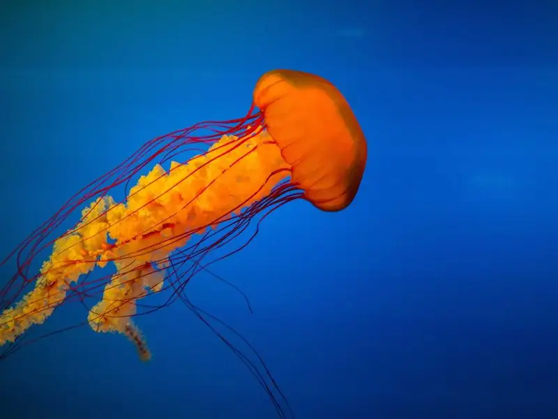
Album cover: an orange jellyfish trailing long red tentacles through deep blue water

Slow Current

Lumen Harbor

1:424:05

The card background is the album cover itself, blurred 28px and darkened, so every album gets a matching color field for free. The blurred copy sits on its own layer that extends 40px past the card on every side, which pushes the faded blur edge out of sight. The sharp cover and the controls stay outside the filter.

View code
.bl-album {
  position: relative;
  display: flex;
  flex-wrap: wrap;
  align-items: center;
  gap: 22px;
  width: min(100%, 540px);
  padding: 24px;
  overflow: hidden;
  isolation: isolate;
  border-radius: 26px;
  box-sizing: border-box;
  background: #0c2546;
  color: #fff;
}
.bl-album__bg {
  position: absolute;
  inset: -40px;
  z-index: -1;
}
.bl-album__bg img {
  display: block;
  width: 100%;
  height: 100%;
  object-fit: cover;
  filter: blur(28px) saturate(140%) brightness(.55);
}
.bl-album__art {
  display: block;
  flex: 0 1 180px;
  min-width: 140px;
  aspect-ratio: 1;
  height: auto;
  margin: 0 auto;
  border-radius: 16px;
  object-fit: cover;
  box-shadow: 0 16px 34px rgb(0 0 0 / 35%);
}
.bl-album__info {
  flex: 1 1 200px;
  min-width: 0;
}
.bl-album__title {
  margin: 0;
  color: #fff;
  font-family: "Fraunces", Georgia, serif;
  font-size: 26px;
  font-weight: 600;
  line-height: 1.15;
  letter-spacing: 0;
}
.bl-album__artist {
  margin: 4px 0 16px;
  color: #dfe8f5;
  font-size: 15px;
}
.bl-album__bar {
  height: 5px;
  overflow: hidden;
  border-radius: 5px;
  background: rgb(255 255 255 / 28%);
}
.bl-album__bar span {
  display: block;
  width: 42%;
  height: 100%;
  background: #fff;
}
.bl-album__time {
  display: flex;
  justify-content: space-between;
  margin: 6px 0 12px;
  color: #dfe8f5;
  font-size: 12px;
  font-variant-numeric: tabular-nums;
}
.bl-album__controls {
  display: flex;
  justify-content: center;
  align-items: center;
  gap: 14px;
}
.bl-album__btn {
  display: grid;
  place-items: center;
  width: 44px;
  height: 44px;
  padding: 0;
  border: 0;
  border-radius: 50%;
  background: rgb(255 255 255 / 14%);
  color: #fff;
  cursor: pointer;
}
.bl-album__btn svg {
  fill: currentColor;
}
.bl-album__btn--play {
  width: 56px;
  height: 56px;
  background: #fff;
  color: #0c2546;
}
.bl-album__icon-pause,
.bl-album__btn--play[aria-pressed="true"] .bl-album__icon-play {
  display: none;
}
.bl-album__btn--play[aria-pressed="true"] .bl-album__icon-pause {
  display: block;
}
.bl-album__btn:focus-visible {
  outline: 3px solid #fff;
  outline-offset: 3px;
}

Video-style blurred hero from a still photo

  • filter: blur
  • @keyframes drift
  • pause button

Trails that start where the road ends

Small-group treks across three mountain ranges, ten walkers at most, guides who grew up there.

A heavily blurred photo with a slow drift reads like an out-of-focus background video, without shipping one. Blur removes fine detail, so a small, strongly compressed image is enough here. The drift only runs when motion is allowed, and the pause button stops it, since motion that lasts longer than five seconds needs a way to stop it.

View code
.bl-hero {
  position: relative;
  display: grid;
  align-items: center;
  min-height: 420px;
  padding: 48px clamp(20px, 6vw, 72px) 80px;
  overflow: hidden;
  isolation: isolate;
  box-sizing: border-box;
  background: #2a3138;
  color: #fff;
}
.bl-hero::before {
  content: "";
  position: absolute;
  inset: 0;
  z-index: -1;
  background: rgb(12 16 22 / 38%);
}
.bl-hero__media {
  position: absolute;
  inset: -40px;
  z-index: -2;
}
.bl-hero__media img {
  display: block;
  width: 100%;
  height: 100%;
  object-fit: cover;
  filter: blur(12px) brightness(.62);
}
.bl-hero__content {
  max-width: 560px;
}
.bl-hero__title {
  margin: 0 0 14px;
  color: #fff;
  font-family: "Fraunces", Georgia, serif;
  font-size: clamp(30px, 6vw, 50px);
  font-weight: 600;
  line-height: 1.08;
  letter-spacing: -.01em;
}
.bl-hero__text {
  margin: 0 0 24px;
  color: #eef1f4;
  font-size: 17px;
  line-height: 1.55;
}
.bl-hero__cta {
  min-height: 48px;
  padding: 0 24px;
  border: 0;
  border-radius: 999px;
  background: #f4d35e;
  color: #1c1a12;
  font: inherit;
  font-size: 16px;
  font-weight: 700;
  cursor: pointer;
}
.bl-hero__pause {
  position: absolute;
  right: 16px;
  bottom: 16px;
  min-height: 36px;
  padding: 0 14px;
  border: 1px solid rgb(255 255 255 / 55%);
  border-radius: 999px;
  background: rgb(12 16 22 / 55%);
  color: #fff;
  font: inherit;
  font-size: 13px;
  font-weight: 600;
  cursor: pointer;
}
.bl-hero__pause[aria-pressed="true"] {
  background: #fff;
  color: #12161c;
}
.bl-hero__cta:focus-visible,
.bl-hero__pause:focus-visible {
  outline: 3px solid #fff;
  outline-offset: 3px;
}
@media (prefers-reduced-motion: no-preference) {
  .bl-hero__media img {
    animation: bl-hero-drift 24s ease-in-out infinite alternate;
  }
  .bl-hero:has(.bl-hero__pause[aria-pressed="true"]) .bl-hero__media img {
    animation-play-state: paused;
  }
  @keyframes bl-hero-drift {
    from {
      transform: scale(1.05) translate(-2%, 1%);
    }
    to {
      transform: scale(1.15) translate(2%, -1%);
    }
  }
}
@media (prefers-reduced-motion: reduce) {
  .bl-hero__pause {
    display: none;
  }
}

Fixing blur that bleeds at the edges

  • overflow: hidden
  • transform: scale
  • negative inset
Bare blurFaded, spilling edges
Clip and scalescale: 1.25
Clip and insetinset: -12px

The same 6px blur three times. Bare, the edges fade into the page and spill past the box. Clipping the frame and scaling the image up 25% hides the fade, but the scale you need depends on the box size. A negative inset of about twice the radius on the blurred layer works at any size.

View code
.bl-edge {
  display: grid;
  grid-template-columns: repeat(3, minmax(0, 1fr));
  gap: clamp(14px, 4vw, 28px);
  width: min(100%, 620px);
  padding: 14px 6px;
  box-sizing: border-box;
}
.bl-edge__item {
  margin: 0;
}
.bl-edge__frame {
  position: relative;
  aspect-ratio: 3 / 4;
  border-radius: 12px;
  background: #fff;
}
.bl-edge__frame img {
  display: block;
  width: 100%;
  height: 100%;
  object-fit: cover;
  filter: blur(6px);
}
.bl-edge__frame--scale,
.bl-edge__frame--inset {
  overflow: hidden;
}
.bl-edge__frame--scale img {
  scale: 1.25;
}
.bl-edge__frame--inset img {
  position: absolute;
  inset: -12px;
  width: calc(100% + 24px);
  max-width: none;
  height: calc(100% + 24px);
}
.bl-edge__item figcaption {
  display: grid;
  gap: 2px;
  margin-top: 12px;
  color: #22252e;
  font-size: 14px;
  line-height: 1.3;
}
.bl-edge__item figcaption span {
  color: #555b68;
  font-family: ui-monospace, Consolas, monospace;
  font-size: 12px;
}

What the blur radius costs

  • custom properties
  • range input
  • output
A tall waterfall dropping into a mossy green gorge surrounded by pine forest
blur(8px), reaches about 15px past the edge

Drag the slider and watch the dashed box. It marks roughly how far the blur reaches past the image, about 1.88 times the value in blur(), using the three-pass box blur formula from the Filter Effects spec. A wider reach means more pixels read for every output pixel, on every repaint, so keep the radius and the blurred area small.

View code
.bl-cost {
  --bl-cost-r: 8px;
  display: grid;
  gap: 18px;
  width: min(100%, 460px);
}
.bl-cost__view {
  display: grid;
  place-items: center;
  padding: 60px 0;
  border-radius: 18px;
  background: #fff;
}
.bl-cost__frame {
  position: relative;
  width: min(calc(100% - 128px), 240px);
  aspect-ratio: 4 / 3;
}
.bl-cost__frame img {
  display: block;
  width: 100%;
  height: 100%;
  border-radius: 6px;
  object-fit: cover;
  filter: blur(var(--bl-cost-r));
}
.bl-cost__spill {
  position: absolute;
  inset: calc(var(--bl-cost-r) * -1.88);
  border: 2px dashed #c2410c;
  border-radius: 10px;
  pointer-events: none;
}
.bl-cost__controls {
  display: grid;
  grid-template-columns: auto 1fr;
  align-items: center;
  gap: 8px 14px;
  color: #22252e;
}
.bl-cost__label {
  font-size: 15px;
  font-weight: 700;
}
.bl-cost__range {
  width: 100%;
  min-height: 28px;
  margin: 0;
  accent-color: #c2410c;
}
.bl-cost__range:focus-visible {
  outline: 3px solid #2f54eb;
  outline-offset: 3px;
}
.bl-cost__out {
  grid-column: 1 / -1;
  color: #40444f;
  font-family: ui-monospace, Consolas, monospace;
  font-size: 13px;
}

Animated blur with opt-in motion

Blur that changes over time: a focus pull, a motion blur illusion and a text entrance. All three animate only inside prefers-reduced-motion: no-preference, and the moving ones wait for a click before they start.

Depth-of-field focus pull

  • filter: blur
  • aria-pressed
  • layered SVG

Three ridgelines on separate layers, each with its own blur value for every focus plane, like a camera racking focus. Pick a plane and the blur moves between layers. The change is instant under reduced motion and eases over 0.6s otherwise, and each layer is wider than the frame so its blurred edges stay hidden.

View code
.bl-dof {
  display: grid;
  gap: 14px;
  width: min(100%, 560px);
}
.bl-dof__scene {
  position: relative;
  height: 250px;
  overflow: hidden;
  border-radius: 20px;
  background: #f6d2b8;
}
.bl-dof__sun {
  position: absolute;
  top: 34px;
  left: 62%;
  width: 64px;
  height: 64px;
  border-radius: 50%;
  background: #fff4e3;
}
.bl-dof__layer {
  position: absolute;
  bottom: -12px;
  left: -24px;
  display: block;
  width: calc(100% + 48px);
  height: calc(100% + 12px);
  max-width: none;
  object-fit: cover;
  object-position: center bottom;
}
.bl-dof[data-focus="near"] .bl-dof__layer--mid { filter: blur(3px); }
.bl-dof[data-focus="near"] .bl-dof__layer--far { filter: blur(6px); }
.bl-dof[data-focus="near"] .bl-dof__sun { filter: blur(8px); }
.bl-dof[data-focus="mid"] .bl-dof__layer--near { filter: blur(5px); }
.bl-dof[data-focus="mid"] .bl-dof__layer--far { filter: blur(3px); }
.bl-dof[data-focus="mid"] .bl-dof__sun { filter: blur(5px); }
.bl-dof[data-focus="far"] .bl-dof__layer--near { filter: blur(9px); }
.bl-dof[data-focus="far"] .bl-dof__layer--mid { filter: blur(4px); }
.bl-dof__controls {
  display: flex;
  justify-content: center;
  gap: 8px;
  padding: 5px;
  border-radius: 999px;
  background: #fff;
  justify-self: center;
  box-shadow: 0 6px 18px rgb(60 30 50 / 10%);
}
.bl-dof__btn {
  min-width: 80px;
  min-height: 44px;
  padding: 0 16px;
  border: 0;
  border-radius: 999px;
  background: transparent;
  color: #3b2440;
  font: inherit;
  font-size: 15px;
  font-weight: 600;
  cursor: pointer;
}
.bl-dof__btn[aria-pressed="true"] {
  background: #5a3e6e;
  color: #fff;
}
.bl-dof__btn:focus-visible {
  outline: 3px solid #5a3e6e;
  outline-offset: 2px;
}
@media (prefers-reduced-motion: no-preference) {
  .bl-dof__layer,
  .bl-dof__sun {
    transition: filter .6s ease;
  }
}

Motion blur illusion on a fast move

  • @keyframes
  • filter + scaleX
  • aria-pressed

Blur and stretch only while it is moving fast.

CSS blur is the same in every direction, so a convincing motion blur pairs it with a horizontal stretch and two fading ghost copies, and only in the fast middle of the move. At rest the puck is sharp and round. The loop waits for the Play button and never runs under reduced motion.

View code
.bl-zip {
  display: grid;
  gap: 18px;
  width: min(100%, 560px);
}
.bl-zip__track {
  --bl-zip-size: 56px;
  position: relative;
  height: 120px;
  padding: 0 18px;
  overflow: hidden;
  border: 1px solid #2c3140;
  border-radius: 18px;
  background: #151925;
  container-type: inline-size;
}
.bl-zip__track::after {
  content: "";
  position: absolute;
  inset: auto 18px 28px;
  height: 2px;
  background: #2f3547;
}
.bl-zip__puck {
  position: absolute;
  top: 22px;
  left: 18px;
  width: var(--bl-zip-size);
  height: var(--bl-zip-size);
  border-radius: 50%;
  background: #ff8a4c;
  box-shadow: inset -8px -8px 0 rgb(0 0 0 / 14%);
}
.bl-zip__bar {
  display: flex;
  flex-wrap: wrap;
  justify-content: space-between;
  align-items: center;
  gap: 12px;
}
.bl-zip__caption {
  margin: 0;
  color: #c9cedb;
  font-size: 14px;
}
.bl-zip__play {
  min-width: 92px;
  min-height: 44px;
  padding: 0 20px;
  border: 0;
  border-radius: 12px;
  background: #ff8a4c;
  color: #1a0f08;
  font: inherit;
  font-size: 15px;
  font-weight: 700;
  cursor: pointer;
}
.bl-zip__play[aria-pressed="true"] {
  background: #f1f2f6;
}
.bl-zip__play:focus-visible {
  outline: 3px solid #fff;
  outline-offset: 3px;
}
@media (prefers-reduced-motion: no-preference) {
  .bl-zip:has(.bl-zip__play[aria-pressed="true"]) .bl-zip__puck {
    animation: bl-zip-run 2.4s infinite;
  }
  @keyframes bl-zip-run {
    0%, 18% {
      transform: translateX(0) scaleX(1);
      filter: blur(0);
      box-shadow: inset -8px -8px 0 rgb(0 0 0 / 14%);
      animation-timing-function: cubic-bezier(.7, 0, .3, 1);
    }
    34% {
      transform: translateX(calc((100cqw - 36px - var(--bl-zip-size)) * .5)) scaleX(1.7);
      filter: blur(3px);
      box-shadow: -26px 0 0 -6px rgb(255 138 76 / 40%), -50px 0 0 -12px rgb(255 138 76 / 18%);
      animation-timing-function: cubic-bezier(.7, 0, .3, 1);
    }
    50%, 68% {
      transform: translateX(calc(100cqw - 36px - var(--bl-zip-size))) scaleX(1);
      filter: blur(0);
      box-shadow: inset -8px -8px 0 rgb(0 0 0 / 14%);
      animation-timing-function: cubic-bezier(.7, 0, .3, 1);
    }
    84% {
      transform: translateX(calc((100cqw - 36px - var(--bl-zip-size)) * .5)) scaleX(1.7);
      filter: blur(3px);
      box-shadow: 26px 0 0 -6px rgb(255 138 76 / 40%), 50px 0 0 -12px rgb(255 138 76 / 18%);
      animation-timing-function: cubic-bezier(.7, 0, .3, 1);
    }
    100% {
      transform: translateX(0) scaleX(1);
      filter: blur(0);
      box-shadow: inset -8px -8px 0 rgb(0 0 0 / 14%);
    }
  }
}
@media (prefers-reduced-motion: reduce) {
  .bl-zip__play {
    display: none;
  }
}

Headline that blurs into focus

  • @keyframes
  • filter: blur
  • IntersectionObserver

Every number, finally in focus.

Ledgerline 4.2 brings live cash forecasts to every account.

Each word starts transparent and blurred 12px, then sharpens a beat after the one before it. The animation is attached only when the headline scrolls into view and only when motion is allowed, so without script or with reduced motion the text is simply there. Replay restarts it.

View code
.bl-words {
  display: grid;
  justify-items: start;
  gap: 14px;
  width: min(100%, 560px);
  color: #f3f1ea;
}
.bl-words__title {
  margin: 0;
  color: #f3f1ea;
  font-family: "Fraunces", Georgia, serif;
  font-size: clamp(34px, 8vw, 58px);
  font-weight: 600;
  line-height: 1.05;
  letter-spacing: -.015em;
}
.bl-words__title span {
  display: inline-block;
}
.bl-words__sub {
  margin: 0;
  color: #c4c1b6;
  font-size: 16px;
}
.bl-words__replay {
  min-height: 44px;
  padding: 0 20px;
  border: 1px solid #6b685f;
  border-radius: 999px;
  background: transparent;
  color: #f3f1ea;
  font: inherit;
  font-size: 14px;
  font-weight: 600;
  cursor: pointer;
}
.bl-words__replay:hover {
  background: #26251f;
}
.bl-words__replay:focus-visible {
  outline: 3px solid #e9c46a;
  outline-offset: 3px;
}
@media (prefers-reduced-motion: no-preference) {
  .bl-words.is-playing .bl-words__title span {
    animation: bl-words-in .8s ease both;
  }
  .bl-words.is-playing .bl-words__title span:nth-child(2) { animation-delay: .12s; }
  .bl-words.is-playing .bl-words__title span:nth-child(3) { animation-delay: .24s; }
  .bl-words.is-playing .bl-words__title span:nth-child(4) { animation-delay: .36s; }
  .bl-words.is-playing .bl-words__title span:nth-child(5) { animation-delay: .48s; }
  @keyframes bl-words-in {
    from {
      opacity: 0;
      filter: blur(12px);
      transform: translateY(.15em);
    }
    to {
      opacity: 1;
      filter: blur(0);
      transform: none;
    }
  }
}

What is the CSS blur effect?

The browser applies a Gaussian blur while it renders, either to the element through filter or to what sits behind it through backdrop-filter. The source image never changes.

The W3C Filter Effects Module Level 1 also fixes the order of operations: the filter runs first, then clipping, masking and opacity, so those effects act on the already blurred result.

Both are CSS properties that take the same blur() function, so what gets blurred is the only real difference between them.

It also isn’t a shadow, even though the numbers look alike. The W3C Filter Effects draft notes that the standard deviation behind blur() is different from the blur radius in box-shadow, so the same number does not give the same spread.

How the blur radius works

The number inside blur() is the standard deviation of the Gaussian function. Bigger number, more neighboring pixels mixed in, softer image.

Real engines only approximate the curve. A note in the W3C Filter Effects Module Level 1 editor’s draft (22 September 2026 edition) says all major implementations used a three-pass box blur as of January 2024, and its formula works out to an extent of about 1.88 times the standard deviation.

By that formula, blur(10px) has an extent of about 19px. Leave at least that much room around the element for the soft edge.

Which blur() values are valid

Lengths in px, rem and em all work, so blur(8px) and blur(1.17rem) are both fine.

blur(0) and an empty blur() change nothing, which makes zero the natural unblurred state. Percentages are invalid, so blur(10%) gives no blur, and the spec doesn’t allow negative numbers either.

MDN’s filter reference adds that an invalid function parameter makes the function return none. A bad value fails quietly and the element renders sharp.

Choosing between filter and backdrop-filter for blur

Reach for filter: blur() when the element itself should go soft. If the element has to stay sharp and only the stuff behind it should blur, that’s backdrop-filter: blur().

OptionWhat gets blurredNeeds transparencyMain failure
filter: blur()The element and all its childrenNoText inside goes soft too
backdrop-filter: blur()Whatever paints behind the elementYesNothing shows on an opaque element
Pre-blurred imageThe image file itselfNoBlotchy upscaling on 2x screens

A filter treats the element and all its descendants as one group, so filter: blur(4px) on a card blurs its heading and button too (W3C Filter Effects Module Level 1).

Backdrop-filter needs transparency to show anything. MDN states that the element or its background must be transparent or partially transparent for the effect to appear.

It’s also the property behind the glassmorphism look, a translucent panel over a busy background with sharp text on top.

There’s one spot where backdrop-filter breaks and it catches people out. A child inside a backdrop root only blurs what sits between that root and the child, not the page behind it. MDN lists the triggers as opacity below 1, a filter, a mask, a clip-path, another backdrop-filter, or a mix-blend-mode other than normal.

Engines have not always agreed on that boundary. A March 2019 Chromium intent-to-ship thread recorded that the shipped WebKit and Edge versions still filtered everything behind the element, all the way to the root, while the spec stops at the backdrop root.

Safari 18 shipped the unprefixed property in September 2024 (Apple release notes). Test any faded or filtered parent in Safari anyway.

The third route skips runtime blur. On the Made Mistakes site, images shrunk to about 20px wide and scaled up with background-size: cover showed blotchy artifacts on 2x and higher displays, and a single filter: blur(15px) line fixed it.

How to blur an image, text or background in CSS

Put filter: blur(radius) on the element you want soft. For frosted glass, give the element on top a translucent background plus backdrop-filter: blur(radius).

Blurring an image or text with filter

An image needs one line.

img.soft { filter: blur(6px); }

Text blurs the same way, and so does any container. The catch is that a container takes its children with it, so the safe pattern is to blur a separate background layer and keep the content in a sibling.

.hero-bg {
  position: absolute;
  inset: 0;
  background: url(hero.jpg) center / cover;
  filter: blur(15px);
}

The unblurred state is blur(0), so a hover rule that resets the filter plus transition: filter 0.3s gives a smooth unblur. The W3C draft says blur() interpolates as a length, which is what makes that transition work.

A blurred element still responds to clicks, because filter has no effect on hit-testing (W3C).

Building a frosted glass panel with backdrop-filter

  1. Place an image or colorful background behind the panel.
  2. Give the panel a semi-transparent background, for example rgb(255 255 255 / 30%) (the value MDN uses in its own example).
  3. Add backdrop-filter: blur(10px), and put -webkit-backdrop-filter: blur(10px) above it for Safari versions before 18.
  4. Wrap the blur in @supports (backdrop-filter: none) or (-webkit-backdrop-filter: none) and keep a solid, slightly more opaque background outside it as the fallback.

The same recipe fits a sticky navigation bar, where the page scrolls underneath a translucent header. For a modal, put the blur on the overlay, not on the page content.

For the card styling around the blur, see this guide to glassmorphism in CSS.

Browser support for CSS blur, including the Safari prefix

As of October 2026, filter: blur() and backdrop-filter: blur() both work in current Chrome, Firefox and Safari. Only Safari versions before 18 need the -webkit- prefix for the backdrop version.

  • filter: blur() has been Baseline since September 2016 and Baseline widely available since March 2019 (MDN Web Docs)
  • backdrop-filter reached Baseline newly available in September 2024 (MDN Web Docs)
  • Chrome supports backdrop-filter from version 76 (web.dev)
  • Firefox turned it on by default in version 103, released July 26, 2022, after it sat behind a preference (Firefox release notes)
  • Safari dropped the prefix in version 18, released September 16, 2024 (Apple)

Before Safari 18, only the prefixed property worked. WebKit has shipped it that way since 2015, according to the Chromium intent-to-ship thread, so a blur written without the prefix did nothing in Safari.

Declare both lines, prefixed first, and keep the values identical.

Safari 18 also fixed backdrop-filter: blur not rendering on elements added after the page loaded (Apple’s release notes). On older Safari, a modal or toast inserted by script is the case to test.

For unsupported browsers, web.dev recommends falling back to a plain image rather than a polyfill, because a polyfill costs performance.

Treat all of this as routine cross-browser compatibility work. Check the blur in Safari, Chrome and Firefox, on desktop and on a phone.

Does the CSS blur effect slow down a page?

It can. The cost rises with the blur radius and with the size of the blurred area, and how badly it hurts depends on whether the engine runs the blur on the CPU or the GPU.

Why a larger radius costs more

CSS filters and SVG filters both blur with convolution filters, which read a number of input pixels for every output pixel (Chrome for Developers). A bigger image or a bigger radius means more reads, every frame.

SourceWhere the blur ranReported result
Chrome for Developers, Animating a blur (last updated 2017)GPU shader, because the element was promoted and blurredAbout 90ms per frame in the promoted-copies demo
WebKit Bugzilla 240865, reported May 2022CPU path in WebKitGTKOver ten seconds per frame at a 60px radius
Same report, September 2023 commentAfter later WebKitGTK fixesNo slowdown seen in the test case
Same report, October 2026 commentWebKitGTK 2.54.1 with SkiaA milder slowdown on repaints of large filtered elements, and the bug is still open

Chromium’s own 2019 intent-to-ship for backdrop-filter described it as computationally intensive, like filters in general, while expecting the cost to stay manageable.

The WebKit reporter hit the slowdown on Reddit, where a post marked Spoiler blurs its image at 60px, and called the page unusable in GNOME Web 42.2.

The sources look like they contradict each other. Chrome’s engineers found that promoting the blurred element made animation worse, while a WebKitGTK developer said will-change: transform or translateZ(0) is what makes the element composite on the GPU, where the static blur ran much faster. They aren’t really in conflict, since one source measured an animated blur on a GPU shader and the other a static blur on a CPU path. Neither result transfers to the other engine without a test.

That WebKitGTK workaround had its own bug. In the same 2023 comment, the forced-GPU test page went blank after scrolling.

MDN calls will-change a last resort for existing performance problems and warns that overuse eats memory. Profile first, then add it.

Paint Flashing shows nothing for a promoted blurred element, according to the Chrome post, so the DevTools performance trace is where the busy GPU shows up. Test on a phone too, since desktop GPUs are deceptively powerful.

Animating blur on hover and in transitions

Animating the blur radius is the expensive case. The Chrome team’s write-up calls it very slow.

A blur that changes every frame is a convolution filter re-run on the GPU every frame, and that blows through the 16ms budget that 60fps allows.

The workaround is to pre-compute a few blurred copies at 1px, 2px, 4px and 8px, then cross-fade them with opacity, each stage taking a quarter of the duration. Promote a parent wrapper, not the blurred copies. A blurred element that is not promoted gets rasterized into the nearest parent texture and reused, while a promoted one is re-blurred on every frame.

That write-up was last updated in October 2017 and still treats IE 10 and 11 as a support concern, so read its frame numbers as a pattern, not a benchmark. Its authors also warn that the copied DOM and extra layers can push lower-end phones, and they published a library for the technique in the GoogleChromeLabs ui-element-samples repository.

Honestly, for a plain hover state I’d skip animating blur altogether. There are lighter options, such as the ones in this guide to CSS hover effects.

For multi-step blur changes, CSS keyframes drive the timeline, but the per-frame cost above still applies.

When CSS blur breaks layout or looks wrong

Most blur problems trace back to how the W3C spec defines the filter property.

Edges are the first surprise. The blur spills into the transparent area around the element, so its edges fade, and because filter leaves box geometry alone, neighbors do not move to make room. Clip the spill with overflow: hidden on the parent and scale the blurred element up slightly. CSS-Tricks clips the blurred edges with overflow: hidden in its blurred-border technique.

Fixed children are next. A filter other than none creates a containing block for absolute and fixed positioned descendants, unless the element is the document root (W3C). A position: fixed button inside a blurred wrapper now positions against the wrapper, not the viewport.

Then z-index gets trapped. A filter other than none creates a stacking context the same way opacity does (W3C), and MDN’s stacking context page lists backdrop-filter in the same group. A dropdown inside a blurred header cannot rise above content outside it by raising its own z-index.

The fix for those last two is the same. Apply the blur to a sibling layer so fixed and z-indexed content is not a descendant of the filtered element. MDN adds that will-change on a stacking-context property creates the context up front, so a performance tweak can reshuffle layers too.

Blur also changes nothing outside painting. W3C describes filter as altering how an element paints, so blurred text stays in the document.

Accessibility for blurred text and frosted panels

Text over a blurred background still has to meet WCAG’s contrast minimum, 4.5:1 for normal text and 3:1 for large text, which W3C defines as 18 point or 14 point bold (Success Criterion 1.4.3, Level AA).

Blur softens a background but does not darken it, so the ratio depends on the lightest spot behind the text. W3C lists background images with too little contrast behind text as a named failure (technique F83), and a blurred photo is still a background image.

Check the worst spot with a color contrast tool, then tint the panel until that spot passes.

.panel {
  --alpha: 0.5;
  background: rgb(255 255 255 / var(--alpha));
  backdrop-filter: blur(10px);
}

@media (prefers-reduced-transparency: reduce) {
  .panel { --alpha: 0.95; }
}

Chrome documents prefers-reduced-transparency for this case, raising a panel’s opacity from 0.5 to 0.95 when the user asks for less transparency. As of October 2026, that documentation lists Chrome 118 and Edge 118, Firefox behind a flag, and Safari as unsupported, and MDN’s browser compatibility data shows the same gap for Firefox and Safari, so treat it as an enhancement.

Keep a solid panel background that passes contrast with no blur at all. Under prefers-reduced-transparency: reduce, raise the panel opacity, and under prefers-reduced-motion: reduce, drop the blur transition.

Both preferences are media queries that read operating system settings. WCAG 2.3.3 (Level AAA) says motion animation triggered by interaction can be disabled unless it is needed for function or information, and technique C39 does that with the reduced-motion query.

The scale and translate that often ride along with a hover blur are the clear cases. Gating the whole transition behind prefers-reduced-motion: no-preference covers the rest without a judgment call.

Chrome DevTools can emulate the reduced transparency preference in the Rendering tab, which makes the fallback easy to test.

CSS Blur Effect FAQ

Can blur hide sensitive content or spoilers safely?

No. Blur only changes how an element paints (W3C), so the text stays in the document and anyone can read it with view-source or developer tools.

A spoiler that reveals on click is fine. Anything private should stay out of the markup until the user is allowed to see it.

How does CSS blur differ from SVG feGaussianBlur?

The blur itself is the same, and MDN shows blur(1.1px) matching an SVG filter with a stdDeviation of 1.1. SVG accepts up to two stdDeviation values, while blur() takes a single length.

An SVG filter also has a filter region, which extends 10% past each edge by default, and W3C says a very large stdDeviation can get clipped by it.

Which pixel value does each Tailwind backdrop-blur class produce?

Every Tailwind utility maps to a single value. backdrop-blur-md outputs blur(12px), and backdrop-blur-[2px] takes any custom length.

The small sizes moved between versions. backdrop-blur-sm is blur(4px) in v3 and blur(8px) in v4, where blur(4px) is backdrop-blur-xs (Tailwind docs).

How do I fade a blur gradually with a mask?

Put backdrop-filter: blur() on an overlay and add a mask-image gradient to the same element, so the blur weakens where the mask turns transparent. Smashing Magazine’s January 2024 blurry shimmer tutorial pairs the two this way.

Stack several layers with rising radii and the same mask for a smoother falloff.

Is blur supported on video and iframe elements?

Yes. The W3C draft says filter applies to all elements, so filter: blur() works on a video or an iframe just as it does on an image.

Full-screen areas are the costly case, so test a blurred video background on a phone.

Does the order of filter functions matter when chaining blur with others?

It does. Filter functions run in the order written, and each takes the previous result as its input (W3C).

MDN’s example shows two identical drop shadows ending up in different colors because a hue-rotate() sits between them. Put blur() after a drop-shadow() and it blurs the shadow too.

A Safe Production Setup for the CSS Blur Effect

A production-safe CSS blur effect starts with a solid fallback panel that already passes contrast, then adds the smallest blur radius that still looks right.

Fallback first protects every visitor the blur never reaches, including browsers without backdrop-filter and users who ask for less transparency.

Check contrast on the fallback panel before anything else. After that, keep the radius small and the blurred area smaller, and only touch animation or will-change once the result has survived a phone test.

The trade-off is visual. A tint strong enough to pass contrast over a busy photo makes the panel look less like glass.

This advice was verified on 27 October 2026. It shifts once Safari ships prefers-reduced-transparency, because the reduced-transparency rule then stops being an enhancement and becomes a baseline.

Tune the tint and radius with a CSS glassmorphism generator before running the phone test.