All Articles
540 articles published
Everything we've published - tools, tutorials, and practical guides for people who build websites for a living. New posts land here first.

A customer in Lagos spends 20 minutes filling their cart with products they genuinely want to buy. They proceed to checkout, excited about their…

Default browser checkboxes look different on every device. Ugly on some. Broken on others. Bootstrap checkbox examples solve this problem with consistent, styled form…

That satisfying wave spreading outward from your fingertip. Material Design made this button click animation the standard for touch feedback on the web. These…

Users hate waiting without knowing how long something takes. The Bootstrap progress bar solves this by giving visual feedback during file uploads, form submissions,…
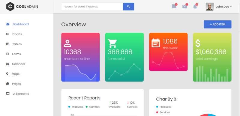
Profile cards decide whether visitors connect with your team or bounce to competitors. A poorly designed member showcase kills trust faster than broken links.…
Scrolling doesn’t have to feel flat. CSS parallax examples show how background and foreground layers moving at different speeds create depth, pulling visitors into…

Protecting privacy while accessing the web securely, watching videos unrestricted, and using any online service (in Europe) has become more important than ever. For…

That frosted glass effect you keep seeing on modern websites? It’s called glassmorphism. Apple brought this translucent UI design trend mainstream with macOS Big…

Email marketing remains one of the most powerful tools in your digital arsenal. For every dollar you spend on email campaigns, you can expect…

Dropdowns look simple until you build one from scratch. Positioning, animations, click-outside detection, keyboard support. These Tailwind dropdown examples solve all of it with…

Modals can make or break your user experience. Done right, they guide users through critical actions. Done wrong, they frustrate and drive people away.…

Tables look simple until you try to style them. Then borders double up, cells collapse, and mobile layouts fall apart. Tailwind table examples solve…

WordPress core still has no stable tabs block, and that gap has quietly sold a lot of plugins. Figuring out how to add tabs…

Your site loads fine on your machine. A visitor sends back a screenshot of a grey blocking page instead. ERRSSLVERSIONORCIPHERMISMATCH means the browser and…

Users abandon pages that feel frozen. A spinning loader tells them something is happening. Building Tailwind spinner examples takes just a few utility classes,…

Tooltips are small. Their impact on usability is not. These hover-triggered popups clarify icons, explain form fields, and guide users without cluttering your layout.…

Users abandon pages that leave them guessing. A progress bar fixes that. Tailwind CSS makes building these indicators fast. No custom stylesheets. No complex…

Your Wix site deserves a real web address, not a clunky subdomain. Learning how to connect a domain to Wix takes about 10 minutes…

Accordions solve a real problem: too much content, not enough space. These collapsible panels let users reveal information on demand without overwhelming the interface.…

A sidebar can make or break your web app’s user experience. Get it right and users flow through your content effortlessly. Get it wrong…

Your stylesheet means nothing without selectors that actually hit their targets. CSS select examples show you exactly how to target any element on a…

Cards are everywhere. Product grids, testimonials, pricing tables, user profiles. Building them with Tailwind card examples gives you complete control over every pixel without…

This guide covers practical button techniques you can use today. Press effects, hover states, rotating buttons, neumorphic styles, and performance optimization. Each example includes…

Your domain sits at GoDaddy. Your WordPress install sits somewhere else entirely. Nothing links the two until you edit a handful of DNS records.…
You’ll find code snippets for React, Vue, and Angular. Comparison tables against Font Awesome and Material Icons. Accessibility patterns that pass WCAG audits. Whether…
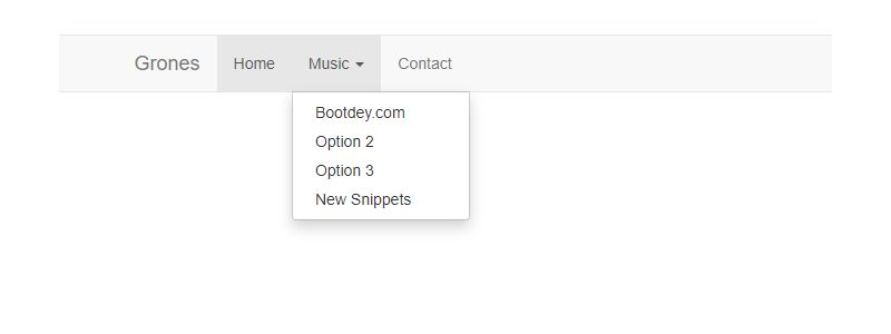
Dropdowns break or make your site’s navigation. Get them wrong, and users leave frustrated. These Bootstrap dropdown examples show you exactly how to build…
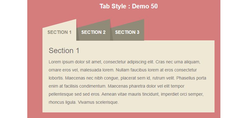
Tabs keep interfaces clean. Instead of cramming everything onto one screen, you split content into logical sections users can switch between. These Bootstrap tabs…

Lists appear on every website. Navigation menus, feature highlights, pricing breakdowns, step-by-step guides. They structure content and guide users through information. Yet styling them…

A plain “Download” link doesn’t cut it anymore. Users expect visual feedback, clear file indicators, and buttons that actually look clickable. These CSS download…

Every web application needs a way to grab user attention without leaving the page. Bootstrap modal examples show you exactly how to create dialog boxes,…