

Ever hovered over a sleek button or image on a website and witnessed the subtle, yet captivating, dance of shadows? That’s the art of CSS shadow effects—a game-changer for digital canvases.
It’s not just aesthetics; it’s about bringing depth to your designs, making them pop off the screen and inviting users into a more tangible experience.
Here’s the scoop: by the time you reach the end of this article, you’ll grasp how to wield shadows like a pro—casting, tweaking, and animating them for that extra zest in your web projects.
We’re diving deep into the nitty-gritty of box-shadows, exploring the nuances of text-shadow magic, and pushing the envelope with multiple shadows that add dimension and drama.
Ready to make your UI/UX stand out? You’ll be engineering these effects, making them responsive, and ensuring they’re as cross-browser friendly as a warm handshake.
Get set to elevate your front-end prowess, one shadow at a time.
CSS Shadow Effects Examples To Check Out
3D Cartoon Text w/CSS text-shadow: Unleashing the Fantasy!
See the Pen
3D Cartoon Text w/CSS text-shadow by Fielding Johnston (@fielding)
on CodePen.
Man, have you seen this effect by Fielding Johnston? Makes any text look like it jumped right out of a cartoon. Ideal for those whimsical story websites where the words just need a little extra life.
Smartly Embossed: Making Text Pop!
See the Pen
Text Shadow Example by Aakhya Singh (@aakhya)
on CodePen.
Okay, this one’s super sleek. It’s like the text got a little lift. With both white and black shadows, it gives off that embossed feel.
Beautiful CSS box-shadow: Flexibility at its Finest by Airen
See the Pen
Beautiful CSS box-shadow by 大漠 (@airen)
on CodePen.
Ever wondered how flexible the CSS box-shadow property could be? Airen shows us just that. Trust me, it’s legit!
CSS3 Text-Shadow Effects: Because, Why Not?
See the Pen
CSS3 text-shadow effects by Jorge Epuñan (@juanbrujo)
on CodePen.
Our buddy Jorge Epunan dished out an array of cool text-shadow effects. If you’re looking to experiment, this one’s a goldmine.
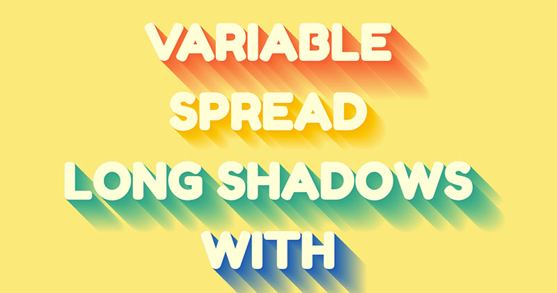
Variable Longshadow with That Gradient Touch
See the Pen
Variable Longshadow with Gradients Mixin by Dario Corsi (@dariocorsi)
on CodePen.
Crafted by Dario Corsi, this one’s got that customizable edge. Feel like a designer and adjust it just how you want.
Strokes, Shadows and a Dash of Halftone by Mark Mead
See the Pen
Strokes, Shadows + Halftone Effects by Mark Mead (@markmead)
on CodePen.
Shadows can be artsy too! Check out Mark’s creative combo of offset looks and SVG patterns. So good for titles or hero sections!
Far Flung Shadow: Shadows on the Loose
See the Pen
Text Shadow Example by Aakhya Singh (@aakhya)
on CodePen.
Blurred, distant shadows are in vogue now. Play around with different orientations and hues, and see where it takes you.
Lighting it up with Fusing Light Bulb Text Effect
See the Pen
Fusing light bulb Text effect by Ankit Navrang (@AnkitNavrang)
on CodePen.
Big shoutout to AnkitNavrang for this electrifying design.
Sass Text Shadow Effect: Sassy and Classy
See the Pen
Sass Text Shadow Effect by alfabill (@alfabill)
on CodePen.
Brought to you by alfabill, this effect is a blend of elegance and pop. That yellow background paired with vibrant shadows? Chef’s kiss!
Netflix Vibe with a Shadowy Twist by Nooray Yemon
See the Pen
Netflix style text animation with CSS by Nooray Yemon (@yemon)
on CodePen.
That iconic Netflix shadow? Nooray brought it. Simple but shouts DRAMA. Just like binge-watching on a Saturday night.
Text Shadow Pattern Animation: Dance of the Shadows
See the Pen
[webkit] Animated “text-shadow” pattern by carpe numidium (@carpenumidium)
on CodePen.
Carpe Numidium’s creation lets you groove with the shadows. And yep, customization’s on the house!
Animating Envelopes with Shadows: Jake Giles-Phillips’ Creation
See the Pen
Animated CSS Mail Button by Jake Giles-Phillips (@jakegilesphillips)
on CodePen.
Ever seen an envelope dance? Hover over it and watch its shadow play with light. It’s like that envelope is getting closer, making everything more real. Shadows, my friend, ain’t just about darkness.
Shadow that Moves with the Text
See the Pen
Moving Text-shadow by Shadi (@ShadiMuma)
on CodePen.
A tip of the hat to ShadiMouma. This effect? Brilliantly simple.
Stepping into the Limelight: The Fancy Text Shadow
See the Pen
Fancy text shadow by agathaco (@agathaco)
on CodePen.
What’s in a name? Everything! Like, you see “Fancy Text Shadow” and think – this is gonna be rad. And, dang, it is! Imagine a sleek text saying ‘SHADOWS’ against a pristine white backdrop. That’s your star.
Material Shadows? Thank Samuel Thornton!
See the Pen
Material Design Box Shadows by Samuel Thornton (@sdthornton)
on CodePen.
Thornton’s magic makes materials come alive. Shadows, materials, and oodles of creativity.
Layers and Text, A Match Made in Heaven
See the Pen
Layered text-shadow effect CSS by Shireen Taj (@TajShireen)
on CodePen.
Brought to life by Shireen Taj. Pssst, you can tweak it to your heart’s content.
Going Beyond the Rectangle: Chris Coyier’s Vision
See the Pen
Shadow on Shape by Chris Coyier (@chriscoyier)
on CodePen.
Remember when web shadows had to be all square? Chris didn’t think so. Say hello to shadows that hug every curve and edge, thanks to CSS filters.
Live Stripes: Yoksel’s Shadow Playground
See the Pen
Live stripes by yoksel (@yoksel)
on CodePen.
It’s all box-shadows. Pure CSS. And all Yoksel. Vibes right there!
Feeling Groovy with Daniel Gonzalez
See the Pen
Groovy CSS Effect by Daniel Gonzalez (@dan10gc)
on CodePen.
Got those ‘Good Vibes Only’ feels? Gonzalez turned them into a visual delight. Backed with sunshine yellow, it’s a party on a webpage.
Blurry, But Make It Fashion
See the Pen
CSS Blurred Text Shadow by Stack Findover (@stack-findover)
on CodePen.
Created by Rahul Jangid, this blurred text shadow effect is all about dreamy vibes. Customize? Oh, you bet!
Ribbon-ed & Shadowed, Courtesy of Luiz
See the Pen
Nice CSS Shadow Effect by Luiz Otávio Miranda Figueiredo (@luizomf)
on CodePen.
Ever seen a ribbon in design? That edge shadow? That’s Luiz adding some finesse.
Solo Shadow Game by TundraTech
See the Pen
Isolating CSS Box Shadows by TundraTech (@TundraTech)
on CodePen.
Shadows can be complex. But here, TundraTech keeps it neat. Isolating a shadow has never looked this slick.
Beauty in Shadows: Alex Moore’s Pretty Shadow
See the Pen
Pretty shadow by Alex Moore (@MoorLex)
on CodePen.
When Alex Moore calls something ‘Pretty’, you better believe it’s gonna dazzle. This effect’s a total show-stealer.
Turn Up the Glow: Aakhya Singh’s Masterpiece
See the Pen
Text Shadow Example by Aakhya Singh (@aakhya)
on CodePen.
Shadows don’t just darken; they can glow! Dive into Aakhya Singh’s radiant creation. And guess what? It’s all yours to play with.
Pinching the Text to Life
See the Pen
Pinchy Type with CSS text-shadow by Bennett Feely (@bennettfeely)
on CodePen.
Thanks to Bennett Feely, the text’s got some style, huh?
Where Shadows Dance
See the Pen
Animated Text-Shadow by Erin E. Sullivan (@erinesullivan)
on CodePen.
Erin E. Sullivan made sure that text isn’t just about words. With animation, it grooves!
Let’s Draw the Lines
See the Pen
Text Shadow Example by Aakhya Singh (@aakhya)
on CodePen.
Aakhya Singh serves a dual combo: outlines and shadows. Twist it and tweak it however you like.
Little Drops of Creativity
See the Pen
dropplets by Oscar Salazar (@raczo)
on CodePen.
Oscar Salazar blends SVG filters and shadows. It’s like rain on a webpage.
Hover and Revel
See the Pen
hover text shadow effect by Pablo Colomban (@pablocolomban)
on CodePen.
Pablo Colomban has a message: Hover, see magic. Those text-shadow effects? Chefs kiss.
Glassy Vibes
See the Pen
Text Shadow Example by Aakhya Singh (@aakhya)
on CodePen.
Aakhya Singh’s back, turning text into transparent art. Got your own vibe? Mold it!
Shadows that Box the Game
See the Pen
Dynamic Box Shadow by Drew McConville (@drew_mc)
on CodePen.
Drew McConville keeps it neat, clean, and elegantly shadowed.
Tinkling with Shadows
See the Pen
Box shadow piano by yoksel (@yoksel)
on CodePen.
Yoksel takes a spin, sprinkling CSS magic on a piano. I mean, how cool is that?
Singing in Pink Stripes
See the Pen
Striped Long Text Shadow Effect by Mandy Michael (@mandymichael)
on CodePen.
Mandy Michael paints the text in pink stripes and shadows. Pink lovers, she’s got your back!
Building Blocks of Shadows
See the Pen
CSS Box Shadow Example by Mike Colagrossi (@SantinoMPC)
on CodePen.
It’s all about those shadow building blocks. Plain, simple HTML and CSS.
Mobile Lights and Parallax Sights
See the Pen
Parallax Shadows (Mobile-Friendly) by Janne Aukia (@jaukia)
on CodePen.
Janne Aukia crafted this. Mobile-friendly shadows that give depth and dimension.
3D? Nah, It’s CSS Magic!
See the Pen
Box-shadow spill by timaronan (@timaronan)
on CodePen.
Play with offsets, play with box-shadows. Dive into a 3D illusion.
Neon Nights and Text Delights
See the Pen
Neon text-shadow effect by Fernando Gamers (@fernandogamers)
on CodePen.
Fernando Gamers turns the web into a neon party. Text shines bright tonight!
Cast It, Box It
See the Pen
Box Shadow Example #1 by Manu Arora (@manuarora700)
on CodePen.
Manu Arora’s project is all about casting shadows the right way.
Layered Eclipses
See the Pen
Multiple Shadows by Andrew Spencer (@iam_aspencer)
on CodePen.
Andrew Spencer crafts depth by stacking shadows. It’s like sunlight filtering through the blinds.
Images Step Out
See the Pen
Image Shadows by Oscar Marcelo (@oscarmarcelo)
on CodePen.
Thanks to Oscar Marcelo, images aren’t flat. They’ve got edge, they’ve got shadows.
FAQ On CSS Shadow Effects
How do I create a basic CSS shadow effect?
Alright, kick things off with box-shadow, it’s your bread and butter. You’ve got four main values: horizontal offset, vertical offset, blur radius, and color. Tweak these, and boom, you’ve got a shadow. Think of it as X and Y axes, a soft-focus dial, and a paint swatch for the web.
What’s the difference between text-shadow and box-shadow?
Text-shadow is all about letters getting their moment in the spotlight. You’re applying it directly to text, giving glyphs depth and drama. Box-shadow? That’s for elements. Think divs and buttons. It wraps around the whole box, giving it that oomph like it’s lifting off the page.
Can CSS shadows be animated?
Heck yes, they can! Animate CSS shadows using transition or @keyframes. Change properties over time, like size, angle, or color shifts. It’s like your shadow’s doing a little dance—subtle or bold, your call—bringing those interactive elements to life.
How do I add multiple CSS shadows to an element?
Layer them up! Separate multiple shadow values using commas in box-shadow or text-shadow. Start with the closest layer and stack ’em like pancakes. More shadows create deeper complexity, like a digital sandwich of depth. Each comma is a step further into a shadowy abyss.
Is it possible to have an inset CSS shadow?
Absolutely. Slide the word ‘inset’ into your box-shadow declaration. Now the shadow’s playing coy, nesting inside your element. It’s a cool trick for creating an inner glow or a carved-in look. Inset is the silent ninja of the shadow world—it’s there, but oh so discreet.
How do CSS shadow properties affect page performance?
Keep your shadow game tight. Simple, single-layer shadows? Not much sweat for browsers. But heavy multi-layer effects or large blur radii can tax rendering times, especially on less beefy devices. Balance beauty with a need for speed; it’s part of responsible web citizenship.
Can shadows in CSS have transparent colors?
Transparent colors are our secret ingredient. Use rgba or hsla for your shadow color, and that last value? That’s your transparency ticket.
It’s like watering down paint for that perfect translucency. Crisp edges are out; it’s all about that dreamy, soft blend into the background.
How do I ensure my CSS shadows work across all browsers?
Cross-browser fun begins with progressive enhancement and fallbacks. Stick with standard syntax, and test as you go—Chrome, Firefox, you name it.
Vendor prefixes? They’re so last season, but sometimes necessary. Check compatibility and know your audience’s browser habits. No shadows left behind, that’s your motto.
What are the best practices for responsive CSS shadows?
Responsive shadows respond gracefully to screen size changes. Use relative units like ’em’ or ‘rem’ for shadow offsets and blur. Keep an eye on @media queries—it’s not just about text size; shadows can shift to suit smaller screens too.
Responsiveness isn’t just a feature; it’s a philosophy.
How do I make a CSS shadow responsive to user interaction?
Get dynamic with hover states or JavaScript events. A cursor’s hover could signal a shadow to grow, signaling interaction possibilities.
Combine with transition for smoothness that feels organic. It’s like your elements are saying, “Come on over, there’s more to see here” with every user move.
Conclusion
So, we’ve plunged deep into CSS shadow effects—turned every stone, shuffled through every nuance. You’re now fully equipped to cast, shift, and fine-tune shadows that will breathe depth into flat designs. From subtle text whispers to boisterous box eruptions, these effects are your secret arsenal for the visual pop.
- You’ve learned to layer with finesse,
- animate with purpose,
- and keep performance in check.
Remember, shadows are the silent narrators of your design story. They give context, establish hierarchy, and nudge user interaction. Smartly deployed, they don’t just embellish; they transform.
Now, take these shadow spells, spin them into your digital cauldron, and watch as each pixel dances in the newfound dimensional space. Let each project be a testament to how well-placed shadow effects can elevate web design from flat to fantastically three-dimensional.
There are also similar articles discussing CSS range slider, javascript text animation, CSS dashboard, and product card design.
And let’s not forget about articles on CSS pagination, CSS scroll effects, CSS lists, and CSS search boxes.